Hey,
I deleted following custom CSS code from Quick CSS field, added “Hoofdmenu Links” in Advanced Styling tab and chose 17px as font size
#top #header .av-main-nav > li > a {
	font-size: 17px;
}
In first element you added in Advanced Styling “Alleen toepassen bij muis-hover” was checked so it was being applied only on hover state.
Please review your website :)
Best regards,
Yigit
Hey,
Have you tried changing font size in Enfold theme options > Advanced Styling > H1?
If you have and it did not work, please create temporary admin logins and post them here privately so we can look into it :)
Regards,
Yigit
Hi Victoria, perfekt! Thank you so much!
Do you habe an idea for my second question?
Do you now, how i can change the font-size of the mega menu title?
I tried this: #top #header .mega_menu_title a { font-size: 26px !important; }
but it didn’t work.
Kind regards,
Anna
Hi,
Thank you for the screenshot.
Edit the special heading element, go to the Screen Options and try to define the font size for medium sized screens (between 768px and 989px – eg: Tablet Landscape). You can also hide it when necessary.
Best regards,
Ismaelg
Hi bishstan,
Here is the code you can put in Enfold > General Styling > Quick Css, if it does not work, put into themes/enfold/css/custom.css
#top #header .av-main-nav > li > a {
	font-size: 17px;
}
#top .social_bookmarks li a {
    font-size: 20px;
}
If you need further assistance please let us know.
Best regards,
Victoria
Hey FayeMcC,
Sorry for the late reply and thanks for the example link.
I believe you are looking at this one:
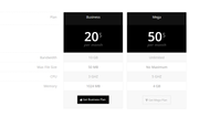
Please try Enabling the Avia Layout Builder Debugger and then pasting in this shortcode in a new page:
[av_table purpose='pricing' caption='' av_uid='av-46vmngy']
[av_row row_style='avia-heading-row' av_uid='av-45s5m2a'][av_cell col_style='avia-desc-col' av_uid='av-43cwysi']Plan[/av_cell][av_cell col_style='' av_uid='av-42aq0c2']Business[/av_cell][av_cell col_style='' av_uid='av-41352uq']Mega[/av_cell][/av_row]
[av_row row_style='avia-pricing-row' av_uid='av-3yqto5u'][av_cell col_style='avia-desc-col' av_uid='av-3xek25e'][/av_cell][av_cell col_style='' av_uid='av-3vnbtpe']20$
<small>per month</small>[/av_cell][av_cell col_style='' av_uid='av-3uktq0i']50$
<small>per month</small>[/av_cell][/av_row]
[av_row row_style='' av_uid='av-3s6wnpe'][av_cell col_style='avia-desc-col' av_uid='av-3qrslf6']Bandwidth[/av_cell][av_cell col_style='' av_uid='av-3pe4ef6']10 GB[/av_cell][av_cell col_style='' av_uid='av-3n7ojgy']Unlimited[/av_cell][/av_row]
[av_row row_style='' av_uid='av-3lmbn1u'][av_cell col_style='avia-desc-col' av_uid='av-3jw4p76']Max File Size[/av_cell][av_cell col_style='' av_uid='av-3iz8pqq']50 MB[/av_cell][av_cell col_style='' av_uid='av-3hg3bz6']No Maximum[/av_cell][/av_row]
[av_row row_style='' av_uid='av-3fo0nuq'][av_cell col_style='avia-desc-col' av_uid='av-3divj02']CPU[/av_cell][av_cell col_style='' av_uid='av-3cmw4du']3 GHZ[/av_cell][av_cell col_style='' av_uid='av-3am13de']5 GHZ[/av_cell][/av_row]
[av_row row_style='' av_uid='av-386d89e'][av_cell col_style='avia-desc-col' av_uid='av-36r53de']Memory[/av_cell][av_cell col_style='' av_uid='av-35ggx9e']1024 MB[/av_cell][av_cell col_style='' av_uid='av-33k159u']4 GB[/av_cell][/av_row]
[av_row row_style='avia-button-row' av_uid='av-32b228i'][av_cell col_style='avia-desc-col' av_uid='av-305sus2'][/av_cell][av_cell col_style='' av_uid='av-2yfxx0y'][av_button label='Get Business Plan' link='manually,http://' link_target='' color='theme-color' custom_bg='#444444' custom_font='#ffffff' size='medium' position='center' icon_select='yes' icon='29' av_uid='av-2x7x4k2']

[/av_cell][av_cell col_style='' av_uid='av-2vwhy82'][av_button label='Get Mega Plan' link='manually,http://' link_target='' color='theme-color-subtle' custom_bg='#444444' custom_font='#ffffff' size='medium' position='center' icon_select='yes' icon='44' av_uid='av-2t9lvtu']

[/av_cell][/av_row]
[/av_table]
This should give you the example table which you can examine the settings or adjust to suit your needs, and then paste into your page.
Best regards,
Mike
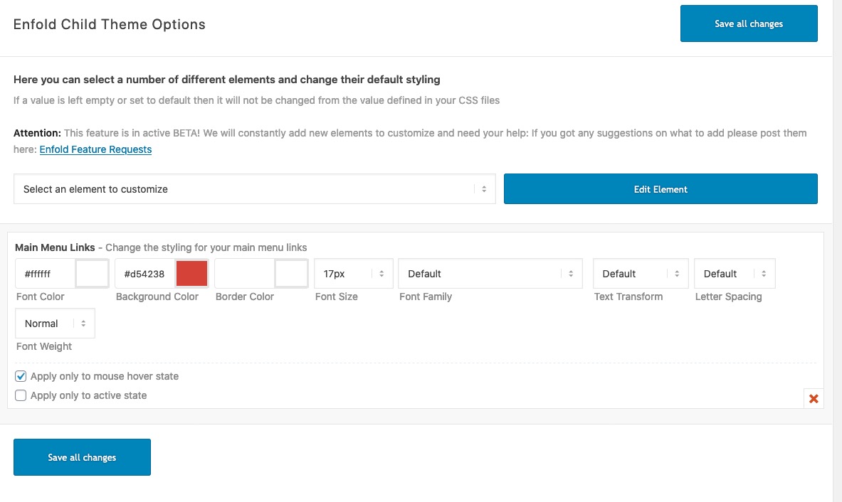
The rule of the hover state with font-size comes from:
#top #header .av-main-nav > li:hover > a {
	color: #ffffff;
	background-color: #d54238;
	font-size: 17px;
}
and maybe it is set in the “Advanced Styling”
Solution:
#top .av-submenu-container {
font-size: 16px;
font-family: dn-pro-dn-pro-bold;
font-weight: bold;
color: #333333;
My only issue is the margin/padding left.
Hi,
Where can I change the size of the font main menu?
It gets bigger with the mouseover
Main menu sublevel Links is 17 px
Main menu Links is 17px, this remains small
Maybe I should do that in the css?
What is the code then?
Please take a look: http://maastrichtvooriedereen.nl.transurl.nl/wie-zijn-wij/wat-doen-wij/
Hope to hear from you soon.
Regards Tom
Hey andfri78,
Thank you for the update.
You can use the following css code to adjust the style of the slider arrows — decrease its size, remove the background and change its position if necessary.
@media only screen and (max-width: 989px) {
.avia-slideshow-arrows a::before {
	top: 0;
	left: 0;
	right: 0;
	bottom: 0;
	text-align: center;
	color: inherit;
	background: transparent;
	line-height: 32px;
	font-size: 11px;
}
}
You can change the captions’ font size for different screen sizes in the slides’ Styling > Font Sizes panel.
Best regards,
Ismael
Hey bobfurgo,
Add the following to quick css:
.sub-menu li a span.avia-menu-text{
font-size:15px!important;
}
Adjust the font-size to whatever you need.
Best regards,
Jordan Shannon
Hey Nathan,
Add this to quick css:
#dtw_clock_widget-2{
text-align:center!important;
font-size:25px!important;
}

#clock_1.digits{
font-size:35px!important;
}
Best regards,
Jordan Shannon
hi
the site i’m working on is evokespirit.com
the page i’m working on is
how do I center the text and time and make the font and time numbers larger?
View post on imgur.com
on the back end I selected that it’s centered and it’s not yet showing that change on the front:
View post on imgur.com
thank you
Hey Nathan,
Add this to quick css:
@media only screen and (max-width: 767px)  {
h1.av-special-heading-tag{
font-size:40px!important;
}}
Best regards,
Jordan Shannon
Hi,
To reduce the text in the footer for all screen sizes, Please try this code in the General Styling > Quick CSS field or in the WordPress > Customize > Additional CSS field:
#footer p,#footer a {
	font-size: 10px !important;
}
Please adjust the font-size to suit.
After applying the css, Please clear your browser cache and check.
To do this only for mobile, please use this css instead:
@media only screen and (max-width: 767px) {
#footer p,#footer a {
	font-size: 10px !important;
}
}
Best regards,
Mike
It worked. Thank you. Please see if these customization options can be added under Enfold Theme Options in the next update. I am currently using the following additional css which would be great of they could just be selectable options:
@media only screen and (min-width: 760px) {
span.copyright {
width: 100%;
text-align: left;
}
#socket .sub_menu_socket {
width: 100%;
}
#socket .sub_menu_socket #avia3-menu {
display: flex;
text-align: left;
}
}
#footer .container {
font-size: 13px;
text-align: left;
}
@media only screen and (max-width: 479px) {
.responsive #top #wrap_all #header > #header_meta .container > .social_bookmarks {
display: block !important;
}
}
Hi,
1- I enabled Custom Fields (Özel Alanlar) in Settings and checked “header” and it was set to “no” – https://prnt.sc/q5o31x. I simply typed “yes” and updated your page. I am not sure why exactly this issue occurs but in case it happens in future, please check if header is set to “yes” in custom fields.
2- I added following code to bottom of Style.css file of your child theme in Appearance > Editor
.recentcomments a, .widget_recent_entries li a {
    font-style: inherit;
    font-family: inherit;
    font-size: 13px;
}
Please review your website :)
Best regards,
Yigit
Hi, I have managed to make adjustments to the footer and socket using the following custom css:
@media only screen and (min-width: 760px) {
span.copyright {
width: 100%;
text-align: left;
}
#socket .sub_menu_socket {
width: 100%;
}
#socket .sub_menu_socket #avia3-menu {
display: flex;
text-align: left;
}
}
#footer .container {
font-size: 13px;
text-align: left;
}
I however have another issue.
I have set and displayed the Header Social Icons. They are appearing on desktop but not on mobile devices. How can this be fixed?
Link: https://mrpanels.com/
Thank you Victoria.
Jordan solution didn’t work.
So I create a test page in private so you can see the result.
The css is:
.page-id-718 .menu, h3.widget-title, span.avia-menu-text, .main_menu ul:first-child > li > a, #top #header .mega_menu_title a {
font-family:'arial', sans-serif!important;
text-transform: uppercase!important;
letter-spacing:1px!important;
font-weight:normal!important;
font-size:15px!important;
text-align: center!important;
color: red!important;
}
In addition to the red color, I would like to have the logo bigger on my home and moved slightly to the left compared to the menu for better centering (10 or 15 px) . I would like all these apply just for the home page.
I tried a lot of solution but I don’t find the good one.
Thanks for helping,
Regards
Iceman
-
This reply was modified 6 years, 3 months ago by
 ICEMAN.
Hi,
Thanks for that. Please try the following in Quick CSS under Enfold->General Styling:
.main_color .required {
    color: red;
    font-size: 20px;
}
Best regards,
Rikard
I now have only one blog issue. I need help with formatting. It’s kind of important because this guy worked on it for me and he screwed my page up completely and now it’s a mess! Please help As soon as possible. I do know you’re busy.
I would like to show a list of the post titles below a static pic. Like this:
https://dynamicrealestatemarketing.com/wp-content/uploads/2019/12/capture-blog-list-idea..png
However, this is what I have:
https://dynamicrealestatemarketing.com/wp-content/uploads/2019/12/capture-blog-post-list.png
I need to know how to change the color and size of the font as well. Right now it’s teal and very large.
I’m so confused to get this fixed. Please help!
I am having more issues. Please, if you could help me, I would be eternally grateful.
This topic was modified 22 minutes ago by kgoldman.
This topic was modified 1 minute ago by kgoldman.
-
This topic was modified 6 years, 3 months ago by
 kgoldman.
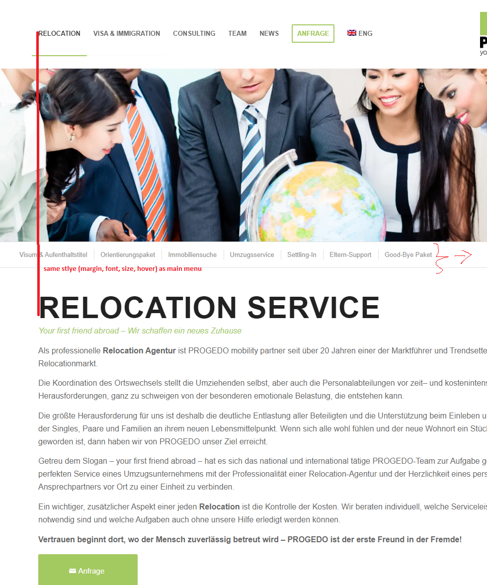
Hello,
1)
I use the fullwidth submenu. I want this to be in the same style as the main menu. In addition, the distance to the left should be the same as in the Main Menu. The following code doesn’t work. Can you help?
/*Fullwidth Submenu same styling as main menu*/
#top .av-subnav-menu .avia-menu-text > li > a {
font-size: 16px;
font-family: dn-pro-dn-pro-bold;
font-weight: bold;
color: #666666;
}
#top .av-subnav-menu > li > a:hover {
    color: #333333;
}
https://s19.directupload.net/images/191202/hixlhojk.png
Many thanks in advance.
-
This topic was modified 6 years, 3 months ago by
 RisingStar.
Dear Enfold support team,
as you all know responsive design has become very important these days!
When I worked with Enfold to optimize my webpage for all possible devices, I came to the conclusion, that Enfolds responsive customizations are not at the level that they could be….
(1) Enfold Responsive Options handle only devices up to 989 screen width. iPad has 1024 px, so 989 option should be changed to 1024 to cover iPads.
(2) I saw that there is little to no room for flexibility with many Enfold elements/shortcodes above 1024px. Text-Block element only offers font-size in px.
Headings offer vw size, but not for subheading font-size. And actually users will want vw font size like 2.7vw 2.8vw and so on as a dropdown menu.
Flexible vw font-size for all elements as a selectable choice is a MUST in my opinion. Then there are elements which offer no selectable font-size at all like Button and icon/symbol-box. I know CSS customizations are possible with dev classes, but this takes a lot of time where it could be easy with shortcode options. In general many elements/shortcodes seem to miss important customization options that many users may be interested in.
So to make Enfold better I kindly and urgently want to ask to adress these issues in near future Enfold Updates.
As a summary please adress these aspects:
>Priority High<
– “vw” font-size with decimal place support as dropdown for all enfold elements where it makes sense. Especially heading + subheading/subtitle, Text block, icon/symbol box, button
– Change 989 value for responsive screen options to 1024 px or add 1024 option
>Priority Low to Medium<
-Update existing shortcodes for more customization possiblilities (like more HR style variations and with color, columns with rotate option, different colours/width for top+bottom border)
Thank you very much for understanding my concerns!
-
This topic was modified 6 years, 4 months ago by
 Flow9999.
Hi. I need to change the footer text font size. How do I do that?
Hi,
I have compared your two sites stylesheets and the demo site was missing this in your Quick CSS:
.postid-79206 .avia-button-fullwidth { font-size: 45px !important; }
.postid-79206 .avia_button-fullwidth_icon {
    font-size: 45px;
}
which I added for you
and in style.css your live site is missing:
#top .avia-gallery .avia-gallery-thumb a {
width: 25%;
opacity: 1;
display: block;
float: left;
}
#top div .avia-gallery img {

box-sizing: border-box;
}
I did not add
That is all I found, the two sites look the same to me, please clear your browser cache and check.
Best regards,
Mike
Hi sparkylab,
We apologize for the delayed response.
1. Please add this css code in Quick CSS or your custom css file.
@media only screen and (max-width:767px) {
    #socket .container {
        display: flex;
        flex-direction: column;
        text-align: center;
    }

    #socket .container .social_bookmarks {
        order: 1;
    }

    #socket .container .sub_menu_socket {
        order: 2;
    }

    #socket .container .sub_menu_socket .menu,
    #socket .social_bookmarks {
        margin: 6px 0 0;
    }

    #socket .container .sub_menu_socket .menu li,
    #socket .social_bookmarks li {
        float: none;
        display: inline-block;
    }

    #socket .social_bookmarks li a {
        font-size: 18px;
    }

    #socket .container .copyright {
        order: 3;
    }
}
2. The only button I could see not centered is the button below the form, can you give us a screenshot on how it looks on your end?
3. It’s possible, if it’s the image above “So, who am I?”, then you can use this css code:
.home #av_section_3 .avia_image {
    max-height: 260px;
    width: auto;
}
Hope this helps.
Best regards,
Nikko
Hello,
I’d like to change the “slideshow controls”. Basically in mobile view they are much to big: the arrows as well as the dots (for the number of pictures).
How can I decrease the size of the controls?
For selection “minimum white”, is it possible to deselect the rectangle around the arrow?
Is it possible to define different control sizes for large, medium and small screens?
Additonally, how can I change the caption font size for large, medium and small screens?
Please find below the link to the website where the support is needed.
Thank you,
Andreas
In Text Block / Screen Options / Font Size settings, I have a custom font size for “Font Size for small screens (between 480px and 767px – eg: Tablet Portrait)” and”Font Size for very small screens (smaller than 479px – eg: Smartphone Portrait)”. But they don’t actually work, the font size doesn’t get smaller like it should. Please advise.
Thanks Victoria! I’d like to make font size smaller (for 1024px screen width) on heading and text of all my 6x 1/3 columns at bottom of main page.
Hey Lara,
Here you go:
#top .av-form-error-container {
border: 1px solid #FFF;
padding: 15px;
color: #FFF;
line-height: 1.4em;
font-size: 13px;
margin-bottom: 20px;
}
Best regards,
Basilis