-
Search Results
-
hi guys
i have another issue here(my template seems to be full of them) i can’t modify my menu items font style and color despite the fact that i followed every step in the youtube video
advanced styling–>select an element to customize–>main menu linksit’s getting to a point where whenever i watch the video for a specific part i just know it won’t work for me before i even try
Hi there,
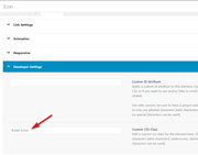
As the title says, our small bar has changed colour …. I have entered the correct colour on Enfold Child>Advanced Styling> Small bar above Main Menu
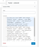
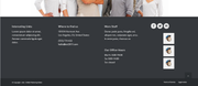
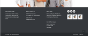
I have the following in the quick CSS section:
.logo {
padding-top: 10px;
padding-bottom:10px;
}
.avia-testimonial {
background: #ffffff;
box-shadow: 0 0 2px rgba(0, 0, 0, 0.2);
border-radius: 4px;
}
#header_meta #avia2-menu a {
font-size: 16px !important;
font-weight: normal !important;
}
#header_meta .phone-info
{
font-size: 16px !important;
font-weight: normal !important;
}
.slideshow_caption { width: 100%;Thanks,
D
Hi,
I want to include a seal using the following code provided from jameda.de<script src="https://cdn1.jameda-elements.de/widgets/siegel/81338913_1/858486/" type="text/javascript" async></script><div id="jameda-widget-container858486" style="position:relative; width:272px; height:168px; margin:15px; background-image:url(https://cdn1.jameda-elements.de/premium/widgets/_images/top10-top20-bg.png); background-repeat:no-repeat; font-family:Arial, Helvetica, sans-serif; font-size:12px; line-height:15px;"><div style="position:absolute; top:25px; left:108px; width:148px; height:58px; overflow:hidden; white-space:normal;"><a href="https://www.jameda.de/dresden/aerzte/hno-aerzte-hals-nase-ohren/christiane-kirchner/uebersicht/81338913_1/?utm_content=Top10-01%2F2020&utm_source=Kunden-Homepages&utm_medium=Badges&utm_term=81338913&utm_campaign=Badges" style="font-size:15px; line-height:18px; font-weight:bold; color:#01a3d4; text-decoration:none; border:0px;" target="_blank">Christiane Kirchner</a></div><div style="position:absolute; top:98px; left:108px; width:152px; height:53px; overflow:hidden; color:#888; font-size:11px; line-height:13px;"><strong>HNO-Ärzte</strong><br>in Dresden auf <a href="https://www.jameda.de/dresden/aerzte/hno-aerzte-hals-nase-ohren/fachgebiet/?utm_content=Top10-01%2F2020&utm_source=Kunden-Homepages&utm_medium=Badges&utm_term=81338913&utm_campaign=Badges" class="jam_link_check" style="color:#069bd2; font-size:11px; text-decoration:none; border:0px; background-color:transparent !important;" target="_blank">jameda</a></div></div>When inserting this code either in a text block or in a code block, the backend looks like as ist should –> Dropbox But at the frontend, it looks terrible, e.g. the background image isn’t loaded. You can see here (please scroll to the bottom of the page): https://hno-dresden.com/unsere-praxis/aerzte/kirchner/
Does anybody has an idea how to fix?
Thanks a lot in advance, yours, Thomas
PS: Cache is cleared.
Hallo, ich habe zwei Fragen, die beide die Mobile-Darstellung betreffen:
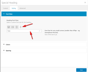
Bei “Spezielle Überschrift” gibt es die Einstellung
“Heading Font Sizes … Select a custom font size for the heading.”
1) Wo / wo kann ich zentral einstellen, wie groß für die verschiedenen Bildschirmgrößen die “custom font size” für die Speziellen Überschriften voreingestellt ist?
2) Wo / wie kann ich zentral eingeben, wie groß über den Texteditor definierte H1, H2 usw. in der Mobile-Darstellung ausgegeben werden?Die Headlines der Seite https://schnelletexte.de sind in der Mobile-Darstellung viel zu klein, und ich will nicht in jedem Textfeld manuell die Headlinegröße ändern.
Vielen Dank!
Hi
on this under development site
https://aussiehiddentreasures.com/
front end password = aussieWhen I try to add this css
@media only screen and (max-width: 600px) {
.single-product-summary {
width: 100%;
}
the menu font changes from bold green letters set in the admin – to thin black lettering
FYI the css above makes the woocommerce description the full width of the phone page (overriding the css to get the menu to the right on a normal size page)
here is the full custom css
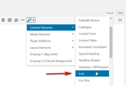
.page-thumb { display: none; } .woocommerce-tabs { display: none !important; } .related.products { display: none; } .template-shop { background-image: url(https://aussiehiddentreasures.com/wp-content/uploads/2020/01/bg5-light.jpg); background-repeat: repeat; background-position: top left; } .single-product .template-shop { background-image: url(https://aussiehiddentreasures.com/wp-content/uploads/2020/01/bg1.jpg); background-repeat: repeat; background-position: top left; } .single-product-summary { background-image: url(https://aussiehiddentreasures.com/wp-content/uploads/2020/01/80-white-frost-panel-1.png); background-repeat: repeat; padding-top: 20px; padding-right: 20px; padding-bottom: 20px; padding-left: 20px; } .inner_sidebar { background-image: url(https://aussiehiddentreasures.com/wp-content/uploads/2020/01/80-white-frost-panel-1.png); background-repeat: repeat; padding-top: 20px; padding-right: 20px; padding-bottom: 20px; padding-left: 20px; } .pagination { background-image: url(https://aussiehiddentreasures.com/wp-content/uploads/2020/01/80-white-frost-panel-1.png); background-repeat: repeat; padding-top: 20px; padding-right: 20px; padding-bottom: 20px; padding-left: 20px; } .single-product-main-image { width: 25%; } .single-product-summary { overflow: hidden; width: 45%; float: left; margin-right: 5%; } .single-product .sidebar { width: 30%; } @media only screen and (max-width: 600px) { .single-product-summary { width: 100%; }Heading Font Sizes and Content Font Sizes in your Icon Box Element only has 3 screen sizes, Medium, Small and Very Small. I had to use css to make the heading larger on default screen size.
Animated Numbers only has one font size, default, there is no way to change the font size for Medium, Small and Very Small.
Will this be fixed in upcoming update? Or, can you provide me with CSS in the meantime?.
Also, will you guys be removing all these tabs in styling elements? It makes it so much more time confusing and unduly complicated to change an element – your old way really was much better.
Thank you!
~e
Hi, after updating the theme to 4.7 the easyslider element for a single image doesn’t show the chosen font sizes on mobile
– after saving and reopening the font size drop down switches back to default
– so h2 on mobile shows desktop setting
– one slider element that has not been saved after updating is still showing intended font size
Thanks for taking a look!
