Hi,
Thank you for the link to your product page, I assume this section will be used in many pages so I would recommend giving this section a custom ID, right now the section ID is the default av_section_1 so the following CSS will use this ID, but you should change it so there won’t be a conflict with other iconboxes on your site.
#av_section_1 .iconbox.av-no-box a.iconbox_icon:before {
    font-size: 90px;
}
#av_section_1 .iconbox.av-no-box a.iconbox_icon {
    border-style: none !important;
    border-width: 0 !important;
}
After applying the css, please clear your browser cache and check.
Best regards,
Mike
Hey vivienne2020,
Your logo looks fine on my end on mobile, could you post a screenshot of the problem please?
Also let us know which text you would like to target on mobile. Some browser render fonts a bit different, that might account for the difference in size you are seeing.
Best regards,
Rikard
well the given css has one selector more than the above – and then it is more specific :
Try:
div .mfp-title {
    font-size: 20px;
}
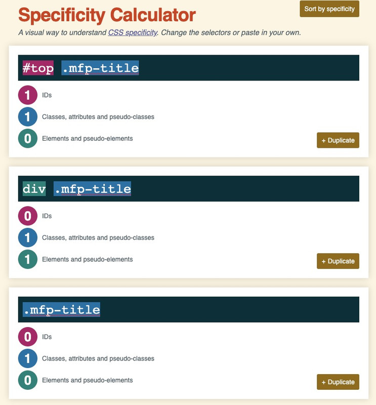
you see that the rule with the div wins that competition ;)
and if you want to be sure that your custom css overrules the given one take the #top rule
https://specificity.keegan.st/
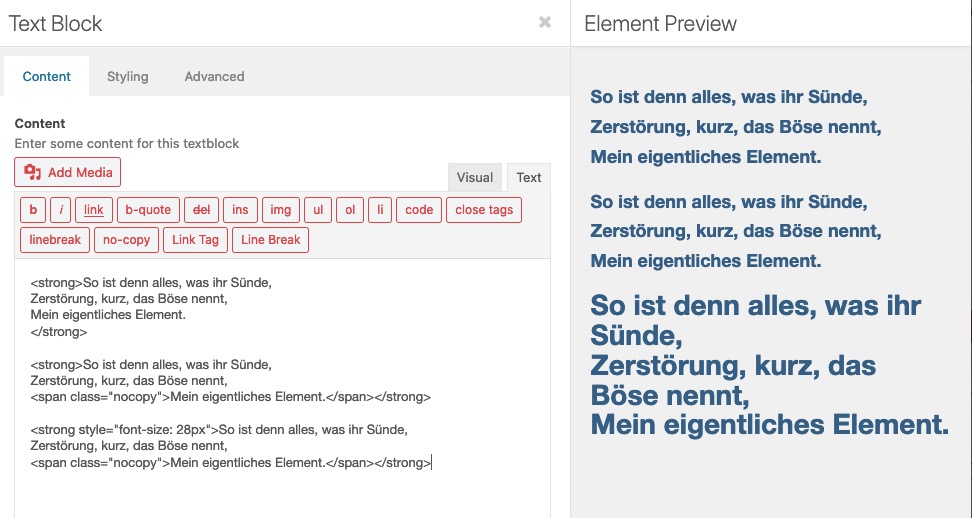
and how did you want to achieve these different text-sizes? Are these textblock alb elements – and you have set the font-size via the styling tab of the textblock alb:
– or did you insert inline css – like:
This reply has been marked as private.
Hi
individual font sizes in the content elements “text-block” are not executed.
Hi
individuelle Schriftgrößen in den Inhaltselementen “text-block” werden nicht ausgeführt.

thanks solf
-
This topic was modified 5 years, 3 months ago by
 solf.
solf.
Hi,
Please try this code in the General Styling > Quick CSS field or in the WordPress > Customize > Additional CSS field:
html body.page-id-11963 a.iconbox_icon[data-av_iconfont='fontello']:before {
    font-size: 90px;
}
After applying the css, please clear your browser cache and check.
Best regards,
Mike
Hi, yes you can do that using the follwing CSS:
.mfp-title {
    font-size: 20px;
}
Hello together
I have created a gallery with various photos
everything works out fine
my question
when I open a photo in the gallery, the title of the photo appears below, which is included in the media library
can I format this title
font size font etc.
kind regards
Franz
So you wan the whole thing to look like? For some reason it still fails…
@media only screen and (max-width: 767px) {
td.product-quantity {
min-width: 120px !important;
}
#top div .quantity input.plus, #top div .quantity input.minus {
line-height: 29px !important;
width: 30px !important;
height: 30px !important;
}
td {
font-size: 12px !important;
}
#top div .quantity input.qty {
height: 30px !important;
width: 30px !important;
line-height: 29px !important;
}
.shop_table td {
height: 100% !important;
}
table.shop_table .woocommerce-cart-form__cart-item.cart_item {
height: 100% !important;
}
}
Dear support team
I have the issue with the mobile site that pages except for the home page, the logo only shows 1/3 of its initial image.
I have just checked the website that it also happens on the desktop, the pages except for the home page only shows 1/3 of its initial logo image.
In addition, if you could help to look into the font size, where I can adjust the mobile font size? and why it shows a different font size with each browser.
Thanks for your help!
ooh right I see…
So let’s say I change it into an ‘h1’ (instead of p) then the quick ccs code would be:
.rv-h1-portfolio h1 {
    font-size: ...
}
-
This reply was modified 5 years, 3 months ago by
 rvga.
rvga.
Hi again,
the heading “Service SEO : stratégie de contenus” is not formatted as H1 but as paragraph
Either you change it to H1 in the text editor (recommended) or you use
.rv-h1-portfolio p {
    font-size: ...
}
Rikard, you can check on that page: https://c-serp.fr/clients-references/service-seo-strategie-de-contenus-blog-vacance-enfant/
I declared in the Custom css Class of the first text block: “rv-h1-portfolio”
And in the quick css, I wrote:
#rv-h1-portfolio h1 {
   font-size:50px;
   text-align:left;
   color:#a81010;
   text-shadow:1px 1px 2px white;
}
Obviously that doesn’t work.
An ID should be unique for a single page, but a class can be used many times.
Ok, so I undesrtand that these 2 fields do the same job, except that the Custom ID is unique to a page, portfolio or a post and that the Custom css class can be shared among many pages, portfolios or posts, am I right?
Hello
I’ve looked at this post but I’m trying to stick with just css for making this work. My colleague has added a WPML menu to the right of the icon, and I’ve tried some other css (see below), which sort of work but I’d like to apply links and use styling on some text items. Thank you in advance.. I’m using all 3 menus – main, secondary and WPML, so can I make a menu widget and then add it before the icon? I also would like to hide it on mobile, but once I now what to target I should be ok>
https://kriesi.at/support/topic/hamburger-menu-next-to-default-menu-in-enfold/
/* add text left of burger on desktop */

.av-burger-menu-main a::before {
    content: "Custom icon text";
    font-size: 24px;
    position: absolute;
    left: 50%;
    transform: translateX(-50%);
    line-height: 1em;
    width: 500px !important;
}

.av-burger-menu-main.menu-item-avia-special:after  {
    content: 'Menu';
    font-size: 14px;
    top: -77px;
    position: relative;
    color: #fff;
    left: 66px;
}

li#menu-item-burger:before {
    content: 'Menu';
    position: absolute;
    top: 45px;
    right: 50px;
}
This reply has been marked as private.
Hi,
Add this as well:
#avia-menu li a .avia-menu-subtext{
font-size:15px!important;
}
Best regards,
Jordan Shannon
Hi,
Add this as well:
#avia-menu li a .avia-menu-subtext{
font-size:15px!important;
}
Best regards,
Jordan Shannon
Hey designyvr,
Thank you for the inquiry.
This should be possible if we set the table data to collapse to the next line and if set the table to inherit the width of the view port or browser screen. Please try this code in the Quick CSS field.
@media only screen and (max-width: 767px) {
  .responsive .avia_scrollable_table .avia-data-table > thead > tr > th, .responsive .avia_scrollable_table .avia-data-table > tbody > tr > th, .responsive .avia_scrollable_table .avia-data-table > tfoot > tr > th, .responsive .avia_scrollable_table .avia-data-table > thead > tr > td, .responsive .avia_scrollable_table .avia-data-table > tbody > tr > td, .responsive .avia_scrollable_table .avia-data-table > tfoot > tr > td {
    white-space: wrap;
  }

  .avia_scrollable_table .avia-table {
    width: 100%;
  }

  .avia-data-table .avia-pricing-row td, .avia-data-table .avia-pricing-row th {
    text-align: center;
    font-size: 18px;
    line-height: 1.3em;
  }
}
Best regards,
Ismael
Hi guys,
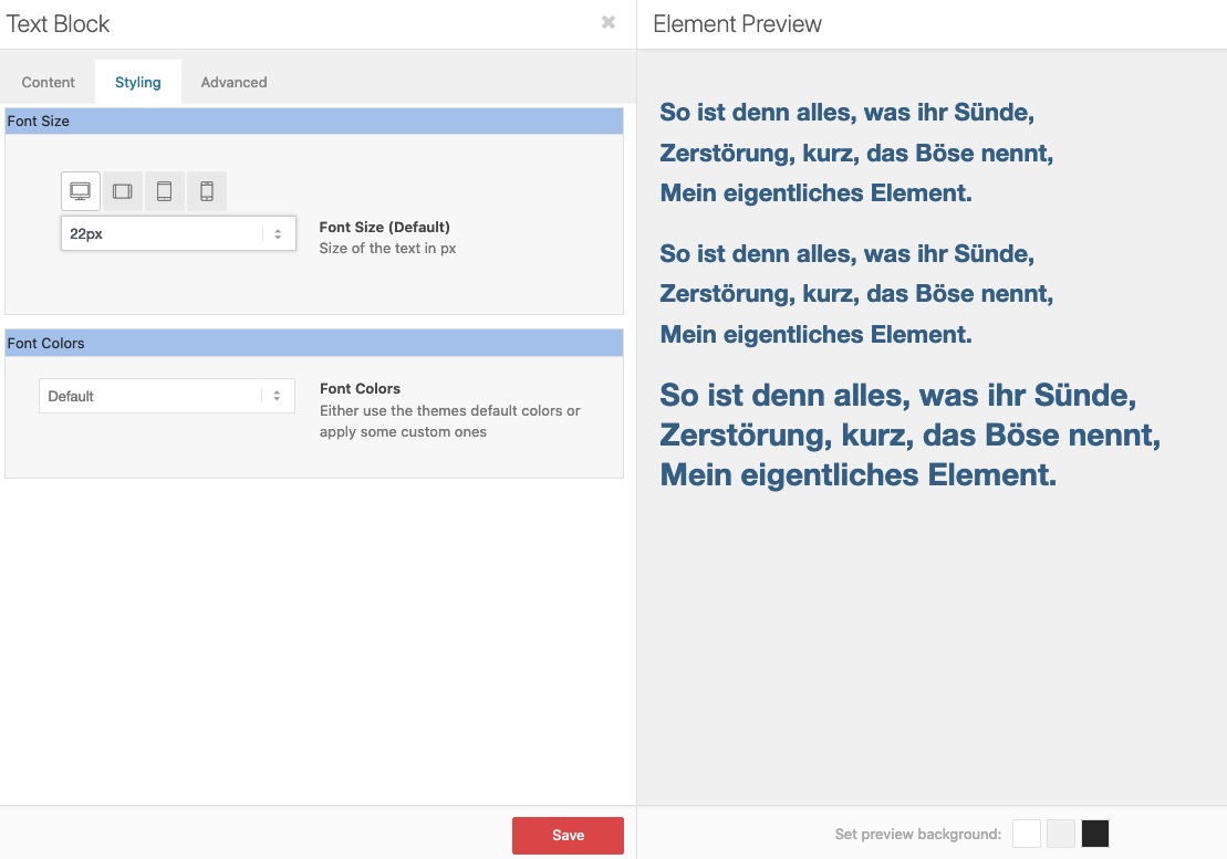
In a the text tab of a text block, I use to have the following code:
<h1 style="font-size: 50px; text-align: left; color: #a81010; text-shadow: 1px 1px 2px white;">This is my H1 text</h1>
It works fine.
Using now a unique custom ID attribute to manage my H1’s, I’ve tried to rewrite that code in the css area but wasn’t able to make it work.
The ID attribute is “rv-h1-portfolio” and here is the last try I’ve written, with no effect at all:
#rv-h1-portfolio .h1 {
   font-size: 50px;
   text-align: left;
   color: #a81010;
   text-shadow: 1px 1px 2px white;
}
Anyone can correct and help me getting the right code please ?
Hi, thank you for your reply.
I’ve updating the test page so you can take a look. I did not uploaded any image yet. I pasted the code and you will see the dotted border splitted in two parts.
I tried the code like this:
<p style=”text-align: left;”><span style=”font-size: 20px;”>Lorem ipsum</span>
<br class=”avia-permanent-lb” /> Lorem Loren.
Lorem lorem:
– link 1
– link 2
– link 3
email address
And it works and the dotted border is not split in two parts, but I can’t figure out how to change the alignment of the text and the picture like in the semple I sent.
Thank you very much in advance
Thank you very much
Hi,
Thanks for the update. The easiest way would be to assign a class to your button elements. If you want a 12 pixel font size, then you could name the class button-12 for example. Then add this to Quick CSS:
.button-12 span {
  font-size: 12px;
}
You can add as many classes as you like depending on which font size you want.
Best regards,
Rikard
Hi,
You are welcome! :)
1- Please go to Settings > General and change it under “Date Format”
2- Please replace following code
.bloglist-compact .date-container {
    float: right;
}
with following one
.main_color .bloglist-compact .fallback-post-type-icon {
    display: none;
}
3- Please add following code to Quick CSS as well
.bloglist-compact .date-container {
    color: black;
    font-size: 14px;
}
Best regards,
Yigit
Hi Rikard,
Sorry my bad I’ve included it now.
In my wordpress editor I created a draft test page for you to see, the page is called WTforms Test page.
In the WPforms test page I have created for you, I’ve left the WPforms and right under it there is the image of the short code when I switched layout mode from Default to Advanced.
These are the instruction of what I did step by step:
– Create a new page using the advanced layout from the Enfolds theme.
– I’m clicking to Plugins Addition (where the WTforms should be). Its nothing there.
– I then switch to default editor mode.
– I open the menu and go to widgets, there i can find WPforms plugin, i click that and add it to the page.
– I test the page and there is the contact form created with the WTforms plugin.
– I check the short code:
[av_one_full first  min_height='' vertical_alignment='' space='' row_boxshadow='' row_boxshadow_color='' row_boxshadow_width='10' custom_margin='' margin='0px' mobile_breaking='' border='' border_color='' radius='0px' padding='0px' column_boxshadow='' column_boxshadow_color='' column_boxshadow_width='10' background='bg_color' background_color='' background_gradient_color1='' background_gradient_color2='' background_gradient_direction='vertical' src='' background_position='top left' background_repeat='no-repeat' highlight='' highlight_size='' animation='' link='' linktarget='' link_hover='' title_attr='' alt_attr='' mobile_display='' id='' custom_class='' aria_label='' av_uid='']

[av_textblock size='' av-medium-font-size='' av-small-font-size='' av-mini-font-size='' font_color='' color='' id='' custom_class='' av_uid='av-ki5qjgpg' admin_preview_bg='']
Here is the WTforms plugin to be filled
[/av_textblock]

[/av_one_full]
– When I switch to advanced layout the form disappear both in the layout editor AND in the page preview.
I hope my explanation is more clear now.
Matteo.
Hey bemodesign,
Add this to quick css and adjust to what you need:
#avia-menu li a .avia-menu-text{
font-color:red!important;
font-size:25px!important;
}
Best regards,
Jordan Shannon
Hi Rikard,
Menu font size fixed all good!
Just that the changes you made affected my entire content width all images, videos and text area are over size to full screen. very weird.
I tried to fix it no success I don’t know what you did, please take a look.
Best
Alhaji
-
This reply was modified 5 years, 3 months ago by
 Alhaji2017.
Sure it’s seen below!
Also while you look can you please advice me how to change menu fontsize with a hoover on mouse over effect, as seen on original site , URL also attached below.
Thanks Johan
-
This reply was modified 5 years, 3 months ago by
 IntelligentSolutions. Reason: I found where to edit font size of menu via advanced editing
Thank you Rikard I saw the main menu changed already but not the secondary menu.
Dou want to take a look?
In addition when I change the font size to 22 it change immediately as it was.
Best Alhaji
-
This reply was modified 5 years, 3 months ago by Alhaji2017.
Hey dkarvasz,
Sorry for the late reply and thanks for the link to your site.
To remove the background color from the header social icons you could use this css:
#top #wrap_all .social_bookmarks > li:hover a {
    background-color: transparent !important;
}
But I believe that your background color issue could be solved with this css, please try this code in the General Styling > Quick CSS field or in the WordPress > Customize > Additional CSS field:
#top .social_bookmarks li a {
    border-radius: 100px;
}
#header .social_bookmarks li a {
    line-height: 40px !important;
}
#top .social_bookmarks {
    margin: 10px 0 0 -9px !important;
}
After applying the css, please clear your browser cache and check.
I see that you have added your phone number to the Enfold Theme Options > Header > Extra Elements > Phone Number or small info text field and you also have Font Awesome code there, to use this to should install the Font Awesome plugin it should work right away for you.
Or you can insert a phone icon before the actual phone number with this shortcode:
[av_font_icon icon='ue854' font='entypo-fontello' size='20px'][/av_font_icon]
Best regards,
Mike
Hi Rikard,
i put this css code, but nothing change
/* Price*/
.av-catalogue-container.my-custom-catalogue .av-catalogue-list li .av-catalogue-price {
color: white;
font-weight: bolder;
font-size: 14px;
font-family: ‘verdana’, sans-serif;
}
/* Price*/
.av-catalogue-container.my-custom-catalogue .av-catalogue-list li:hover .av-catalogue-price {
color: white;
}
/* List item on hover */
.av-catalogue-container.my-custom-catalogue .av-catalogue-list li:hover {
background: black;
}
when i hoover on the tekst i wont that he dont move, price have white color also.
the menu is not complete, whe finish when whe have the css code.
Kinds regards,
Theo