first there will be only the chance to give the heading more place to use.
Either you increase the normal content width from 1310px to something differnt – you see on my installation there is a 1510px choosen.
Or you go and set a smaller font-size:
.home #av-layout-grid-1 h1.av-special-heading-tag {
  font-size: 42px;
  line-height: 58px;
  background-color: transparent;
}
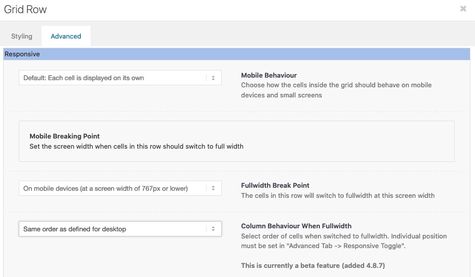
On default the order is set to have on responsive case on top the first column ( cell ) – but you can change that on :
“Column behavior when fullwidth”
Hello,
i want a very minimalistic Slider arrows. Just a black arrow and the box should be white.
But there seems to be some transparent black layer above it which i cant remove.
This is my css:
` #top .avia-smallarrow-slider .avia-slideshow-arrows a {
width: 40px !important;
background-color: white;
top: -10px;
width: 60px;
height: 60px;
font-size: 50px;
line-height: 62px;
}
#top .avia-smallarrow-slider .avia-slideshow-arrows a:before {
line-height: 40px !important;
color: black;
}
#top .avia-smallarrow-slider .avia-slideshow-arrows {
width: 30%;
}
.avia-slideshow-arrows.avia-slideshow-controls {
position:absolute!important;
top: -2px!important;
transform: translateY(-0%)!important;
z-index:999;
margin-left: 80%;
Thank you @guenni007, that’s very helpful! It looks much better now! :-)
And yes, this is the page I’m building!
To make the top of the page perfect:
For the “red banner” at the top of the page, I would like to show the first 2 words of the main heading (“Negotiation Techniques”) in the 1st line – right now “Techniques” is breaking and showing in the 2nd line. Do you know an easy way of how to achieve this? I don’t seem to be able to set a specific font size as I’m using Special Heading.
As you’re very good with alignments, I’d also like to ask you about these two:
1. I would like the image (portrait photo) in the section “About the Instructor” to be aligned with no space in between with the next section “Reviews”. I tried out everything in the settings, however do not manage to bring the image down. Do you know of an easy way of how to achieve this?
2. In the section “The Masterclass”, there are 3 images that I use for the 3 different sub-topics (“Negotiation Blueprint”, etc.). I would like them to be displayed a bit smaller, however don’t manage to add a transparent border or spacing around them to do so. Do you know by any chance how to do that?
Thank you again, I really appreciate your advices!! :-)
Hi Rikard,
Thank you for your suggestions and help! I have a few open follow up questions:
1. Your advice here works very well – heading size now looks great on Desktop and Mobile! I have one more question to make the heading exactly the way it was designed: The line should break after “…who strive to” so that “Secure Maximum Value” falls into the next line. I’m not able to add “<br class=”avia-permanent-lb” />” to the heading title though. Is there a way to achieve a line break in the heading?
2. Font size is great now! What CSS code do I need to add though to make the font Bold?
3. I added a Separator/Whitespace element inside the right cell as you suggested. It didn’t change the image size on Mobile though and in addition the Separator/Whitespace element is now visible (please see the link to the current status below in private content). What do you advise to achieve showing the entire image on Mobile as well while not having any “visible overlay” on top of it?
Thank you again,
Markus
Hi,
Glad to hear, to adjust the text try this css:
#main .main_color .avia_textblock td .p1 {
    margin: 0;
    line-height: 20px;
    font-size: 18px;
    color: #000;
}
To remove the extra padding & margin from the images above to tighten it up, try this css:
#main .main_color .avia_textblock td img {
	margin: auto;
	padding: 0;
}
#main .main_color .avia_textblock tr:nth-child(1) td {
	padding: 0;
}
Please see the screenshot in the Private Content area of the expected results.
After applying the css, please clear your browser cache and check.
Best regards,
Mike
Hey flordelizamejia,
Please try adding this to your functions.php file:
function ava_custom_css_admin_mod() {
    echo '<style>
      .wp-core-ui .attachments:after {
          visibility: hidden;
          display: block;
          font-size: 0;
          content: " ";
          clear: both;
          height: 0;
      }
    </style>';
  }
  add_action('admin_head', 'ava_custom_css_admin_mod');
Best regards,
Rikard
Hey lauragrashoff,
Thanks for the login details. The space seems to be working fine on my end when I checked a Special Heading and Text Block element, where exactly are you seeing this problem?
Please try this in your functions.php file to fix the image reordering problem:
function ava_custom_css_admin_mod() {
    echo '<style>
      .wp-core-ui .attachments:after {
          visibility: hidden;
          display: block;
          font-size: 0;
          content: " ";
          clear: both;
          height: 0;
      }
    </style>';
  }
  add_action('admin_head', 'ava_custom_css_admin_mod');
Best regards,
Rikard
Hi Markus,
Thanks for the update.
1. Are you looking to make changes which will apply to your whole site? If so, then please do them under Enfold->General Styling->Typography. If you want to target that heading only, then please try this in Quick CSS:
.home #av-layout-grid-1 h1.av-special-heading-tag {
    font-size: 54px;
}

@media only screen and (max-width: 767px) {
.home #av-layout-grid-1 h1.av-special-heading-tag {
    font-size: 20px;
}
}
2. Please try this CSS as well:
.home #av-layout-grid-1 .avia_iconbox_title {
    font-size: 20px;
}
3. Could you try to add a Separator/Whitespace element inside of the right cell? That should make it larger in mobile.
Best regards,
Rikard
Amazing! Is there a way to modify the text within the cells? I’d like to make it look more consistent with the rest of the text – larger font size & less spacing between lines.
thanks,
Ryan
I added / edited the “small bar above main menu” via advanced styling, and added phone number top left, social icons top right. I also edited the phone number text with this CSS:
.phone-info {
font-size: 18px;
padding-top: 12px;
padding-bottom: 12px;
}
Now, I would like to modify the social icons by:
Centering them height-wise with the phone info
removing the borders in between them
adding a circular background #c24e2d
like this:

Thanks!
Ryan
This caracter:
#top #wrap_all ins::before {
content: “\2219”;
text-decoration: none;
display: inline-block;
padding: 0 7px 0 3px;
font-size: 20px;
line-height: 12px;
}
it no longer displays correctly.
Please see this screenshot.
Best regards
Oriano
Hi Rikard,
Thank you so much for your advice, the Special Heading element seems to work better and I also managed to figure out the image size for Desktop. Everything is much closer now to the look and design it is supposed to have.
To finalise it, I have 3 open questions – please also see the 2 screenshots attached:
1) I’m using Special Heading H1 and still the font size is too small on Desktop. How can I increase the special heading size for Desktop while making the heading size for Mobile smaller?
2) How can I increase the font size for the button text? (I tried HTML code “<b>… </b>”, however it doesn’t work).
3) In “Edit Cell” > “Styling” > “Background” I have applied “Stretch to Fit”, which works on Desktop. However on Mobile the image does still not show in full size. What do I need to change to show the full image on Mobile as well?
Thank you in advance for your support!
Markus
Hi,
1.) Any of those options should be fine, but we recommend the Quick CSS field or adding it in the child theme’s style.css file.
2.) Try to set the text-transform property to none, or just replace the css with this one.
.products .product h2, .products .product h3, .products .product h4, .products .product h5, .products .product h6, h2.woocommerce-loop-product__title {
    padding-top: 5px;
    font-size: 1em;
    line-height: 1.3em;
    font-weight: normal;
    margin: 0;
    text-transform: none !important;
}
Best regards,
Ismael
Hey emanuelecocchiaro,
Please try this in your functions.php file:
function ava_custom_css_admin_mod() {
    echo '<style>
      .wp-core-ui .attachments:after {
          visibility: hidden;
          display: block;
          font-size: 0;
          content: " ";
          clear: both;
          height: 0;
      }
    </style>';
  }
  add_action('admin_head', 'ava_custom_css_admin_mod');
Best regards,
Rikard
Hi,
Thanks for the update. I still can’t see any problem with the font sizes, since they are corresponding to your element settings. How exactly did it work before, and which version of the theme were you running then?
The second problem is likely a theme problem. Please try to replace /enfold/config-templatebuilder/avia-shortcode-helpers/class-avia-slideshow.php with this file: https://raw.githubusercontent.com/KriesiMedia/enfold-library/master/temp_fixes/Enfold_4_8_9/alb/class-avia-slideshow.php. We can do it for you if you give us permission to do so, and if you include FTP login details in private as well.
Best regards,
Rikard
Hi,
I have a question. Is it possible to create only one word in a different font and font size? For example via a new shortcode? And what is the best way to do it? I would need only one word in the font “Juniper and Sage” from time to time.
Thank you and best regards, Sabine
Hey Brolle,
Thank you for the inquiry.
You can use this css code to adjust the style of the product title.
.products .product h2, .products .product h3, .products .product h4, .products .product h5, .products .product h6, h2.woocommerce-loop-product__title {
    padding-top: 5px;
    font-size: 1em;
    line-height: 1.3em;
    font-weight: normal;
    margin: 0;
}
You may need to toggle or temporarily disable the Enfold > Performance > File Compression settings after adding the css. If it doesn’t work, please post the site URL in the private field so that we can inspect the product elements directly.
Best regards,
Ismael
Hey rixi,
Thank you for the inquiry.
We could decrease the font size of the menu items and adjust the width of the logo on screens that are smaller than 1366px. Please add this code in the Quick CSS field or in the child theme’s style.css file.
@media only screen and (max-width: 1366px) {
  #top #header .av-main-nav>li>a {
    font-size: 13px;
  }

  .logo img, .logo svg {
    max-height: 75px;
    top: 10px;
  }
}
Best regards,
Ismael
Hi kazumakitajima,
Please try adding this CSS code in your Quick CSS:
#top .slide-entry-excerpt .more-link {
    border: 0px;
    transition: 666ms cubic-bezier(0.666, 0, 0.333, 1);
    font-size: 14px;
    letter-spacing: 1.5px;
    line-height: 1;
    margin: 0px;
    overflow: hidden;
    padding: 18px 18px 18px 58px;
    position: relative;
    text-transform: uppercase;
}

#top .slide-entry-excerpt .more-link:before,
#top .slide-entry-excerpt .more-link:after {
    opacity: 0.3;
    background-color: #000000;
    content: "";
    display: block;
    height: 2px;
    left: 0px;
    position: absolute;
    top: 24px;
    width: 40px;
}

#top .slide-entry-excerpt .more-link:after {
    transform: translate3d(-100%, 0, 0);
    transition: transform 666ms cubic-bezier(0.666, 0, 0.333, 1);
}

#top .slide-entry-excerpt .more-link:hover {
    color: #000000;
    opacity: 1;
}

#top .slide-entry-excerpt .more-link:hover:after {
    transform: translate3d(0%, 0, 0);
}

#top .slide-entry-excerpt .read-more-link .more-link-arrow {
    display: none;
}
Hope it helps.
Best regards,
Nikko
Hi,
I didn’t remove it, it’s still in the quick css.
I installed this code, is there an error somewhere?
/* Umbruch Menue mobil */
@media only screen and (max-width: 1140px) {
#top #header .av-main-nav > li.menu-item {
display: none!important;
}
#top #header .av-burger-menu-main {
cursor: pointer;
display: block!important;
}}
/* Headerzeile groesser, Schrift groesser, vertikal zentriert */
#top #wrap_all #header_meta {
min-height: 60px;
}
#header_meta a, #header_meta span { font-size:18px !important; }
#top .sub_menu>ul {
margin-top: 15px;
}
.phone-info{
margin-top: 15px;
}
#header_meta .phone-info {
font-size: 18px !important;
}
html_header_top.html_header_topbar_active.html_header_sticky.html_large #top #main {
padding-top: 177px;
}
(P.S. Please excuse my bad English.)
Hey dafcom,
Please try this in your functions.php file:
function ava_custom_css_admin_mod() {
    echo '<style>
      .wp-core-ui .attachments:after {
          visibility: hidden;
          display: block;
          font-size: 0;
          content: " ";
          clear: both;
          height: 0;
      }
    </style>';
  }
  add_action('admin_head', 'ava_custom_css_admin_mod');
Best regards,
Rikard
Hi,
Thanks for the screenshot, the issue that I see is sometimes you have a strong > span
<strong><span style="font-size: 18pt; font-family: tahoma, arial, helvetica, sans-serif; color: #000080;">
and other times you have a span > strong > span
<span style="color: #000080;"><strong><span style="font-size: 18pt; font-family: tahoma, arial, helvetica, sans-serif;">
so you will need to manually correct the wrong ones with the color span before the strong by removing that span and add the color to the span after the strong.
Considering that your posts have a lot of added colors with spans and strong, I don’t see an easier way to adjust these colors except manually.
Best regards,
Mike
for some headings i prefer the method of fluid font-size – but i use the clamp values –
like:
font-size: clamp(1.5rem, 2.5vw, 4rem);
font-size: clamp(min, mid, max);
min: The minimum value is the smallest value. This is the lower bound in the range of allowed values. If the preferred value is less than this value, the minimum value will be used.
mid: The preferred value is the expression whose value will be used as long as the result is between the minimum and maximum values.
max: The maximum value is the largest (most positive) expression value to which the value of the property will be assigned if the preferred value is greater than this upper bound.
See: https://webers-testseite.de/heading-with-fluid-font-size/
and : #top .av-special-heading.fluid-font .av-special-heading-tag {font-size: clamp(25px, 7vw, 150px) !important;}
Hi,
Looks like the default style for the caption is overriding the advanced styling. Please try to add this css code temporarily to adjust the title of the captions on mobile view.
@media only screen and (max-width: 479px) {
    .responsive #top .slideshow_caption h2 {
        font-size: 70px !important;
    }
}
Best regards,
Ismael
Need CSS to change the font colour and size when using transparent glassy header please
Hi,
Thanks for the feedback, as I understood you wanted to change the £30.00 font size, like in the screenshot above, correct?
If so this css is still working in my tests:
#top.single-product .price span.woocommerce-Price-amount,
#top.single-product .price span.woocommerce-Price-currencySymbol{
    font-size: 20px;
}
try checking that this was copied correctly, or perhaps you have a css error before this, try adding it to the WordPress ▸ Customize ▸ Additional CSS field to check.
To center the div try this css:
#top.single-product #subscription_product_id > .av-woo-purchase-button.avia-builder-el-last {
	text-align: center;
}
here is a screenshot of my test of these two rules, note the £30.00 font is larger and the div is centered:

After applying the css, please clear your browser cache and check.
Best regards,
Mike
Hi Mike
Thanks for this but it unfortunately did not work. The sign up button appears as you expected, but there is not change to font size.
I would like the whole div center aligned. When I look at inspect element and make the changes below it works but not in custom css.:-
.av-woo-purchase-button av-av_product_button-3cd9da5fea0ef5fb27aee617571c39a3 avia-builder-el-11 el_after_av_textblock avia-builder-el-last {
margin: auto;
width: 50%;
text-align: center;
}
Also, the code you gave :-
#top.single-product .quantity {
display: none;
}
… This wasn’t what made the changes to the quantity section – I removed this by applying the woocommerce inventory setting to only permit one item purchase for this subscription product
What next?
Thanks
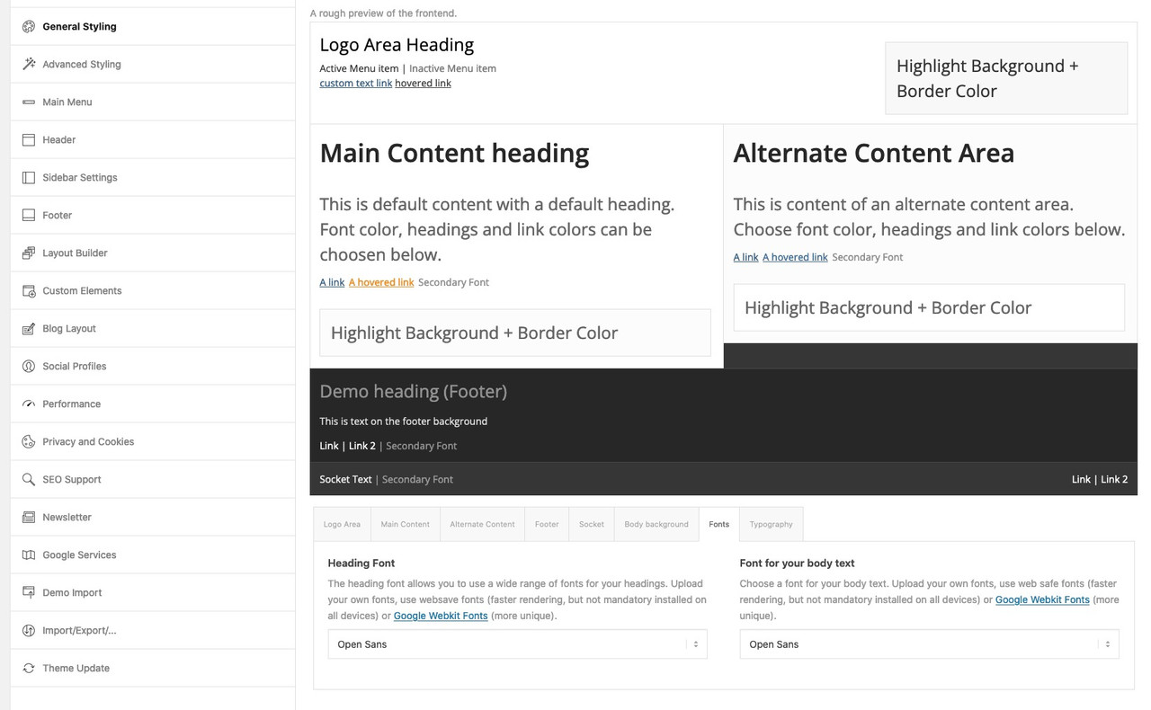
@sitesme: you see my image above – on Enfold Options Page.
These links work with the enfold integrated Google Fonts. But it will show the preview with a longer delay – because all fonts had to be loaded on that preview page.
And as Ismael mentioned you can see the preview on top. – thats why this section has the topic: A rough preview of the frontend
btw. to better evaluate the font – you can increase the font-size by adding this to your child-theme functions.php:
function admin_head_mod() {
  echo '<style type="text/css">
  	#avia_options_page .live_bg_wrap .main_h3 { font-size: 36px !important; }
  	#avia_options_page .content_p, #avia_options_page .bg2 { font-size: 24px; }
  </style>';
}
add_action('admin_head', 'admin_head_mod');
__________________________
see font-size relation if you enter that snippet above:
Hey Kurt,
Thank you for the inquiry.
This is actually a known issue on the latest version of the theme. To fix the gallery sorting, please add this code in the functions.php file temporarily .
function ava_custom_css_admin_mod() {
    echo '<style>
      .wp-core-ui .attachments:after {
          visibility: hidden;
          display: block;
          font-size: 0;
          content: " ";
          clear: both;
          height: 0;
      }
    </style>';
 }
 add_action('admin_head', 'ava_custom_css_admin_mod');
Related thread: https://kriesi.at/support/topic/gallery-drag-and-drop-sort/#post-1337989
Best regards,
Ismael