This reply has been marked as private.
Hi,
I want to change the h2 font size through the typography settings.
However, the changes have no effect.
What can i do?
Thanks!
on downloading your woff2 and uploading it to : https://wakamaifondue.com/
i can see that all variable properties are lost.
And that the file-size is less than the correct variable font – so your gtmetrix result is very good: https://gtmetrix.com/reports/www.greenconnections.nl/LddWcoje/
how did you get the woff2 from that open sans font?
yes it is a bit more complex – but you will be rewarded with more styling options.
i do always transform the downloaded ttf variable fonts to woff2 fonts – because these files do have the best compression level of all font mime types.
All browsers that support variable font files do support woff2.
if you open the mentioned page : https://wakamaifondue.com/ and drag your ttf ( or in my case the woff2 to that circle with the rotating letters. you can see on variable section for open sans font:
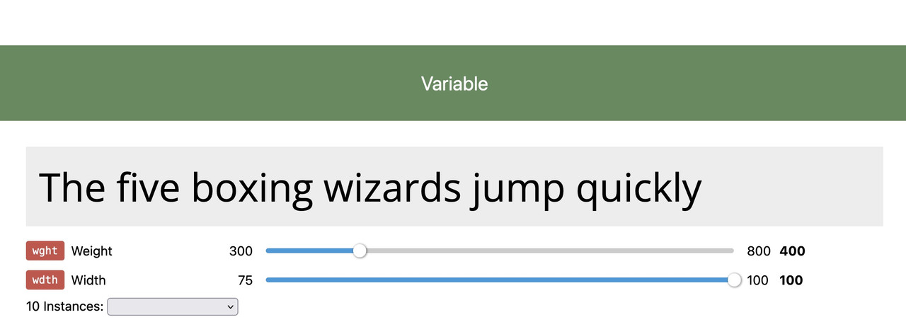
here you can see the layout options on that variable font – so my more detailled @import rule will be:
( btw i do place the fonts in the same directory as the enfold custom font manager fonts and that css rule to style.css of my child theme )
on my style.css i have:
@font-face {
  src: url('/wp-content/uploads/avia_fonts/type_fonts/opensans-variable.woff2') format('woff2');
	font-family:'Open Sans Variable';
	font-weight: 300 800;
	font-stretch: 75 100;
	font-style: normal;
}
on my quick css
f.e.:
#top #wrap_all .av-special-heading-tag {
    font-family:'open-sans',Helvetica,Arial,sans-serif
    font-weight: 400;
}

@supports (font-variation-settings: normal) {
    #top #wrap_all .av-special-heading-tag {
      font-family: 'Open Sans Variable', sans-serif;
      font-stretch: 100%;
      font-weight: 350;
    }
}
this is because : if the browser supports variable fonts – that font will be taken – if not the normal open-sans (uploaded via custom font manager) is in place as fallback.
Very nice tool on firefox ( i got the developer edition installed – but maybe the normal one has it too ) on developer tools is the fontstyle tab:
enlarge the image on click
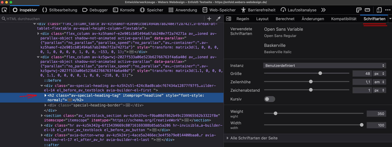
you see that the font is working under its variable layout options.
you can adjust the existing sliders until you like the layout – and then note these settings and transfer them to css.
i do not see that options on your page –
so that was my assumption, that a variable font loses its properties via the Custom Font Manager.
Now do you realy need those layout options – or maybe it is enough to have a normal and a bold variant?
see file-size comparison:
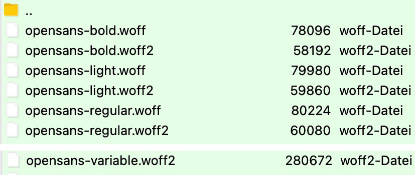
you can compare those file-sizes now – think of performance of your page – perhaps it is enough to have two fixed font-weights only for selection.
and on gtmetrix the font-loading times:

Hey larademartino,
Thank you for the inquiry.
Looks like the font of the text in the list is set to 13px by default. To adjust it, please add this css code.
#top ul li {
    font-size: 10px;
}
You may need to toggle or temporarily disable the Enfold > Performance > File Compression settings after adding the css.
Best regards,
Ismael
Hey team,
In a text box, my bullet points font seems a lot larger than the rest (size 10).
Can you please look into this for me?
Thank you so much
Hi,
Thank you for your question, based on the file name:
opensans-variablefont_wdthwght-webfont
it is a variable font with weight, so it should include all sizes and weights, you will only need to set the size and weight in your element, or advanced style setting, or in your css, depending on how you are assigning this.
Best regards,
Mike
just put his code name it f.e. prg_patterns.php – therefore you had to start that codesnippet of him by a leading <?php
– and upload it to your child-theme/shortcodes folder.
if you haven’t allready this littel snippet in your child-theme functions.php – insert it :
function avia_include_shortcode_template($paths){
  $template_url = get_stylesheet_directory();
      array_unshift($paths, $template_url.'/shortcodes/');
  return $paths;
}
add_filter('avia_load_shortcodes', 'avia_include_shortcode_template', 15, 1);
see doku to have own alb elements
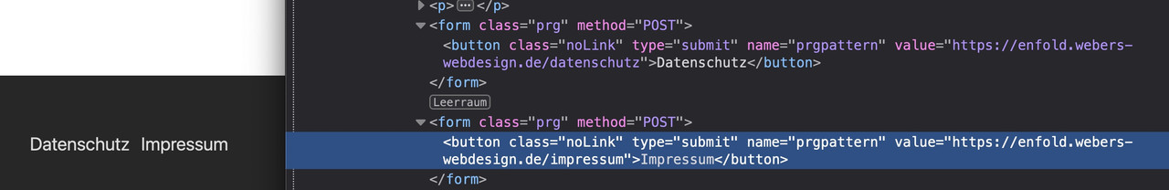
see example in the footer area with links to impressum and datenschutz
https://enfold.webers-webdesign.de/impressum/#footer
i just edited his code a bit to have on form element classes to style the form output better:
/* form output */
ob_start();
?>
	<?php if( $atts['newtab'] == 'true' ): ?>
	<form class="prg newtab" method="POST" target="_blank">
	<?php else: ?>
	<form class="prg" method="POST">
	<?php endif; ?>
		<button class="noLink" type="submit" name="prgpattern" value="<?php echo $redirect_slug; ?>"><?php echo $atts['title']; ?></button>
	</form>
<?php
return ob_get_clean();
then i can set for those forms:
#top form.prg {
  display: inline-block;
  margin-bottom: 0;
}

#top form.prg .noLink {
  border: none;
  font-size: inherit;
  color: inherit;
  background-color: transparent;
}

#top form.prg .noLink:hover {
  color: gold;
  cursor: pointer;
  transition: all 0.5s ease
}
Hi,
Did you try removing the code I referred to above? That is what is adding space above the social icons:
#top .social_bookmarks {
    margin-top: 40px!important;
    font-size: 28px;
}
If you add a class to the container which holds the social icons, then it will be easier to target it with CSS.
Best regards,
Rikard
Hi,
This seems to be coming from your child theme:
#top .social_bookmarks {
    margin-top: 40px!important;
    font-size: 28px;
}
Try removing it, or put it in a media query if you only want that to apply on screens larger than mobile.
Best regards,
Rikard
Hi,
Glad to know that the suggestions above are working. To control the size of the product description on different screen sizes, please try this css code.
#av_product_description p {
  font-size: 44px;
}

@media only screen and (max-width: 1024px) {
  #av_product_description p {
    font-size: 38px;
  }
}

@media only screen and (max-width: 989px) {
  #av_product_description p {
    font-size: 32px;
  }
}

@media only screen and (max-width: 767px) {
  #av_product_description p {
    font-size: 24px;
  }
}
Please make sure to purge the cache after adding the css.
Best regards,
Ismael
The same form looks different on its own and on Enfold.
The difference is the gaps between the fields, it’s too wide on Enfold.
Can you use CSS to make the one on Enfold look more like the one on its own? Thanks.
Here’s the CSS in my email app:
.formkit-submit {font-size: 18px !important}
.formkit-submit:hover {background: #808080 !important}
.formkit-guarantee {line-height: 1.5em !important}
.formkit-checkbox {display: none !important}
.formkit-fields {margin: 0 auto !important}
.formkit-subheader {margin: 0 auto !important}
.formkit-subheader > p {margin: 0 auto !important}
.formkit-header > h2 {margin: 0 auto !important}
.formkit-header {margin: 0 0 10px 0 !important}
Hey Sozo,
Thank you for the inquiry.
You can actually use html tags in the description field and add some css to adjust the style of the elements. To adjust the style of the default elements in the banner for example, you can use this css code.
#av_product_description  * {
    color: red;
    font-size: 99px;
}
To add a drop shadow to the description text, use this css.
#av_product_description p {
    text-shadow: 0 2px black;
}
Best regards,
Ismael
First, a quick thank you. You guys are amazing and work very hard to help all of us with our various issues, often repeating yourselves time and time again. Your hard work and dedication are very much appreciated and I can’t simply say thank you enough. My recent project was an absolute success because of all of you and I’m truly greatful, so thank you. thank you.
On to the question…
in the shop options, we now have the option of uploading a banner (THANK YOU!) and a shop description but we aren’t given much control over those two things. The banner worked out fine, it does what I needed by default so that’s cool. On the description, which I’m using as a page title all we can really do is change the font color. It’s great and I appreciate it, was just hoping for greater control. Other than adding an H tag, we can’t really do much.
I would like to add a custom CSS class so that I can add a drop shadow behind the title text as I do on the other pages. Those options are normally found in the developer tab of the element and we don’t have that option here. Inspecting the element just shows a container and a H1 tag, so I need help.
How can I go about adding a drop shadow to that area? It would also be nice to set the font size for the various devices too but I can wait on that one. LOL
Thanks Again!
Hi,
Try this CSS as well:
.main_color label {
  color: red;
  font-size: 36px;
}

.main_color input[type='submit'] {
  color: blue;
  font-size: 24px;
}
Best regards,
Rikard
Thanks!
What about editing the font size of the form fields, form labels and the submit button?
I would like to round the corners of the form fields and the submit button.
I would also like to edit the font size of the form fields, form labels and the submit button.
Can I have the CSS code? Thanks.
-
This topic was modified 3 years, 6 months ago by
 Samuel.
Hi Samuel,
Thanks for contacting us!
Please add following code to Quick CSS field in Enfold theme options > General Styling tab
1-
.avia_ajax_form label.input_checkbox_label {
  line-height: 1.3em;
}
2-
#top .avia_ajax_form .text_input, #top .avia_ajax_form .select, #top .avia_ajax_form .text_area {
  font-size: 20px;
  font-family: georgia;
}
If these do not help, please post a screenshot showing the changes you would like to make. You can upload your screenshots on imgur.com and post the links here :)
Regards,
Yigit
(Please refer to the first form on the link.)
How do I narrow the line height for the checkboxes?
How do I change the font and size of the fields?
Can I have the CSS code? Thanks.
This reply has been marked as private.
Hey,
Please edit your slide and then go to Styling > Font Sizes to change responsive font sizes – https://imgur.com/a/b5krQQk :)
Cheers!
Yigit
Hi,
Glad to know that the suggestions above are working. And yes, you can use the following css code to adjust the size of the menu item.
#top #wrap_all #av-burger-menu-ul li {
    font-size: 26px;
}
Default size is 18px. You may need to toggle or temporarily disable the Enfold > Performance > File Compression settings after adding the css code.
Best regards,
Ismael
How can I edit the width of the text block in the slide show? (I would need about 40%)
Another little problem at the slide-show Font Sizes: When I change the font size for little screens or very little screens the text block changes from left to the whole width of the picture, what I don’t need/like.
Thank you for your help.
Hey John,
1- I edited your custom CSS code and changed
ul.social_bookmarks li a {
    background: #031926 !important;
    border-radius: 10px !important;
}
into following
#top #wrap_all .social_bookmarks li a {
    background: #031926;
    border-radius: 10px !important;
}
2- I edited following code
#footer-page ul.av-share-box-list li a {
    border-radius: 10px;
    background: #031926;
    margin-right: 15px;
}
and increased font size as following
#footer-page ul.av-share-box-list li a {
    border-radius: 10px;
    background: #031926;
    margin-right: 15px;
    font-size: 20px;
}
Please review your website :)
Regards,
Yigit
Hi,
Thanks for the update. I see where you have added a class now. Please try this CSS instead:
@media only screen and (max-width: 767px) {
#footer-page .email-link a {
    font-size: 10px;
}
}
Best regards,
Rikard
Hi,
If you add a class to the link, then you can target it like this:
@media only screen and (max-width: 767px) {
#footer-page a.your-class {
    font-size: 10px;
}
}
Best regards,
Rikard
Well – i use nearly almost the quick css – the only thing that always bothers me is that the window widths are limited. I’m now working on a high-resolution 4k 32” monitor. So I want to be able to take advantage of that.
I put in my child-theme functions.php file:
function admin_head_mod() {
echo '<style type="text/css">
  #avia_options_page .live_bg_wrap .main_h3 { font-size: 36px !important; }
  #avia_options_page .content_p, #avia_options_page .bg2 { font-size: 24px; }
  #avia_quick_css .avia_description {float: none;margin-bottom: 20px !important;padding-left: 0 !important;width: 98%}
  #avia_quick_css .avia_control {float: left;max-width: 98% !important;width: 98% !important}
  .avia_footer_links li {float: left;padding-right: 20px}
  .avia_footer .avia_footer_save {float: left}
  .avia_reset {display: none !important }
  #avia_options_page { max-width: 3000px!important}
</style>';
}
add_action('admin_head', 'admin_head_mod');
however, the latest enfold versions now have a “Theme Reset All Options” button on the import/export tab – I already include this in the code as seen above.
First : wouldn’t it be better to have a white png of that icon – to have the same look for the icons on top?
.main_color .thrive-coaching.iconbox_top .iconbox_icon {
  content: " ";
  background-color: #FFF;
  background-image: url(//leagrowingpeople.com/wp-content/uploads/2022/04/consciousuncoupling.png);
  background-size: 35px;
  background-position: center 6px;
  background-repeat: no-repeat;
  border: 2px solid #b3dce1;
  color: transparent !important; /*** this is enough to get rid of entypo-fontello icon ***/
}

/**** if you decide to have a white png file you can get rid of that  ****/
.main_color .thrive-coaching.iconbox_top a.iconbox_icon:hover {
  background-color: #b3dce1;
  border: 2px solid #b3dce1;
}

in this case with white png file use only:
.main_color .thrive-coaching.iconbox_top .iconbox_icon {
  content: " ";
  background-image: url(//link-to-your-white-png-file/consciousuncoupling-white.png);
  background-size: 35px;
  background-position: center 6px;
  background-repeat: no-repeat;
  color: transparent !important; /*** this is enough to get rid of entypo-fontello icon ***/
}


