Hi,
This is my website. As you can see the logo and menu are overlapping are overlapping at the moment.
Can you please do something so that the menu font gets smaller as the width gets lower than 1405px?
I am looking at the website here, this is using enfold theme as well. Observe how the font changes with varying the screen size.
Thanks!
Hey Simon!
Try adding this code to the Quick CSS:
span.av-seperator-icon {
    font-size: 24px;
}
Cheers!
Josue
Hi,
How to change the logo size, i need 150px wide. Also i need to change the menu size in the header to at least 18px, what is the css class for that ?
Hi
I have made a Full Screen Slider but I can not get the size of the Caption Title Font or Text Caption Font Size to change the set- on my Iphone. Why?
http://www.screencast.com/t/o3zv4c5n
http://www.screencast.com/t/trc4QjQmes
What is this CSS which I got from you earlier:
@media only screen and (max-width: 479px) {h1 {font-size: 24px; }
h2 {font-size: 25px; }}
Does it influence my problem?
br
Carsten
Hey slui!
If you can post the link to your website and point out the section, we can help you better. But in general you can use !important rule to override other rules
.ad {
font-size: 35px !important;
color: white !important;
}
Regards,
Yigit
Hi,
I just wanted to know what the best way is to override a font style such as H2 or H1 via css in a color section. I have the custom-css activated in Enfold so I can add a class.
Here is what I tried
.ad {
font-size: 35px;
color: white;
}
Is that enough to get it to work?
sl
Hi heufti65!
Please try using following code
#top .aviaccordion-title h3 {
font-size: 16px !important;
}
the code you used should change its color
Regards,
Yigit
Hi!
Thank you for using Enfold.
Use these selectors to increase the size of the social icons:
#top .social_bookmarks {
height: 60px;
}

#top .social_bookmarks li {
width: 50px;
}

#top .social_bookmarks li a {
width: 50px;
line-height: 50px;
min-height: 50px;
}

#top .social_bookmarks li a {
font-size: 40px;
}
Please refer to this link on how to change the social icons: https://kriesi.at/support/topic/custom-social-media-icon-in-menu/#post-319596
Cheers!
Ismael
Hey!
Resize the captions with this:
@media only screen and (max-width: 479px) {
.responsive #top .slideshow_caption h2 {
font-size: 15px !important;
}

.responsive #top .slideshow_caption .avia-caption-content {
font-size: 10px !important;
}
}
Or hide them on mobile device with this because they are covering the background image:
@media only screen and (max-width: 479px) {
.responsive #top .slideshow_caption .avia-caption-content, responsive #top .slideshow_caption h2 {
display: none !important;
}
}
Best regards,
Ismael
Hi!
Default color values are the ones you pick on General Styling panel. If you want to know the default values of css properties such as font-size, line-height etc. You can find it on css > base.css file.
Best regards,
Ismael
Thought I’d share some code for Contact Form 7 users:)
Contact Form 7 styling to match Enfold’s Contact Form (Light Transparent Color Scheme)
Added these classes in style.css of child theme (or in Quick CSS of Enfold’s General Styling)
.enf_fields {
	background: rgba(0, 0, 0, .0) !important;
	border:2px solid #fff !important;
	border-radius:3px !important;
	padding: 13px !important;
	width: 100% !important;
	min-width: 50px;
	font-weight: 400 !important;
	color:#fff !important;
	}

.enf_text {
	font-weight: 400 !important;
	color:#fff !important;
}

.enf_button {
	background: rgba(0, 0, 0, .0) !important;
	border:2px solid #fff !important;
	border-radius:3px !important;
	padding:16px 20px !important;
	min-width:142px !important;
	font-size:12px !important;
	}

.enf_button:hover {
	background:#883D1F !important;
}
*CHANGE background # to your theme color.
And here’s the Contact Form 7 data:
<p class=enf_text>Name*</p>

[text* text-1 class:enf_fields]

<p class=enf_text>E-Mail *</p>

[email* email-1 class:enf_fields]

<p class=enf_text>Message *</p>

[textarea* textarea-1 class:enf_fields]

[submit class:enf_button]
And how it looks: 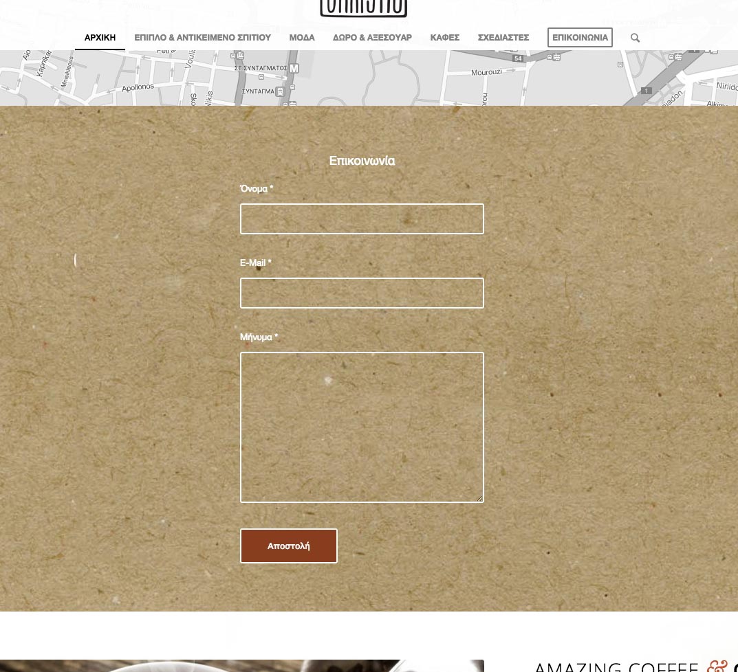
My Custom CSS contains the following:
Am I missing something?
#top .av-main-nav ul a {
width: 100%;
height: auto;
float: left;
text-align: left;
line-height: 10px;
padding: 8px 15px;
font-size: 12px;
min-height: 23px;
max-width: none;
text-decoration: none;
}
<div class=”gm-style-iw” style=”left: 12px; top: 5px; width: 228px; height: 158px; overflow: auto; position: absolute;”><div style=”overflow: auto;”>
h2.avia-caption-title { font-size: 24px !important; }
.avia-caption-title { font-size: 20px !important; }
.avia-caption-content { font-size: 26px !important; }
#top #menu-item-search {
display: none;
}
#after_layer_slider_1 {
border-top: none!important;
}
#header_main {
border-bottom: none!important;
}
div#full_slider_1 div.avia-slideshow-arrows.avia-slideshow-controls {
display: none;
}
Thanks
Rick
Hi guys,
I’m trying to change my socket a bit. I already managed the socket to look the way i want it to look like: no copyright and centered social icons. Now I’m trying to change the icons – but i can’t find the right codes for the icons I want to use for the functions.php file. How do I find the right codes?
Another big issue is to change the size. I change the size and now the padding is totally wrong and the hover doesn’t match at all. I’d like to disable the hover and have the icons in a font-size of 35 px. Is that possible?
Thanks a lot
Cheers
Bernd
Where can I find what the default values are for the styles in Enfold. I want to change some of mine , like H1 H2 etc and I’d like to know what I’m starting from in terms of font, font size etc.
Thanks
Hallo Neo,
Die Beitragüberschrift über die volle Breite (habe es bereits eingebaut). Für die Überschrift zum formattieren (ist hier nur ein Beispiel):
#top .fullsize .template-blog .post-title {
max-width: none !important;
}

#top .fullsize .template-blog .post-title {
    color: blue !important;
   font-size:  20px !important;
}
Regards,
Günter
Hey Giles!
Thank you for using our theme.
The color can be changed with:
#main .main-title a {
    color: #2d5c88 !important;
}
You can only change the font-size with CSS, not the tag. Adjust the value to your need.
#main .main-title a {
    font-size: 20px !important;
}
Regards,
Günter
Hi!
1. Can you post a link to a variable product on your site?
2. Try adding this to Quick CSS:
.product-remove a.remove {
    text-indent: initial !important;
    font-size: 0;
    background: none !important;
    border: 0 !important;
    border-radius: 0;
}
.product-remove a.remove:after {
    content: "Remove";
    font-size: 12px;
}
Best regards,
Josue
Hi!
Please use following code
.phone-info { font-size: 14px; }
#top .social_bookmarks li a { font-size: 16px; }
Cheers!
Yigit
Hey!
Please use following one for the title
.avia-button-wrap span.avia_iconbox_title {
font-size: 24px;
}
Regards,
Yigit
Hi jansthh!
Please add following code to Quick CSS in Enfold theme options under General Styling tab and adjust as needed
#top .avia-button-fullwidth .av-button-description {
font-size: 12px; }
Best regards,
Yigit
Hi!
“Sujet” is not a valid permalink structure. Please refer to this link: http://codex.wordpress.org/Using_Permalinks#Choosing_your_permalink_structure
Regarding the widget titles, you have this custom css:
.widgettitle {
font-weight: 600;
text-transform: uppercase;
font-size: 16px;
color: white!important;
}
Change the color or remove it.
Cheers!
Ismael
Hey trackvets!
Please add following code to Quick CSS in Enfold theme options under General Styling tab
h3.team-member-name, .team-member-job-title { text-align: center; }
h3.team-member-name { font-size: 16px; }
Regards,
Yigit
Hey George!
Try adding this code to the Quick CSS:
@media only screen and (max-width: 989px)
{
	.responsive div .avia_responsive_table .avia-data-table table,
    .responsive div .avia_responsive_table .avia-data-table tbody,
    .responsive div .avia_responsive_table .avia-data-table tr,
    .responsive div .avia_responsive_table .avia-data-table td,
    .responsive div .avia_responsive_table .avia-data-table th{display:block; border-top:none; border-right:none; border-left:none; text-align: center;}
    .responsive .avia_responsive_table .avia-data-table{border-style:solid; border-width: 1px;}
    .responsive .avia_responsive_table .avia-data-table .avia-pricing-row .avia-desc-col{text-align: center;}
    .responsive .avia_responsive_table .avia-data-table .avia-button-row, .responsive .avia_responsive_table .avia-data-table tr:first-child th{display:none;}
    .responsive .avia_responsive_table .avia-data-table td:before {
	display:block;
	font-style: italic; font-size: 11px;
	}

	.responsive .avia_responsive_table .avia-data-table td {
		position: relative;
	}

    .responsive .avia_scrollable_table {
        width: 100%;
        overflow-x: scroll;
        overflow-y: hidden;
        -webkit-overflow-scrolling: touch;
        -ms-overflow-style: -ms-autohiding-scrollbar;
    }

    .responsive .avia_scrollable_table .avia-data-table > thead > tr > th,
    .responsive .avia_scrollable_table .avia-data-table > tbody > tr > th,
    .responsive .avia_scrollable_table .avia-data-table > tfoot > tr > th,
    .responsive .avia_scrollable_table .avia-data-table > thead > tr > td,
    .responsive .avia_scrollable_table .avia-data-table > tbody > tr > td,
    .responsive .avia_scrollable_table .avia-data-table > tfoot > tr > td {
        white-space: nowrap;
    }
}
Cheers!
Josue
Hey simonac!
Please wrap it inside a span as following
<span class="custom-trademark">®</span>
and add following code to Quick CSS
.custom-trademark { font-size: 14px!important; }
Best regards,
Yigit
Hi foamymedia!
Please add following code to Quick CSS in Enfold theme options under General Styling tab
@media only screen and (max-width: 480px) {
h1.av-special-heading-tag {
font-size: 26px!important;
}}
Cheers!
Yigit
RE: http://screencast.com/t/0CFhDbWeF4
Any obvious reason why the backgrounds for screen capture above would act as independent blocks?
The content of the layer is http://screencast.com/t/hEzHpz9pp.
<h2 class="sliderhead sliderbox" style="box-shadow: 0px 4px 10px -5px black; text-shadow: none; font-weight: normal; opacity: 0.75; text-align: right; padding: 25px 30px 25px 40px; font-family: inherit; font-size: 16px; line-height: 18px; color: rgb(255, 255, 255); background: none repeat scroll 0% 0% rgb(56, 48, 48); width: auto; height: auto; border-width: 0px;">Label Design</h2>
<p class="sliderbox" style="box-shadow: 0px 4px 10px -5px black; text-shadow: none; font-weight: normal; opacity: 0.75; text-align: right; padding: 25px 30px 25px 40px; font-family: inherit; font-size: 16px; line-height: 18px; color: rgb(255, 255, 255); background: none repeat scroll 0% 0% rgb(56, 48, 48); width: auto; height: auto; border-width: 0px;">Packaging, labels and POS displays that give your product the attention it deserves.</p>
Hi!
Please go to Appearance > Editor and open helper-main-menu.php file and find
echo avia_logo(AVIA_BASE_URL.'images/layout/logo.png', $addition, 'strong', true);
and add your text right below it as following
echo "<div class='header-custom-text'>Here is my custom text!</div>";
Then you can adjust its position using custom CSS in Quick CSS field
.header-custom-text { position: relative; right: 0; top: 10px; color: red; font-size: 24px; }
Best regards,
Yigit
Thanks Josue. That worked pretty well. I also added in conditional font sizes. The only issue now is that the images are distorted. Any way to keep that from happening? The possible challenge is that the original image dimensions for the top slider are different than the lower slider. Top one is 1030x420px and the lower one is 1030x260px.
This is how I started, now the caption looks ok:
https://dl.dropboxusercontent.com/u/27860455/web/easyslider1.png
But I want to cover 100% width, like this:
https://dl.dropboxusercontent.com/u/27860455/web/easyslider2.png
here is my CSS code:
/* easy slider */
.avia-caption {
    left: -20px;
}
h2.avia-caption-title { font-size: 12px; }
.avia-caption {
    position: absolute;
    bottom: -49px;
}
.avia-slideshow, .avia-slideshow-inner {
    overflow: visible !important;
}
.avia-slideshow {
    padding-bottom:49px;
}