Hi,
Thank you for the update.
The title of the masonry title is white because of the following code.
#top #wrap_all .all_colors .av-masonry-entry-title {
    color: white;
    font-size: 30px;
    line-height: 1;
}
You may need to remove the modification or override it using the following css.
#top #wrap_all .all_colors .av-masonry-entry-title {
    color: black;
    font-size: 30px;
    line-height: 1;
}
Please make sure to toggle or temporarily disable the Enfold > Performance > File Compression settings after doing the modification.
Best regards,
Ismael
And when I insert a parameter table in the text block, the font size is small than main content, how to change the size for the content in the table?
I paste the link below.
Hey schweg33,
To make the social icons larger try this CSS in your Enfold Theme Options ▸ General Styling ▸ Quick CSS field:
#top #wrap_all .social_bookmarks li a {
  width: 40px!important;
  line-height: 40px!important;
  min-height: 40px!important;
  font-size: 30px!important;
}
#top #wrap_all .social_bookmarks li {
height: 30px!important;
width: 40px!important;
}
#top #wrap_all .social_bookmarks {
  height: 60px!important;
}
#top nav .social_bookmarks {
margin-top: -20px;
}
To invert the social icons colors try this css:
#top #wrap_all .av-social-link-youtube a {
    color: #a72b1d;
}

#top #wrap_all .av-social-link-instagram a {
    color: #a67658;
}
After applying the css, please clear your browser cache and check.
Best regards,
Mike
So – if you follow my instructions – also at the example page – you can see that it works. Even though I do not think this is recommendable.
First of all, you don’t seem to have grasped the difference between classes and ids.
So if you follow the description you will see that I have assigned an ID to the button row and not a class.
There is no option on the button-row element to give different classes or id’s to the single button in a row.
You are only able to do that for the wrapping container. That is the reason for the first snippet:
It passes this assigned ID to the child elements ( avia-button) in combination with an index, so that each avia-button now has a unique ID.
( click to enlarge the image:)

on that screenshot you see that the ID of the button row will be found on each button ( part of that row ) as a unique ID for each Button with a littel addendum ( – button1; -butten2 etc. )
As already mentioned above, you could of course select the individual buttons in the row by count them.
an expression like this will do the selection too: #abc .avia-button:nth-of-type(1) .avia_iconbox_title
__________________________________
Here now my closing comment:
It is generally not recommended to include an H1 tag within an anchor tag. The H1 tag is typically used to indicate the main heading of a webpage, and it is best to reserve it for that purpose. Using an H1 tag within an anchor tag could be seen as a misuse of the tag, and could potentially harm your SEO efforts. Additionally, search engines may not be able to understand the context of the H1 tag if it is used in this way.
It is best to stick to using anchor tags for linking purposes, and using H1 tags for headings.
If you only like to have bigger font-sizes inside a “button” – there are other better and easier ways to obtain it.
Hi all ,
I use a code snippet in the telephone extra area
<ul class="contact"><li class="phone"><span class="in1"><a href="tel:123">[av_font_icon icon='ue854' font='entypo-fontello' size='20px'][/av_font_icon]</span>123</a></li> | <li class="mail"><span class="in1">[av_font_icon icon='ue805' font='entypo-fontello' size='20px'][/av_font_icon]</span><a href="mailto: (Email address hidden if logged out) ">xx@rxxde</a></li> | <li class="local"><a href="https://xxxl" target="_blank"> <span class="in1">[av_font_icon icon='ue856' font='entypo-fontello' size='20px'][/av_font_icon]</span>Link</a></li></ul>
The fontello icons are only working if I set the performance setting to “always load all elements” or manage manual
Seems that the system isn’t recognizing that a fontello icon is used.
On an previous test it worked.
you can set the line-height to normal – this will bring it to a value that h-line and p-line are not overlapping ( in englisch it is ascender-line and descender-line).
( nearby 1.35em )
btw. i would recommend a setting like this – or a relative line-height – otherwise you had to react each time a responsive font-size will not fit to an absolute line-height
see how line-height: normal works on a fluid font-size: https://webers-testseite.de/heading-with-fluid-font-size/
just make your browser window smaller and wider to see
_____________
off topic:
and sup and sup text will be ok. too because the setting of enfold is correct :
sub, sup {
  font-size: 0.75em;
  line-height: 0;
  position: relative;
  vertical-align: baseline;
}
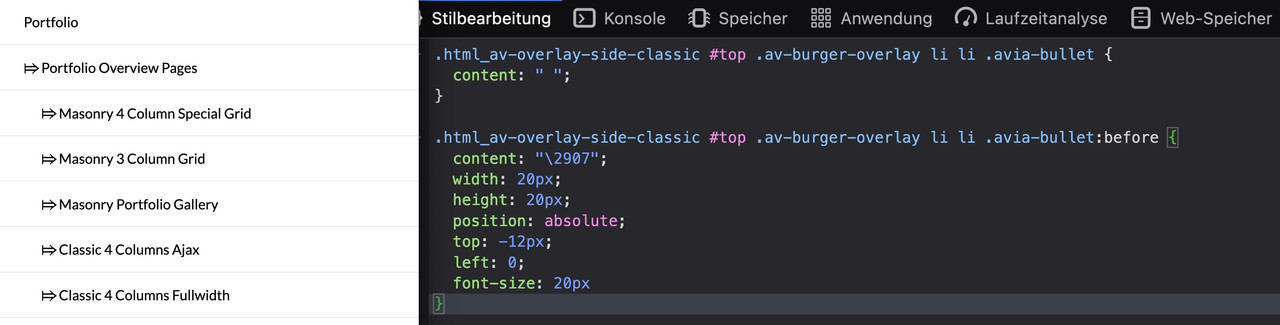
depends on what kind of hamburger menu you have choosen – for example a classic one:
.html_av-overlay-side-classic #top .av-burger-overlay li li .avia-bullet {
  content: " ";
  opacity: 0.5;  /*** default is 0.3  ***/
  height: 0
}

.html_av-overlay-side-classic #top .av-burger-overlay li li .avia-bullet:before {
  content: "\2907";
  width: 20px;
  height: 20px;
  position: absolute;
  top: -12px;
  left: 0;
  font-size: 20px
}
looks this way ( click to enlarge ) :
if you like to differ between the menu levels – we had to be more precise in the selector.
f.e.:
.html_av-overlay-side-classic #top .av-burger-overlay li li .avia-bullet {
  content: " ";
  opacity: 0.5;  /*** default is 0.3  ***/
  height: 0
}

.html_av-overlay-side-classic #top .av-burger-overlay .sub-menu .avia-menu-text {
  padding-left: 5px ;    /*** a little more distance to that sign  ***/
}

.html_av-overlay-side-classic #top .av-burger-overlay .sub-menu .avia-bullet:before {
  content: "\2907";
  width: 20px;
  height: 20px;
  position: absolute;
  top: -12px;
  left: 0;
  font-size: 20px;
  color: red;
}

.html_av-overlay-side-classic #top .av-burger-overlay .sub-menu .sub-menu .avia-bullet:before {
  content: "\21A6";
  font-size: 20px;
  color: green
}
Btw: sometimes the “avia-bullet” is set to display: none – you then had to get rid of that setting first
You can find here the codes for the content insertion :
use the hex-code and replace the leading &#x with a backslash \
html-entities
-
This reply was modified 2 years, 11 months ago by
 Guenni007.
I can’t find the place to change the fonts size and colors and background for the sidebar.
Now the font is too small and there is no separation from the main content part.
The font color should be #0e4174, and when hovering, it should change to #a11218, the font size of the parent page should be bigger than the child page.
And the child page titles should be indented.
Can you help me?
Hey annikass,
Thank you for the inquiry.
There are more heading size options for different devices in the Enfold > General Styling > Typography tab. Just toggle any of the heading elements and adjust the font sizes for different devices. You may need to toggle or temporarily disable the Enfold > Performance > File Compression settings after adjusting the settings.
Best regards,
Ismael
Hi!
I would like to make the H1 and H2 smaller for mobile devices. I have looked at previous threads about this and tried the codes provided but it did not change anything. Could you maybe help me with this?
The font is currently 60 px and should be 30px on mobile view.
Thanks in advance!
Hey René,
Did you try adding the text that you want smaller on a different row below the pricing row? If you want to keep the text in the same cell, then you can format the text like this instead:
<span style="font-size:14px;">per kwartaal</span>
Best regards,
Rikard
Hi,
I would like to embed a princing table similar to the demo site.

The pricing row contains the text “€ 67,50 per kwartaal” in large text. I would like the text ” per kwartaal” in small font similar to the Enfold demo site.
Can you tell me how to achieve this?
thank you,
René
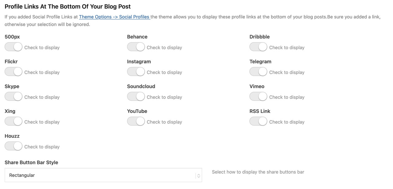
have a look to the docu:
https://kriesi.at/documentation/enfold/social-share-buttons/#how-to-add-custom-social-icons-to-enfold-options
i do often prefer the option a little bit under the snippet: “Using images or non-Fontello icons” – so you can have multicolored icons
this to child-theme functions.php:
function avia_add_houzz_social_icon($icons) {
$icons['Houzz'] = 'houzz';
return $icons;
}
add_filter('avf_social_icons_options','avia_add_houzz_social_icon', 10, 1);
and f.e. something like this to your quick css:
#top #wrap_all .av-social-link-houzz a:before{
    content: "";
    width: 20px;
    height: 20px;
    display: inline-block;
    vertical-align: middle;
    background: url(url-to-your-houzz.png) no-repeat center center;
    background-size: contain;
}
you find the new entry on the end of the drop-down list.
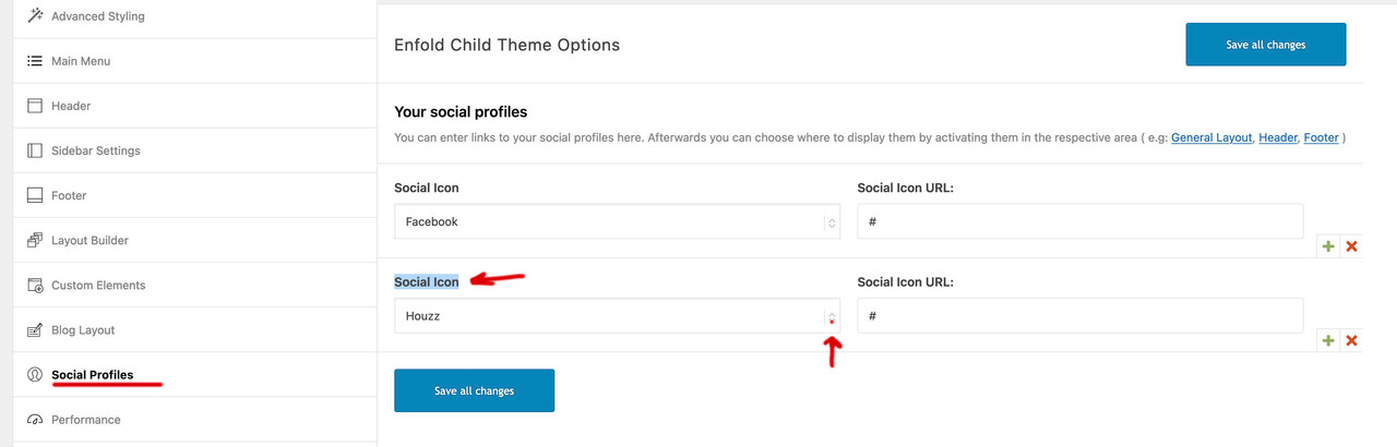
and on blog-layout options you will see too that new social option
Hi,
For the down chevron icon I believe that you mean like this:

If so try this CSS in your Enfold Theme Options ▸ General Styling ▸ Quick CSS field:
.portfolio-preview-title::before {
  content: "\e883";
  font-family: entypo-fontello;
  font-size: 40px;
  position: relative;
  top: 6px;
  display: inline-block;
  padding-right: 10px;
}
After applying the css, please clear your browser cache and check.
Best regards,
Mike
Hey guychalk,
Thanks for your question but this is not a feature and would not be easily achieved.
I see that on mobile your secondary menu is at the top and the link text is large, two options that I can think of would be to decrease the font size to make the links easier to read, or make each link full width so the links are stacked instead of side-by-side. If you would like help to achieve one of these let us know.
Best regards,
Mike
Hi,
Thanks for the link to your site, in your text element you have 8 extra div’s, perhaps you copied them in error, please go to the text element and click the text tab:

But please note that you have set the option at Enfold Theme Options ▸ Advanced Styling ▸ P to a font size 15px that will override the text element font size:

so you should remove this customization first so you can choose the font size of text elements individually.
Or you could try this CSS in your Enfold Theme Options ▸ General Styling ▸ Quick CSS field:
#top #main.all_colors .avia_textblock p {
    font-size: 30px;
}
adjust the number to suit, after applying the css, please clear your browser cache and check.
Best regards,
Mike
Hi,
Thank you for the update.
In the layer slider, you can use the Device Visibility options to toggle the visibility of a specific layer. For example, you can duplicate the current text, increase its font size, and set it to be visible only on mobile view. Then, you can adjust the visibility of the original text and display it on larger screens only.
Best regards,
Ismael
hello, I can’t understand, I create a block of text and change the font size, only instead of having a bigger font I get more line spacing… why?
Hi,
Thanks for your patience and the link to your site, I see in your Enfold Theme Options ▸ Advanced Styling you have the Main Menu Links element with a font size three times:


please try removing the two you don’t want to use and save and then clear your browser cache and check.
Best regards,
Mike
Hi,
Try this instead:
.avia-content-slider .slide-entry-title a {
  font-size: 32px;
  color: red !important;
}
Best regards,
Rikard
Hey Julien,
Thanks for the link to your site, have you tried placing your shortcode differently in your temple file, it sounds like the shortcode is outside the main container, or perhaps there is an unclosed div. Unfortunately your theme editor is disabled so we can’t see your child theme files.
Please note that I would not recommend using a footer.php or a header.php in your child theme, because every so often we change these files and it becomes the top issue after updates.
For you adding fixed content like an accordion FAQ at the bottom of a single post, I recommend injecting the shortcode, for example to add an accordion before the footer of every single post, try adding this code to the end of your child theme functions.php file in Appearance ▸ Editor:
function insert_before_footer(){
	if(is_single()) {
    echo do_shortcode("[av_toggle_container faq_markup='' initial='0' mode='accordion' sort='' styling='' colors='' font_color='' background_color='' border_color='' toggle_icon_color='' colors_current='' font_color_current='' toggle_icon_color_current='' background_current='' background_color_current='' background_gradient_current_direction='vertical' background_gradient_current_color1='#000000' background_gradient_current_color2='#ffffff' background_gradient_current_color3='' hover_colors='' hover_font_color='' hover_background_color='' hover_toggle_icon_color='' size-toggle='' av-desktop-font-size-toggle='' av-medium-font-size-toggle='' av-small-font-size-toggle='' av-mini-font-size-toggle='' size-content='' av-desktop-font-size-content='' av-medium-font-size-content='' av-small-font-size-content='' av-mini-font-size-content='' heading_tag='' heading_class='' alb_description='' id='' custom_class='' template_class='' element_template='' one_element_template='' av_uid='av-lg8glvl5' sc_version='1.0' admin_preview_bg=''][av_toggle title='Toggle 1' tags='' custom_id='' element_template='' one_element_template='' av_uid='av-lg8glhnz' sc_version='1.0']Toggle 1 content[/av_toggle][av_toggle title='Toggle 2' tags='' custom_id='' element_template='' one_element_template='' av_uid='av-lg8glpqw' sc_version='1.0']Toggle 2 content[/av_toggle][/av_toggle_container]");
  }
}
add_filter( "ava_before_footer", "insert_before_footer" );
Try adjusting this to suit your needs.
Here is a link to our Hooks & Filters
Best regards,
Mike
Hey Kathy Evans,
Thank you for your patience and the link to your site, when I check your slider it seems the only issue is with the second slide text font is too large, please note that you can adjust the font size for each screen size in the element options:

changing a huge font size down for tablet will allow the buttons to show.
Best regards,
Mike
Hi,
To use the exact same font for the category links under each Blog entry in the grid layout as in the sidebar widgets category links I recommend this css:
.html_modern-blog #top div .main_color .blog-categories a {
	font-family: 'open-sans', Helvetica, Arial, sans-serif;
	font-weight: lighter;
	text-transform: none;
	color: #567483;
	font-size: 16px;
}
After applying the css, please clear your browser cache and check.
Please see the screenshot in the Private Content area of the expected results.
Best regards,
Mike
Hi Rkard,
thx- font size works, but color not with this code. Any idea?
Best regards
Tilman
Hi,
Please try this instead:
.avia-content-slider .slide-entry-title a {
  font-size: 32px;
  color: red;
}
Best regards,
Rikard
hey Richard,
for content and excerpt it’s fine
-> what is the code for modifying post titles font size & color accordingly?
I have tried
.avia-content-slider .slide-entry-title {
font-size: 32px;
color: red;
}
… but this does not work
Thx again & best regards Tilman
Hey Tilman,
Please try the following in Quick CSS under Enfold->General Styling:
.avia-content-slider .slide-entry-excerpt {
  font-size: 14px;
  color: red;
}

.avia-content-slider  a.more-link {
  color: yellow;
}
Best regards,
Rikard
if you sitch off your merging we can better inspect your site – but there is a rule inside your css:
#top #header .av-main-nav>li>a {
 font-size:14px
}
and i think that this comes from advanced styling. And this is not your intention ?
how did you load the cormorant garamond font?
 Kerstin
Guest
Hi,
the fontsize of my frontpage on a mobile device is very small …
Is it possible to increase the fontsize only on the frontparge and only for a mobile phone?
If yes, how can I do this?
Many thanks in advance again!
Best Regards,
Kerstin
Dera Team,
on my page below I want in the blog post grid to make the title font smaller plus a different color. And a different color for the “read more” link, too
I did not find in the forum / docs how to get this done
Thx a lot & best regards
Tilman