Hi Alexander,
Please try the following in Quick CSS under Enfold–>General Styling:
@media only screen and (max-width: 767px) {
.home h1.av-special-heading-tag {
font-size:30px !important;
}
}
Adjust the value 30 to your liking.
Thanks,
Rikard
Hi,
I’m having problems with the team member element when it is being resized to a smaller screen size than the desktop. I have four team members lined up side-by-side. When the screen is resized, only 2 of team member elements are resized properly while the other 2 look out of place (different image and font sizes).
You can recreate this by dragging the window browser size and you’ll see that the four team members don’t resize properly.
sl
Hi anyone_officechanges!
Thanks for reaching out to us!
You can add the following code in the Quick CSS field under the General Styling tab in the Enfold theme options:
#header_meta a, #header_meta span {
    font-size: 20px;
}
Adjust the number to the size you want. Let me know if you need further assistance.
Cheers!
Jordan
need to increase main and sub nav to 16px. also need to add a thin 1x bottom border to the top nav (one with social icons and such at top) same color as the one as the main nav. #5F8789
Ellytaylor.net
providing a login in the pm
-
This topic was modified 10 years, 1 month ago by
 karenleighburton. Reason: forgot the admin url
Hi!
Yes sir please add following code to Quick CSS as well
h3.grid-entry-title {
    font-size: 20px;
}
Best regards,
Yigit
Perfect! Is there one additional bit for enlarging the font size of the title?
Thank you!
Hi!
Please try adding following code to Quick CSS in Enfold theme options under General Styling tab
nav.sub_menu * {
    color: #FFF7EB!important;
    font-size: 16px;
}
and then go to Enfold theme options > Advanced Styling and edit “Main menu links”.
If that does not help, please start a new thread and post login credentials privately. If you post them here, creator of this thread will be able to see them as well
Best regards,
Yigit
I need to increase the font size of the menu above the logo to a 15px (top menu) (actually want that in a cream color bar like the main menu as well). and I want to make the font size on the main menu below the logo to a 16px or 17px font (depending on space).
Link to image: https://www.dropbox.com/s/qxz0i7xuh6yqfmo/Screenshot%202016-03-10%2009.56.52.png?dl=0
Link to website: http://ellytaylor.net
These are all things I’ve tried; none of which have worked, as well as in the advanced styling which doesn’t seem to override anything at this point – even the heading fonts.
#avia-menu .avia-menu {
font-size: 20px !important;
}
#header_main .container, .main_menu ul:first-child > li a {
line-height: 88px;
font-size: 20px !important;
}
.sub_menu>ul>li>a, .sub_menu>div>ul>li>a {
font-size: 16px;
font-color: #FFF7EB !important;
}
Hi Guys,
Thanks, the logo is perfectly displayed on vertical view tablet, perfectly what we needed.
Any solution for the submenu?
“Our submenu is really long, because of the nature of our content on the page. Any chance we can change the font size on tablet vertical view?” The fix you gave me in your previous messages didn’t work unfortunately.
Thanks!
Hey!
The code Ismael provided is for hiding it.
If you want to change the size, you need to to convert it
@media only screen and (max-width: 767px) {
.responsive #top .slideshow_caption h2 {
font-size: 10px !important;
}
}
let me know if you need anything else
Regards,
Basilis
 A
AParticipant
Hey, there-
So close to putting a bow on this one! Just a few pesky mobile responsiveness details…

1) The page title is WAY too big. I know it’s also very long; client insists.
UPDATE: fixed it with
.title_container .main-title {
margin: 0;
font-size: 13px;
position: relative;
z-index: 2;
min-height: 36px;
line-height: 1.3em;
padding-top: 10px;
padding-bottom: 5px;
letter-spacing: .04em;
font-weight: 200;
}
2) The slider is smooshed. On iPhone6 viewport, the buttons on the slideshow are cut off by the section below (and are too large). I would like to leave the slider in, but this section needs to have a height which accommodates the title, caption, and buttons. Alternatively, I would be happy to have the buttons removed for mobile viewing. What media query Quick CSS could make this a reality?
3) The color section underneath the slider should be customized for this size (padding, heading font-size).
THANKS
-
This topic was modified 10 years, 1 month ago by
 A.
A.
Hi Ismael, I put in the code to reduce the font size, but it didn’t change. Those words are my key marketing / targeting messages so I’d like to keep them. Do you have another code line that may work better? Thank you.
tried to change the pixels but that didn’t work i have these codes on there as well, maybe they will contradict each other, i dont know:
#top #header .social_bookmarks li:last-child {
border-right-style: solid !important;
border-right-width: 1px !important;
}
.rtl ul#avia2-menu {
margin-left: 10px;
}
.rtl li.menu-item-language {
padding-right: 10px!important;
}
.avia-content-slider .slide-entry-title {
font-size: 20px;
}
.avia-content-slider .slide-image, .avia-content-slider .slide-image img {
margin: auto;
}
.rtl .post-title.entry-title {
letter-spacing: 0.01em!important;
}
.rtl .post-title, .rtl .slide-entry-title {
letter-spacing: 0.01em!important;
}
ul.avia_wpml_language_switch_extra {
display:none !important;
}
Hi dominiquehurley!
Thank you for using Enfold.
You can either hide the caption on mobile or decrease the font size. Try this:
@media only screen and (max-width: 767px) {
.responsive #top .slideshow_caption h2 {
    font-size: 10px!important;
}
}
If you want to remove it completely, use this:
@media only screen and (max-width: 767px) {
.responsive #top .slideshow_caption h2 {
    display: none !important;
}
}
Regards,
Ismael
Hey!
Set the font size and weight of the price per unit with this:
#top .price-unit, #top .price-unit span {
    font-size: 12px;
    font-weight: 300;
}
Cheers!
Ismael
Okay, I understand. But you mentioned to use the actual html markup. How can I do that, because indeed I would like to have more icons being displayed in the post slider. For example the icon which has the following shortcode.
[av_font_icon icon='ue8c7' font='entypo-fontello' style='border' caption='' link='' linktarget='' size='20px' position='left' color=''][/av_font_icon]
Thanks!
Hey!
Please add following code to Quick CSS
@media only screen and (max-width: 768px) {
.slideshow_caption {
    width: 100%;
}
.avia-caption-content {
    font-size: 14px!important;
}
h2.avia-caption-title {
    font-size: 30px!important;
}}
Best regards,
Yigit
Hi,
I would like to see a transparent header/nav in some pages of The Events Calendar (month, list and eventview). For the eventview I added some code to functions.php which shows the transparent header/nav option and added a block of code to default-template.php to show a big header (not fancy, but it works)
<div id="av_section_1" class="avia-section main_color avia-section-default avia-no-border-styling avia-bg-style-scroll  avia-builder-el-0  el_before_av_fullscreen  avia-builder-el-first   av-minimum-height av-minimum-height-custom container_wrap fullsize" style="background-color: #329dfc; background-repeat: no-repeat; background-image: url(https://www.ericsmeets.nl/testserver/wp-content/uploads/2016/02/bg_overig.png); background-attachment: scroll; background-position: bottom right; background-color: #329dfc; " data-section-bg-repeat="no-repeat">
			<div class="container" style="height:430px">
				<main role="main" itemprop="mainContentOfPage" class="template-page content  av-content-full alpha units">
					<div class="post-entry post-entry-type-page post-entry-7343">
						<div class="entry-content-wrapper clearfix">
							<div style="padding-bottom:10px;color:#ffffff;font-size:70px;" class="av-special-heading av-special-heading-h1 custom-color-heading blockquote modern-quote modern-centered  avia-builder-el-1  avia-builder-el-no-sibling   av-inherit-size"><h1 class="av-special-heading-tag" itemprop="headline"><?php the_title() ?></h1><div class="av-subheading av-subheading_below av_custom_color" style="font-size:20px;"><p><?php the_field('subtitle_eventheader','option') ?></p>
							</div>
							<div class="special-heading-border">
								<div class="special-heading-inner-border" style="border-color:#ffffff"></div>
							</div>
						</div>
					</div>
				</div>
			</main>
		</div>
		<div class="av-extra-border-element border-extra-arrow-down">
			<div class="av-extra-border-outer">
				<div class="av-extra-border-inner" style="background-color:#329dfc;"></div>
			</div>
		</div>
	</div>
I copied this block from another page which has a header and changed the title to the default page title. But after some time I noticed that the month and list view are also using this file.
Is there a way to get these options in the theme itself, or which file do i have to change to get this layout?
To clarify the issue I’ve added some printscreens.
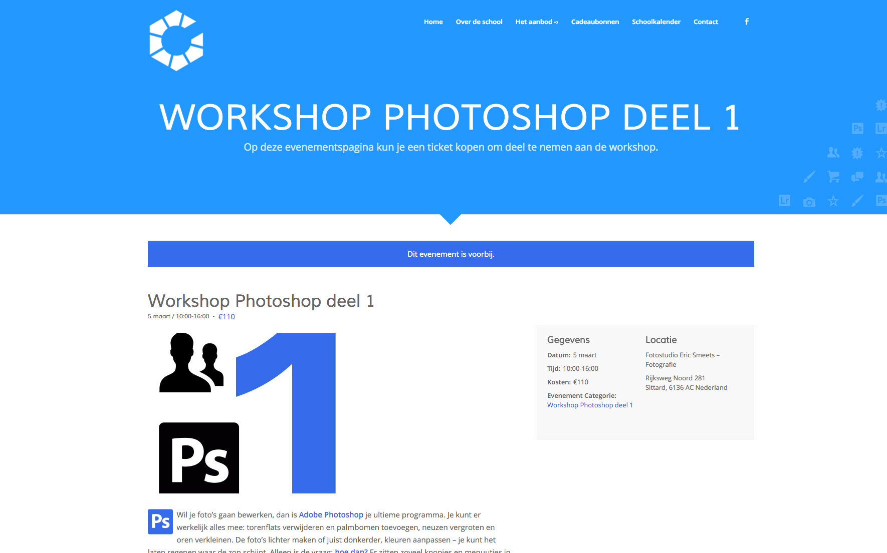
This is de desired view, transparent nav and big header
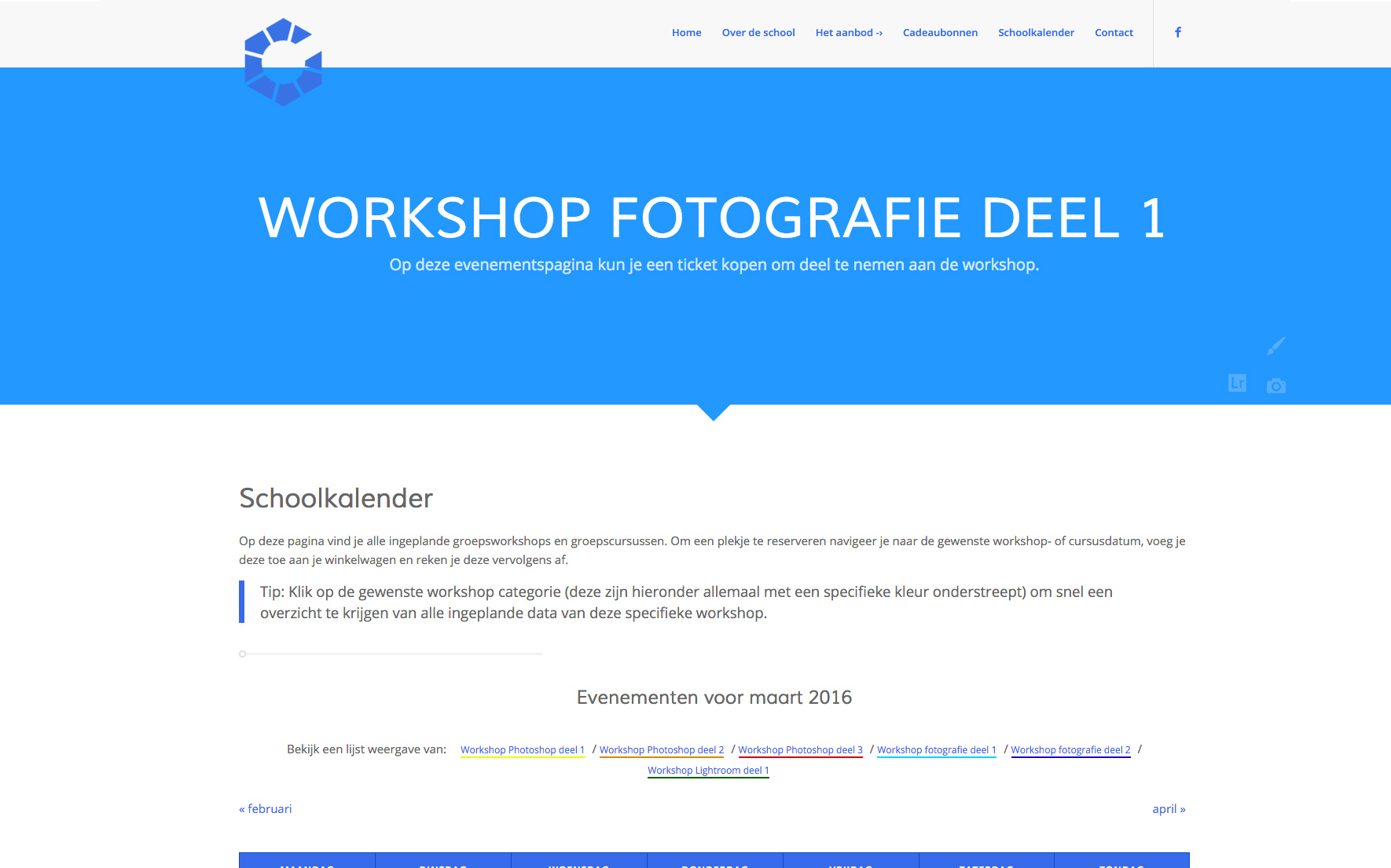
This is the month-view. I would like the same layout as the event-view
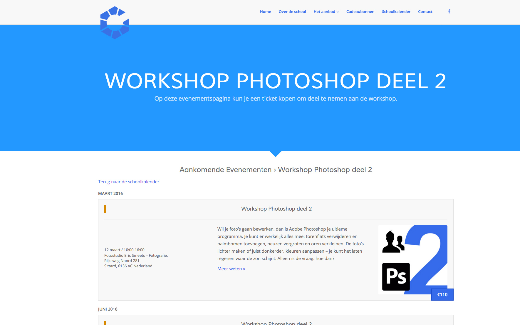
This is the list-view, I also would like the same layout als the event-view
-
This topic was modified 10 years, 1 month ago by
 EricSmeets.
Hi!
use this code in Quick CSS field:
@media only screen and (max-width: 989px) and (min-width: 768px) {
#avia-menu li a {
font-size: 17px;
}}
and adjust as needed.
Regards,
Andy
Hey!
Alright. Thank you for the update. Now, I get it. The issue with this is that the grid style or the post slider do not accept shortcode. Try to add the actual html markup of the icon instead of the shortcode. Example:
<span class="av_font_icon avia_animate_when_visible av-icon-style- av-no-color avia-icon-pos-left avia_start_animation avia_start_delayed_animation" style=""><a href="LINK HERE" class="av-icon-char" style="font-size:20px;line-height:20px;" aria-hidden="true" data-av_icon="" data-av_iconfont="entypo-fontello"></a></span>
The code above will add the “notes’ icon. Are you going to use different icons?
Regards,
Ismael
Hey doperdoll!
please use the below css to make the dropdown look similar to megamenu
#top .av-main-nav ul a {
    padding: 3px 12px 3px 12px;
    font-weight: normal;
    font-size: 14px!important;
    line-height: 23px!important;
}

#top .av-main-nav ul a:hover {
    font-size: 14px!important;
}
Regards,
Vinay Kashyap
I figured out how to change the font size and spacing on mega menu from one of the other posts. However, I have one main menu item that is just a drop down. Can you provide the css for the drop down to match my existing font size and spacing like i have it in my mega menu please. Below is what i currently have in my css:
.logo img { position: relative; top: 6px; }
#top #header .av-main-nav > li > a {
        font-size: 20px !important;
    }
}
#top #header .avia_mega_div > .sub-menu > li > ul > li a { padding-top: 0; }
.avia_mega_div .avia-bullet { margin-top: 8px; }
#top #header .avia_mega_div > .sub-menu { padding: 5px 18px 5px; }
#top #header .avia_mega_div > .sub-menu > li > ul > li a { font-size: 14px; }
#top #header .mega_menu_title a { font-size: 16px; }
.av-main-nav > li > a {
    padding: 0 20px;
}

.av_seperator_small_border .av-main-nav > li > a > .avia-menu-text{
    padding-left: 20px;
    margin-left: -20px;
}
Hi,
when I’m logged in WordPress, the h2.font-weight poperty “lighter” works.
If the WordPress User is logged out, the h2.font-weight property “lighter” doesn’t work further.
I think the used font-weight is “normal”.
Facts:
Font: Open Sans
Tested font-sizes: H2, H4
Used font-weight property: lighter (I use the extended styling properties and have tested Quick CSS -> the result is the same)
WordPress Installation: MultiDomain (WordPress MU Domain Mapping plugin in use)
It looks like a security problem. By changing user access rights the displayed font-weight changes.
Any idea why it is not working and how i can fix this?
Many thanks,
Ralf
-
This topic was modified 10 years, 1 month ago by
 RSTAC.
Hi jelle!
Please add following code to Quick CSS in Enfodl theme options under General Styling tab
h2.avia-caption-title {
    font-size: 20px;
}
.avia-caption-content p {
    font-size: 14px;
}
.caption_framed .slideshow_caption .avia-caption-content p, .caption_framed .slideshow_caption .avia-caption-title, .avia-caption .avia-caption-content p, .avia-caption .avia-caption-title {
    background: rgba(0, 0, 0, 0.8);
}
0,0,0 is RGB value of the color and 0.8 is opacity level. Please adjust values as needed
Regards,
Yigit
hello, how to adjust the fade settings and font size of the easy slider?
After increasing the font size for the phone number in the top right header. the header overlap the first section(orange background) of the layout. Please look at the website and you’ll understand. thank you.
.phone-info span {
line-height: 2em;
font-size: 16px;
}
-
This topic was modified 10 years, 1 month ago by
 wtony.
Hey ccyran!
I have loaded the web site and seems OK to me, with firefox on MAC. I also checked the fonts size and they are ok.
Cheers!
Basilis
Hi again Andy,
I’ve done some more work on the header since I wrote the above and have added a text widget and tried to add a second logo, using some of the tips I found on the help forum.
The text widget is:
<p style=”text-align: center;”><span style=”font-size: 28px;”>THOMAS HENTHORNE</span></p>
<p style=”text-align: center;”><span style=”font-size: 22px;”>Marin Real Estate</span></p>

So that adds text and the logo. The text was off so I added the following CSS from related support topics:
#header .widget {
left: 50%;
padding-top: 0;
position: absolute;
top: 0;
transform: translate(-50%);
z-index: 999;
}
That got the “Thomas Henthorne ” etc text nicely centered, but two problems remain:
1. The above-mentioned one where the grey title bar is partially under the header when the page loads prior to any scrolling
2. I can’t figure out how to get the Sotheby’s logo positioned to the right so it’s positioned as in this picture where I dragged it with my browser and took a photo before it snapped back:
photo here of sotheby’s logo positioned correctly
Thanks again for your help!
Rob
Hey!
Please add following code to Quick CSS as well
.remove-icon-border .av_icon_caption, .adapt-icon-border .av_icon_caption { font-size: 20px !important; }
Can you please elaborate on “tooltip text background” changes you would like to make? A screenshot would help :)
Regards,
Yigit
Hi goldengate415!
header with menu seems to be fine to me. Could you fix it? if not send us screenshot to highlight your intentions. Use imgur.com or dropbox.
You can increase phone number with this code in Quick CSS field:
.phone-info.with_nav {
font-size: 20px;
}
and adjust as needed.
Cheers!
Andy