Hi!
Thank you for the inquiry.
The following css rule appears above the header, which might be causing the issue that you described above. Did you add the code somewhere in the template files?
av-image-caption-overlay { bottom: -20px !important; font-size: 10px !important; height: auto !important; left: 50% !important; transform: translate(-50%) !important; width: 100% !important; text-align: justify !important; }
Cheers!
Ismael
I added this CSS and applied the class name in the home page text element’s Advanced > Developer Settings tab, but it doesn’t seem to work. What am I missing?
/*to make h1 text smaller on mobile as the enfold settings dont work*/
@media only screen and (max-width: 767px) {
.homeintrotext {
font-size: 80% !important;
}
}
Hi solidt,
Please try to add this CSS code in Enfold > General Styling > Quick CSS:
#top .av-masonry .format-standard .av-inner-masonry-content-pos-content:before {
    content: '\e84b';
    font-family: 'entypo-fontello';
    display: block;
    font-size: 30px;
    line-height: 58px;
    margin: 0 auto 20px auto;
    width: 60px;
    border-radius: 100px;
    border-style: solid;
    border-width: 1px;
    text-align: center;
    transition: all 0.3s ease-in-out;
    background-color: #f8f8f8;
    border-color: transparent;
    opacity: 0.7;
    position: absolute;
    left: 50%;
    margin-left: -30px;
    top: -75px;
}

#top .av-masonry .format-standard:hover .av-inner-masonry-content-pos-content:before {
    opacity: 1;
    background-color: #000000;
    color: #ffffff;
}
Hope it helps.
Best regards,
Nikko
Hey,
You have the following custom CSS code:
.av-fields-with-error {
  font-size: 20px;
  background-color: rgba(0,0,0,0);
  border: 0;
}
With this code you’re setting background color to transparent. Modify this code to change the background color.
Best regards,
Yigit
Hello,
In the codes below, twitter works with the old icon. I ask you if we can edit the twitter icon to appear as “X”.
Another issue is that the codes below work very well.
But when I look through GSM, social media accounts are in the center. You can look at the attached photo, is it possible to adjust them so that GSM is on the right side?
—————————————————
@media only screen and (max-width: 990px) { .responsive.html_mobile_menu_tablet #top #header #header_meta .social_bookmarks {
display: block;
}
}
#top .social_bookmarks li {
width: 35px;
}
#top .social_bookmarks li a {
width: 30x;
line-height: 30px;
min-height: 30px;
font-size: 20px;
}
#top #wrap_all .social_bookmarks .social_bookmarks_facebook a{color:#fff; background-color:#37589b; }
#top #wrap_all .social_bookmarks .social_bookmarks_twitter a{color:#fff; background-color:#46d4fe; }
#top #wrap_all .social_bookmarks .social_bookmarks_youtube a{color:#fff; background-color:#ff0000; }
#top #wrap_all .social_bookmarks .social_bookmarks_linkedin a{color:#fff; background-color:#419cca; }
#top #wrap_all .social_bookmarks .social_bookmarks_instagram a{color:#fff; background-color:#f15e78; }
.responsive #top #wrap_all #header_meta .social_bookmarks li.social_bookmarks_facebook a{color:#fff; background-color:#37589b; }
.responsive #top #wrap_all #header_meta .social_bookmarks li.social_bookmarks_twitter a{color:#fff; background-color:#46d4fe; }
.responsive #top #wrap_all #header_meta .social_bookmarks li.social_bookmarks_linkedin a{color:#fff; background-color:#419cca; }
.responsive #top #wrap_all #header_meta .social_bookmarks li.social_bookmarks_youtube a{color:#fff; background-color:#ff0000; }
.responsive #top #wrap_all #header_meta .social_bookmarks li.social_bookmarks_instagram a{color:#fff; background-color:#f15e78; }
Hey OneOfMany,
Thank you for the inquiry.
You can adjust the font sizes for different screen width in the Enfold > Genera Styling > Typography panel. Additional style adjustments can be done in the Enfold > Advanced Styling panel.
Best regards,
Ismael
Hey charger70,
Thank you for the inquiry.
You may have provided a different URL. Please provide the URL of the site shown in the screenshot. Have you tried editing the Styling > Font Sizes settings of the slide?
Best regards,
Ismael
Hallo Enfold-Team,
wo kann ich in der mobilen Version einstellen, dass die Schriftgröße etwas kleiner angezeigt wird?
Mein Entwurf (offline) zeigt auf der Desktop Seite eine große Schrift, die in der mobilen version jedoch zu groß anzeigt wird.
Für eure Antwort bedanke ich mich schon mal im Voraus
English
Where can I set in the mobile version that the font size is displayed slightly smaller?
My design (offline) shows a large font on the desktop side, but it is displayed too large in the mobile version.
Thank you in advance for your answer
Hi,
I reviewed the code in the pastebin and it looks like the code was doubled, and this was noted in the other thread, so I removed the extra code and also commented out the extra line:
content_wrap.avia_swipe_trigger( {prev:'.av_prev_tab_section', next:'.av_next_tab_section'} );
and now the 4 icons are showing at the top in a grid instead of off the screen,

so if you are not seeing it like this then clear your cache or open a private window until you do.
If for small screens you want the 4 tabs to be in a single row, try this CSS in your Enfold Theme Options ▸ General Styling ▸ Quick CSS field:
@media only screen and (max-width: 430px) {
	#top.page-id-196 .av-section-tab-title {
    padding: 1px 2px 0px 2px;
	}
	#top.page-id-196 .av-tab-section-icon {
    font-size: 20px;
	}
	#top.page-id-196 .av-inner-tab-title {
    font-size: 10px;
	}
	#top.page-id-196 .av-section-tab-title {
    width: 25%;
	}
}
this is the expected results:

Best regards,
Mike
Hi,
To have very large menu items and align them at the top try this CSS in your Enfold Theme Options ▸ General Styling ▸ Quick CSS field:
#top #av-burger-menu-ul {
	vertical-align: top;
}
@media only screen and (max-width: 767px) {
#av-burger-menu-ul .avia-menu-text {
	font-size: 60px;
}
}
@media only screen and (min-width: 767px) {
	#av-burger-menu-ul .avia-menu-text {
	font-size: 80px;
}
}
feel free to adjust to suit, this is the expected results:

Since the original question has been answered we will close this thread as it has now covered multiple topics, please note that we ask each thread to limit to one topic.
If you have any further questions please create a new thread and we will gladly try to help you. Thank you for using Enfold.
Best regards,
Mike
Hi,
Thank you for your patience and the link to your site, I cloned your last slider item and saw the font size error on the frontend, it looks like the css for the slide was not added to the style for some reason, if you add this css to your Enfold Theme Options ▸ General Styling ▸ Quick CSS field it will correct this if you want to add more slides:
#top #wrap_all .avia-slideshow .av-slideshow-caption .avia-caption-title {
    font-size: 36px;
}
#top .avia-slideshow .avia-caption-content p {
    font-size: 20px;
}
I didn’t add this and I removed the cloned slide I created.
I don’t know why this has occurred, I tried looking at your Enfold Theme Options ▸ Performance settings and your plugins, etc but didn’t find a cause.
I created a test page on my site with 10 slides and your layout and font sizes and they all worked correctly. So you could try using this css for now and if you find any other issues in the future perhaps they will also point to a cause for this.
Or you could try disabling all of your plugins. If that resolves the issue, reactivate each one individually until you find the cause.
Perhaps your server is also caching, so try clearing your server cache and if it is using object-oriented cache such as Memcached, Redis, Varnish, Litespeed, etc try disabling it to see if this helps. Otherwise if you don’t have any other issues I would try using the css for now.
Best regards,
Mike
Hi woogie07,
How would you style the button?
You can add this CSS code:
#top .av-section-tab-title {
    padding: 10px 10px 0;
}

#top .av-section-tab-title .av-outer-tab-title {
    background-color: #FFFFFF;
    border: 1px solid rgb(209,213,219);
    border-radius: 0.5rem;
    box-sizing: border-box;
    color: #111827;
    line-height: 1.25rem;
    padding: 0.75rem 1rem;
    text-align: center;
    text-decoration: none #D1D5DB solid;
    text-decoration-thickness: auto;
    box-shadow: 0 1px 2px 0 rgba(0, 0, 0, 0.05);
    cursor: pointer;
}


#top .av-section-tab-title .av-outer-tab-title .av-inner-tab-title {
    margin: 0;
}

#top .av-inner-tab-title,
#top .av-tab-section-icon,
#top .av-tab-arrow-container,
#top .av-tab-section-image {
    width: 100%;
}
Maybe add an arrow icon above each tab header?
It’s possible, you can use this CSS code:
#top .av-outer-tab-title:before {
    content: '\e88b';
    display: block;
    font-family: 'entypo-fontello';
    font-size: 18px;
}
Best regards,
Nikko
Hello,
-upload for a long time (without send)
-contact form disappeared after long time
Please try deactivating all active plugins and check if that helps.
Again; the message when you enter wrong email is little, white background and not readable. Where can I change that?
Please add following code to bottom of Quick CSS field and adjust as needed:
.av-fields-with-error {
  font-size: 20px;
  color: orange;
  background-color: black;
}
Again; the border after clicking “send” become colored (yellow maybe..). Where can I change that color?
Please go to Enfold theme options > General Styling > Main Content and change the “Highlight Color”.
Best regards,
Yigit
Hi,
Thank you for the screenshot.
Looks like the caption title of the other slides have different configuration. Please edit the slider item, then look for the Styling > Font Sizes settings.
Best regards,
Ismael
Hi,
For your special heading subheadline, when you choose a special heading with a Subheading you will see a option in the font tab to set the font size, there is not a site wide font size for each specific element, but you could create a CET – Custom Element Templates and then use your element on your site. You can also do this for your buttons, or since your buttons are set to use the theme color you can change the color in your styling, but this will also effect other elements, so it would probably be better to create a “read more” CET button instead.
Hopefully this answers your two new questions, but please note that we ask that each thread stays on a specific topic, this helps other users find solutions based on the opening subject line quicker, and makes it easier for Mods to help. For further questions please open a new thread
Please let us know if your original question has been answered and we can close this thread, thanks for your understanding.
Best regards,
Mike
Hi Mike,
that worked perfectly! Now one mor question: I use “Special headlines” and i want to correct the font size of the subheadline, because at the moment too small. However, I only find the option to correct it “manually” each time. Is there another variant where I can define the “default size”.
Best, Petra
Hi Rikard,
I logged into the backend and suddenly the correct font sizes were back. I didn’t have to change anything.
Thanks a million and all the best!
Petra
Hi,
Thank you for the update.
We can reproduce the issue but not yet sure what is causing it. It might be due to the hidden section on desktop and medium devices. Please try to add this css code and make sure to temporarily disable the Enfold > Performance > File Compression settings.
@media only screen and (min-width: 990px) {

  .responsive.av-no-preview #top #wrap_all .av-desktop-hide,
  .responsive.av-no-preview #top #wrap_all .av-desktop-font-size-hidden,
  .responsive.av-no-preview #top #wrap_all .av-desktop-font-size-title-hidden {
    display: none;
    height: 0;
  }
}

@media only screen and (min-width: 768px) and (max-width: 989px) {

  .responsive.av-no-preview #top #wrap_all .av-medium-hide,
  .responsive.av-no-preview #top #wrap_all .av-medium-font-size-hidden,
  .responsive.av-no-preview #top #wrap_all .av-medium-font-size-title-hidden {
    display: none;
    height: 0;
  }
}
Best regards,
Ismael
Hi,
1. How can I re-sort the tabs in the tab section without having to create them again?
In the tab section element place your mouse over the double arrow in the tab and drag the tab to a new placement:

the tab number won’t change but the title and content will change.
2. I would like to have the symbol boxes without frames, but the symbols in the same size and view as symbol boxes with frames, or can I set the color of the text box to white or another color?
I assume this is your example:

I’m not sure that I understand your question, both elements are the same size, but the first one with no background color looks larger because it blends into the element padding.
If you change second one the background color to white it will look the same:

so I’m not sure what you want to achieve.It dose look like you are using a different font size for the first box:

Best regards,
Mike
Hi,
Please try this CSS as well:
#top label.input_checkbox_label {
    color: #919191;
    font-size: 15px;
}
Best regards,
Rikard
Hi,
Is there any css coding to change footer column headings to upper and lower (instead of caps) and also reduce font size.
Thanks
Hi,
1. https://www.w3schools.com/tags/tryit.asp?filename=tryhtml_link_phoneto
2 and 3:
header_meta {
    background: #969696;
}
.phone-info div {
    color: #fff;
    font-size: 14px;
}
Best regards,
Rikard
Hi!
Thank you for the info.
Please look for this css modification in the Quick CSS field..
#top label.input_checkbox_label {
    font-size: 11px;
    line-height: 11px;
    font-weight: normal;
}
.. then, replace it with:
#top label.input_checkbox_label {
    font-size: 11px;
    line-height: 11px;
    font-weight: normal;
    top: 5px;
    position: relative;
}
Regards,
Ismael
Hi,
For border color, radius, and icon size try this css:
#top #header.header_color .widget input[type=text] {
	border-color: red;
	border-radius: 10px;
}
#top #header.header_color .widget #searchsubmit {
    border-radius: 0 10px 10px 0;
}

#top #header.header_color .widget #searchform #searchsubmit {
 	font-size: 30px;
}
This should also work on your live site.
Best regards,
Mike
Hi,
When I check it doesn’t look like you have made a choice for your font size:
after you make a choice remember to make it for each language and save.

Best regards,
Mike
Hi,
On the page that you linked to I didn’t see your example, so here is a screenshot of the first item:

do you want the large 20,00 € + IVA to be small.
and the small 24,40 € to be large?
both can stay in their places, you just want the font size changed, correct?
Best regards,
Mike
Hi Kriesi-Team
When I label a checkbox, the font size is very small and vertically not in the middle of the checkbox. I have not found any settings for this. Is there a CSS code?
Thanks,
Beat
I don’t mean the Font Size. If you scroll down You will see that the pic of Olha Karpi is not centered. The same happens with the title “unsere Kooperationspartner”, which is also in the home. I can’t see the complete title in the mobile version. It would be better if I could send you a picture to show you, but I don’t have an option here.
Hey yas28,
Do you mean that the titles don’t fit on a single line like this:

you can adjust the font size for mobile at styling ▸ font size and click the icon for the phone and then set the size you wish

To see a better display of your site for mobile when you are editing, try opening your site in another tab and use the Dev Tools Responsive Design Mode

Best regards,
Mike
Hi,
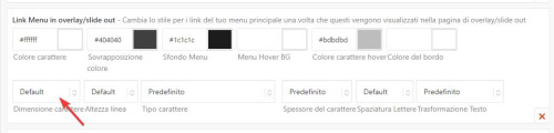
You can change the font size in the Enfold Theme Options ▸ Advanced Styling for menu items, but the flag is a very small icon, so you can’t make it larger.
Best regards,
Mike