Viewing 30 results - 991 through 1,020 (of 18,717 total)
  • Author
    Search Results
  • #1424849

    Hi jnightingale,

    Yes, you can change it, if you edit the Fullwidth Easy Slider, then click on the slide item, to edit it, then go to Styling > Font Sizes > (Caption Title Font Size), select the Mobile Device icon and change the font size.
    Here’s a screenshot:

    Hope it helps.

    Best regards,
    Nikko

    #1424781
    frb1
    Participant

    Hi Kriesi,

    Just wanted to add some universal styles to all buttons in our site (sliderbuttons, general content buttons etc.)
    I wish to have two looks. A light and a dark.

    I’m trying to follow: https://kriesi.at/documentation/enfold/button/#toggle-id-12
    But can’t find the “custom CSS class name support” under “layout builder”, and can’t find a topic in here that enlightens me…

    Can you help?
    Right now i’m designing each botton style like this, which seems not be be a good idea:
    .avia-button {
    font-size: 0.8em !important;
    text-transform: uppercase;
    color: #ffffff !important;
    padding-left: 1.4em !important;
    padding-right: 1.4em !important;
    padding-top: 1em !important;
    padding-bottom: 1em !important;
    font-weight: 400 !important;
    letter-spacing: 0.3em;
    background-color: #232323 !important;
    border: 1px solid #232323 !important;
    border-radius: 0px !important;
    }
    .avia-slideshow-button {
    font-size: 0.8em !important;
    color: #232323 !important;
    padding-left: 1.4em !important;
    padding-right: 1.4em !important;
    padding-top: 1em !important;
    padding-bottom: 1em !important;
    font-weight: 400 !important;
    letter-spacing: 0.3em;
    background-color: #fff !important;
    border: 1px solid #fff !important;
    border-radius: 0px !important;
    }
    .avia-slideshow-button:hover {
    padding-left: 1.4em !important;
    padding-right: 1.4em !important;
    padding-top: 1em !important;
    padding-bottom: 1em !important;
    opacity: 1 !important;
    font-size: 0.8em !important;
    color: #77855a !important;
    font-weight: 400 !important;
    letter-spacing: 0.3em;
    background-color: #fff !important;
    border: 1px solid #fff !important;
    border-radius: 0px !important;
    }

    #1424669

    The thing is, you didn’t mention that you were using the hamburger from the start.
    I can see the item but it is set to display none by css code.

    to see a first result bring this to quick css and look:
    ( a little bit more css to see selectors if influnce )

    #top .menu-item-cart.menu-item-avia-special  {
      display: block !important;
    }
    #top .menu-item-cart.menu-item-avia-special a {
      font-size: 24px !important;
    }
    .av-burger-overlay-active #top .menu-item-cart.menu-item-avia-special a {
    	color: #FFFFFF !important;
    }
    #top .menu-item-cart.menu-item-avia-special a:hover {
    	color: #9d1a18 !important;
    }

    (click to enlarge:)

    _____________________

    and don’t forget to replace the “#” by the link of that cart icon

    get rid of the class: menu-item in that snippet:

    function add_cart_icon_to_main_menu( $items, $args ){
      if ($args->theme_location == 'avia'){
        $cartLink = '<li class="menu-item-cart menu-item-avia-special" role="menuitem"><a aria-label="Cart" href="#" rel="nofollow" aria-hidden="false" data-av_icon="" data-av_iconfont="entypo-fontello" alt="Cart" ><span class="avia_hidden_link_text avia-menu-text">Cart</span></a></li>';
        $items =  $items . $cartLink;
      }
      return $items;
    }
    add_filter( 'wp_nav_menu_items', 'add_cart_icon_to_main_menu', 9999, 2 );
    #1424641
    daves1997
    Participant

    removed this junk code but didn’t help
    [av_textblock fold_type='' fold_height='' fold_more='Read more' fold_less='Read less' fold_text_style='' fold_btn_align='' textblock_styling_align='' textblock_styling='' textblock_styling_gap='' textblock_styling_mobile='' size='' av-desktop-font-size='' av-medium-font-size='' av-small-font-size='' av-mini-font-size='' font_color='' color='' fold_overlay_color='' fold_text_color='' fold_btn_color='theme-color' fold_btn_bg_color='' fold_btn_font_color='' size-btn-text='' av-desktop-font-size-btn-text='' av-medium-font-size-btn-text='' av-small-font-size-btn-text='' av-mini-font-size-btn-text='' fold_timer='' z_index_fold='' id='' custom_class='' template_class='' element_template='' one_element_template='' av_uid='av-lok43reo' sc_version='1.0' admin_preview_bg='']

    #1424600

    Hi,
    Thank you for the link to your site, I recommend changing this css:

    @media only screen and (max-width: 767px) {
    .av-elegant-toggle .taglist a {
    line-height: 4.0em;
    font-size: 0.9em;
    padding: 12px 24px;
    }
    }

    to this:

    @media only screen and (max-width: 767px) {
    .av-elegant-toggle .taglist a {
        line-height: 4.0em;
        font-size: 0.9em;
        padding: 12px 20px;
        display: inline-block;
    }
    }

    This is the expected results:
    Enfold_Support_3839.jpeg

    Best regards,
    Mike

    #1424577

    In reply to: Mobile menu

    Hi limedrop,

    Unfortunately, we don’t have styling options for the Mobile Menu, however, we can assist you with the CSS code necessary to have that style, you can try to add this CSS code in Enfold > General Styling > Quick CSS, to set the background color, color, font-size, etc.

    #top #wrap_all #av-burger-menu-ul li a {
        background-color: blue;
    }
    
    #top #wrap_all #av-burger-menu-ul li a .avia-menu-text {
        color: white;
        font-size: 18px;
    }

    Hope it helps.

    Best regards,
    Nikko

    #1424520

    Hey ti2media,

    Thank you for the inquiry.

    Please add this css code to adjust the size of the icon and move it beside the burger menu.

    #top .av-custom-menu-button .av_font_icon {
        font-size: 30px;
        color: red;
    }
    
    #top .av-custom-menu-button {
        position: absolute;
        right: 100px;
        top: 14px;
        z-index: 100;
        height: 62px;
        width: 50px;
        border-right: 2px solid;
        line-height: 62px;
    }
    

    After that, you have to remove this css code to get rid of the box beside the cart icon.

    .av-custom-menu-button a {
        padding: 10px 10px;
        background: red;
        position: relative !important;
        left: 0 !important;
    }

    Best regards,
    Ismael

    #1424491

    Topic: Mobile menu

    in forum Enfold
    limedrop
    Participant

    I want to style the mobile menu (background, font size etc.:

    “Advanced Color And Styling Options
    You can edit more and advanced color and styling options for the overlay/slideout menu items in Advanced Styling”

    However, this option is not available in the Advanced styling meny…..
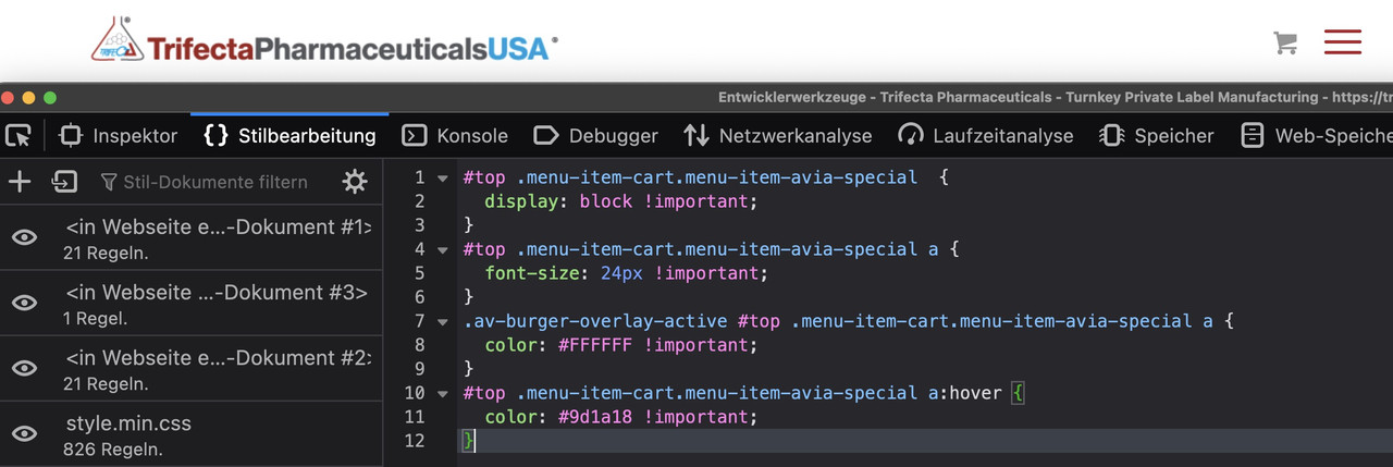
    #1424446
    ti2media
    Participant

    Dear Support,

    on my website I would like to have a shopping icon next to the burger menue. It should display like this: shopping icon | Burger Menue (Separated by Pipe). I followed the tutorial here: https://kriesi.at/support/topic/add-menu-button-link-next-to-hamburger-menu/

    I tried both solutions. The solution with the child theme kind of works, but the shopping icon is not displayed next to the burger menue. Also if you resize the window the icon stays.

    The other solution with the custom link is only displayed when you resize to iPad and I wasn’t able to display the shopping icon instead of words.

    What can I do to have the shopping icon separated with pipe on the left next to the burger menue on all sizes on desktop as well as mobile.

    This is the code I used in the child functions.php

    add_action(“ava_main_header”, function() {
    $output = “<div class=’av-custom-menu-button’><span class=’av_font_icon av-lohplat8-ce23023e5d946d9fe018078fcb85f9c9 avia_animate_when_visible av-icon-style avia-icon-pos-left av-no-color avia-icon-animate avia_start_animation avia_start_delayed_animation’><span class=’av-icon-char’ aria-hidden=’true’ data-av_icon=’’ data-av_iconfont=’entypo-fontello’></span></span></div>”;
    echo $output;
    }, 10);

    • This topic was modified 2 years, 3 months ago by ti2media.
    • This topic was modified 2 years, 3 months ago by ti2media.
    • This topic was modified 2 years, 3 months ago by ti2media.

    Hi Rikard,
    the formatting of the main menu is not taken over, also the formatting for buttons (frame width 1), and also the font size <p> is not correct. Also the size of the H tags does not fit from my point of view.

    #1424273
    annameis
    Participant

    Hi – I am using custom CSS to style the Accordion Sort menu – please see below. On mobile the menu does not break into two lines but gets cut off. Any suggestions on how to fix this?

    Appreciate your help!
    Anna

    .toggler.activeTitle {
    border-bottom: 0;
    }

    .taglist a:hover, #top .taglist .activeFilter {
    color: red;
    }

    .taglist a:hover, #top .taglist {
    color: white;
    }

    .av-elegant-toggle .taglist a {
    background: #fff;
    border-radius: 4px;
    padding: 5px 15px;
    margin: 5px;
    color: #333;
    text-decoration: none;
    }
    .av-elegant-toggle .taglist { margin-bottom: 20px; }

    .av-elegant-toggle .tag-seperator { display: none; }

    @media only screen and (max-width: 767px) {
    .av-elegant-toggle .taglist a {
    line-height: 4.0em;
    font-size: 0.9em;
    padding: 12px 24px;
    }
    }

    .av-accordion-tab-sort-filter .taglist a {
    display: inline-block;
    }

    #1424223

    In reply to: Layout wrong

    Thank you, that works! One other question – I have tried to increase font size is Typographie but it doesn’t work. Can you help me there too please? It’s for the body of blog posts and pages.

    I’d also like to know how to automatically include the title and feature image in a page?

    Thanks again

    #1424195

    In reply to: CSS for search bar

    Hey Illingco,

    Thank you for opening a different thread.

    How can I also control the eyeglass icon color?

    Have you tried changing the color values in the css modification from the previous thread?

    .header_color .widget_search input[type=submit]:hover {
        background-color: #dc291d;
        color: #232323;
    }
    

    If you want to adjust the initial color, use this:

    #top #header.header_color .widget #searchform #searchsubmit {
        font-size: 16px;
        color: blue;
    }
    

    To adjust the border width of the search bar, add this css code.

    #top #header.header_color .widget #s {
        border-width: 3px !important;
    }
    

    Best regards,
    Ismael

    #1424067

    In reply to: Adjust the page

    Hey Yaphoon,
    1: to change the font size of the special heading, please use the setting in the element
    Enfold_Support_3799.jpeg
    2: for the table font color, try this CSS in your Enfold Theme Options ▸ General Styling ▸ Quick CSS field:

    .main_color table caption, .main_color tr:nth-child(even), .main_color .pricing-table>li:nth-child(even), #top .main_color .avia-data-table.avia_pricing_minimal td {
        color: #000;
    }

    3: to change the font colors, please use the option in the element:
    Enfold_Support_3801.jpeg
    4: to change the font size in the icon list element, please use the element options:
    Enfold_Support_3803.jpeg
    5+6: to add space above the special heading “Contact Us For More Information” and “You Might Also Like” try adding some “top padding” in the element:
    Enfold_Support_3805.jpeg

    Best regards,
    Mike

    Hi,
    Try this CSS in your Enfold Theme Options ▸ General Styling ▸ Quick CSS field:

    #top .main_color #commentform input[type='text'],
    #top .main_color #commentform textarea {
      color:    #000;
      font-size: .8em;
    }
    

    After applying the css, please clear your browser cache and check.

    Best regards,
    Mike

    Hi Mike,

    Thanks for your support. That works great for the fixed terms.
    Ho can I apply it (font-size and color) also for the input text?
    Kind Regards

    #1424028

    Topic: Adjust the page

    in forum Enfold
    Yaphoon
    Participant

    Hi there,
    I want to have adjust some in this page

    1. I want to make the title font size smaller, where to set
    2. Specification chart, I want make all the words in black color
    3. Key feature, I want to make all in white color, including flip and make 2 line bigger space
    4. Application, I want to make the list words font bigger
    5. Make space bigger before “Contact Us For More Information”
    6. Make space bigger before “You might Also like”
    https://img.savvyify.com/image/9gk58

    I want show the element from portfolio. But this time seems wrong, pls help.

    Wang

    Hi,
    Try this CSS in your Enfold Theme Options ▸ General Styling ▸ Quick CSS field:

    #commentform ::-webkit-input-placeholder {
      color:    #000;
      font-size: .8em;
    }
    #commentform :-moz-placeholder {
      color:    #000;
      font-size: .8em;
    }
    #commentform ::-moz-placeholder {
      color:    #000;
      font-size: .8em;
    }
    #commentform :-ms-input-placeholder {
      color:    #000;
      font-size: .8em;
    }
    

    After applying the css, please clear your browser cache and check.

    Best regards,
    Mike

    #1423949

    Hey JantienM,

    Please try using this code instead:

    .iconbox_icon:before {
      font-size: 30px;
    }

    Best regards,
    Rikard

    Hi Nikko

    Great help, that works!
    Just need the class to adjust font-size and color terms.

    Thanks

    #1423909
    JantienM
    Participant

    Hi,

    I want the icon (and the background rounding) to be bigger of my icon content boxes (see fourth content block) I tried using this code:

    [data-av_icon]:before {
        font-size: 50px!important;
    }
    .iconbox_icon {
        margin-right:20px!important;
    }

    But then ALL my icons on the website are bigger.

    Hope you can help me out, thx!

    #1423842

    Thank You, Ricard,

    And sorry about the snarkiness, I do very much appreciate the help.

    I was able to remove the castegory name and tweaked the CSS a bit to make the grid titles work:
    .page-id-2477 #after_section_1 .avia-content-slider h3 {
    font-family: ‘Arial Narrow’ !important;
    font-size: 18px !important;
    letter-spacing: 0.03em; !important;
    }

    My last issue on that page is the grey line under the hero section – I tried so many things. It is only there if the next section has component boxes (none of them have borders). If I try to use a grid section or place it inside a color section instead the line is gone, but all Quick CSS formatting of the grid titles are null and void.

    I can remove the diagonal border if I must but it looks nice with their triangle logo.

    The issue is definitely related to the next section as the line moves down if I put things in between.

    #1423809

    Hi,

    Sorry for the late reply.

    1. You might want to consider a different layout option, as the title text has to be really small in order to it to fit properly. If you still want to make the titles smaller, then please try CSS like this:

    .page-id-2477 #after_section_1 .avia-content-slider h3 {
      font-size: 14px;
    }

    2. Please try the following CSS to hide the categories:

    .page-id-2477 #after_section_1 .avia-content-slider .blog-categories  {
      display: none; 
    }

    3. You could add the latest post to a dedicated category, then select that category in the Blog Posts element. Once you write a new post, then you can remove the category from the second latest post and add it to the latest. There is unfortunately no option to only show the latest post at the moment.

    Best regards,
    Rikard

    #1423642

    Hey Monika,

    Thank you for the inquiry.

    What is the actual model of the device where you have taken the screenshot? You should be able adjust the size of the heading elements with custom css.

    @media only screen and (max-width: 489px) {
    
      /* Add your Mobile Styles here */
      section.av_textblock_section.av-lhystxxf-ab9a26b95349e3f8f25451c3d741af57 h3.p1 .s1 {
        font-size: 1em;
        word-break: break-word;
      }
    }

    Best regards,
    Ismael

    #1423451

    In reply to: Portfolio grid

    Hey,

    Where is the main link color on general setting?

    It inherits the Enfold theme options > General Styling > Main Content > Primary Color option ( https://i.imgur.com/04nCGNN.png )

    Again: how to set that text dimension?

    I already provided you with a custom CSS code to change the font size in my previous response. If that’s not what you’d like to do, please send us a screenshot and show it.

    Regards,
    Yigit

    #1423450

    In reply to: Portfolio grid

    Ok, done.
    How to set the order of the works? For example, i would set like this: nautical, transportation, graphics, interior. Both the sections and the works.
    How to set the font size of the works names? (Venticinque, TRENTATRE/7, etc…..)
    Thanks

    #1423437

    In reply to: Portfolio grid

    Hey,

    how to change the dimensions of those text?

    Please add the following code to the Quick CSS field in Enfold theme options > General Styling tab

    
    #top #js_sort_items {
      font-size: 22px;
    }
    

    Again, look at the titles: why the current section is not visible? How to change that color?

    The active filter isn’t visible because it looks like you set the main link color to transparent ( https://i.imgur.com/dq2ivXL.png ). This is a very bad idea. Please go to Enfold theme options > General Styling and set it to a solid color.

    Regards,
    Yigit

    #1423398
    frb1
    Participant

    Hi Kriesi,

    On one specific portfolio element, I need Excerpt to show on hover, and title below.

    Is it possible to show Title below and Except on Hover centered on the dark overlay, ONLY on the occasions of the portfolio-grid where I chose to show “Title and Excerpt”? Elsewhere I need except to stay below.

    Tried to change alter your suggested code like follows, but I’m not sure of the content name for excerpts…

    .grid-entry a:hover:before {
    content: attr(Excerpt);
    position: absolute;
    width: 100%;
    z-index: 1000;
    text-align: center;
    opacity: 1;
    font-size: 18px;
    color: #ffffff !important;
    top: 50%;
    transform: translateY(-50%);
    animation: avia-fadein 0.60s 1 cubic-bezier(0.175, 0.885, 0.320, 1.275) !important;
    }

    #1423158

    In reply to: Size of video slider

    Hi Loveronika,

    Thanks for giving us admin access.
    I have adjusted the font sizes on smaller devices (you can see this when you edit the slide element, and you go to Style > Font Sizes, then you select those icons and set the font sizes). Then I added this CSS in Enfold > General Styling > Quick CSS, to adjust the height of the slider:

    @media only screen and (max-width:479px) {
        .home #full_slider_1, 
        .home #full_slider_1 .avia-slideshow, 
        .home #full_slider_1 .avia-slideshow-inner, 
        .home #full_slider_1 .avia-slide-wrap {
            min-height: 300px;
        }
    
        .home #full_slider_1 .avia-slide-wrap {
            background-size: cover !important;
        }
    }

    Please review your website.

    Best regards,
    Nikko

    #1423065
    KMCHOUSTON
    Participant

    Hey team

    I am designing a site at tara.meditationinhouston.org

    I have layed out the header style I would like to achieve, but cannot get the right placement. As a result, I have two issues arising.
    The text at the top is a header widget.
    The menu is Logo Left, Menu Right with a large logo.

    1) I am trying to make a responsively centered Header Widget for all screensizes. Here is the CSS I used
    .header-title {
    color:#000000;
    display: block;
    text-align: center;
    font-size: 40px;
    font-family: Lato;
    }

    .header-tagline {
    color:#0397d6;
    display: block;
    text-align: center;
    font-size: 24px;
    font-family: Lato;
    }

    a.header-tagline:hover {
    color: #146e9e;
    }

    #header .widget {
    position: relative;
    display: block;
    width: 55vw;
    margin-left:calc(33%);
    text-align: center;
    line-height: 30px;
    }
    2) I also need to get the menu to stop overlapping on all of the content at the top of the page. It is blocking the view. How can I do that?

Viewing 30 results - 991 through 1,020 (of 18,717 total)