Hi,
.post-entry a {
font-size: 12px;
font-weight: normal;
}
Try it like that and let us know if it works properly
Best regards,
Basilis
Hi,
Please add .studioicons to the code like this:
#top .studioicons .iconbox_icon {
	font-size: 100px !important; /* Icon size */
	width: 74px !important; /* Container size */
	height: 74px !important; /* Must be the exact same value as the width */
}
Best regards,
Mike
Hallo,
In einer Seite für einen Kunden habe ich die Lightbox – Farben angepasst: wir wollten einen weißen Hintergrund und die Farben für Schrift in schwarz. Alles wird korrekt abgebildet nur die Pfeile für die vor- und Zurück- Navigation in der Lightbox sind nicht zu sehen.
Können Sie mir bitte weiterhelfen:
ich habe die Lightbox -Farben für eine Seite wiefolgt verändert:
Eingaben im QUICK CSS:
/* Lightbox titel */
div .mfp-title {
font-size: 11px;
padding-top: 10px;
color: #000000;
}
.mfp-counter {
color: #000000;
font-size: 11px;
padding-top: 10px;
}
/* Lightbox Hintergrundfarbe */
.mfp-bg {
background-color:#ffffff!important;
}
/* Lightbox Transparenz */
.mfp-zoom-in.mfp-ready.mfp-bg, .mfp-zoom-in.mfp-ready .mfp-preloader {
opacity: 1;
}
/* Lightbox Schrift Farbe */
.mfp-wrap * {
color: #000000!important;
}
Vielen Dank!
Here is a widget title I adjustet with this code:
.widgettitle {
background-color: #e4e4e4;
color: #363636 !important;
font-size: 1.5em;
margin: 2px 0 20px;
padding: 2px 5px 2px 20px;
font-weight: normal; }
Looks like this:
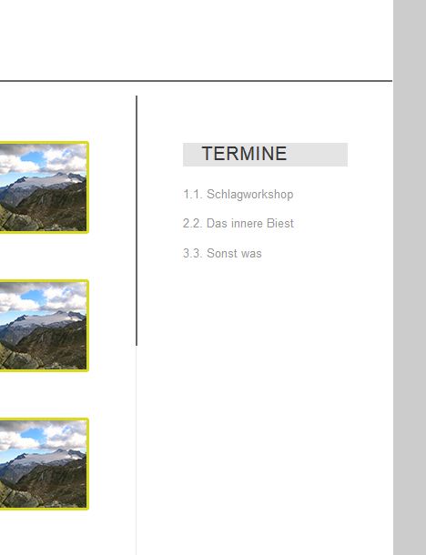
‘termine’ is the widget title.
I would like it to look like this:
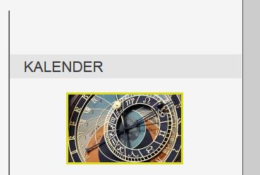
I want the same effect as ‘kalender’ with the gray bar covering the whole sidebar width.
How can i achieve this?
Still working on local host, so can’t provide a link.
Thank you!
How can I make the title be the same as this:
[av_heading heading='שאלות נפוצות לגבי הספר' tag='h2' style='blockquote modern-quote modern-centered' size='34' subheading_active='' subheading_size='20' padding='20' color='' custom_font='#ffffff' av-medium-font-size-title='' av-small-font-size-title='' av-mini-font-size-title='' av-medium-font-size='' av-small-font-size='' av-mini-font-size='' custom_class='' admin_preview_bg=''][/av_heading]
The one you gave me is smaller font and not aligned to the center.
I want to achive the following:
I want to adjust the main navigation under my logo.
All menu items shall be uppercase, I want the surrounded with a 3px border in #fff
All menu items have the same size and are spaced evenly across the page. .
Active and hover menu items change to a white background, a #ccc font color and a 3px solid border in #d8d920.
I tried to tinker with #avia-menu > li.page_item.menu-item.page-item-2 and #avia-menu > li.menu-item.current-menu-item > a, but I couldnt get the desired result.
i am working on localhost, so I dont have alink.
Any hints or hints to necessary css selectors appreciated.
Hey,
Please try adding this code to the Quick CSS section under Enfold > General Styling or to your child theme’s style.css file:
.av-catalogue-title {
    font-size: 24px;
    color: red;
}
.main_color .av-catalogue-content {
    color: orange;
    font-size: 20px;
}
Best regards,
Yigit
Hey Dennso,
Please try the following in Quick CSS under Enfold->General Styling:
@media only screen and (max-width: 767px) {
.iconlist-char:before {
  font-size:18px !important;
}
}
Best regards,
Rikard
Hey xandria,
Here is the code you can put in Enfold > General Styling > Quick Css, if it does not work, put into themes/enfold/css/custom.css
.html_elegant-blog #top .post-entry .post-title,
.html_elegant-blog .avia-content-slider .slide-entry-title {
  text-transform: none;
}
.av-masonry-entry .av-masonry-entry-title {
  font-size: 18px;
  font-weight: bold;
}
If you need further assistance please let us know.
Best regards,
Victoria
Hi dondela,
Please, remove that code and add this one, the curly was in the wrong place.
@media only screen and (max-width: 767px) {
  #top .av-large-testimonial-slider .avia-testimonial-meta-mini {
      padding-top: 185px;
  }
  .responsive #top .av-large-testimonial-slider.avia-testimonial-wrapper .avia-testimonial {
    padding: 0px 35px;
  }
  #top #wrap_all .all_colors #after_section_5 h1 {
    font-size: 24px;
  }
}
If you need further assistance please let us know.
Best regards,
Victoria
Hi,
It looks like in your custom css or General Styling > Quick CSS field you have this code:
#top .iconbox_icon, #top .iconbox_icon {
	font-size: 100px !important; /* Icon size */
	width: 74px !important; /* Container size */
	height: 74px !important; /* Must be the exact same value as the width */
}
please adjust “font-size: 100px !important;” to a smaller number.
Best regards,
Mike
Hi schnippel,
Here is the code you can put in Enfold > General Styling > Quick Css, if it does not work, put into themes/enfold/css/custom.css
/*Header in sidebar to turn to burger until 1500px*/
@media only screen and (min-width: 990px) and (max-width: 1500px) {

        .responsive #top .av_header_transparency.av_alternate_logo_active .logo a > img{opacity:1}
        .responsive #top .av_header_transparency .logo img.alternate{display:none;}

        .responsive #top #wrap_all #header {position: relative; width:100%; float:none; height:auto; margin:0 !important; opacity: 1; min-height:0;}
        .responsive #top #main {padding-top:0 !important; margin:0;}
        .responsive #top #main .container_wrap:first-child{ border-top:none; }
        .responsive.html_header_top.html_logo_center .logo { left: 0%; -webkit-transform: translate(0%, 0); -ms-transform: translate(0%, 0); transform: translate(0%, 0); margin:0; }
        .responsive .phone-info{float:none; width:100%; clear:both; text-align: center;}
        .responsive .phone-info span{margin:0;padding:0; border:none;}
        .responsive.html_header_top #header_main .social_bookmarks ,
        .responsive.html_top_nav_header #top .social_bookmarks { width:auto; margin-top:-16px; }

        .responsive #top .logo{position: static; display:table; height:80px !important; float:none; padding:0; border:none; width:80%; }
        .responsive .logo a{display:table-cell; vertical-align: middle;}
        .responsive .logo img{height:auto !important; width:auto; max-width: 100%; display: block;  max-height: 80px;}
        .responsive #header_main .container{height:auto !important; }
        .responsive #top .header_bg { opacity: 1; filter: alpha(opacity=1); }
        .responsive.social_header .phone-info {text-align: center; float:none; clear:both; margin:0; padding:0;}
        .responsive.social_header .phone-info span{border:none; width:100%; text-align: center; float:none; clear:both; margin:0; padding:0;}
        .responsive #header_meta .social_bookmarks li{ border-style:solid; border-width:1px; margin-bottom:-1px; margin-left:-1px;}
        .responsive #top #header_meta .social_bookmarks li:last-child{border-right-style: solid; border-right-width:  1px;}
        .responsive #header .sub_menu, .responsive #header_meta .sub_menu>ul{float:none; width:100%; text-align: center; margin:0 auto; position: static;}
        .responsive #header .social_bookmarks{padding-bottom:2px; width:100%; text-align: center; height:auto; line-height: 0.8em; margin:0;}
        .responsive #header_meta .sub_menu>ul>li{float:none; display: inline-block; padding: 0 10px;}
        .responsive #header .social_bookmarks li{float:none; display: inline-block;}
        .responsive.bottom_nav_header #header_main .social_bookmarks{ position: relative; top: 0; right: 0; margin: 10px auto; clear:both;}
        .responsive.bottom_nav_header.social_header .main_menu>div{height:auto;}
        .responsive .logo img{margin:0;}
        .responsive.html_header_sidebar #top #header .social_bookmarks{display:none;}
        .responsive body.boxed#top, .responsive.html_boxed.html_header_sticky #top #header{max-width: 100%;}

        .responsive.html_header_transparency #top .avia-builder-el-0 .container, .responsive.html_header_transparency #top .avia-builder-el-0 .slideshow_inner_caption{padding-top:0;}
        .responsive #top .av_phone_active_right .phone-info.with_nav span{border:none;}

        .responsive #top #wrap_all .av_header_transparency .main_menu ul:first-child > li > a,
        .responsive #top #wrap_all .av_header_transparency .sub_menu > ul > li > a,
        .responsive #top .av_header_transparency #header_main_alternate,
        .responsive .av_header_transparency #header_main .social_bookmarks li a,
        .responsive #top #wrap_all .av_header_transparency .phone-info.with_nav span,
        .responsive #top .av_header_transparency #header_meta,
        .responsive #top .av_header_transparency #header_meta li,
        .responsive #top #header_meta .social_bookmarks li a{ color:inherit; border-color: inherit; background: inherit;}
        .responsive.html_top_nav_header .av-logo-container{height:auto;}
        .responsive.html_top_nav_header .av-section-bottom-logo{border-bottom-style: solid; border-bottom-width: 1px;}


      /*new mobile*/
        .responsive .av-burger-menu-main{display: block;}
        .responsive #top #wrap_all .main_menu{top:0; height:80px; left:auto; right:0; display: block; position: absolute;}
        .responsive .main_menu ul:first-child > li a { height: 80px; line-height: 80px;}
        .responsive #top .av-main-nav .menu-item{display:none;}
        .responsive #top .av-main-nav .menu-item-avia-special{display:block;}
        .responsive #top #wrap_all .menu-item-search-dropdown > a { font-size: 24px; }
        .responsive #header_main_alternate{display:none;}
        .responsive #top #header .social_bookmarks{display:none;}
        .responsive #top #header .main_menu .social_bookmarks{display:block; position: relative; margin-top: -15px;}
        .responsive #top .av-logo-container .avia-menu{height:100%;}
        .responsive #top .av-logo-container .avia-menu > li > a{line-height: 80px;}
        .responsive #top #main .av-logo-container .main_menu{display:block;}
        .responsive #top #main .av-logo-container .social_bookmarks{display:none;}
        .responsive #top #main .av-logo-container .main_menu .social_bookmarks{display:block; position: relative;}
        .responsive #top #main .av-logo-container .main_menu{display:block;}
        .responsive #top #header_main > .container .main_menu  .av-main-nav > li > a,
        .responsive #top #wrap_all .av-logo-container {height:80px; line-height:80px; }
        .responsive #top #wrap_all .av-logo-container {padding:0;}
        .responsive #top #header_main > .container .main_menu  .av-main-nav > li > a{
            min-width: 0; padding:0 0 0 20px; margin:0; border-style: none; border-width: 0;
        }
        .responsive #top .av_seperator_big_border .avia-menu.av_menu_icon_beside{border-right-style: solid; border-right-width: 1px; padding-right: 25px;}
        .responsive #top #header .av-main-nav > li > a, .responsive #top #header .av-main-nav > li > a:hover{
        background:transparent;
        color: inherit;
        }

        .responsive.html_top_nav_header .av-logo-container .inner-container{overflow: visible;}
        .html_header_sidebar #header .container {
          width: 90%;
        }

}
If you need further assistance please let us know.
Best regards,
Victoria
Hi dondela,
Here is the code you can put in Enfold > General Styling > Quick Css, if it does not work, put into themes/enfold/css/custom.css
@media only screen and (max-width: 767px) {
  #top .av-large-testimonial-slider .avia-testimonial-meta-mini {
      padding-top: 185px;
  }
}
.responsive #top .av-large-testimonial-slider.avia-testimonial-wrapper .avia-testimonial {
    padding: 0px 35px;
}
  #top #wrap_all .all_colors #after_section_5 h1 {
    font-size: 24px;
  }
If you need further assistance please let us know.
Best regards,
Victoria
Hi,
If you want to import the page Victoria linked to then you can activate debug mode in order to see builder shortcodes: http://kriesi.at/documentation/enfold/enable-advanced-layout-builder-debug/
Then you can paste this shortcode to a new page:
[av_section min_height='' min_height_px='500px' padding='huge' shadow='no-shadow' bottom_border='no-border-styling' bottom_border_diagonal_color='#333333' bottom_border_diagonal_direction='' bottom_border_style='' id='' color='main_color' custom_bg='' src='https://test.kriesi.at/enfold-2017/wp-content/uploads/sites/24/2017/02/banner-news-alt.jpg' attachment='1057' attachment_size='full' attach='scroll' position='top center' repeat='stretch' video='' video_ratio='16:9' overlay_enable='aviaTBoverlay_enable' overlay_opacity='0.6' overlay_color='#000000' overlay_pattern='' overlay_custom_pattern='' av_element_hidden_in_editor='0']
[av_heading heading='Latest News<br/>Everything thats going on at Enfold is collected here' tag='h1' style='blockquote modern-quote modern-centered' size='40' subheading_active='' subheading_size='15' padding='0' color='custom-color-heading' custom_font='#ffffff' admin_preview_bg='rgb(34, 34, 34)'][/av_heading]

[av_hr class='custom' height='50' shadow='no-shadow' position='center' custom_border='av-border-fat' custom_width='50px' custom_border_color='#ffffff' custom_margin_top='30px' custom_margin_bottom='30px' icon_select='no' custom_icon_color='' icon='ue808' font='entypo-fontello' admin_preview_bg='rgb(34, 34, 34)']

[av_textblock size='' font_color='custom' color='#dddddd' admin_preview_bg='rgb(34, 34, 34)']
<p style="text-align: center;">Hey there! We are Enfold and we make really beautiful and amazing stuff.
This can be used to describe what you do, how you do it, & who you do it for.</p>
[/av_textblock]
[/av_section]

[av_masonry_entries link='category' sort='no' items='6' columns='3' paginate='load_more' query_orderby='date' query_order='DESC' size='fixed' gap='large' overlay_fx='active' id='' caption_elements='title excerpt' caption_styling='overlay' caption_display='always' color='' custom_bg='']
Best regards,
Rikard
Hey DROR,
You can’t add an icon in the Special Heading Element but you imitate the Special Heading using a Code Block, with a fontello icon:
<div class="av-special-heading av-special-heading-h3">
<span class="av-icon-char av-icon-char-custom" style="font-size:20px;line-height:20px;width:20px;" aria-hidden="true" data-av_icon="" data-av_iconfont="entypo-fontello"></span>
<h3 class="av-special-heading-tag " itemprop="headline">The Title</h3>
<div class="special-heading-border"><div class="special-heading-inner-border"></div></div>
</div>
just replace The Title, with the title you want to use, then on your Quick CSS section, located in Enfold > General Styling, add this css code:
#top span.av-icon-char.av-icon-char-custom {
    float: left;
    margin-right: 4px;
}

#top span.av-icon-char.av-icon-char-custom:before {
    content: "\e836" !important;
}
just replace content with the right icon. Hope it helps :)
Best regards,
Nikko
So far about 10 moderators have given CSS or information on how to fix contact 7 form on my site.
You cannot change the background color, the font color, the size of the form, nothing. The input fields are different colors. Some black some white. Can’t remove white border around the captcha
Looks terrible and unprofessional
I would like this resolved properly as this has been an issue for over 12 months
Dear Support,
i have analysed the source code of my clients enfold page.
Please explain the long inlines codes.
Please tell me, from which source does it comes and how can i prevent this.
<script type=’text/javascript’>var mejsL10n = …..
It’s something like this
“”Pfeiltasten Hoch\/Runter benutzen, um die Lautst\u00e4rke zu regeln.”,”mejs.unmute”:”Laut schalten”,”mejs.mute”:”Stumm””
really needed for running a page?
<script type=”text/javascript”>window._wpemojiSettings =
Is this really needed to running this page perfect?
And the biggest impact:
<!– custom styles set at your backend–>
<style type=’text/css’ id=’dynamic-styles’>
What the hell is it? Endless inline code at line 113
The only custom code is:
.html_header_top #top .av_header_stretch .container {
height: 150px;
}
.avia-mailchimp-form .form_element > * {
text-align: center;
}
#header_main .container {
height: 150px;
}
.html_header_top.html_logo_center .logo {
left: 10%; }
#top .social_bookmarks li a { font-size: 20px; }
Thanks
S.
-
This topic was modified 8 years, 1 month ago by
 Hokuspokus.
Hello –
I found a thread about this but some of the replies were marked private so I couldn’t see the results. Is there anyway to avoid the navigation wrapping on smaller screens and tablets like in this example?
https://www.ostomy.org/wp-content/uploads/2018/03/Screen-Shot-2018-03-08-at-10.33.03-AM.png
I tried to decrease the size of the navigation fonts but it is still happening. Any advice?
Thanks,
kelly
Hey Serge,
To upload the custom fonts manually and add them to frontend elements using CSS code please follow the below steps:
1. Generate the webfont kit from fontsquirrel
2. Extract The files and copy the @font css code from stylesheet.css to Enfold child theme styles.css
@font-face {
    font-family: 'YOUR-FONT-NAME';
    src: url('YOUR-FONT-NAME.woff2') format('woff2'),
         url('YOUR-FONT-NAME.woff') format('woff');
    font-weight: normal;
    font-style: normal;
}
3. Copy the woff and other font files to the same folder as the child theme styles folder wp-content\themes\enfold-child
4. Now you can start assigning new font family to headings and paragraph using custom CSS in your child theme styles or in the Quick CSS section
NOTE: If the below code doesn’t change anything deactivate caching plugin and try adding “!important” to the font-family: ‘YOUR-FONT-NAME’!important;
p {
 font-family: 'YOUR-FONT-NAME';
 font-size: 18px;
}
Another way to do this would be to use a plugin like Use any font which will make the job of assigning fonts very easy.
Best regards,
Vinay
In this case, icons are not in right position (https://www.glassfire.it/2018/)
[av_font_icon icon='ue854' font='entypo-fontello' style='' caption='' link='' linktarget='' size='20px' position='left' color=''][/av_font_icon] <span class=”custom-header-meta”>PHONE</span>
[av_font_icon icon='ue805' font='entypo-fontello' style='' caption='' link='' linktarget='' size='20px' position='left' color=''][/av_font_icon] <span class=”custom-header-meta”>MAIL</span>
span.custom-header-meta {
float: left;
display: block;
height: 20px;
line-height: 20px;
padding-right: 10px;
}
Hey Joe,
Here is the code you can put in Enfold > General Styling > Quick Css, if it does not work, put into themes/enfold/css/custom.css
@media only screen and (max-width: 767px) {
  .av-image-caption-overlay-center {
    font-size: 14px;
  }

}
If you need further assistance please let us know.
Best regards,
Victoria
Hi,
Apologies, I forgot this is a font and not an image. The following should work, just adjust the value:
.iconbox_icon.heading-color{
font-size:12px!important
;
}

Best regards,
Jordan Shannon
Hi PestkaStudio,
Here is the code you can put in Enfold > General Styling > Quick Css, if it does not work, put into themes/enfold/css/custom.css
@media only screen and (min-width: 1024px) and (max-width: 1200px){
  .phone-info {
    top: 76px;
    margin-right: 85px;
    width: 60%;
  }
}

@media only screen and (min-width: 1201px) {
  .phone-info {
    top: 76px;
    margin-right: 85px;
  }
}

@media only screen and (min-width: 768px) and (max-width: 1023px){
  .phone-info {
    top: 76px;
    margin-right: 85px;
    width: 40%;
    font-size: 18px;
  }
}
@media only screen and (max-width: 767px) {
  .phone-info {
    display: none;
  }
}
If you need further assistance please let us know.
Best regards,
Victoria
Hello,
Since I now wanna put our site online I struggle to get details finalized. One of them is the menu.
When I’m on the regular (desktop) View than everything is fine. As soon as a I change the layout to smaller screen size – the menu structure changes to Hamburger style (which is OK) but the fonts and the size of the menu (+ sub-menus) are changed as well.
I have no clue why it changes and where to adjust so independent from the screen size I see them all the same style (= desktop view). I have a guess why it happens but anyway I have no idea how to solve it.
thx
roland
Dear Support:
A puzzling challenge! I’ve tried using both the Advanced Styling feature and adding custom CSS to override the font size of the block quotes, but without success.
Here is the custom CSS I used:
DIV.entry-content blockquote p {
font-size:12px !important;
}
Ideas on how I can do this?
Many thanks for your help.
Cheers,
Tim
PS I would note that I am using WP Rocket to minify my CSS… but I am clearing the cache before I refresh.
Hi,
We have added the below code to the Quick CSS section.
Please change the URL of the logo to a tick image.
.progressbar-percent {
	color:transparent;
	background: url('http://stageholdings.co.uk/wp-content/uploads/2017/08/SC-logo-497x454_hight-1-257x300.png');
	background-size: 30px 40px, cover;
	background-position: top right;
       background-repeat: no-repeat;
       width:60px;
}
.progressbar-percent span {
	color: #000!important;
}
As an optional choice, you can also use any Icon that comes with enfold by adding the below CSS. To use the icon I have commented the background rule in Quick CSS.
.progressbar-percent span:after {
        content:"\e812";
        color:#000;
	font-family: 'entypo-fontello';
	position: absolute;
	right: 5px;
}
Let us know if you have any questions :)
Best regards,
Vinay
-
This reply was modified 8 years, 1 month ago by
 Vinay.
Hi,
This is now the active CSS:
@media only screen and (max-width: 767px) and (min-width: 480px) {
.responsive #top .slideshow_caption h2 {
    font-size: 26px !important;
}
}
26 pixels is what you wanted, right? If not then please increase the value.
Best regards,
Rikard
Hi Yigit,
Thank you for responding so quickly.
I have added your code to the Quick CSS section. When !important is added the font-size does change, without the size doesn’t change. Thank you.
Still the size increases beyond the div. Probably because of the !important override.
What notes in the equation can you change to make the size more fitting? Or how can the code be altered?
Hey ZOUT,
Please try adding this code to the Quick CSS section under Enfold > General Styling or to your child theme’s style.css file:
@media only screen and (max-width: 1070px) {
#top.home #av_section_1 .no_margin.av_one_fourth {
    width: 100%;
}}
.home #av_section_1 h1 {
    font-size: calc(70px + (120 - 70) * ((100vw - 767px) / (1920 - 767)));
}
Best regards,
Yigit