Hi,
Thank you for the info. I don’t know why the succeeding sections are not editable so we used this css code to apply the same csshero style for every h1 element in the “our-services” page.
#top.page-id-18 #wrap_all .av-special-heading h1.av-special-heading-tag {
    font-size: 20px;
    color: #000000;
    font-weight: 400;
    letter-spacing: 2px!important;
    font-family: Lato;
    line-height: 28px;
}
Best regards,
Ismael
Hi,
Add this to quick css:
@media only screen and (max-width: 767px)  {
h1{
font-size: 13px!importantl
}}
Simply adjust the font size to what you want.
Best regards,
Jordan Shannon
I see how that works, but looks very weird broken all up :-( is there any way to reduce the font size on a mobile for H1, I think that would be better.
Thank you Vinay
Hey Viney
Yes I know but ist was the same on German and English 1310px but still they were showed different in size. Also wenn you changed both on 1510px they doesen’t show the same width. There is still a difference of 200px?!? I changed now, so that it fits.
Also the fonts of the navigation were not the same anymore. Now that seems to be right now. What have you done?
You can also see the print screens I sent..
-
This reply was modified 8 years ago by
 Jacky.
Hi,
You can use the below shortcode
[av_textblock size='' font_color='' color='' av-medium-font-size='' av-small-font-size='' av-mini-font-size='' av_uid='av-jgf28bl6' custom_class='' admin_preview_bg='']
<span class="framed-text">21<span>m</span><sup>2</sup></span>
[/av_textblock]
Or the below HTML inside the text editor in “Text view”
<span class="framed-text">
    21m<sup>2</sup>
</span>
And finally, add the below CSS to Enfold > General Styling > Quick CSS
.framed-text {
    border:1px solid #ddd!important;
    padding: 5px;
    font-family: Lucida Sans Typewriter,Lucida Typewriter;
    font-size: 28px;
}
Best regards,
Vinay
Vinay, thank you very much for the return.
You forgot a detail. I need to have 2 types of accordion. One for desktop and other for mobile devices. Comop I use this code?
LIKE THIS:
/*ACCORDION DESKTOP*/
@media only screen and (max-width: 768px) {
.av_toggle_section .toggler {
font-family: Oswald, ‘Roboto’, ‘HelveticaNeue’, Helvetica, Arial, sans-serif !important;
font-size: 45px;
line-height: 1.5em;
color: #FFF;
padding: 20px;
background: rgb(255,0,0,0.1) !important;
font-weight: bolder;
}
/*ACCORDION DEVICES*/
@media only screen and (max-width: 767px) {
.av_toggle_section .toggler {
font-family: Oswald, ‘Roboto’, ‘HelveticaNeue’, Helvetica, Arial, sans-serif !important;
font-size: 20px;
line-height: 1.5em;
color: #FFF;
padding: 20px;
background: rgb(255,0,0,0.1) !important;
font-weight: bolder;
}
Hi Guys,
the gym theme is great, but I was wondering if there was anything I could do to sort out the titles not being cut off when view on a mobile in portrait mode.
Its using Special Heading element
H1 to display
I know if possible use shorter titles! but thats not always possible. (and we don’t want all the other platforms to be reduced just to caterer for this one platform and rotation)
Many Thanks
Hi,
I am using tabs for my users to scroll through a few different informational pieces. I am not using text in the titles – images only. I had adjusted the spacing and size of the titles to make the images larger. The update to 4.3 seems to have broken some of the CSS references I make, causing the images to be the smaller size and tiling the image to fill the space.
Here’s the quick CSS that I have been using to style the tab titles:
/* Tabs */
#botstyle .av-inner-tab-title {
    width: 170px !important;
    font-family: 'Source Code Pro', monospace;
    font-size: 22px;
    font-weight: 700;
    text-transform: none !important;
}

/* Make heading wider for images to be bigger */
.av-tab-section-image {
    width: 120px !important;
}
Link to my site is in the private content so that the mods can see what’s happening.
I’m looking for what I hope is a quick fix to make this work again. Thanks!
Hey mleite1,
Please import the font by adding the below code to the top of the styles sheet:
@import url('https://fonts.googleapis.com/css?family=Oswald');
To change the font style:
.av_toggle_section .toggler {
font-family: Oswald, ‘Roboto’, ‘HelveticaNeue’, Helvetica, Arial, sans-serif !important;
 font-size: 45px;
 line-height: 1.5em;
 color: #FFF;
 padding: 20px;
 background: rgb(255,0,0,0.1) !important;
 font-weight: bolder;
}
Please check this links for more info on accordion.
If you have more questions please post a link to the page where we can inspect the element in question.
Best regards,
Vinay
Hi,
Thank you for the update.
Adjust the font size of the h1 element on mobile view.
@media only screen and (max-width: 767px) {
#top #wrap_all .main_color h1 span {
    font-size: 24px !important;
    word-break: break-word;
}
}
Best regards,
Ismael
Hi,
Please change the font size value to 50px in the code Rikard gave you earlier.
Best regards,
Vinay
How do I place two buttons next to each other instead of it being stacked ontop of eachother?
My page – http://wsmsnyc.org/teachereducation/tuition-scholarships/
two buttons are labelled “2018-19 WSMS-TEP Scholarship Application” and “Financial Statement”. they built using a textbox and the code is:
[av_button label='2018-19 WSMS-TEP Scholarship Application ' link='manually,http://wsmsnyc.org/teachereducation/wp-content/uploads/2018/04/2018-19-WSMS-TEP-Scholarship-Application.docx' link_target='_blank' size='medium' position='left' icon_select='no' icon='ue800' font='entypo-fontello' color='custom' custom_bg='#f37733' custom_font='#ffffff' custom_class='' admin_preview_bg='']
[av_button label='Financial Statement' link='manually,http://wsmsnyc.org/teachereducation/wp-content/uploads/2018/04/2018-19-WSMS-TEP-Scholarship-Financial-Statement.docx' link_target='_blank' size='medium' position='left' icon_select='no' icon='ue800' font='entypo-fontello' color='custom' custom_bg='#f37733' custom_font='#ffffff' custom_class='' admin_preview_bg='']
I think with a quick CSS-Style, right?
Hello there,
Hope you are well. If you check the Private Content area, you can login to the website in question and get a better idea of what I am trying to accomplish. I need to move the pricing information on the Product List over to the left, so that things that are on sale can be seen (the sale price). Take a look at the screenshot, and notice how sale pricing gets cut off. This may have to do with a piece of code that is causing it to do so, which was generously provided in the past by an Enfold supporter. I’ve gone ahead and included the quick CSS code that I have in case you guys can identify the problem straight away.

Also is there any way to ghetto rig pagination without page reloading in Enfold? IIRC, Enfold does not support this directly, but there has got to be a way. On the What’s New page, if you click on page 2, 3, etc. the page reloads and then goes back up to the top of the big list which frustrated customers who lose their place on the page. Is there any way to have the pagination work without the page reloading?
#avia-menu .avia-menu-text { font-family: "microgramma_dbold_extended" !important; }

.av-catalogue-content {
display: none;
}

/*fix pricing overlap problem on whats new page*/
.av-catalogue-title {
    padding-right: 80px;
    font-size:16px;
}
.av-catalogue-price.av-cart-update-price>span.woocommerce-Price-amount.amount {
  font-size: 16px;
}
#top #wrap_all ins:before {
    padding: 0px 4px 0 3px;
}
.av-catalogue-price {
    width: 75px;
}

/*Shrink logo on mobile so search icon is visible*/
@media only screen and (max-width: 450px) {

.responsive .logo img {

width: 75%;

}

}

.page-id-5978 .av-catalogue-title {
color: black;
}
Hi Ismael
Got it sorted!
For others, to style an individual menu item simply insert menu item id (e.g. menu-item-222) into .av_seperator_small_border .av-main-nav > li > a > .avia-menu-text so you get code something like this in your custom css
.av_seperator_small_border .av-main-nav > li#menu-item-222 > a > .avia-menu-text
{
colour:
border:
font-size:
}
Kind ergards
Duncan
Hi,
In this case, the “Title Here”, is plain text in a text block element, so it would be best to add a custom class to it so we can target it. I added the class “text-title” to it in the “custom css class” box, please look for this, here is a screenshot:
You can use this class as many times as you like, anywhere on your site. Then add this css to control the size of the text:
/*mobile*/
@media only screen and (max-width: 767px) {
.text-title  {
    font-size: 44px !important;
}
}

/*tablet-desktop*/
@media only screen and (min-width: 768px) {
.text-title   {
    font-size: 70px !important;
}
}
Please adjust the font-size to suit.
Best regards,
Mike
Hi Ismael
I’ve tried this., but I cant get it to work.
If you look a the menu item ‘A University Login’ I’ve applied the class:
.unilogin {
font-size: 30px!important;
color: red!important;
border: none!important; }
but for some reason this is not working?
kind regards
Duncan
Hi!
Hoping that you can help me with this:
I am resizing text on this page – to make a smooth transmission from full screen (desktop) to ‘media only screen’
It doesn’t matter which ‘size’ the browser window is open –> the goal is to see never any big dark blue gaps between the columns.
dev3.mimoa.co.za
I achieved a good result with this:
@media only screen and (max-width: 1100px) {
.page-id-13 .av_textblock_section .avia_textblock h4 {
font-size: 15px !important;
}
}
But it is not totally there. I would like to activate the BURGER menu earlier if possible.
And I would also like to tell the columns at which screen size to ‘Fullwidth Break Point’ exactly. On .page-id-13 only.
Kind regards
Linda
Hi,
That is possible. Replace the previous css codes with this one.
@media only screen and (min-width: 990px){
.responsive.av-no-preview #top #wrap_all .av-desktop-hide,
.responsive.av-no-preview #top #wrap_all .av-desktop-font-size-hidden,
.responsive.av-no-preview #top #wrap_all .av-desktop-font-size-title-hidden{display:block;}
}

/* Tablet Portrait size to standard 960 (devices and browsers) */
@media only screen and (min-width: 768px) and (max-width: 989px) {
.responsive.av-no-preview #top #wrap_all .av-medium-hide,
.responsive.av-no-preview #top #wrap_all .av-medium-font-size-hidden,
.responsive.av-no-preview #top #wrap_all .av-medium-font-size-title-hidden{display:block;}
}

@media only screen and (min-width: 1025px){
.responsive.av-no-preview #top #wrap_all .av-desktop-hide,
.responsive.av-no-preview #top #wrap_all .av-desktop-font-size-hidden,
.responsive.av-no-preview #top #wrap_all .av-desktop-font-size-title-hidden{display:none;}
}

/* Tablet Portrait size to standard 960 (devices and browsers) */
@media only screen and (min-width: 768px) and (max-width: 1024px) {
.responsive.av-no-preview #top #wrap_all .av-medium-hide,
.responsive.av-no-preview #top #wrap_all .av-medium-font-size-hidden,
.responsive.av-no-preview #top #wrap_all .av-medium-font-size-title-hidden{display:block;}
}
I’m not sure if this is going to solve the issue entirely because, as far as I remember, you wanted the “landscape” option to cover screens up to 1280px because of your iPad Pro device. This is the actual css media query for iPad Pro.
/* ----------- iPad Pro ----------- */
/* Portrait and Landscape */
@media only screen
  and (min-device-width: 1024px)
  and (max-device-width: 1366px)
  and (-webkit-min-device-pixel-ratio: 1.5) {
}

/* Portrait */
@media only screen
  and (min-device-width: 1024px)
  and (max-device-width: 1366px)
  and (orientation: portrait)
  and (-webkit-min-device-pixel-ratio: 1.5) {
}

/* Landscape */
@media only screen
  and (min-device-width: 1024px)
  and (max-device-width: 1366px)
  and (orientation: landscape)
  and (-webkit-min-device-pixel-ratio: 1.5) {

}
Best regards,
Ismael
Hello, I’m finalizing the project and organizing the elements in the devices is being very difficult.
Now I’m trying to fix ACCORDION on the devices (see image – https://d.pr/KFM5du)
I use the code below. But it does not change the background color on the devices and the properties of the text does not change. Just the size of the font.
In the desktop code I can not change the font for Oswald.
CODES
/*ACCORDION DESKTOP*/
@media only screen and (max-width: 768px) {
.accordion {
font-family: Oswald, ‘Roboto’, ‘HelveticaNeue’, Helvetica, Arial, sans-serif !important;
font-size: 45px !important;
}
}
/*ACCORDION DEVICES*/
@media only screen and (max-width: 767px) {
.accordion {
font-family: Oswald, ‘Roboto’, ‘HelveticaNeue’, Helvetica, Arial, sans-serif !important;
font-size: 25px !important;
line-height: 1.5;
background: rgb(255,0,0,0.1) !important;
}
}
This reply has been marked as private.
Hi,
No that code is not right.
also, the code has the max-width of (max-width: 1023px) I will change.
New code:
/*TITULOS PARA DEVICES E DESKTOP*/
/*DEVICES*/
@media only screen and (max-width: 767px) {
.av-special-heading.av-special-heading-h3 h3.av-special-heading-tag {
    font-size: 44px !important;
}
}

/*DESKTOP*/
@media only screen and (min-width: 768px) {
.av-special-heading.av-special-heading-h3 h3.av-special-heading-tag {
    font-size: 70px !important;
}
}
new code in Instagram Feed
@media only screen and (max-width: 767px) {
.eapps-instagram-feed-title-visible {
    font-size: 44px !important;
}
}

@media only screen and (min-width: 768px) {
.eapps-instagram-feed-title-visible {
    font-size: 70px !important;
}
}
Best regards,
Mike
Mike, thanks for the feedback.
Answer me a question. Does this code work for all resolutions (desktop and devices)? I ask you this because on the desktop this code does not change the size of the titles. Check out the video I made.
I want for desktop and devices. It’s possible?
link video
https://d.pr/3ApHpV
/
Do we move the code at the same time? I was doing some testing a little while ago. Do you confirm that the code is okay?
/
@media only screen and (max-width: 767px) {
h3.av-special-heading-tag,h2.av-special-heading-tag,.eapps-instagram-feed-title {
font-size: 44px !important;
}
}
@media only screen and (min-width: 768px) and (max-width: 1023px) {
h3.av-special-heading-tag,h2.av-special-heading-tag,.eapps-instagram-feed-title {
font-size: 70px !important;
}
}
Hi
I wish to style individual menu items in the nav.
I have a number of menu items aligned to the right and wish to:
1) remove separator for these items only
2) change font size for these menu items
3) change font colour for these menu items
I’ve tried styling menu item, e.g. li#menu-item-222 {float: right;}, but any changes to fonts or borders don’t seem to work?
kind regards
Duncan
Hey DROR,
Thanks for giving the link.
I have checked it and found that this code was used to change the font size:
.post-entry .post-title.entry-title {
    font-size: 44px !important;
}
which should be in your Quick CSS, please try to change it’s size and also add this code inside it:
color: #333333;
so it should look like:
.post-entry .post-title.entry-title {
    color: #333333;
    font-size: 44px !important;
}
Hope it helps :)
Best regards,
Nikko
I apologize if I am overlooking something obvious, but I cannot figure out how to set the body font color in Enfold.
In “General Styling” I see settings for logo area font color, but not for body text font color. I
n “Advanced Styling,” I see settings for body font size, weight, font family, etc., but not color. Nor is there anything relevant in Customizer.
In my (under construction) site, linked as private content, the body text is much too light to be readable.
Please let me know how to set the color of the body text.
-
This topic was modified 8 years ago by
 Auerbach.
Mike, we worked on the site this weekend. We tested on several machines, cleared the cache and did not change using the above code. You can check the code and see what I’m saying.
Is there anything wrong with setting the special heading? Can you check for me? I will make access to the site admin available.
I put large font size in code. I did this to see the effect. There was not.
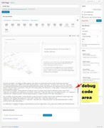
Hey FadingReality,
The first one is a grid row with two halves, on the left is a column and text blocks, on the right is a background image in the grid row.
Please try to Enable Avia Layout Builder Debug and paste this code into the debugger box on a new page on your site and save *please note the images will not show on your site, try adding your own images.:
[av_layout_row border='' min_height_percent='' min_height='' color='main_color' mobile='av-flex-cells' id='Best Rated' av_element_hidden_in_editor='0']
[av_cell_one_half vertical_align='middle' padding='150px,0px,150px,150px' background_color='#f8f8f8' src='' attachment='' attachment_size='' background_attachment='scroll' background_position='top left' background_repeat='no-repeat' mobile_display='']

[av_one_full first min_height='' vertical_alignment='av-align-top' space='no_margin' custom_margin='aviaTBcustom_margin' margin='0px' margin_sync='true' padding='0px' padding_sync='true' border='' border_color='' radius='0px' radius_sync='true' background_color='' src='' attachment='' attachment_size='' background_position='top left' background_repeat='no-repeat' animation='left-to-right' mobile_display='']

[av_heading tag='h1' padding='20' heading='More than 100.000 users and the best rating on Themeforest' color='custom-color-heading' style='blockquote modern-quote' custom_font='#000000' size='40' subheading_active='' subheading_size='15' custom_class='' admin_preview_bg=''][/av_heading]

[av_hr class='custom' height='50' shadow='no-shadow' position='left' custom_border='av-border-fat' custom_width='50px' custom_border_color='#000000' custom_margin_top='30px' custom_margin_bottom='30px' icon_select='no' custom_icon_color='' icon='ue808' font='entypo-fontello']

[av_textblock size='' font_color='' color='' admin_preview_bg='rgb(255, 255, 255)']
Enfold is the best rated top seller on <a href="https://themeforest.net/?ref=Kriesi" target="_blank">Themeforest</a>. There is no other theme with that many sales that has an average rating of 4.85. Heck, you will be hard pressed to find <strong>ANY</strong> product on the web with that many sales and a rating that good ;)
[/av_textblock]

[av_hr class='invisible' height='20' shadow='no-shadow' position='left' custom_border='av-border-fat' custom_width='50px' custom_border_color='#000000' custom_margin_top='30px' custom_margin_bottom='30px' icon_select='no' custom_icon_color='' icon='ue808' font='entypo-fontello']

[av_font_icon icon='ue808' font='entypo-fontello' style='' caption='' link='' linktarget='' size='40px' position='left' color='#e2bc12'][/av_font_icon]

[av_font_icon icon='ue808' font='entypo-fontello' style='' caption='' link='' linktarget='' size='40px' position='left' color='#e2bc12'][/av_font_icon]

[av_font_icon icon='ue808' font='entypo-fontello' style='' caption='' link='' linktarget='' size='40px' position='left' color='#e2bc12'][/av_font_icon]

[av_font_icon icon='ue808' font='entypo-fontello' style='' caption='' link='' linktarget='' size='40px' position='left' color='#e2bc12'][/av_font_icon]

[av_font_icon icon='ue808' font='entypo-fontello' style='' caption='' link='' linktarget='' size='40px' position='left' color='#e2bc12'][/av_font_icon]

[av_hr class='invisible' height='42' shadow='no-shadow' position='left' custom_border='av-border-fat' custom_width='50px' custom_border_color='#000000' custom_margin_top='30px' custom_margin_bottom='30px' icon_select='no' custom_icon_color='' icon='ue808' font='entypo-fontello']

[av_button label='Get it now' link='manually,http://themeforest.net/item/enfold-responsive-multipurpose-theme/4519990?license=regular&open_purchase_for_item_id=4519990&purchasable=source&ref=Kriesi' link_target='' size='large' position='left' icon_select='yes' icon_hover='aviaTBicon_hover' icon='ue859' font='entypo-fontello' color='dark' custom_bg='#444444' custom_font='#ffffff' admin_preview_bg='rgb(255, 255, 255)']

[/av_one_full][/av_cell_one_half][av_cell_one_half vertical_align='middle' padding='500px,0px,500px,0px' background_color='#f8f8f8' src='https://test.kriesi.at/enfold-2017/wp-content/uploads/sites/24/2017/01/mockup.png' attachment='298' attachment_size='full' background_attachment='scroll' background_position='bottom left' background_repeat='no-repeat' mobile_display='av-hide-on-mobile']

[/av_cell_one_half]
[/av_layout_row]
The second one is a color section with a background image, and two 1/2 columns, the left column is empty, the column on the right has text blocks. Here’s the code for it:
[av_section min_height='' min_height_px='500px' padding='huge' shadow='no-border-styling' bottom_border='border-extra-arrow-down' bottom_border_diagonal_color='#ffffff' bottom_border_diagonal_direction='' bottom_border_style='' id='Demos' color='main_color' custom_bg='' src='https://test.kriesi.at/enfold-2017/wp-content/uploads/sites/24/2015/07/isometric-1.jpg' attachment='447' attachment_size='full' attach='scroll' position='center left' repeat='contain' video='' video_ratio='16:9' overlay_opacity='0.5' overlay_color='' overlay_pattern='' overlay_custom_pattern='' av_element_hidden_in_editor='0']
[av_one_half first min_height='' vertical_alignment='av-align-top' space='no_margin' custom_margin='aviaTBcustom_margin' margin='50px' margin_sync='true' padding='0px' padding_sync='true' border='' border_color='' radius='0px' radius_sync='true' background_color='' src='' attachment='' attachment_size='' background_position='top left' background_repeat='no-repeat' animation='left-to-right' mobile_display='']

[/av_one_half][av_one_half min_height='' vertical_alignment='av-align-top' space='no_margin' custom_margin='aviaTBcustom_margin' margin='0px' margin_sync='true' padding='50px' padding_sync='true' border='' border_color='' radius='0px' radius_sync='true' background_color='rgba(255,255,255,0.85)' src='' attachment='' attachment_size='' background_position='top left' background_repeat='no-repeat' animation='left-to-right' mobile_display='']

[av_heading tag='h1' padding='20' heading='A growing library of more than 2 dozen demos' color='custom-color-heading' style='blockquote modern-quote' custom_font='#000000' size='40' subheading_active='' subheading_size='15' custom_class=''][/av_heading]

[av_hr class='custom' height='50' shadow='no-shadow' position='left' custom_border='av-border-fat' custom_width='50px' custom_border_color='#000000' custom_margin_top='30px' custom_margin_bottom='30px' icon_select='no' custom_icon_color='' icon='ue808' font='entypo-fontello']

[av_textblock size='' font_color='' color='' admin_preview_bg='rgb(255, 255, 255)']
Our demos are one of a kind: we only offer<strong> full concept demos</strong> with multiple pages that show whole projects, unlike others who only include a single page and call that a demo ;)

You can import them with <strong>a single click</strong>, they are easily adaptable to your needs and you can chose from a variety of layouts and niche designs. In addition to that you can also use the <strong>demo images used in our demo for your own project</strong>!
[/av_textblock]

[/av_one_half]
[/av_section]
Best regards,
Mike
Hi,
Try adding !important; to your declaration. So:
.entry-content p {
font-size: 16px!important;
}

.entry-content ul li, .entry-content ol li {
font-size: 16px!important;
}
Best regards,
Jordan Shannon
Hallo, habe es gelöst:
.ui-icon.ui-icon-circle-triangle-w {font-size: 0; }
.ui-datepicker-prev.ui-corner-all:before{content: “Zurück”!important; }