I am working on http://www.cacaocircles.com and struggling with the header/menu
I want it to be like the one I created at http://www.victoriawardhypnotherapy.com
So just the menu directly at the top, split around an icon/logo (added as a menu item).
But I’d like it on the green… not the black. I can’t find a way to change the black background!
Or to get rid of the redundant logo at the top.
I have copied across the Quick CSS that I used on the other site, but it doesn’t do the same..
Ideas?
So – outcome is: Menu at top, on a light green background (rather than the transparent of the other site), no logo space at top
Thanks!
.logo { display: none; }

nav.main_menu {
  left: 20%;
}

#top #header .av-main-nav > li > a {
    font-size: 20px!important;
}

.responsive .logo { display: none !important; }

#top .av-subnav-menu li a {
    font-weight: normal;
    font-size: 18px;
    padding: 0 30px;
}
#top .av-subnav-menu > li > a {
    border-left-width: 2px;
    border-color: black;
}
How to change font size of the attribute on mobile devices, and also how to make it so the words wrap and do not go off screen.

Many thanks, Sam.
Hey kwlodar,
Here is the code you can put in Enfold > General Styling > Quick Css, if it does not work, put into themes/enfold/css/custom.css
@media only screen and (max-width: 767px) {
    .responsive .template-page .big-preview {
        padding: 0 0 10px 0;
    }
}
The font is set to 100% on both pages but it is calculated depending on various factors and so it gets different results. It is better to set the font-size in pixels explicitly if you need consistency.
If you need further assistance please let us know.
Best regards,
Victoria
Thanks for your answer! I can’t find it either. This is de Quick CSS I’ve added. There’s nothing that could cause this, is there?
.avia-icon-list .iconlist_icon {
height: 44px;
width: 44px;
line-height: 44px;
font-size: 20px;
text-align: center;
border-radius: 500px;
position: relative;
float: left;
margin-right: 30px;
margin-left: 2px;
z-index: 5;
color: #fff;
}
.avia-icon-list .av-iconlist-empty .iconlist_title {
margin-top: 1px;
}
.avia-icon-list .iconlist_title {
text-transform: initial;
top: 4px;
position: absolute;
}
.avia-timeline-horizontal .av-milestone-date span {
display: block;
zoom: 1;
position: absolute;
width: 30px;
height: 1px;
left: -65px;
top: 0.5em;
display: none;
}
.phone-info {
float: left;
font-weight: bold;
line-height: 20px;
font-size: 12px;
padding: 5px 0;
}
I tried to delete this one but no result:
.avia-timeline-horizontal .av-milestone-date span {
display: block;
zoom: 1;
position: absolute;
width: 30px;
height: 1px;
left: -65px;
top: 0.5em;
display: none;
}
I didn’t add of change any code somewhere else.
Yes indeed the font-size option is only available when selecting the modern style.
On default it is set to default size- but you can select different sizes here.
I am only able to change the font size on special headers when the default heading style is selected, is this the expected behaviour. Should I be able to change the font size when set the heading style to Modern left or centred.
Hi,
I modified the code a bit to separate the sub categories from their parent category. If you want to change the style of the categories, use this:
.grid-entry-categories {
    font-size: 16px;
    color: orange;
}
/* child categories */
.grid-entry-categories .child {
     font-size: 15px;
     color: red;
}
Best regards,
Ismael
Helo,
a have two problems:
1. posts cover photo is too small and not inline with the txt on mobile devices:
https://snag.gy/rJqPd0.jpg or https://snag.gy/QbFsI6.jpg
both screenshots from: https://www.sensity.pl/blog/
the similar situation appears on the single post:
https://snag.gy/uBC3xw.jpg or https://snag.gy/G8fCLh.jpg
both screenshots from: https://www.sensity.pl/zdrada-w-delegacji/
in both cases problem disappears when the sidebar appears on the right (from 800×600 px screen?)
2. The second problem is: I have two different font-sizes: there is 17 px font size on sinle post with no sitebar: https://www.sensity.pl/rodzaje-zdrady/ but other post with sidebar has 15px: https://www.sensity.pl/zaloba-i-swieta-jak-przetrwac-ten-trudny-czas/
In Enfold settings I have set 15 px font and I haven’t enlarge it on posts without sitebar.
What’s wrong?
Thank you for your help!
Chris
Hi gefobilan,
I know, I cannot seem to put it next to the burger. Please remove the code I gave you before and try this one:
.av-burger-menu-main.menu-item-avia-special:after  {
    content: 'Menu';
    font-size: 14px;
    top: -77px;
    position: relative;
    color: #fff;
    left: 66px;
}
If you need further assistance please let us know.
Best regards,
Victoria
solved. you only have to upload the font to your enfold with the different font-sizes and in different bold types … 800, 700, etc.
Hi Ismael,
Thanks, that worked very well!
Now if I want to do changes to the data table rather than the pricing-table, what class is it?
Besides customizing font size and padding, I would like to customize alignment and formatting of the caption of the data table. Can you show me in the right direction?
Thanks,
Tim
Hey Tim,
Thank you for using Enfold.
You should turn off the css minification first and then resave the css code.
#top .pricing-table>li {
    font-size: 10px;
}

/* adjust padding */
.pricing-table>li {
    padding: 4px 6px;
}
Best regards,
Ismael
Hi all,
As a happy Enfold user I have created a page that contains tables with product information. However I want the tables to be smaller in size, i.e. decrease the padding, font size and table width.
For font size I found a solution on this forum, it told me to add the following to the Quick CSS or to the style.css of the Child theme. I have tried both (Quick CSS through and Enfold Child > General styling and in Style.css through Appearance > Editor) but font size in the tables still remains the same.
.avia_pricing_minimal td,
.avia_pricing_minimal th {
    font-size: 10px;
}
What am I doing wrong?
And what additional code can I use to change the cell padding and table width?
What if I want different properties for the default pricing table and/or tabular data tables?
Any help would be highly appreciated.
Thanks,
Tim
can you post your functions.php again here as a copy ?
PS to style the small “good” one use this in quick css:
#header_meta #menu-item-search + a {
    font-size: 20px !important;
    position: relative;
    top: -10px;
    left: 8px;
}

#header_meta .avia-arrow-wrap {
    right: 20px !important;
}
Hi,
Please try this code in the General Styling > Quick CSS field or in the WordPress > Customize > Additional CSS field:
#top .av-special-heading-h3.blockquote h3.av-special-heading-tag {
    font-size: 1em !important;
}
Best regards,
Mike
Hey waveseven,
Please try this code in the General Styling > Quick CSS field or in the WordPress > Customize > Additional CSS field:
#top .woocommerce-product-gallery__wrapper a:first-child:after {
content: attr(title);
margin: 10px 0;
position: relative;
display: block;
width: 100%;
font-size: 12px;
text-align: center;
}
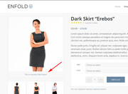
please ensure that your image has the description field filled in:
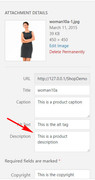
Best regards,
Mike
This is now what I have. I have bolded the chunk not mentioned in your last reply–seems like it is still necessary, so I did not remove it (when I tried removing bolded chunk, it did not change the landscape situation on iphone 7). This now has the subtext pushed all the way over to the right, covering the burger menu:
/*——————–*/
/* Hide logo in mobile*/
/*——————–*/
@media only screen and (max-width: 767px) {
.responsive #top .logo img {
display: none !important;
}
.logo .subtext h1 {
font-size: 17px !important;
}
}
@media only screen and (max-width: 767px) and (orientation:portrait) {
.responsive #top .logo .subtext {
transform: translate(2%, -50%) !important;
width: 235px !important;
}
}
@media only screen and (min-width: 768px) and (max-width: 1023px) {
.responsive #top .logo .subtext {
display: none !important;
}
}
@media only screen and (min-device-width: 481px) and (max-device-width: 1024px) and (orientation:landscape) {
/* For landscape layouts only */
}
i tried different ones, for exmaple this
#advanced_menu_toggle:before {
content: ‘Menu’;
font-size: 14px;
top: -7px;
position: relative;
}
or this
#top #advanced_menu_toggle:after {
content: ‘MENU’;
font-size: 11px;
display: block;
line-height: 2px;
}
#top #advanced_menu_toggle, #top #advanced_menu_hide {
height: 56px;
}
but no ones worked :(
If you want to replace it globlay and not on a specific h tag:
by the way – you definitly want to change the h-tag from h3 to h5
or do you only want to change the size in mobile devices ?
And do you like to have it definitly only for mobile devices or for smaller screens too?
The reason why i asked this is that on mobile devices the enfold adds to the html tag a class called: avia_mobile
so if you like to influence only the mobile version of a tag you can always do it via this class infront of the needed rule f.e.
.avia_mobile h3 {
 font-size: 24px !important
}
if you want the tags to be different you have to do it via child-theme functions.php
you can use this nice replace tag with tag function and an if clause –
function replace_tags_with_tags(){
if(wp_is_mobile()){
?>
<script>
  (function($) {
      function replaceElementTag(targetSelector, newTagString) {
        $(targetSelector).each(function(){
          var newElem = $(newTagString, {html: $(this).html()});
          $.each(this.attributes, function() {
            newElem.attr(this.name, this.value);
          });
          $(this).replaceWith(newElem);
        });
      }
      replaceElementTag('h3', '<h5></h5>'); // you can add here more lines like this semicolon separated
  }(jQuery));
</script>
<?php
}
}
add_action('wp_footer', 'replace_tags_with_tags');
well Enfold includes for some animation allready the waypoint function. On some cases this will be a good thing to control animation on scroll position dependencies.
f.e. : you can see on this page that some h3 headings gets red font when scrolling down – scrolling up will make them again black.
On scrolling down some p-tags content is getting red: https://webers-testseite.de/datenschutzerklaerung/
On this page the images ( sorry for the quick and dirty way – the resolution is bad on growing up) are sized to 100% container width.:
https://webers-testseite.de/ostler/beispiel-seite/
the last page is with this code to guide you in that direction i think you can do some similar effects on scrolling down:
add_action('wp_footer', 'scroll_up_down_change', 9999);
function scroll_up_down_change() {
?>
<script>
(function($) {
    var element_to_animate = $('img.grow');
        element_to_animate.waypoint(function(direction) {
           if (direction === 'down') { $(this.element).css({
			'max-width': '100vw',
            'width': '100%',
			'transition': 'width 1s',
            });
         }
        }, { offset: '20%'});
    element_to_animate.waypoint(function(direction) {
           if (direction === 'up') { $(this.element).css({
			'max-width': '100vw',
            'width': '100px',
			'transition': 'width 1s',
            });}
        }, {offset: '20%'});
})(jQuery);
</script>
<?php
}
so maybe you can look what you can do with the waypoint function to create some new stunning effects
-
This reply was modified 7 years, 3 months ago by
 Guenni007.
Hi,
If you enable debug mode you can add this to a new page to see exactly how it was created: https://kriesi.at/documentation/enfold/intro-to-advanced-layout-builder/#debug-mode
[av_layout_row border='' min_height='0' color='main_color' mobile='av-flex-cells' id='collections' av_uid='av-6ryzw0']

[av_cell_one_fourth vertical_align='top' padding='0px' padding_sync='true' background_color='' src='' attachment='' attachment_size='' background_attachment='scroll' background_position='top left' background_repeat='no-repeat' av_uid='av-6j6fa8']

[av_image src='http://kriesi.at/themes/enfold-shop/files/2015/03/winter-girl-small-495x400.jpg' attachment='551' attachment_size='portfolio' align='center' animation='no-animation' styling='no-styling' hover='av-hover-grow' link='product,66' target='' caption='yes' font_size='' appearance='' overlay_opacity='0.7' overlay_color='#6786a1' overlay_text_color='#ffffff' av_uid='av-6cku1k']
NEW
WINTER COLLECTION
[/av_image]

[/av_cell_one_fourth][av_cell_one_fourth vertical_align='top' padding='0px' padding_sync='true' background_color='' src='' attachment='' attachment_size='' background_attachment='scroll' background_position='top left' background_repeat='no-repeat' av_uid='av-68cnnc']

[av_image src='http://kriesi.at/themes/enfold-shop/files/2015/03/couple-sitting-495x400.jpg' attachment='546' attachment_size='portfolio' align='center' animation='no-animation' styling='no-styling' hover='av-hover-grow' link='product_cat,15' target='' caption='yes' font_size='' appearance='' overlay_opacity='0.7' overlay_color='#6786a1' overlay_text_color='#ffffff' av_uid='av-5z9tg0']
LATEST
STREET CLOTHES
[/av_image]

[/av_cell_one_fourth][av_cell_one_fourth vertical_align='top' padding='0px' padding_sync='true' background_color='' src='' attachment='' attachment_size='' background_attachment='scroll' background_position='top left' background_repeat='no-repeat' av_uid='av-5uqk4o']

[av_image src='http://kriesi.at/themes/enfold-shop/files/2015/03/girls-shopping-desat-495x400.jpg' attachment='549' attachment_size='portfolio' align='center' animation='no-animation' styling='no-styling' hover='av-hover-grow' link='product_cat,12' target='' caption='yes' font_size='' appearance='' overlay_opacity='0.7' overlay_color='#6786a1' overlay_text_color='#ffffff' av_uid='av-5nvd7k']
FRESH
SPORTSWEAR
[/av_image]

[/av_cell_one_fourth][av_cell_one_fourth vertical_align='top' padding='0px' padding_sync='true' background_color='' src='' attachment='' attachment_size='' background_attachment='scroll' background_position='top left' background_repeat='no-repeat' av_uid='av-jynj4']

[av_image src='http://kriesi.at/themes/enfold-shop/files/2015/03/hipster-girls-working-495x400.jpg' attachment='554' attachment_size='portfolio' align='center' animation='no-animation' styling='no-styling' hover='av-hover-grow' link='product_cat,10' target='' caption='yes' font_size='' appearance='' overlay_opacity='0.7' overlay_color='#6786a1' overlay_text_color='#ffffff' av_uid='av-5g4ers']
FUNKY
ACCECCOIRS
[/av_image]

[/av_cell_one_fourth][/av_layout_row]
Best regards,
Rikard
I see in the css:
.av-accordion-style-1 .toggle_icon:before {
position: absolute;
font-size: 18px;
top:50%;
transform: translateY(-50%);
left: 0;
content:“e817”;
font-family: ‘entypo-fontello’;
line-height: 0;
}
What e817 means?
Hi,
The 102% is for your desktop and the 2% is for your mobile devices, perhaps we should declare that it’s for portrait by changing your css to this:
@media only screen and (max-width: 767px) and (orientation:portrait) {
.responsive #top .logo .subtext {
transform: translate(2%, -50%) !important;
width: 235px !important;
}
}
Please leave the rest of the rule as is because it doesn’t matter with orientation:
@media only screen and (max-width: 767px) {
.responsive #top .logo img {
display: none !important;
}
.logo .subtext h1 {
font-size: 17px !important;
}
}
Then this should landscape orientation should work:
@media only screen and (min-device-width: 481px) and (max-device-width: 1024px) and (orientation:landscape) {
.responsive #top .logo .subtext {
    transform: translate(-65%,-50%) !important;
}
}
*the -65% is what looked good in my Chrome browser, but you may need to adjust for your iPad
Best regards,
Mike
I changed to (2%,-50%), and added the code you mentioned. Cleared caches in wordpress and iphone browser history/caches, but the subtext is still pushed to the right . . . that’s still really not a huge deal though. Here’s what i have in total for this — could the chunck of code in the Subtext Styling block be redundant? I do see that I have 102% there, but I think that section is for laptop/desktop (changing the 102% there to 2% causes the subtext to go all the way to the left and overlap the logo):
/*————————–*/
/* CSS – Subtext on right*/
/*————————-*/
#top .logo,
#top .logo a {
overflow: visible;
}
/*—————-*/
/* Subtext styling */
/*—————-*/
.logo .subtext h1 {
font-size: 20px;
font-weight: 550;
}
.logo .subtext {
position: absolute;
top: 50%;
right: 0;
width: 275px;
transform: translate(102%, -50%);
z-index: 999;
}
/*——————–*/
/* Hide logo in mobile*/
/*——————–*/
@media only screen and (max-width: 767px) {
.responsive #top .logo img {
display: none !important;
}
.responsive #top .logo .subtext {
transform: translate(2%, -50%) !important;
width: 235px !important;
}
.logo .subtext h1 {
font-size: 17px !important;
}
}
@media only screen and (min-width: 768px) and (max-width: 1023px) {
.responsive #top .logo .subtext {
display: none !important;
}
}
@media only screen and (min-device-width: 481px) and (max-device-width: 1024px) and (orientation:landscape) {
/* For landscape layouts only */
}
This reply has been marked as private.
I am trying to apply toggle ids and also style the icon to be one color and the text another…
.my-custom-class .toggle_icon { color: #ffffff !important; background: #00aeef !important; }
.my-custom-class .toggle_icon { color: #ffffff; background: #ed4f3e; }
.my-custom-class-2 .toggler, .my-custom-class .toggler { font-size: 18px; font-weight: 600; color: #222222; }
But the toggle ids (something I’ve done many other times) don’t work and neither do the custom styles I’m trying to apply?
on lline 377 there is a missing bracket:
on : #av_section_1 .container
#av_section_1 .container{
margin-buttom: -50px!important;

h1{
font-family: silver-south-serif !important;
font-size: 72px !important;
text-transform: capitalize !important;
}

h2{
font-family: silver-south-serif !important;
font-size: 42px !important;
text-transform: capitalize !important;
}

h3.slide-entry-title.entry-title {
font-family: silver-south-script !important;
font-size: 72px !important;
text-transform: capitalize !important;
}
-
This reply was modified 7 years, 3 months ago by Guenni007.
Hi support.
I am trying to make the H3 on the blog page (grid view) look like this:
h3.slide-entry-title.entry-title {
font-family: silver-south-script !important;
font-size: 72px !important;
text-transform: capitalize !important;
}
The font is uploaded, but nothing happens :-/
Page: the blog
Thanks :-)
/OKEIwebbureau
Hi Franz,
Please try something like this:
Markup:
<h3 class="my-class">TEXT TEXT</h3>
CSS:
@media only screen and (max-width: 767px) {
.my-class {
  font-size:12px;
}
}
Best regards,
Rikard
Something is so odd as the changes I make in the General Styling or Advanced styling are not showing on the front end.
It’s extremely annoying as I need to be able to customize the theme.
Like I changed the font of the menu, the background of the top menu above the logo section, the font size on the site, the footer and socket colors etc …. nothing is showing on the front end.
PLEASE HELP