Forum Replies Created
-
AuthorPosts
-
Hi Ismael,
Thanks for your reply.
I contacted the host of my website. He allocated more memory to my account. Now my page loads reliable again and the problem could be solved.
I have one more question: Does Enfold support SVG now or do I still need the SVG Support plugin?
Best regards,
zizibe1
Hi Rikard,
Thanks for your reply.
In the wp-config.php file, I enabled debugging:
define( ‘WP_DEBUG’, true );
Then I opened FileZilla, went to wordpress > wp-content and downloaded the debug.log file, which mentions several errors concerning the SVG Support plugin and “allowed memory size of bytes exhausted”.
So I deactivated the SVG Support plugin.
And I added the following code (highlighted in bold) to the wp-config.php file to increase the memory limit:
[…]
* @package WordPress
*/define(‘WP_MEMORY_LIMIT’, ‘512M’);
define(‘WP_MAX_MEMORY_LIMIT’, ‘512M’);/** MySQL Einstellungen […]
But the problem still consists.
Please find a download-link of the debug.log file in the private content area.
Best regards,
zizibe1
Hi Ismael,
Thanks for your reply.
I opened FileZilla, went to wordpress > wp-config.php and added the code as follows:
/**
 * For developers: WordPress debugging mode.
 *
 * Change this to true to enable the display of notices during development.
 * It is strongly recommended that plugin and theme developers use WP_DEBUG
 * in their development environments.
 */
define('WP_DEBUG', false);
define('FORCE_SSL_ADMIN', true);

// Enable WP_DEBUG mode
define( 'WP_DEBUG', true );

// Enable Debug logging to the /wp-content/debug.log file
define( 'WP_DEBUG_LOG', true );

// Disable display of errors and warnings
define( 'WP_DEBUG_DISPLAY', false );
@ini_set( 'display_errors', 0 );

// Use dev versions of core JS and CSS files (only needed if you are modifying these core files)
define( 'SCRIPT_DEBUG', true );

/* That's all, stop editing! Happy blogging. */
What shall I do now?
Best regards
zizibe1
September 22, 2021 at 1:04 pm in reply to: Chrome (Mac): caption at the top of big image instead of being in the center #1321909Hi Yigit,
Thanks for your reply.
You can close this topic now.
Best regards,
zizibe1
September 20, 2021 at 12:30 am in reply to: Chrome (Mac): caption at the top of big image instead of being in the center #1321563Hi Rikard,
Mike was kind enough to reopen this thread for me.
I found another solution to solve the issue and would like to share it. Using the following code, I could correct the position of the caption so that it is back in the center of the image, regardless of the size of the browser window:
.avia-chrome.avia_transform .av_fullscreen .active-slide .avia-caption-title {
    padding-top: 45vh;
}
I hope this additional information will be useful to everyone who is reading this post.
Best regards,
zizibe1
September 11, 2021 at 2:25 pm in reply to: Chrome (Mac): caption at the top of big image instead of being in the center #1320524Hi Rikard,
Thanks for your reply.
Your code could solve the issue.
Thanks again. You can close this topic now.
Best regards,
zizibe1
Hi Nikko,
Thanks for your prompt reply.
Yes, the following solution posted by Rikard could solve the issue:
Edit: temporary solution for resolving the empty mobile menu when using an alternate menu for mobile; replace /enfold/includes/helper-main-menu.php, with this file: https://www.dropbox.com/s/6gmyfwwcicl0mdi/helper-main-menu.php?dl=0
Thanks again. You can close this topic now.
Best regards,
zizibe1
June 24, 2020 at 11:38 pm in reply to: Gallery with four thumbnails above and one big image below #1225375Hi Yigit,
Awesome! Thank you very much for your support.
For the sake of completeness, it should be mentioned that the custom CSS code related to that customization is:
#flex-gallery-alt .avia-gallery-thumb a:last-of-type {
width: 100% !important;
}
Thanks again. You can close this topic now.
Best regards,
zizibe1
June 19, 2020 at 10:27 pm in reply to: Gallery with four thumbnails above and one big image below #1224177Hi Yigit,
Thanks for your reply.
I recreated your layout using single Gallery element below your existing section in page in private content field.
Great! That’s the layout I was asking about in the first post of this thread!
I’ve tried to recreate this layout on a new testpage. Unfortunately, I didn’t succeed.
Please have a look at the private content area. What did I wrong?
Best regards,
zizibe1
June 16, 2020 at 4:39 pm in reply to: Gallery with four thumbnails above and one big image below #1223111This reply has been marked as private.June 5, 2020 at 9:19 pm in reply to: Gallery with four thumbnails above and one big image below #1219952This reply has been marked as private.June 1, 2020 at 5:52 pm in reply to: Gallery with four thumbnails above and one big image below #1218481Hi Guenni007,
Thanks for your reply.
For me, it’s very important that the flexbox layout and the gallery layout are exactly the same size. I would very much like to know how to fine-tune that. But I understand if you don’t want to invest any more time in this topic.
I’ve posted a link to the page with the flexbox layout and a link to the page with the gallery layout in the private content are. I would appreciate it very much if a moderator could help me.
Best regards,
zizibe1
May 31, 2020 at 6:45 pm in reply to: Gallery with four thumbnails above and one big image below #1218239Hi Guenni007,
Thanks for your reply.
1.
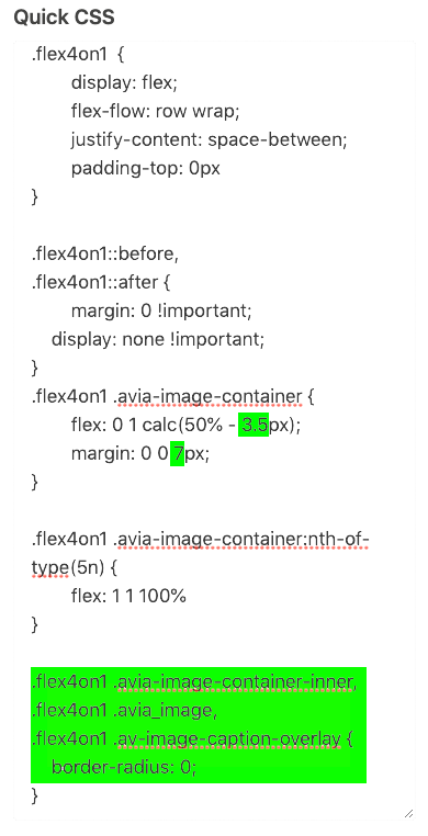
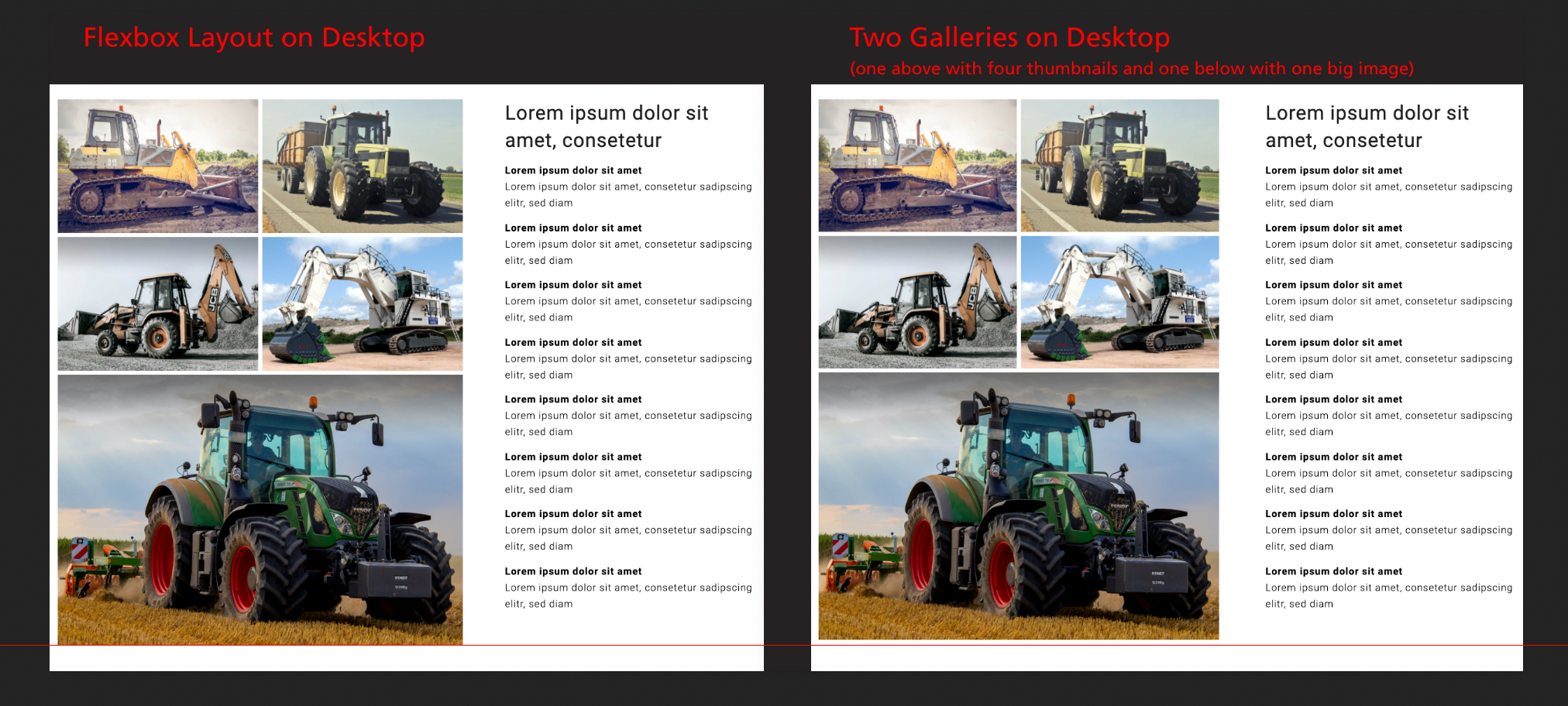
The code looks like this now (adjustments are highlighted in green):Now on desktop, the white spaces between the images of the flexbox layout look the same as the white spaces between the images of the gallery layout.
But as you see on the screenshot below, the flexbox layout is a little bit too big.
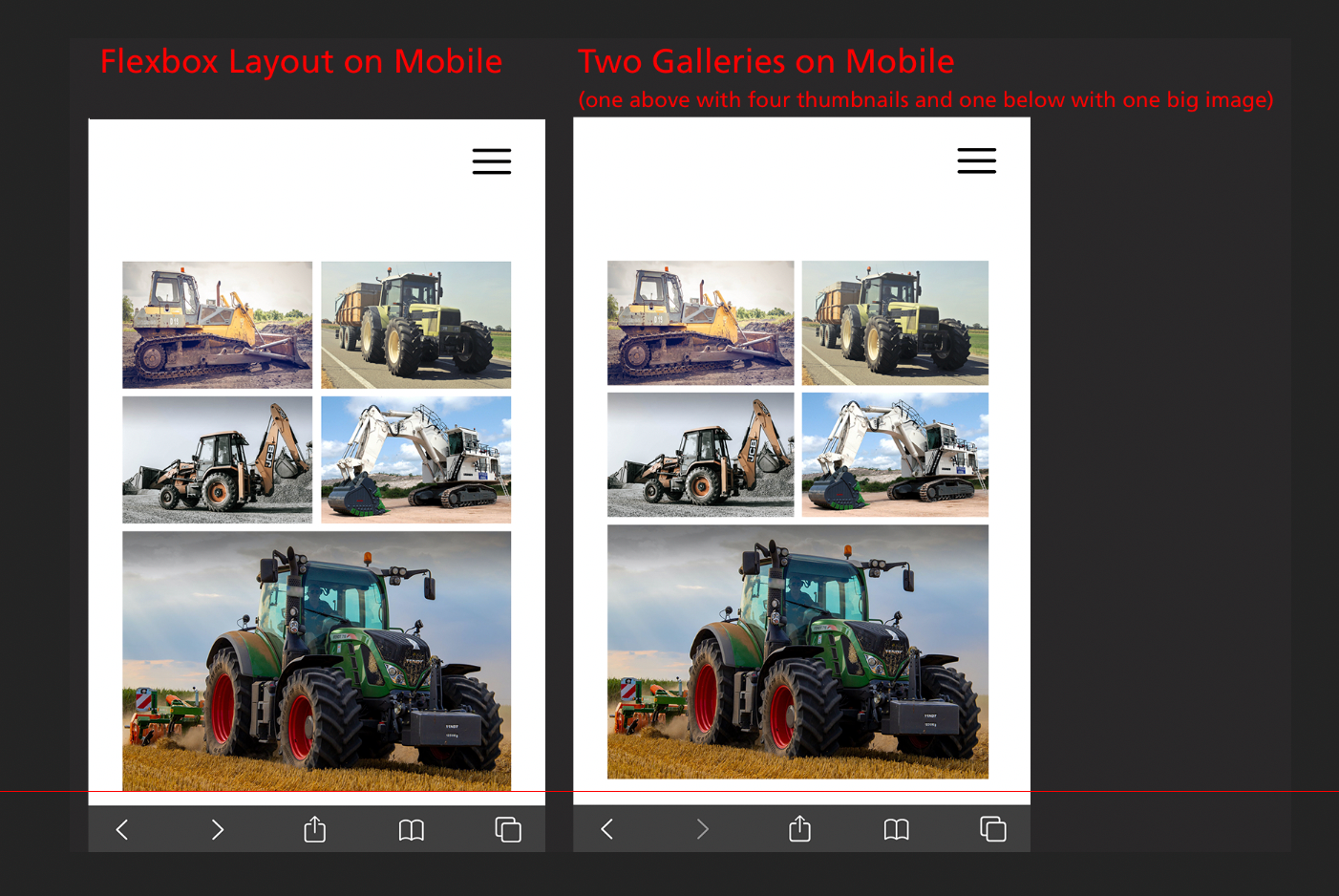
Also on mobile, the flexbox layout is a little bit too big:
How can I correct this?
2.
I’ve added the following code to Appearance > Theme Editor > Enfold Child: Theme functions (functions.php):function change_lightbox_size() { return "full"; } add_filter('avf_avia_builder_helper_lightbox_size','change_lightbox_size', 10);It has worked fine. Now the lightbox of the flexbox layout displays the images in their original size.
3.
I’ve added the following code to Appearance > Theme Editor > Enfold Child: Theme functions (functions.php):function avia_change_gallery_thumbnail_link($link, $attachment, $atts, $meta){ $link = wp_get_attachment_image_src($attachment->ID, "full"); return $link; } add_filter('avf_avia_builder_gallery_image_link', 'avia_change_gallery_thumbnail_link', 10, 4);This code should make the lightbox of the gallery display the images in their original size. Correct? If so, I can see no difference, because the lightbox of the gallery has already displayed the images in in their original size before. But thanks for the code anyway.
Best regards,
zizibe1
May 31, 2020 at 12:04 am in reply to: Gallery with four thumbnails above and one big image below #1218091Hi Guenni007,
Thanks for your reply. I’m sorry for the misunderstanding.
In my previous post, I’d mentioned that the vertical white space between the images was too big. But now I’ve realized that the two horizontal white spaces were too thin actually.
Thanks to your explanation, I could adjust the code like this:
.flex4on1  {
	display: flex;
	flex-flow: row wrap;
	justify-content: space-between;
	padding-top: 0px
}

.flex4on1::before,
.flex4on1::after {
	margin: 0 !important;
    display: none !important;
}
.flex4on1 .avia-image-container {
	flex: 0 1 calc(50% - 3px);
	margin: 0 0 6px;
}

.flex4on1 .avia-image-container:nth-of-type(5n) {
	flex: 1 1 100%
}
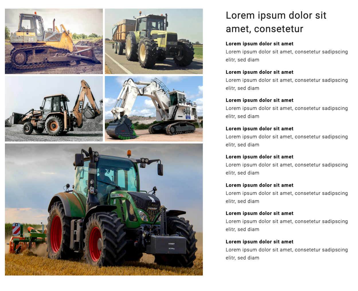
The layout looks like this now:
Now, the white spaces between the images are alright.
I have another two questions:
1.
The corners of the images should be sharp. How do I get rid of the rounded corners?*2.
Currently, the lightbox displays a smaller version of the images (1030 × 687). But the lightbox should display the images in their original size (1196 × 798). How do I achieve this?Many thanks,
zizibe1
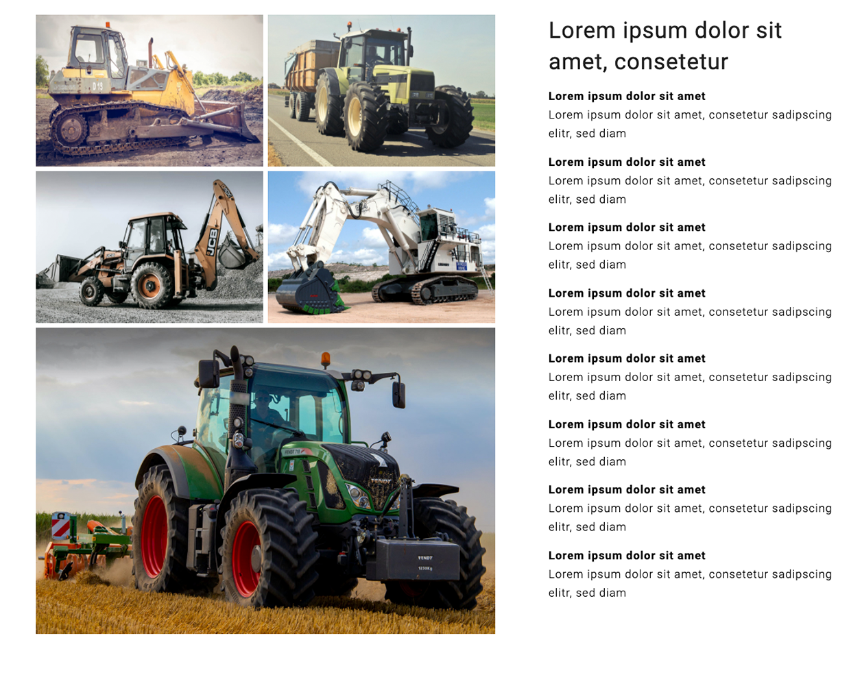
* I’ve just realized that the white spaces between the images are a little bit bigger when the corners of the images are sharp. That’s how it’s supposed to be. So, how can I achieve the following layout which has images with sharp corners?
(Photo credits: DapurMelodi/pexels.com, Andrea Piacquadio/pexels.com, Manzil Joshi/pexels.com, Weir ESCO/pexels.com, Jannis Knorr/pexels.com)
-
This reply was modified 5 years, 11 months ago by
zizibe1. Reason: * addendum
May 29, 2020 at 5:37 pm in reply to: Gallery with four thumbnails above and one big image below #1217818Hi Guenni007,
Thanks for your efforts. I really appreciate them.
Unfortunately, for reasons of anonymity, I’ve posted the link to the website only in the private content are which is only visible to moderators. My apologies for not mentioning this earlier to you.
All five images are exactly the same size (1196 × 798). All landscape format images of the website are this size.
On your testpage https://webers-testseite.de/4on1-flexbox-model/, you have four thumbnails in a row. But on my page, I only want to have two thumbnails in a row.
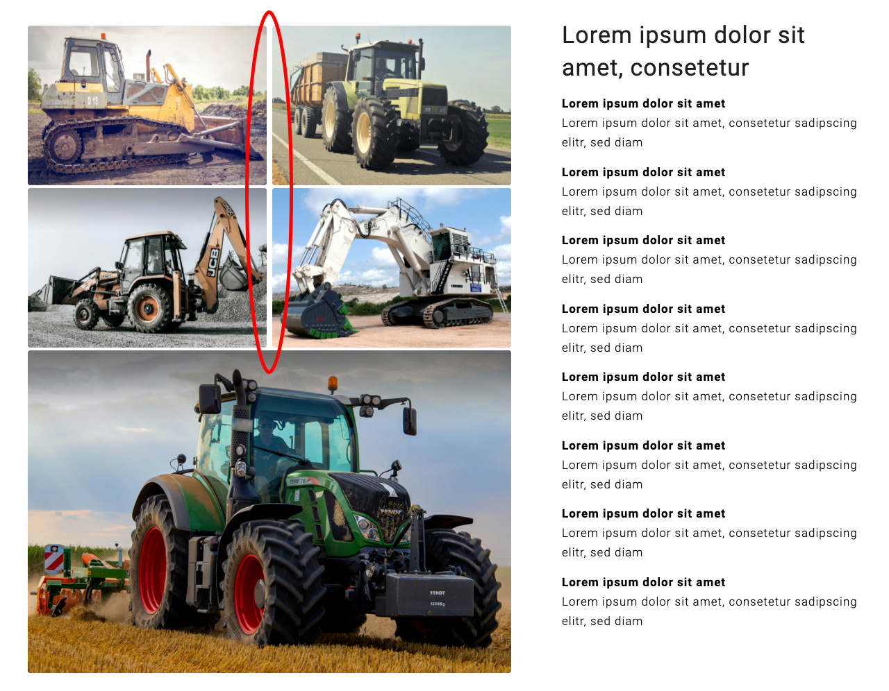
So, I’ve added your code snippet to the code and made two adjustments (see yellow markings):
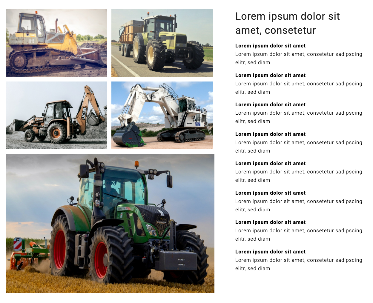
Now, the layout looks like this:
All images are aligned now. But the vertical white space is too big (see red marking).
I hope you can recreate my situation on your testpage and find a way to correct the vertical white space.
Many thanks,
zizibe1
PS: On your testpage, I’ve seen the code to have the container on responsive case under the text. Thank you very much.
In this case, I don’t need this code. Put I’ve posted it here for future reference:
Color Section custom class: section_with4on1
(Note: No other element than the two columns in the Color Section.)@media only screen and (max-width: 767px) { #section_with4on1 .entry-content-wrapper { display: flex; flex-flow: row wrap-reverse; justify-content: flex-start; } }(Photo credits: DapurMelodi/pexels.com, Andrea Piacquadio/pexels.com, Manzil Joshi/pexels.com, Weir ESCO/pexels.com, Jannis Knorr/pexels.com)
May 28, 2020 at 10:18 pm in reply to: Gallery with four thumbnails above and one big image below #1217532Hi Guenni007,
Thanks for your efforts.
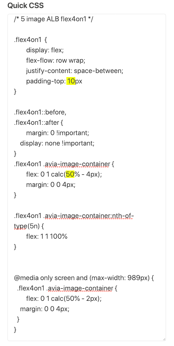
I’ve added the code from your testpage https://webers-testseite.de/4on1-flexbox-model/ to Enfold Child > General Styling > Quick CSS and made some adjustments:
.flex4on1  {
  display: flex;
  flex-flow: row wrap;
  justify-content: space-between;
  padding-top: 10px
}

.flex4on1 .avia-image-container {
  flex: 0 1 calc(50% - 4px);
  margin: 0 0 4px;
}

.flex4on1 .avia-image-container:nth-of-type(5n) {
  flex: 1 1 100%
}

@media only screen and (max-width: 989px) {
  .flex4on1 .avia-image-container {
    flex: 0 1 calc(50% - 2px);
    margin: 0 0 4px;
  }
}
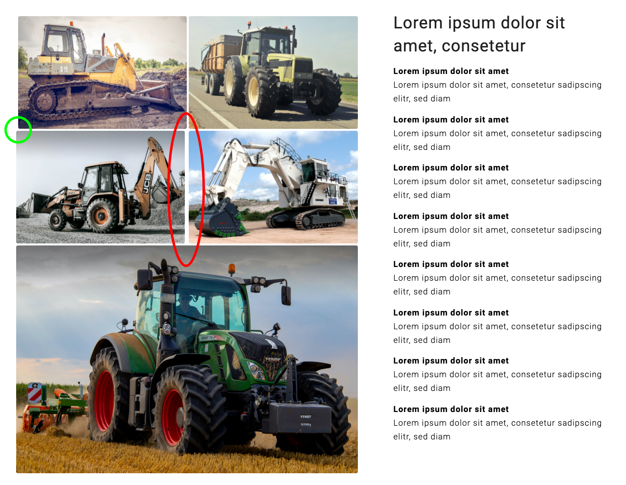
Then I’ve created a new page and added a color-section with two columns in it. The left 3/5 column has only five image elements in it. The right 2/5 column has only text elements in it.
To the left column, I’ve added the custom css class flex4on1 (Edit Cell > Advanced > Developper Settings > Custom CSS Class).
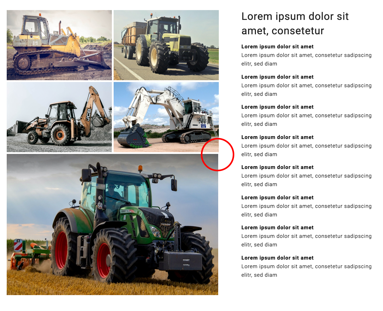
Now, the layout looks like this (unwanted outcomes marked red and green):
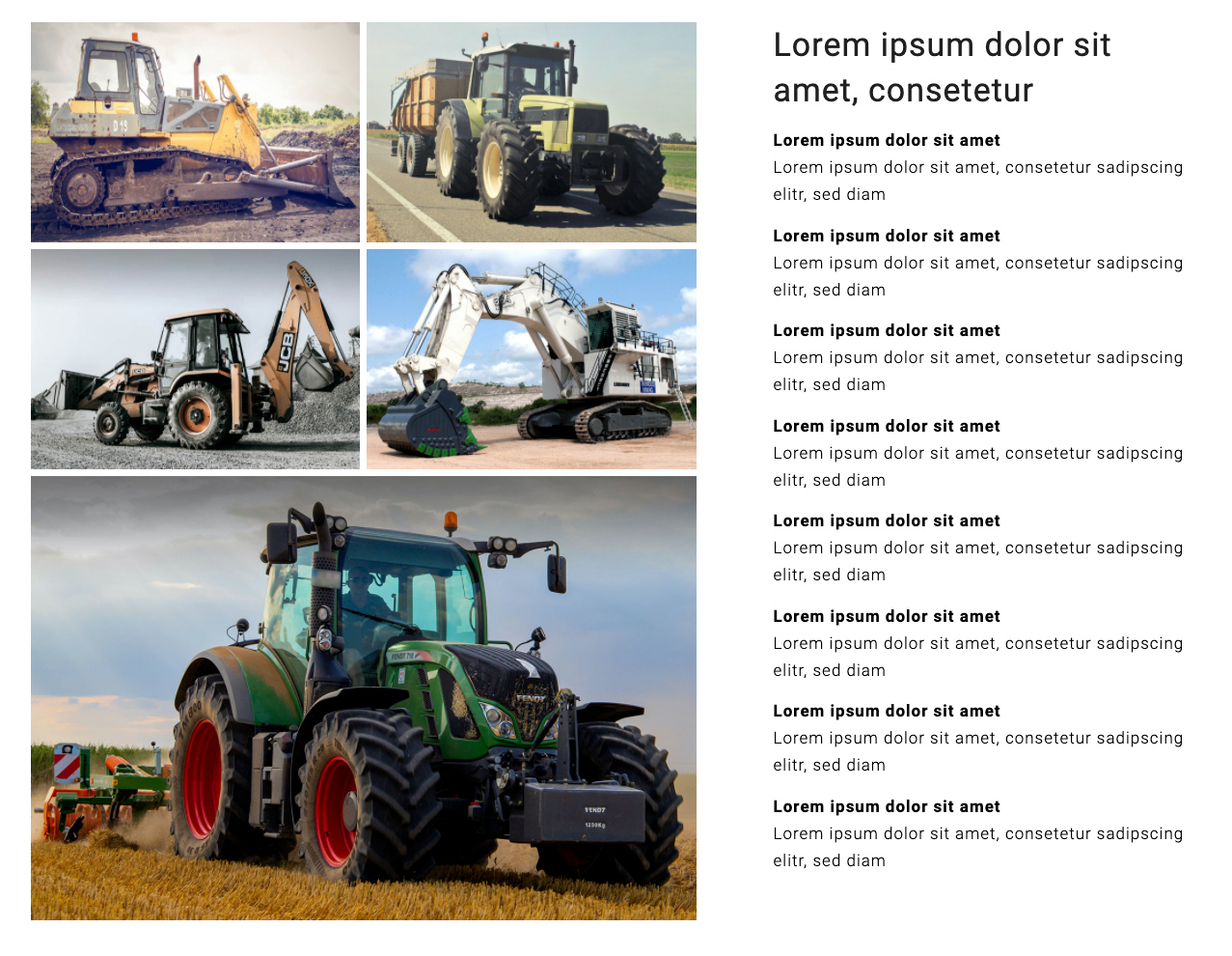
But it should look like this:
Again, I couldn’t figure out how to correct this. Do you see a solution?
Best regards
zizibe1
(Photo credits: DapurMelodi/pexels.com, Andrea Piacquadio/pexels.com, Manzil Joshi/pexels.com, Weir ESCO/pexels.com, Jannis Knorr/pexels.com)
-
This reply was modified 5 years, 11 months ago by
zizibe1. Reason: Correction of the code
Hi Rikard,
Thanks for your recommendation.
You can close this topic now.
Best regards,
zizibe1
May 27, 2020 at 9:37 pm in reply to: Gallery with four thumbnails above and one big image below #1217142Hi Guenni007,
Thanks for your reply.
I’ve added the code from your example page https://webers-testseite.de/masonry-4on1big/ to Enfold Child > General Styling > Quick CSS:
#top .container .av-masonry.masonry41.av-large-gap {
  width: calc(100% + 3px);
}

.masonry41.av-large-gap.av-flex-size .av-masonry-entry .av-inner-masonry {
  margin: 3px !important;
}

.masonry41 .av-masonry-entry:nth-of-type(5n) {
  width: 100% !important;
}

.masonry41 .av-masonry-entry:nth-of-type(5n) img {
  width: 100% !important;
  height: auto;
}

@media only screen and (min-width: 990px) {
  .masonry41 .av-masonry-entry:nth-of-type(5n) {
    width: calc(100% - 6px) !important;
  }
}

@media only screen and (max-width: 989px) {
  .masonry41 .av-masonry-entry:nth-of-type(5n) {
    width: calc(100% - 3px) !important;
  }
}

@media only screen and (max-width: 767px) {
  .masonry41 .av-masonry-entry:nth-of-type(5n) {
    width: 100% !important;
  }
}
Now, my layout looks like this:
1.
The white space between the images looks alright now. Unfortunately, on the right side, the big image doesn’t align with the thumbnails (see red marking). I’ve tried to adjust this by changing the different parameters in the code (or :) chew by myself a little when eating, as you would call it), but I couldn’t figure it out.2.
The lightbox of the Gallery displays the images in their original size (1196 × 798). But the lightbox of the Masonry Gallery displays a smaller version of the images (only 1030 × 687). What can I do to the make the lightbox of the Masonry Gallery show the images in their original size?Best regards,
zizibe1
(Photo credits: DapurMelodi/pexels.com, Andrea Piacquadio/pexels.com, Manzil Joshi/pexels.com, Weir ESCO/pexels.com, Jannis Knorr/pexels.com)
Hi Jordan,
Thanks for your reply.
Could you recommend an online course or online academy to acquire these skills?
Best regards,
zizibe1
May 25, 2020 at 10:42 pm in reply to: Gallery with four thumbnails above and one big image below #1216309Hi Guenni007,
Thanks for your input.
According to your post, I could realize the following layout:
But the Masonry Gallery should look like this:
a)
The white space between the images should be as small as on the screenshot above.b)
On the right side, the big image should align with the thumbnails above as on the screenshot above.c)
In the lightbox of the Masonry Gallery, the images are smaller than in the lightbox of the Gallery. But they should appear the same size.How can I achieve this?
Best regards,
zizibe1
(Photo credits: DapurMelodi/pexels.com, Andrea Piacquadio/pexels.com, Manzil Joshi/pexels.com, Weir ESCO/pexels.com, Jannis Knorr/pexels.com)
Hi Ismael,
Thanks for your reply.
If I understand correctly, I should hire a freelancer to customize the gallery and fulfill my requirements. Is there no way to do it by myself?
Best regards,
zizibe1
May 24, 2020 at 7:00 pm in reply to: Gallery with four thumbnails above and one big image below #1215856Hi Ismael,
Thanks for your reply.
I’ve used the Masonry Gallery element, but I didn’t get the desired result.
1.
In the Masonry Gallery element, the white space between the big image and the thumbnails and also between each thumbnail is too big.In the Gallery element, I could correct this by adding the following two codes to Enfold Child > General Styling > Quick CSS:
/* no border around gallery big preview, correct left and bottom padding */
#top div .avia-gallery .avia-gallery-big {
   border-style: none;
   padding-left: 0px;
   padding-bottom: 0px;
}

/* no border around gallery thumbnails, padding 0px to reduce white space, correct left padding of gallery thumbnails */
#top div .avia-gallery img,
#top #wrap_all .avia-gallery .avia-gallery-thumb a img {
   border-style: none;
   padding-top: 0px;
   padding-left: 0px;
}
Could you please tell me the codes to correct the Masonry Gallery element accordingly?
2.
In the preview of the Masonry Gallery element, only sections of the images are visible. But as in the Gallery element, the whole images should be visible (for comparison, please see the new screenshot in the private content area).3.
In the lightbox of the Masonry Gallery element, the images are smaller than in the lightbox of the Gallery element. But they should appear the same size.Best regards,
zizibe 1
Hi Ismael,
Thanks for your reply.
I’ve already tried the different options in in the element’s Gallery Preview Image Size, but no one fulfills my requirements.
When I choose Portfolio (495×400) e. g., the thumbnails all have the same size. But they should differ in size and should also keep the thin white gap between them as you see on the right side on the screenshot in the private content area.
How can I achieve this layout?
Best regards,
zizibe1
Hi Rikard,
Thanks for your reply.
In the WordPress admin area, I went to Enfold Child > Theme options > Select Your Editor > Use WP Classic Editor > Save all changes.
Now, the two live sites look fine as well.
Thanks again for your great support. You can close this topic now.
Best regards,
zizibe1
Hi Victoria,
Thanks for your reply.
Now, the staging site looks fine.
I would like to fix this error on two live pages as well.
Please tell me what to do.
Best regards,
zizibe1
Hi Ismael,
Thank you for your reply.
Meanwhile, I hired a Codeable expert which solved my issue.
You can close this topic.
Thanks,
zizibe1
Hi Rikard,
Did you already find a solution to my problem?
Best regards,
zizibe1
Hi Rikard,
Thank you for your reply.
I removed the 500px padding on the column with the SVG (caption) in it. Now I can change the section height, but I don’t get the result intended.
1.
The background image in the color section should have at least 100 % of the browser window height on desktop screen. I don’t want to change this setting.2.
When I remove the 500px padding on the column with the SVG in it, the SVG stands too low. The SVG should stay in die upper half of the background imageSo I went back to my original settings I had described in my first post.
To correct the layout on mobile screen, I duplicated the color section of the front page, cropped the background image, adjusted the settings and then selected to hide it on all screens except mobile.
Now, on desktop screen, tablet screen vertical and smartphone screen vertical, the layout is okay.
According to this method, I also tried to correct the layout on tablet screen horizontal and smartphone screen horizontal, but it didn’t work:
– On tablet screen horizontal, there’s too much of the foreground and too little of the sky of the background image visible.
– On smartphone screen horizontal, the SVG is too big.How can I correct this?
Please have a look at the screenshot in the private content area to see how the layout looks on the different screens.
Best regards,
zizibe1
Hi Rikard,
Thank you for your reply.
I went to Color Section > Edit Section > Section height and tried out the different options concerning the section minimum height, but I can’t see any difference.
Maybe it’s because of the hight of the image I inserted in the color section. So, I cropped the image at the bottom. But now, on the desktop screen, the background image shows too little of the foreground. And on mobile screen, the background image is still too high.
Please find a screenshot in the private content area.
How can I solve this problem?
Best regards,
zizibe1
Hi Victoria,
The code works fine. Thank you very much for your support.
You can close this topic now.
Best regards,
zizibe1
-
This reply was modified 5 years, 11 months ago by
-
AuthorPosts

