Forum Replies Created
-
AuthorPosts
-
Hi Rikard,
sorry for taking so long to answer. Me and the customer just decided to leave it like that for the time being.
You can close this topic and I will get back if any further assistance is needed.
Thank you so much and have a great week.
Regards
DanielaHi Rikard,
the sidebar widget displays the events from top to bottom. This makes the whole page very long, as I want to display all events for this year.
The Blog Entry element displays the entries from left to right but it either shows date and text excerpt or nothing. I want the events to be displayed like they are in the sidebar widget (with title, date, place) but in the order of the blog entry element.
I hope this is understandable as I cannot provide any screenshots.
Thanks a lot
DanielaHi Rikard,
sorry, that was my mistake. All events were in draft mode. They are now published and you should be able to see them.
Regards
DanielaHi Rikard,
there are events on the alternative front page that is still in draft mode. It’s the last page in the overview.
Regards
DanielaHi Rikard,
I provided admin access for you as the page in question is not yet published.
Please take a look at the page “Willkommen (copy)”.Thanks a lot.
Regards
DanielaHi Mike,
thanks a lot, I figured it out. Topic can be closed.
Regards,
DanielaHi Mike,
my version of the dotsmenu is already linked to different pages.
Regards
DanielaHi Mike,
the page is not yet active and still under construction. You can see an example for what I want to achieve here.
Best regards
DanielaDifferent question: is it possible to have a box around the icons like a tab in a folder?
Can you have a quick look into this question?
Thanks a lot.
The display problem is solved. I entered css in style sheet, not in theme options. Now I copied it into the theme options and it works.
PS: is it possible to have that menu on every page without inserting it on every single page?
Hi Mike,
I tried to replace this with another hex code, but it does not change. (I changed it to black yesterday, it was displayed in white yesterday but in black today after logging in again. I want it to be #b51917 but it just does not work.)
Different question: is it possible to have a box around the icons like a tab in a folder?
Thanks a lot.
Regards,
DanielaHi Mike,
thank you. It seems to work but somehow I cannot change the color of the icons. I tried to insert the color code in this part of the css:
#top .dotsmenu .av-subnav-menu li a:before {
 display: inline-block !important;
 font-size:30px;
 color: #fff;
}
but nothing changes.
Regards
DanielaTopic can be closed.
Hi Rikard,
I now use a different display for the events list. You can close this topic.Thank you for your efforts.
Regards
DanielaThank you.
I will try to find a solution or use another plugin.
Regards
DanielaHi Rikard,
try decreasing the window width.
On mobile devices the event is not shown properly either. You can only see half the title. It ist just not responsive. Unfortunately I cannot say, since when this occurs.
Regards
Daniela-
This reply was modified 1 year, 11 months ago by
Daniela.
This is the standard code for the events list and nothing was changed.
<div class="em-event em-item" style="--default-border:#_CATEGORYCOLOR">
	<div class="em-item-image {no_image}has-placeholder{/no_image}">
		{has_image}
		#_EVENTIMAGE{medium}
		{/has_image}
		{no_image}
		<div class="em-item-image-placeholder">
			<div class="date">
				<span class="day">#d</span>
				<span class="month">#M</span>
			</div>
		</div>
		{/no_image}
	</div>
	<div class="em-item-info">
		<h3 class="em-item-title">#_EVENTLINK</h3>
		<div class="em-event-meta em-item-meta">
			<div class="em-item-meta-line em-event-date em-event-meta-datetime">
				<span class="em-icon-calendar em-icon"></span>
				#_EVENTDATES
			</div>
			<div class="em-item-meta-line em-event-time em-event-meta-datetime">
				<span class="em-icon-clock em-icon"></span>
				#_EVENTTIMES
			</div>
			{bookings_open}
			<div class="em-item-meta-line em-event-prices">
				<span class="em-icon-ticket em-icon"></span>
				#_EVENTPRICERANGE
			</div>
			{/bookings_open}
			{has_location_venue}
			<div class="em-item-meta-line em-event-location">
				<span class="em-icon-location em-icon"></span>
				#_LOCATIONLINK
			</div>
			{/has_location_venue}
			{has_event_location}
			<div class="em-item-meta-line em-event-location">
				<span class="em-icon-at em-icon"></span>
				#_EVENTLOCATION
			</div>
			{/has_event_location}
			{has_category}
			<div class="em-item-meta-line em-item-taxonomy em-event-categories">
				<span class="em-icon-tag em-icon"></span>
				#_EVENTCATEGORIES
			</div>
			{/has_category}
			{has_tags}
			<div class="em-item-meta-line em-item-taxonomy em-event-tags">
				<span class="em-icon-tag em-icon"></span>
				#_EVENTTAGS
			</div>
			{/has_tags}
		</div>
		<div class="em-item-desc">
			#_EVENTEXCERPT{25}
		</div>
		<div class="em-item-actions input">
			<a class="em-item-read-more button" href="#_EVENTURL">More Info</a>
			{bookings_open}
			<a class="em-event-book-now button" href="#_EVENTURL#em-event-booking-form">
				<span class="em-icon em-icon-ticket"></span>
				Book Now!			</a>
			{/bookings_open}
		</div>
	</div>
</div>
I just cannot understand why three events behave so differently and why the whole list is not responsive anymore.
-
This reply was modified 1 year, 11 months ago by
Daniela.
I just noticed that the mobile view is not even readable. Something must be wrong with the plugin I think
Hi Rikard,
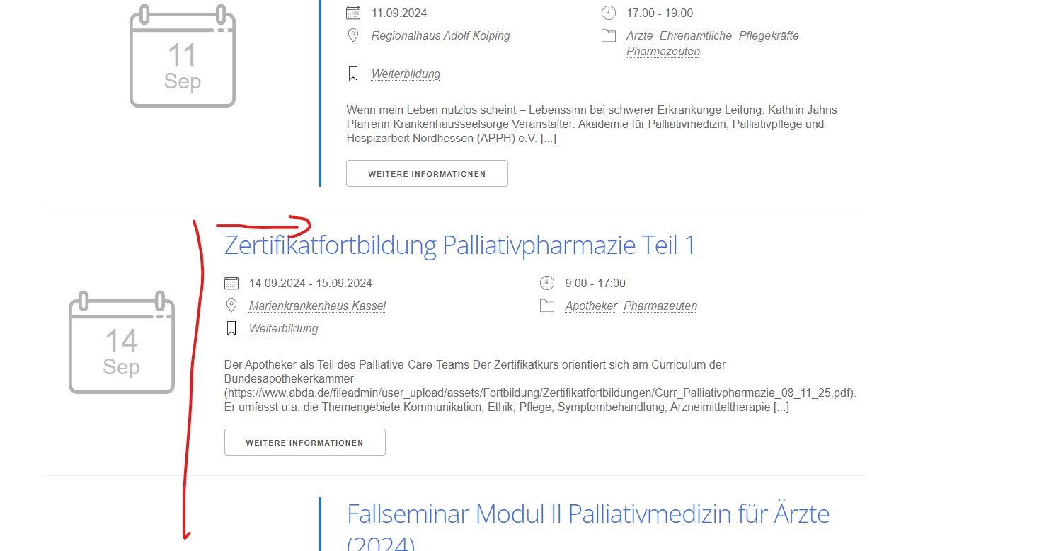
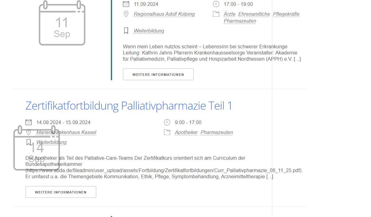
I just found out, that it seems to be a problem depending on screen sizes. On my work screen, the content is not displayed over the placeholder, it is just not aligned with the other events. As soon as I decrease the window size, the text is over the placeholder, even over the sidebar at times.
I will try to provide screenshots.
Yes, I am sure.
I even tried on different devices with cleared cache.
I now deleted the image as well and homepage is fine again.
Hi Ismael,
this is what I see after hard refresh and without login:

On mobile it does not work on every page either. I deleted the filter but the problem seen in screenshot does not disappear.
Hi Ismael,
thank you!
The problem is only visible after logging out of the dashboard. As long as I am logged in, everything is fine.
I checked the page on my mobile and the logo is displayed differently on “Print & Web” and “Shop”. Same applies to desktop. The logo is really huge on these pages.The link for the intended mobile logo is given in private content. It is not supposed to be the one with “Schutzraum”.
I saw that the code in functions was inactive. I activated it with the correct image link and guess what: upon checking on my mobile device on some pages the Enfold logo was displayed, on others the original logo set in theme options was shown.
I have no explanation, as this code works just fine on another customers website I also created with Enfold.If you have any idea about what to do please let me know.
Regards
Daniela-
This reply was modified 2 years, 5 months ago by
Daniela.
Hi Rikard,
thanks for your effort but I found a different style working for my customer. Thread can be closed.
Regards
DanielaHi Rikard,
I tried, but the header widget area does not move. Do I have to add CSS first and then create the header widget?
Best regards
DanielaI checked again and upon adding the code to functions.php a bunch of syntax errors are found
Please find login information below, the site is still in maintenance mode.
-
This reply was modified 1 year, 11 months ago by
-
AuthorPosts


