Forum Replies Created
-
AuthorPosts
-
April 16, 2019 at 8:06 pm in reply to: How to use Enfold code snippets for "Full Width Sub Menu" styling #1091660
thanks Vitoria I understand what your saying , and I have added a widget section with the nav menu widget , however I don’t see “Screen Options ” for for the widget element , is there any code I can use to have it show only on mobile ?
April 14, 2019 at 9:27 pm in reply to: How to use Enfold code snippets for "Full Width Sub Menu" styling #1090739That sounds good , please share with me exactly how I would do that.
April 12, 2019 at 10:26 pm in reply to: How to use Enfold code snippets for "Full Width Sub Menu" styling #1090158Hi Victoria thanks !
Ok so what about simply using the options in the Full Width Sub Menu and have it simply display a button to open a menu
For some reason that function is not working see ticket #1089834April 9, 2019 at 9:40 pm in reply to: How to use Enfold code snippets for "Full Width Sub Menu" styling #1088891Hi Victoria , thanks for taking a look !
That helped , I played around with the code and below is what i ended up with to get as close to the client mock up as possible. Just in case others might want to know ! You guys are great here !!! It looks good in all browsers Edge, IE11, Chrome, Firefox , safari
How ever It looks a little wonky on IPhone though in portrait and landscape. any thoughts ?
======================================================
#sub_menu1.av-submenu-container,
#sub_menu1.av-submenu-container .container {
background: transparent;
max-width: 100% !important;
}
#sub_menu1.av-submenu-container .av-subnav-menu {
display: flex;
justify-content: space-around;
}#top #sub_menu1 .av-subnav-menu > li.current_page_item {
background-color: #75253e !important;
border-bottom: 0px solid #75253e !important;
padding: 15px !important;
}
#top #sub_menu1 .av-subnav-menu > li.current_page_item > a,#top #sub_menu1 .av-subnav-menu > li > a:hover {
color: #fff !important;
}
#top .av-subnav-menu li a {
font-weight: bold;
font-size: 23px;
padding: 15px 0px 15px;
=============================================================-
This reply was modified 6 years, 12 months ago by
webworm72.
April 9, 2019 at 3:41 am in reply to: Text Box in Layout Builder that has the ability to set opacity #1088507ok you can close this ticket , thanks Victoria.
I have a ticket #1088042 no one has responded to yet, perhaps you can help me with.?
April 8, 2019 at 8:38 pm in reply to: How to modify settings for " Full Width Submenu" of Avia Layout builder #1088428you can close this ticket, thanks !
April 7, 2019 at 10:42 pm in reply to: How to have the menu item change color when active Using Full Width Sub Menu #1088057Perfect thanks Mike ! , you can close this one !
April 7, 2019 at 8:39 pm in reply to: Header Code Works in FireFox and Chrome but not IE11 and Edge #1088036I found another code snippet here on the forum to add space between the main menu items and it works on all browsers if anyone is interested see below
we can close this ticket.#top #header .av-main-nav > li {
padding-left: 70px;
padding-right: 70px;
}thanks Mike ! , We can close this one.
April 7, 2019 at 8:04 pm in reply to: How to have the menu item change color when active Using Full Width Sub Menu #1088028Hi Mike thanks for taking a look.
Yes the main top menu works fine. I am talking about the “Full Width Sub Menu” I am using at the bottom of each page.April 5, 2019 at 4:37 am in reply to: How to modify settings for " Full Width Submenu" of Avia Layout builder #1087335thanks for the response Ismael , I’m in the back end in the widgets section , I don’t see a widget called “Page Navigation Widget ”
I see one called “Navigation Menu” which allow you to add a menu to the sidebar.I need to have the secondary menu at the bottom of the pages, stretched out horizontally as in the above mock up , any thoughts ?
That did it !!! ok your my hero now ;-)
I just tested and it works fine on Firefox and Chrome
It’s not working correctly on Edge and IE …any thoughts ?
-
This reply was modified 7 years ago by
webworm72.
thanks Nikko no worries , I appreciate your help.
So I added that code and all it did was push the main menu items to the left against the logoAll I’m looking to do is add some horizontal space/padding between the main menu items to more fully fill in the header area , as in mock up
-
This reply was modified 7 years ago by
webworm72.
April 2, 2019 at 9:32 am in reply to: How to modify settings for " Full Width Submenu" of Avia Layout builder #1085967Hi Rikard thanks !
All that did was make the font green. Not sure if you saw my original message aboveI need to make styling changes to the “Full width Sub Menu” from the Layout builder. I will be using it on all pages of the website. I thought this element would be the best solution to a design that will closely resemble the client’s mock up, see below. *If you have a better idea on how to create a footer sub menu that looks like the mock up , let me know.
I need to make the following adjustments to the styling of the “Full Width Sub Menu” if possible.
*Increase font size and change color .
*Add padding/spacing between the sub menu items to spread them across the bottom horizontally as in the mock up.
*Remove vertical lines between sub menu items
* Make the sub menu item white when that page is the active page, exactly how it functions in the main menu at top.Below is what I am essential looking for as far as spacing for sub menu , however when I try the code snippet , nothing changes
not sure whats going on , look at style 3 with all menu items evenly spread across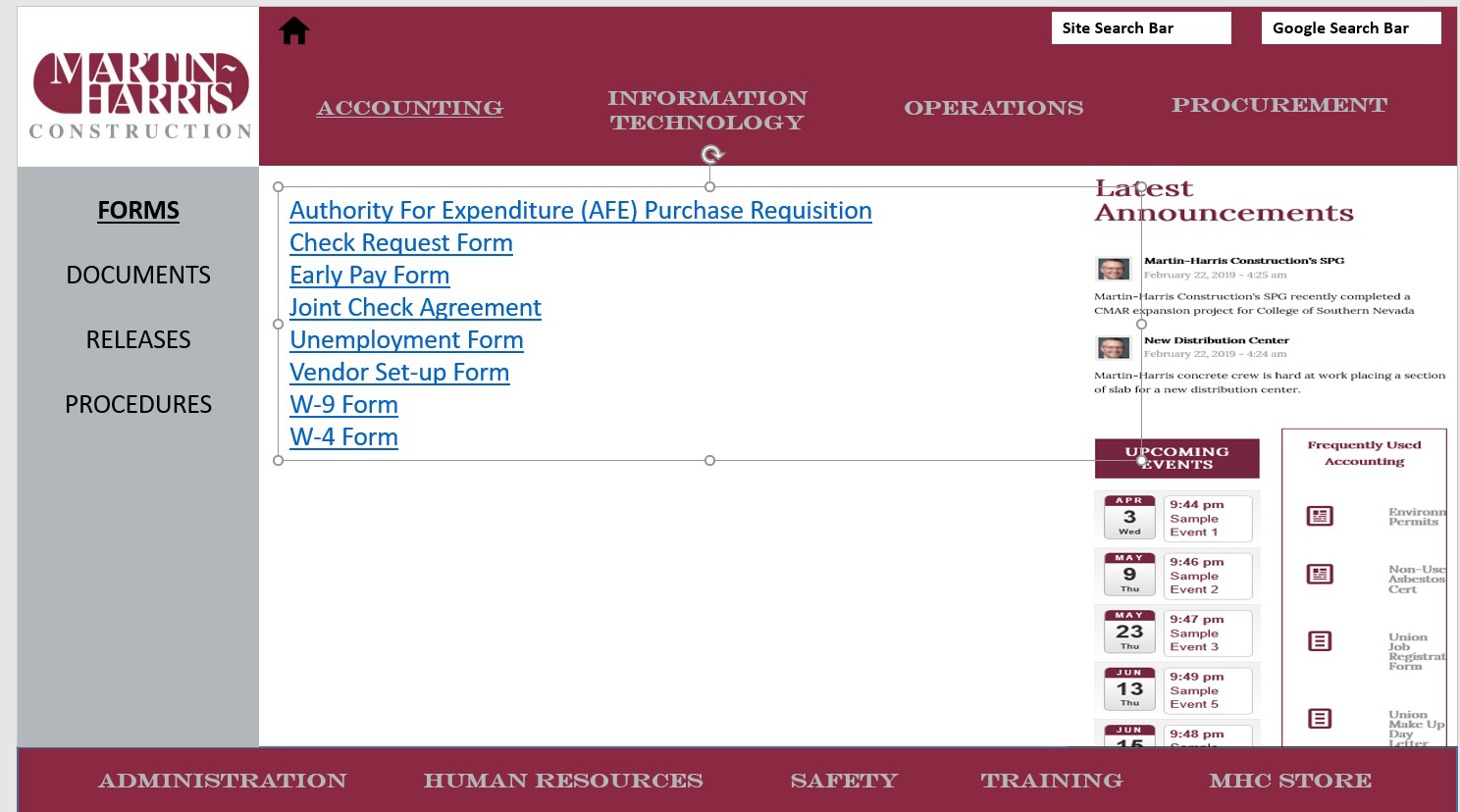
thank you for your assistance !
-
This reply was modified 7 years ago by
webworm72.
Hi Mike thanks !!!
With that last bit of code and some more tweaking of the page’s cell padding I am getting closer to the mock up , see pages below in private section.
My question is how to apply that to the other 8 pages of the website. Accounting, Information Technology, Human Resources etc.
Do I simply add the code below 8 more times with a different page ID , I know that will work as I did it for the “Special Projects ” page to test , see below in private section.
Or… is there is a cleaner way of doing it. perhaps adding all the Page id’s to just the one snippet of code ?Below is what we have so far to make the desired layout/styling of the tab section for the operations page.
====================================================================================
.sidebar_tab_left .tab_content,.sidebar_tab_left .tab_content,.sidebar_tab_left .tab,.tabcontainer .active_tab_content {
box-shadow: 0px 0px 0px 0px rgba(0, 0, 0, 0.2) !important;
left: 0;
padding: 0px 0 0 10px;
border-color: #b2b7bb
!important;
}
.main_color div .sidebar_active_tab, div .main_color .tabcontainer .active_tab_content, div .main_color .tabcontainer .active_tab {
color: #000000;
background-color: #ffffff
!important;
border-color: #ffffff !important;
}
.tab_titles,.active_tab {
background-color: #b2b7bb
!important;
}
.tab_inner_content p,.tab_inner_content a {
font-size: 14px !important;
}
#top.page-id-2438 .main_color .tabcontainer .tab {
color: #fff !important;
font-size: 16px;
line-height: 20px;
padding-top: 10px;
padding-bottom: 05px;
}
#top.page-id-2438 .main_color .tabcontainer .tab.active_tab {
color: #000 !important;
background-color: #b2b7bb !important;
border-color: #b2b7bb !important;
}
#av-layout-grid-1 > div.flex_cell.no_margin.av_two_third.avia-builder-el-1.el_before_av_cell_one_third.avia-builder-el-first {
padding-bottom: 0px !important;
}
==========================================================================-
This reply was modified 7 years ago by
webworm72.
thanks Nikko !
that allowed me to center the menus items and it got rid of the border.at the bottom !
I found another bit of code to get the logo all the way to the left. See live page in private section to see progress.Now I just need to be able to adjust the padding/spacing of the menu times.
*I need to be able to adjust the top and bottom padding of teh menu items
* need to be able to adjust the padding/spacing horizontally between the menu items to space them out more , so as to more closely resemble
the mock up below.
thank you for all your help !
-
This reply was modified 7 years ago by
webworm72.
This reply has been marked as private.April 1, 2019 at 9:53 am in reply to: How to modify settings for " Full Width Submenu" of Avia Layout builder #1085387This reply has been marked as private.This reply has been marked as private.Thanks Again Mike … Appreciate all your help so much… !
See where I am below after adding the last bit of code. I was able to increase the font size for the tab content and changed the background color of the tabs to grey.
However I still need to make the following changes to get closer to the client mock up above.
*the ability to change the the font size and color of the tab titles
*make the active tab background grey as well
*no white border between tabs
*and yes if possible push the grey area of the tab container all the way to the footer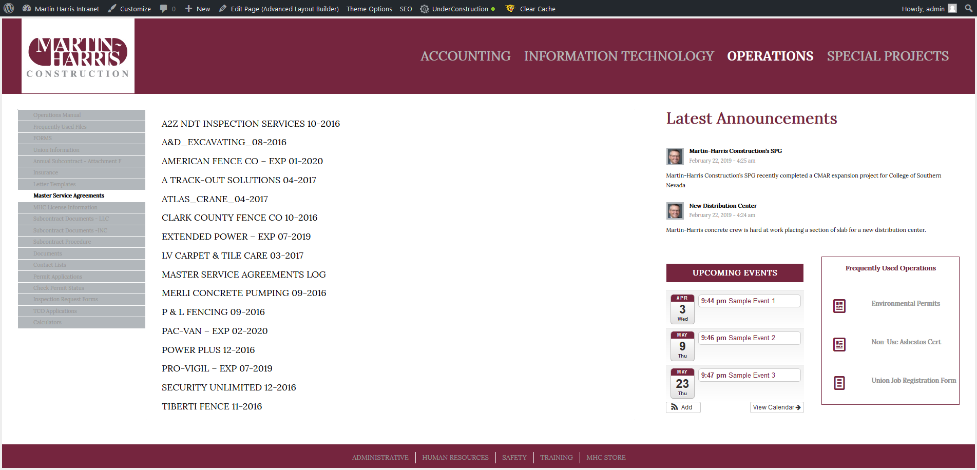
Excellent thanks Mike ! See screen shot of where I am now below.
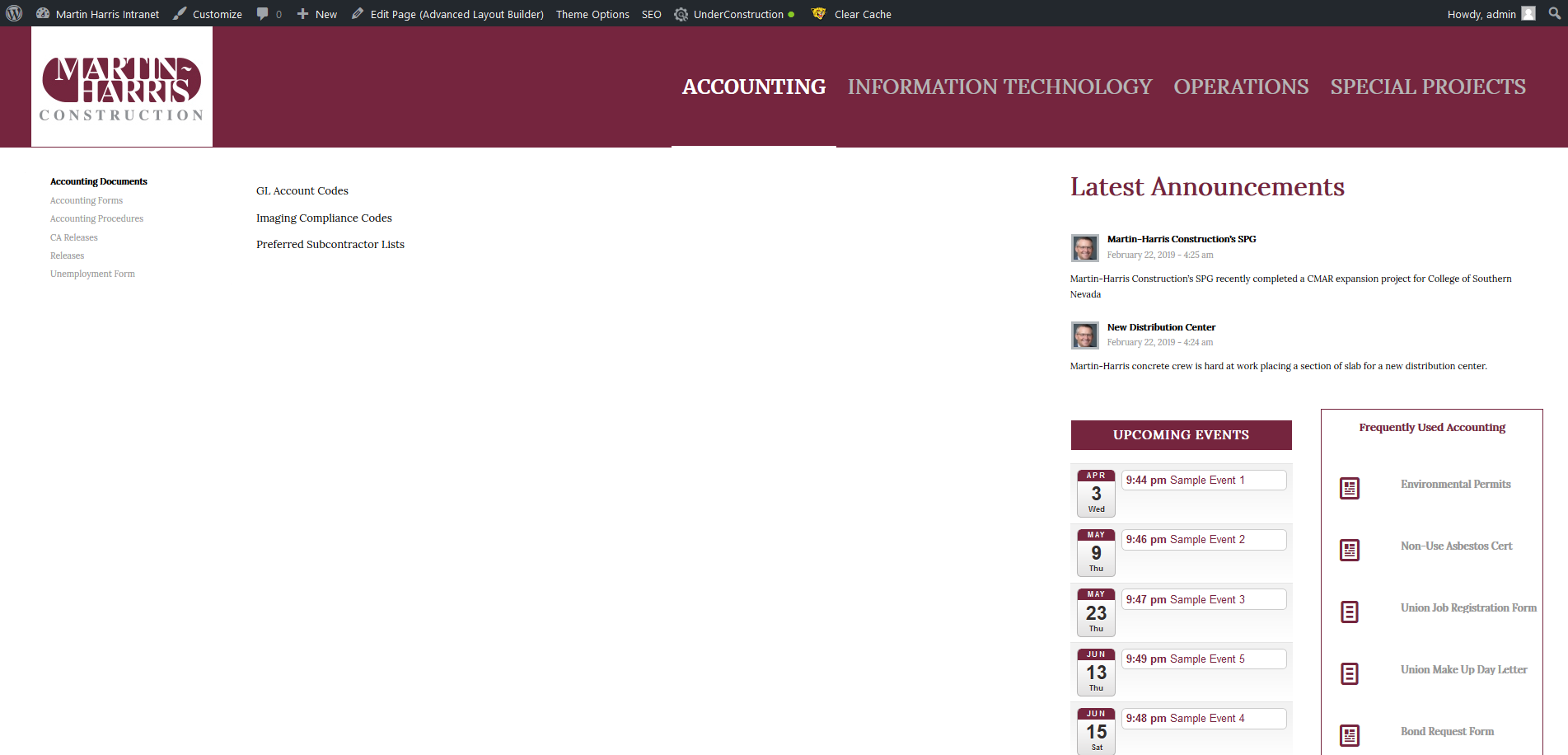
I changed the code a little to get rid of the boxes which I don’t need really. I just need to make the background behind the tabs grey
and I also need to make the text size larger and I will be good, see client mock up below to see what I am shooting for.
thanks Mike , Yes I am using the advanced layout builder , yes I am using the tab editor, yes I have chosen “Display Tabs On Left ”
and this is what it looks like live on my site , see below
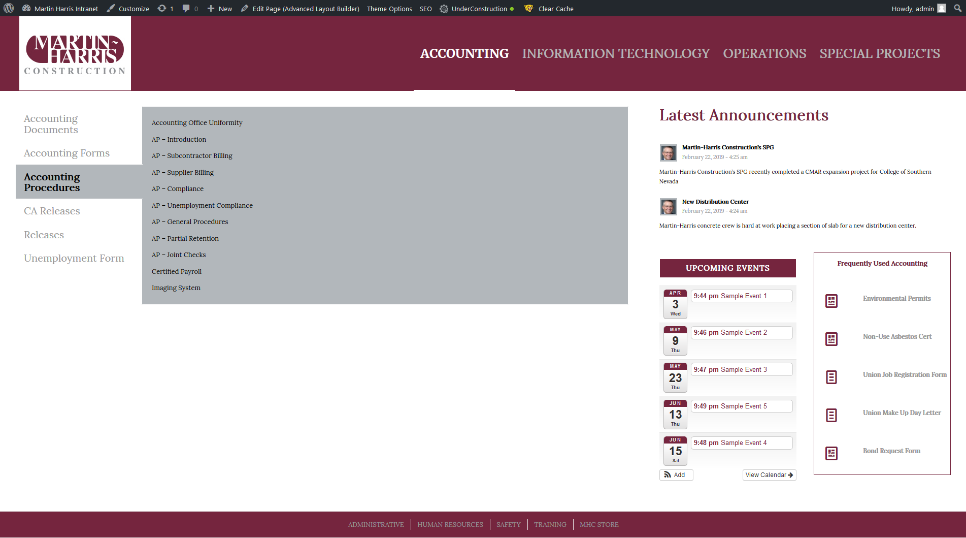
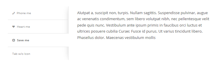
My question is how do I change the style of the tabs, to match what you guys have on your demo page see below
 March 2, 2019 at 2:37 am in reply to: Bug with Active Sate menu items using left side bar menu Enfold theme 4.5.4 #1073472
please close this ticket I figured it out
March 2, 2019 at 2:37 am in reply to: Problem with Active Sate menu items using left side bar menu Enfold theme 4.5.4 #1073471please close this ticket I figured it out
March 2, 2019 at 1:07 am in reply to: Bug with Active Sate menu items using left side bar menu Enfold theme 4.5.4 #1073458This reply has been marked as private.January 25, 2019 at 9:26 pm in reply to: Burger Icon / Mobile menu not working on tablet after is enabled in settings #1058924perfect thanks Victoria !
December 10, 2018 at 10:03 pm in reply to: Tags not formatting correctly on single page posts #1043388That did it thanks Nikko !
November 22, 2018 at 10:35 am in reply to: How to remove underline from H2 titles when using hyperlinks #1036421I found the code on the forum here that takes care of this , if anyone else is interested
#top .custom-color-heading a, #top .custom-color-heading a:hover{
text-decoration:none!important;
}November 21, 2018 at 12:40 am in reply to: Modify Post titles to use two lines with hard return #1035875Thanks Mike !
November 20, 2018 at 6:11 am in reply to: Modify Read More Buttoms for posts and category page #1035428never mind I dug through the forum and found the right code
.main_color .more-link {
color: red !important;
font-size: 20px;
}
.main_color .more-link {
color: white !important;
background: #66bc29 !important;
} -
This reply was modified 6 years, 12 months ago by
-
AuthorPosts
