Forum Replies Created
-
AuthorPosts
-
Hi, Ismaël
Thanks for your answer.
Sorry but it seems to make no difference. This is what I have I write in the Quick CSS box;
/* Add your Mobile Styles here */
@media only screen and (max-width: 480px) {
.header_color .header_bg {
background-size: 100% 100%;
}
}.responsive #top #wrap_all .container {
width: 90%;
max-width: 90%;
}
}
Any mistake somewhere ?Hi,
Our intention is just to move the burger icon slightly to the right (a few pixels) when the home page is displayed vertically on mobile phones.
A CSS code line should do the trick, could you help us in that respect?
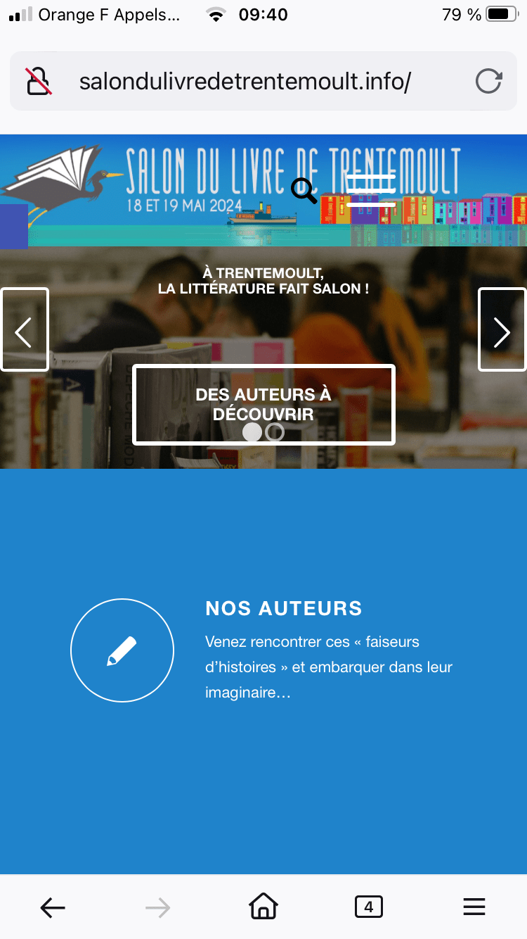
ThanksTo complete my mail, please see what the problem is: http://salondulivredetrentemoult.info/wp-content/uploads/2024/03/Mobile-display-–-Toggled-menu.png
Hi, Ismael
Thanks for your reply and advice.
I’ll open a new thread for the display of the toggled menu.
All the bestHi, Ismaël
We’re almost done… Two last questions:
– what would be the right font size for a correct vertical display of the title and the legend in the slider?
– on the vertical display on mobiles, the toggle menu hides part of the header. Could you tell me how I could reposition it a bit further to the right side of the mobile screen? If there is no specific setting in the theme for that, could you send me the appropriate code?
Thanks, looking forward to reading youThanks for your answer, Ismaël.
In Styling – General, I cannot find the Font Sizes toggle you are mentionning, only Fonts and Typography but there’s no way I can change the size there. Is there another way, some coding maybe? Could you send me the appropriate code for the title and the small code just below? What should be the appropriate size for these 2 items?
Thanks for your helpHi, Ismael
I still cannot solve this problem: Horizontal display of the slider is OK, vertical display > no resizing.
We are already using Full width Easy Slider. What is the proper setting for correct mobile display in all situations?
How can I make sure the images are properly resized for mobile display, how can I dot that?
Thanks for your helpHi, Ismael
Thanks for your quick answer, I appreciate it!The header issue is now solved. The only problem left is the slider: when displayed vertically on mobiles, the slider doesn’t shrink and adapt itself to the narrower surface. Anything we can do about that?
Thanks for your help, have a nice day
-
AuthorPosts