Forum Replies Created
-
AuthorPosts
-
This reply has been marked as private.
Hello,
I need to add this code to the “request an appointment” button on this page built with the Avia Layout Builder<button onclick=”return gtag_report_conversion(‘https://mikes-mechanical.com/contact-us’)”>Submit</button>.
Can you help?
Thanks,
LFHi Rikard,
Yes, I think I took it down before you had a chance to get on there. No worries on the dummy content. I’ll give it a try when it’s done.
Thanks,
LFThis reply has been marked as private.Hi Rikard,
I wasn’t able to add one to the header.
This code added widgets to below the menu:
/* ADD HEADER */
add_action( ‘ava_after_main_menu’, ‘enfold_customization_header_widget_area’ );
function enfold_customization_header_widget_area() {
dynamic_sidebar( ‘header’ );
dynamic_sidebar( ‘meta-header’ );
}
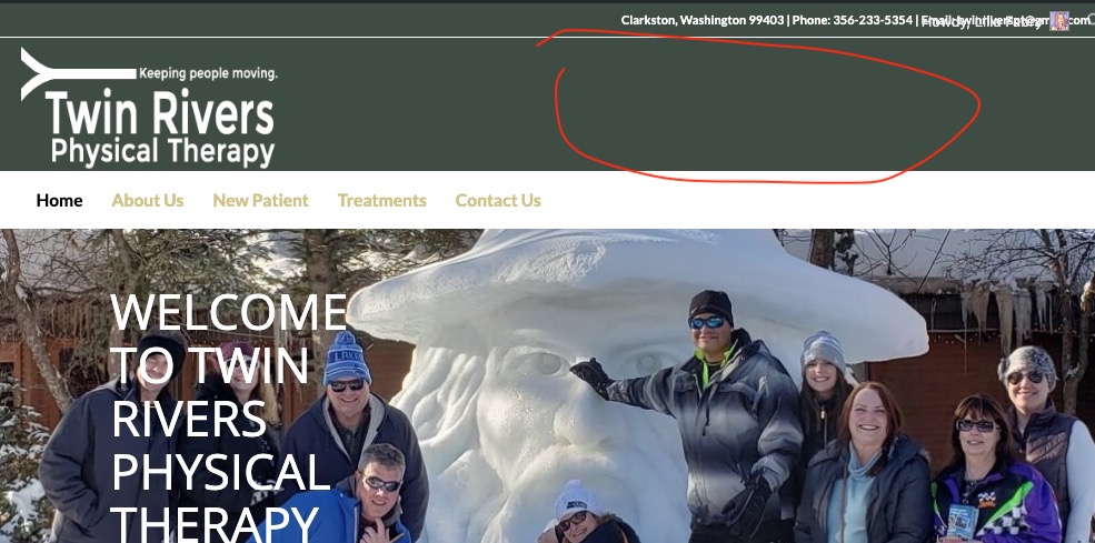
I’d like to add one here: https://twinriverspt.net/
as marked on the screengrab.

Thanks,
LFHi Mike,
Thanks. That code did align most things correctly. However, items are still misaligned on http://troyins.com/health
However, the code I removed
@media screen and (max-width: 750px){header {margin-bottom: -10px;}}
left me with a white space between the header and content on mobile.
Also, the logo is still missing from all desktop pages.
Please help,
LFHi Mike,
I tried the code given and things are still the same. The text still gets cut off and the items are not aligned. As seen here:
https://troyins.com/wp-content/uploads/2019/04/IMG_0380.jpg
and here:
https://troyins.com/wp-content/uploads/2019/04/IMG_0379.jpgAlso, I have this image as the non-sticky logo, and it isn’t showing: https://troyins.com/wp-content/uploads/2019/04/Troy-logo-trans-1.png
I have tried on several devices and browsers. Please help ASAP,
LFHi Rikard,
I’m also seeing image alignment issues on several pages on the mobile site. If you go to https://troyins.com/personal/ you will see the images below “CHECK WITH US FOR ALL YOUR INSURANCE NEEDS” are aligned to the center.
If you go to https://troyins.com/commercial/ you will see the images below “WE SPECIALIZE IN:” are aligned to the right. They are aligned to the center in the page builder and I can see that no other modification has been made.
Thanks,
LF
p.s. I’m also including login creds.Hi Rikard,
thanks for the code, but the issue still remains. Can you help? Is that code for all pages? The item appears on more than one.
Thanks,
LFHi Victoria,
I haven’t heard back from you lately and am still having issues. I’ve added this CSS
@media screen and (max-width: 750px) {.container {
margin-left: 0px !important;}}@media screen and (max-width: 750px) {div#main {
margin-right: -20% !important}}but my mobile content is showing as bunched on the left. The same for the desktop. I can’t figure out how to move the content in without getting the unwanted white space back.
Please help ASAP,
LFHi Victoria,
That worked for the desktop version, thanks. However, the mobile version is still showing the white border.
Thanks,
LFHi Victoria,
Yes, I was able to get the layout builder working again. However, now the site looks different and wrong now. It has a white bar around the whole site and some of the text looks out of line. Please fix this. I saved my old Enfold options and uploaded them but it did not help.
Please fix ASAP,
LFHello,
Has there been any progress on this issue?
Thanks,
LFHello,
I’ve done as asked and now the site looks different and wrong now. It has a white bar around the whole site and some of the text looks out of line. Please fix this. I saved my old Enfold options and uploaded them but it did not help.
Please fix ASAP,
LFThis reply has been marked as private. -
AuthorPosts
