Forum Replies Created
-
AuthorPosts
-
Hi Rikard
Thanks – I have reinstalled theme and child theme manually. Site crashed but eventually got it all back. Always seems to crash when I update Enfold – not sure why.
Anyway – looks to be good – thanks.
Karen
Thanks – all good to close
I have worked it out I think
.page-id-15358 .avia-slideshow-1 h2 {
}Thanks
I have more than one slideshow on that page. I only want o change the title of the first one. I can see that they are named – first one shows as
<div class=”avia-slide-wrap” data-rel=”slideshow-1″>
I don’t know how to assign the css to a data-rel element if you can?
Karenthanks – page is http://www.jdaseymourphotography.com.au/1267835-2/ I want to change the ‘JASPER DA SEYMOUR’ title font.
KarenHi Andy
Fantastic – worked! Had to use in conjunction with below and adjusted the percentages
.container {
padding-left: 0!important;
padding-right: 0!important;
margin-left: 0!important;
margin-right: 0!important;
}Looks good.
Thanks again.
Hi
I am still having trouble with mobile view. I have removed the left and right padding and left and right margin from .container which has made the desktop view nicer as the section images go right to the edge but the mobile now shows the images hard against the left (which is good) but white space to the right.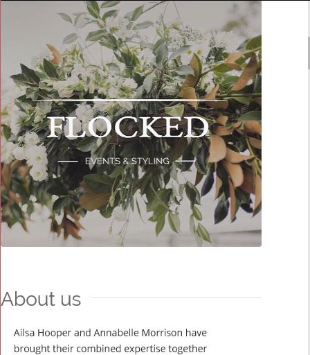
I can’t work out how to get the images to have no white space on the mobile version?
Any help would be appreciated
Karen
Hi
Got classes working. Having another look at borders. WIll get back to you if need more assistance. Thanks
Hi Yigit
I am confused. The original CSS you gave me wasn’t in the styling sheet – I took it out when I couldn’t get it to work. So I am not sure what the mistake was in the styling that you fixed?
This is what you gave me-
@media only screen and (max-width: 480px) {
.flex_cell.custom-cell {
padding-left: 0!important;
padding-right: 0!important;
}} – this isn’t there anywhere? There is no change – the padding is still there on the mobile.So I started trying the other option you sent through with the aim of hiding the image on the mobile but the having a colour section with the full width image which only shows on mobile. This is not the preferred option as it means I have to put every image in twice.
But I have started with that option to hide the image on the mobile version. I have added CSS
@media only screen and (max-width: 500px) {
#only-desktop { display: none !important; }
}I have added the custom class ‘only-desktop’ to the section that holds the pear image on the front page. I have cleared the cache and minified CSS . Image still there. I tried .only-desktop instead of #only-desktop. no change.
I cannot get the custom class option on the sections to work at all.
I would prefer to go back to the first option of removing the padding. Can you look at that for me please?
Appreciate your help.
KarenI did take the CSS out when I couldn’t get it to work
Thank you
Hi Yigit
Can’t get it to work. I have the custom field set up. I have the css in the child style sheet. I made mine .flex-cell.flocked-custom-cell
The name that goes in the custom field. Can you confirm which one I put inflex-cell.flocked-custom-cell
flocked-custom-cell
flex-cellConfirming no dot at the start when I add to field in the element..
I have tried all combinations above and tried adding to the layout image and to the actual image and can’t get a change.
Also tried making the custom CSS display:none; to see if was the padding css that wasn’t working but image still displays in mobile so it doesn’t seem to be picking up the custom CSS.
Karen
-
This reply was modified 9 years, 7 months ago by
kwebdesi.
Hi Yigit
Thanks for the reply. It’s not a border as such (sorry if I didn’t explain well). Any single image has white space on the left and right – doesn’t go all the way to the edge of the screen like the slider and the masonry gallery does. Image shows the white space to left and right of the image of the pear on the table.
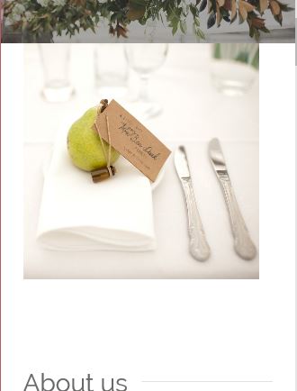
Whereas masonry gallery goes all the way to the edge
Thanks
-
This reply was modified 9 years, 7 months ago by
Perfect – thanks so much. All good.
Karen -
This reply was modified 9 years, 7 months ago by
-
AuthorPosts