Hi Ismael
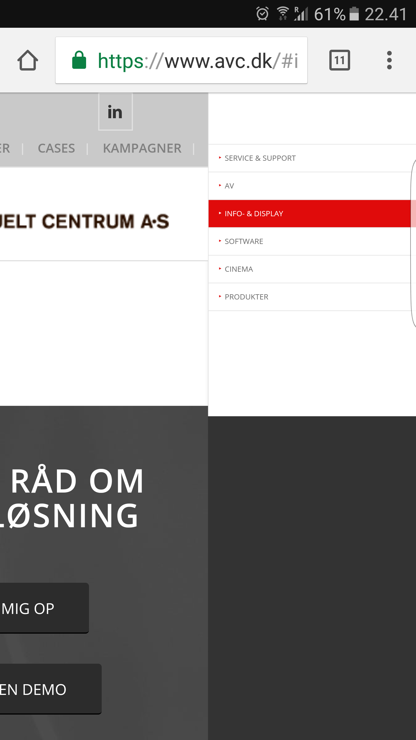
1. There seems to be huge issues when you use anchored menus in mobile wiev but it is only visible on phone browsers (Samsung/Chrome tested). The problem is that the menu does not close but nests on the right of the normal screen. I have attached a screenshot. I have removed all the changes I did in my css and it is still a problem. I have trawvled the forums and can see that this has been an issue before…? I have updated to the latest version.

3. Did you change the code in this thread? I still have the same issue when testing it.
Best Kristian
Hi again
fixed number 1 reading this post:https://kriesi.at/support/topic/how-to-fix-spacing-on-mobile-sticky-menuheader/
/Kristian
Hi Ismael
Thank you for your help.
1. can you take a look on http://www.avc.dk in mobile and try scrolling. The image is hidden under the logo.
2. Id rather have the orange markers active instead of zooming if possible.
3. The script works but show the menus twice?
Best Kristian
