Hi,
no thanks the problem is solved. You can close this ticket.
Best regards,
Gerald
Hi Victoria,
thank you that almost worked. I had to add “!important;” at the end.
For others with this problem. This is the working code:
@media only screen and (max-width: 767px) {
    .responsive #top .container .av-content-small,
     .responsive #top #wrap_all .flex_column,
     .responsive #top #wrap_all .av-flex-cells .no_margin,
     .responsive .content {
            margin-bottom: 0px!important;
     }
     .responsive .content {
         padding-bottom: 0px!important;
     }
}
Thanks that solved my first problem.
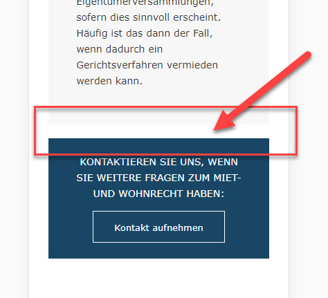
But the bigger one is the second: on this site https://www.heinisch-weber.at/schwerpunkte/ I don’t want any space between the elements in mobile view like it is in desktop view:

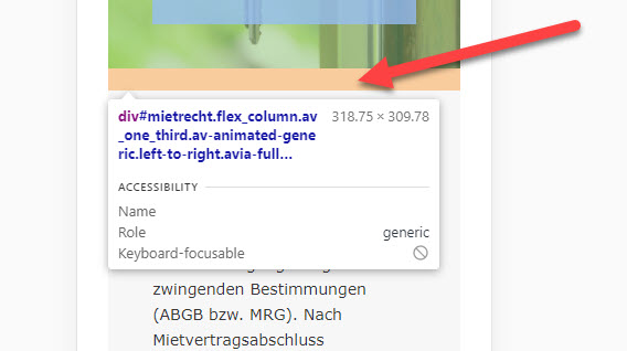
It seems there is also a bottom margin? Why is there no option in the element for it?

and here:

How can I get rid of this space in mobile view? Thank you very much.
