Forum Replies Created
-
AuthorPosts
-
Hmm…must be an issue with my system. :(
I’ll revert back to an older version of Enfold for the time being.Thanks for your help and I look forward to the next Enfold update.
Yep, sure:

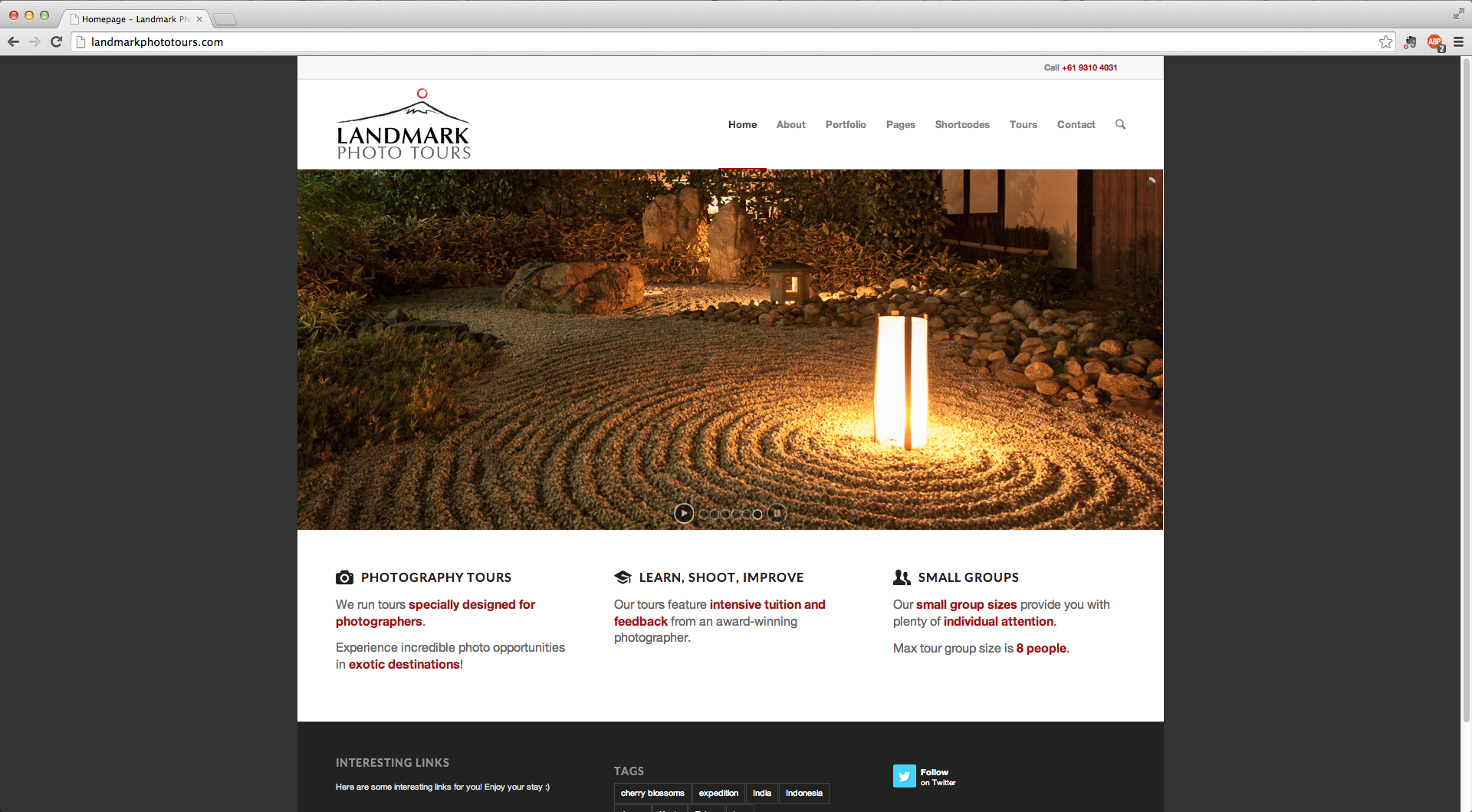
I’m using the latest version of Chrome on Mac OSX Mavericks to view this. The same 1 pixel gap also appears in your demo.
July 13, 2014 at 9:05 am in reply to: Enfold – Lightbox css, bringing back the white border around images #290748I’m in agreement with Monsoon. This new lightbox effect might be commonplace among a lot of themes/websites but it doesn’t feel like it fits with the Enfold style.
It would be nice if there were options to customise the framing of the lightbox.
I’d also be interested in any CSS solutions to customise the lightbox.
Hi Ismael,
Unfortunately this doesn’t work for me. BTW, I use Chrome as my main browser.
In Safari, everything appears OK, even without the additional CSS.
How about the masonry gallery (using the Jetpack plugin) which doesn’t span the full width of the content area?
I’ve also noticed in the online live demo of Enfold that there is odd spacing in the Masonry Portfolio and the Mixed Full Width Portfolio layouts. Images aren’t aligned perfectly and are off by one or two pixels or have 2 pixel spacing rather than 1 pixel spacing.
I don’t remember these issues in older versions of Enfold. The one I was using before updating was v2.4.5.
I think Kriesi needs to release an update soon to solve these issues. I will be reverting back to a previous version if there’s no simple fix for the 1 pixel gap issue.
-
AuthorPosts
