Forum Replies Created
-
AuthorPosts
-
Perfect, thank you! That is a great feature!
Hi
I have another question on this topic.
Ho can I make the Gallery inside the Tab Section full width on the page? I tried some solutions I found on the forum but none of them worked for me.
Thanks
Perfect, thank you!
Hi
Looks good – all options are visible.
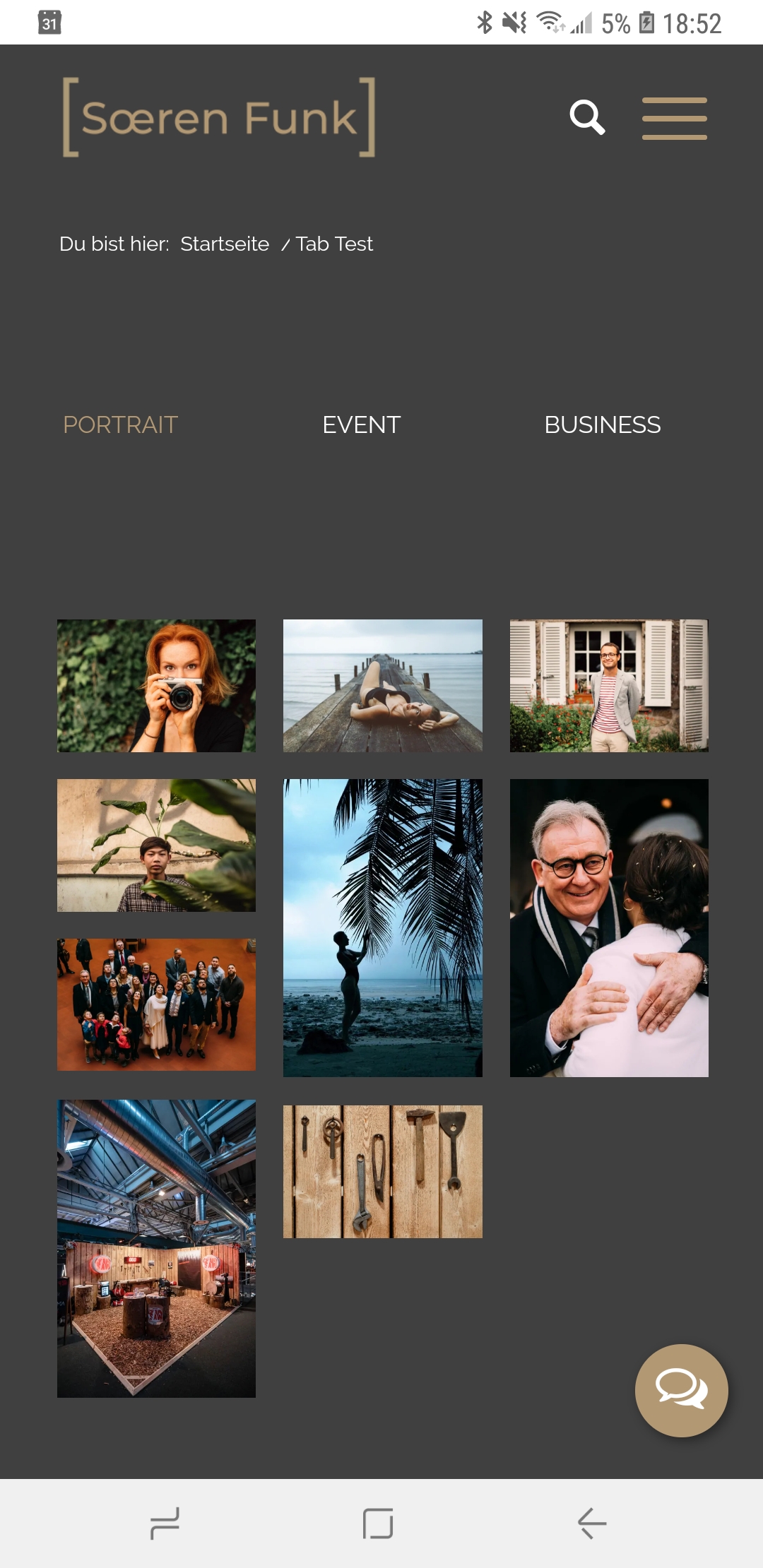
But the entire thing still moves to the left on mobile so that the options on the left side get pushed out of the frame. Is there a solution for that?
Thank you very much,
Sören
I do have one more question.
On the mobile version I see 3 of 6 options. Then I can click through to see the other options. How can I display all 6 options at the same time? – just like with the portfolio grids?

Thank you!
Sören
Never mind, I found the solution to vertical alignment.
Thank you!
Hi
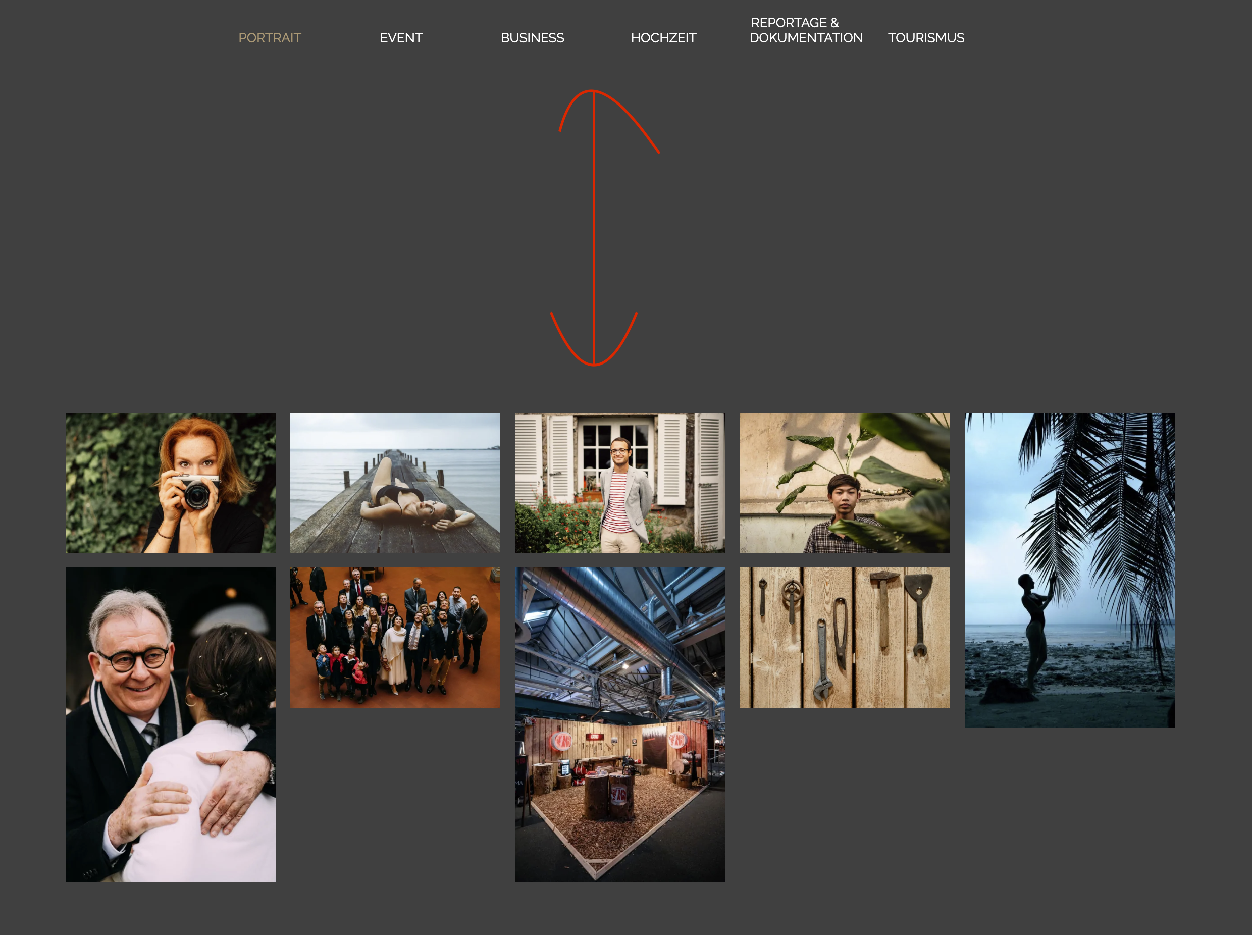
Thats almost perfect. But there is a big gap between the pictures and the selection. How can I close the gap?

Thank you,
Sören
Hi Rikard
Sorry for the late reply, we had a baby in the meantime. =)
Here is the example page where I also took the screenshots: https://www.soerenfunk.com/tab-test/
As described, it should look like in the 500px screenshot.
Thanks, Sören
Hi
The problem solved itself somehow…
I can remember that I changed the editor style in the menu somewhere.
Strage.Thank you
Hi
You can find an example here: https://www.soerenfunk.com/fotografie/portfolio/
On the entire Website the box with the copy should be under the picture, not on top of the picture.
Thank you
-
AuthorPosts
