Forum Replies Created
-
AuthorPosts
-
Hey Jordan,
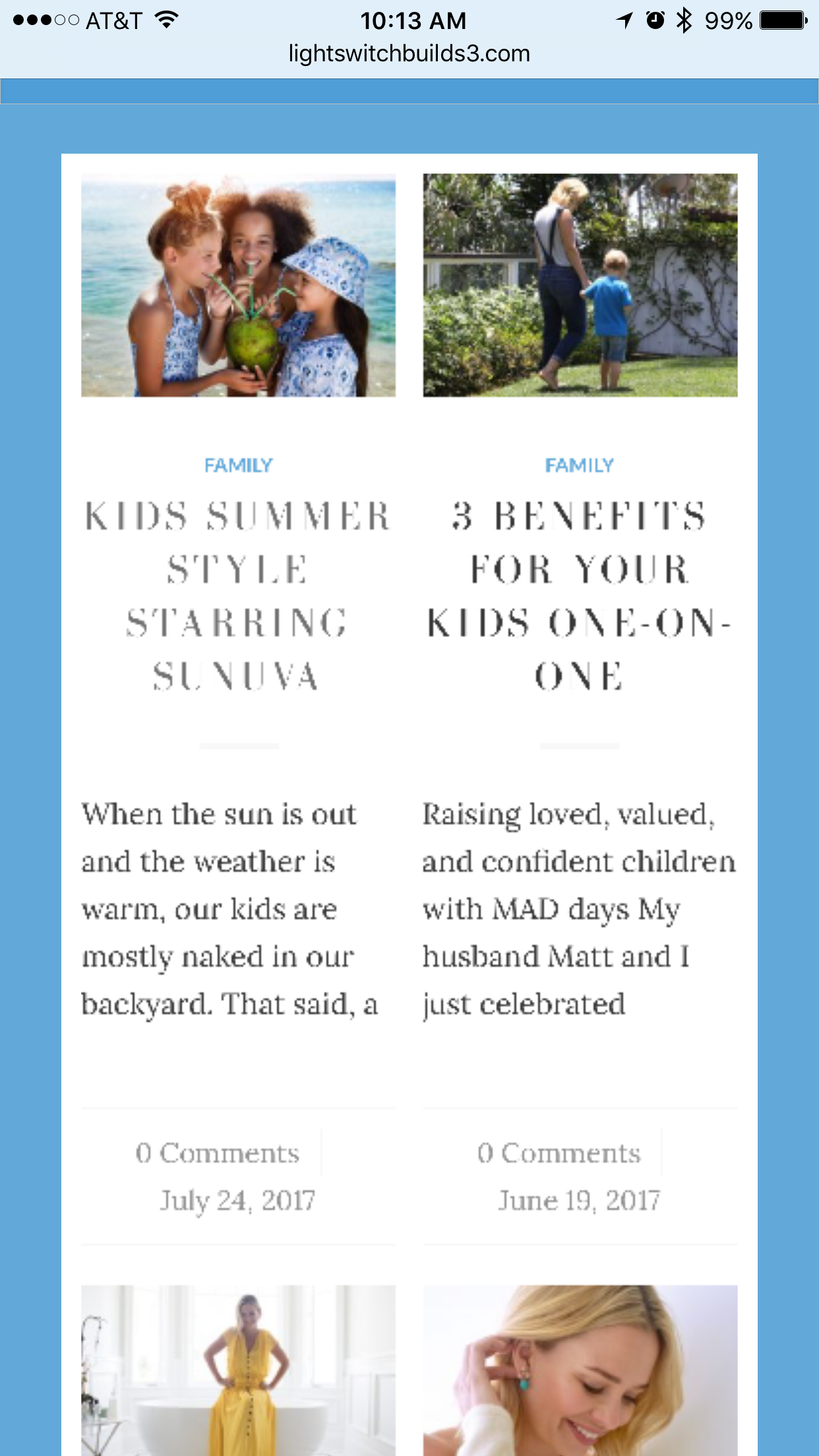
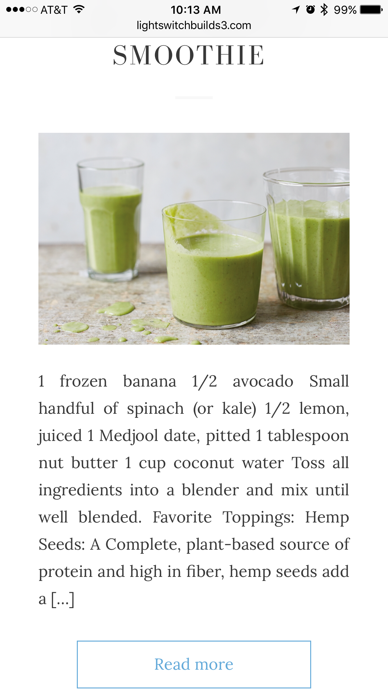
Here are two images showing what I am referring to.


The first shows the top portion being lossless, followed by the rest of the body of the site appearing perfectly fine.Thank you in advance
Ismael,
Thank you for the help. Is there a way to add a … to the cut off text so people know that it is eluding to reading more in the actual post? Is there also a way to assure that it won’t cut a word off mid spelling? That seems a bit odd
Thank you in advance
Hi Jordan,
Firstly – thank you. Secondly, While the size did adjust – it is sitting a bit awkward on the mobile version. Is there a way to not only make it just slightly bigger, but to center it in that space? – I am not suggesting centering it on mobile, I’m speaking centering it vertically.
Thank you in advance
Hi Sarah
Thank you as this solves my issue. Please mark topic as so
Hi Sarah,
If you go to the site I linked in my posting, you will see on mobile that the main sidebar is not centered. I would like it to be centered. Does that require a screen shot?
Thank you
Hi Jordan please see in private, again, thank you in advance
Responding here as a solution has not been supplied – I am simply looking to shorten the “blog preview”
Thank you in advance
Hello,
It is not working for me – as stated – I attempted both ways with zero results.
Additional help here would be greatly appreciated
Jordan,
This is the original code
.logo {height: 68px!important; max-height: 68px!important; width: 750px!important;}This is the code I had been instructed to include for the mobile `@media screen and (min-device-width: 1024px) {
.logo {height: 68px!important; max-height: 68px!important; width: 750px!important;}
}`Thank you in advance
Jordan,
This has been solved, can we mark as so?
Thank you
Jordan,
I have attempted manipulating the current percentages and can not find a sweet spot as when I make said adjustments it is easily discombobulated and the blogs get misplaced on their line as I would like them to remain in one row.
Please advise and thank you in advance
Hi Jordan,
Please see in private
Thank you in advance
Hi Jordan!
Hope all is well. That black is not part of the image itself.
Hi Victoria,
Access below
Thank you in advance
Hi John
For instance, in the top 4 featured blogs (not all posts have been filled in, but you can see there are two written out) – I would like to shorten the preview to potentially 100 characters max. Just the preview for the click through of the entire read.
Please let me know if that helps
Thank you
Hi Yigit,
That does work, however, the client would like to remove a bit more of the negative space between posts. Doable?
Thank you in advance!
Hi Sarah,
Thank you for your help. With the addition of !important , I was able to achieve the desired effect.
Please mark topic as solved.
Thank you!
Hi Victoria,
If you notice to the far right the image is a pixel or two off from lining up with the blue on the far right
Any ideas?
Thank you in advance
Hi Sarah,
I have done as instructed with zero results. The logo is still much too large on mobile
Hi Victoria,
I have done as instructed, both ways with zero results.
Hi Sarah
Thank you for this – curious, what code would I place in the YOUR CODE HERE to ensure the mobile logo responds normally? If you can – check out how the site currently appears on mobile. Perhaps that may help with figuring out the correct solution.
Thank you in advance
I followed the guide – attempting to use both codes (not simultaneously) – neither have worked.
Can someone take a look into this? I tried a few different widget options and nothing is showing up.
Thank you in advance
Hi Jordan,
The author title being bigger is great, however it is now back in its original placement. Can we get it centered, and under the blog title?
Thank you!
Victoria,
Can we remove this thread? Answers are being provided in the other
Thank you
Jordan
Please mark as solved
Thank you!
Jordan,
You always pull through. Placement is correct, however, can we get that centered? And perhaps 2x as big?
Thank you in advance as always
Hi Mike,
This has been solved, thank you for your help!
Victoria..
“Big enough at this point” is an opinion – I am looking for a solution to the issue I have supplied.
Please respond to my request
Thank you
Hi John
The author name is now appearing below the image , not the blog title.
Solution?
Guys
I started this thread 2 weeks ago – I desperately need a solution here.
Please and thank you
-
AuthorPosts
