Forum Replies Created
-
AuthorPosts
-
Hi @Ismael, hi @Guenni007,
thank you so much for your quick and helpful replies!
@Ismael – thanks for pointing me to the z-index option and the clear screenshot, that made it very easy to fix.
@Guenni007 – thanks as well for the additional hint regarding the background color (that probably would have been my next question!).
I’ve already adjusted both settings — works perfectly now!
Much appreciated!
Best,
DianaHi Ismael,
thank you for your suggestion. Unfortunately, I cannot use this solution, because any changes to the parent theme’s functions.php would be overwritten with the next update. After completion, the site will be handed over to the client (THI), who are only end users and cannot re-apply such modifications.
So the only solution will now be to simply remove the anchor links to the moving sections/boxes.
Nevertheless, thank you very much for providing the solution.
Best regards,
DianaDear Ismael,
Thank you very much for your helpful response and for providing the PHP snippet to adjust the heading structure in the Timeline element.
After reviewing this internally, the client has decided not to implement further theme-based customizations via the functions.php file at this stage. As we’re working across several Enfold-based websites, they hope this issue will be resolved in a future theme update instead.
We’ve documented the structural limitation in our accessibility report accordingly.
Thanks again for your support and your assistance on this matter!Best regards,
DianaJuly 16, 2025 at 8:57 pm in reply to: Accessibility Issue with Scroll-to-Top Button (ARIA-hidden focusable element) #1486898Hi Mike,
sorry for the delay – the past few weeks I’ve been fully occupied making five Enfold-based websites WCAG-compliant.
Thanks again for your suggestion regarding the Scroll-to-Top button.
After reviewing the situation, my clients decided not to implement additional plugins or custom code to fix this specific theme-generated issue. Given the already significant effort and cost invested in accessibility improvements, this workaround is currently not seen as proportionate.
The issue has been transparently documented in the accessibility statements, and we hope it will be addressed in a future Enfold update.
Also, thanks for your tip regarding the alternative to the Header Footer Code Manager. I’ll definitely keep the WPCode plugin in mind for future projects …Thanks again for your support !
Best regards
DianaJune 29, 2025 at 4:42 pm in reply to: Accessibility Issue with Scroll-to-Top Button (ARIA-hidden focusable element) #1486109Dear Mike,
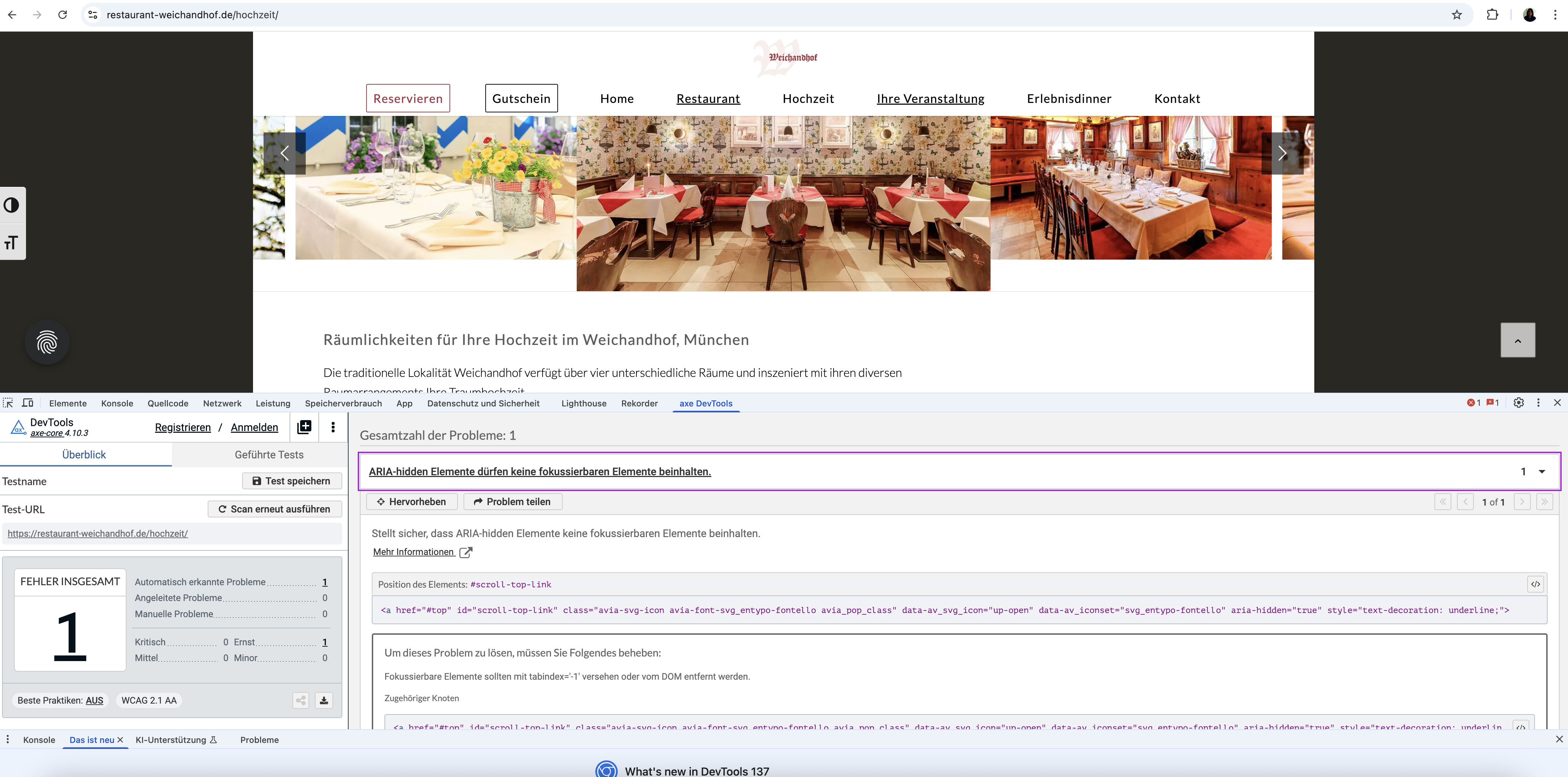
Thank you so much for your quick help and solution suggestion. I wanted to let you know that AXE is actually a free browser extension (available for Chrome) and very easy to install and use. I tested your code after clearing the cache and restarting everything, but unfortunately, AXE still reports the same error (see screenshot at https://restaurant-weichandhof.de/support/axe.png).
Also, this seems to be a global issue. I am currently working on making seven websites accessible, all built with Enfold, and this Scroll-to-Top-Button problem appears across all of them. It would be great to have a solution that I could apply universally or ideally have this fixed directly in the theme itself.
I would also prefer not to use an additional plugin (like WPCode) or keep this code in the functions.php file, as I would lose the changes with the next theme update. Could you perhaps suggest a solution that works via the existing Header Footer Code Manager plugin, or maybe there is another way to solve this via theme settings or CSS/JS?
Thank you so much again for your support!
Best regards,
DianaDear Ismael, dear Guenni007,
Thank you very much for your detailed support and for taking the time to look into the accessibility issue regarding the search icon …
We truly appreciate all the suggestions and the effort you put into providing possible solutions. Also thanks to Günter for stepping in and offering further technical advice.
In the end, the client decided to go with the simplest approach and asked me to remove the search icon entirely from the menu to avoid any further complications. So, with this solution, the issue is resolved from our side.Best regards,
DianaDear Ismael,
Thank you for your response. I appreciate your support.
However, I believe there may have been a misunderstanding regarding the issue. The problem is not with the icon itself or its aria-hidden attribute, but with the structure and function of the link that wraps the icon.
Accessibility tools such as WAVE still flag this element because: The link href=”?s=” does not lead to meaningful content.
It is interpreted as a broken or contextless link (“suspicious link text”), since it doesn’t visibly describe its purpose and doesn’t lead to a proper search page.If the only way to resolve this is by modifying core theme files, I’m afraid I won’t proceed with that, as any such changes would be lost with the next theme update.
Is there any other way?Best regards,
Diana-
This reply was modified 10 months ago by
DianaLoola73.
Dear Ismael,
Unfortunately, the issue still persists. Firstly, I can’t find the code you mentioned. Also, I tested the element again, and WAVE still shows multiple errors:The main issue is that “the link text is not understood” – for example:
.
This single issue seems to trigger additional errors such as “Suspicious link text” and “Redundant link”.
Best regards DianaJune 11, 2025 at 6:20 pm in reply to: Accessibility issue (Easy Slider): Missing accessible text for navigation links #1485336Hey Ismael
Amazing, this works perfectly!!! THANKS a lot.
Best regards, DianaHello Mike,
Thank you very much for your reply.
I have now tried all your options:
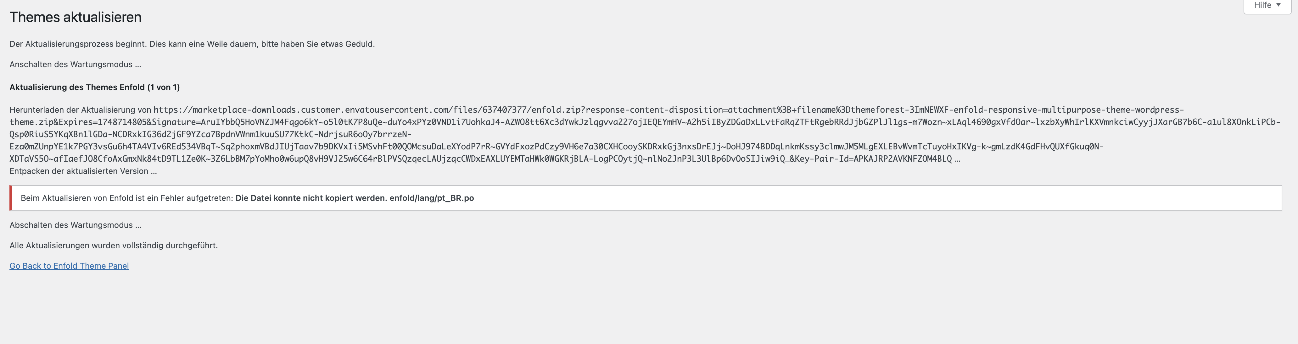
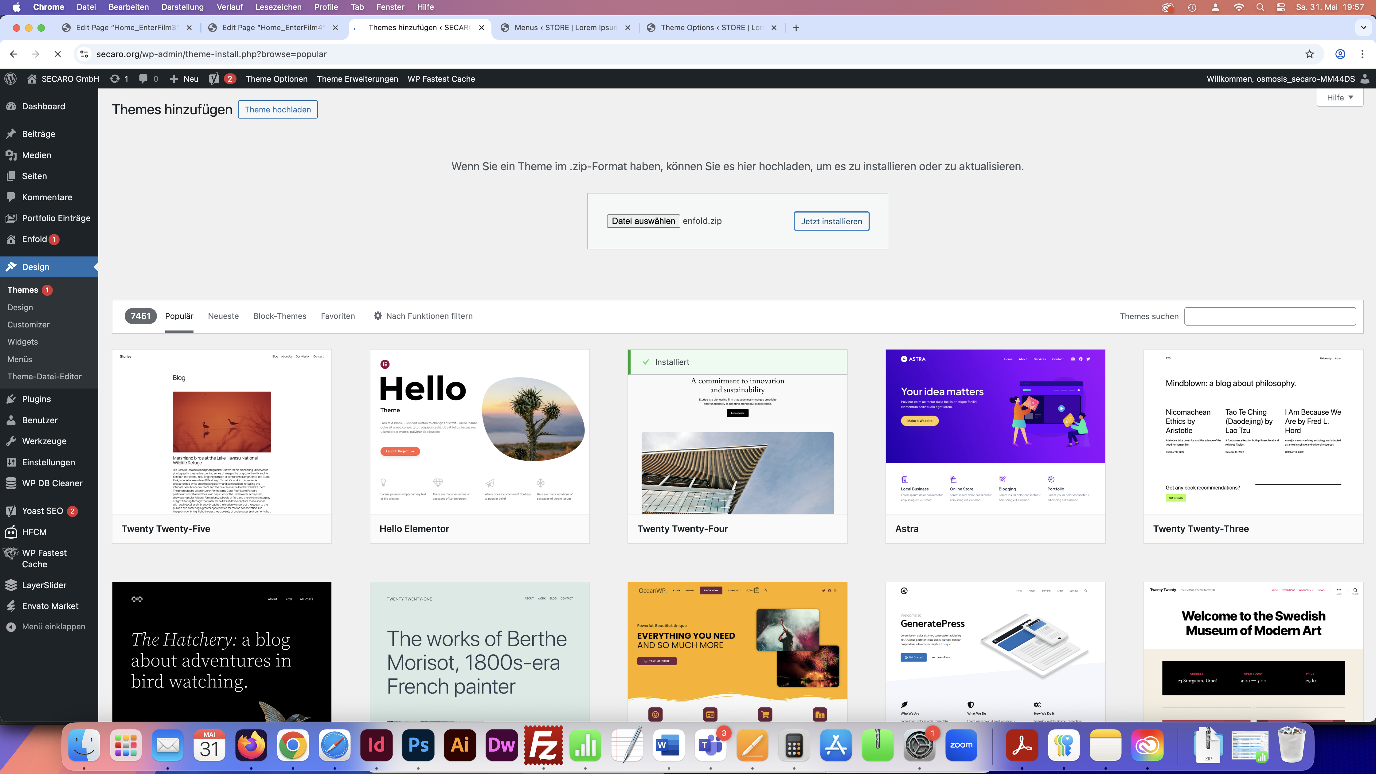
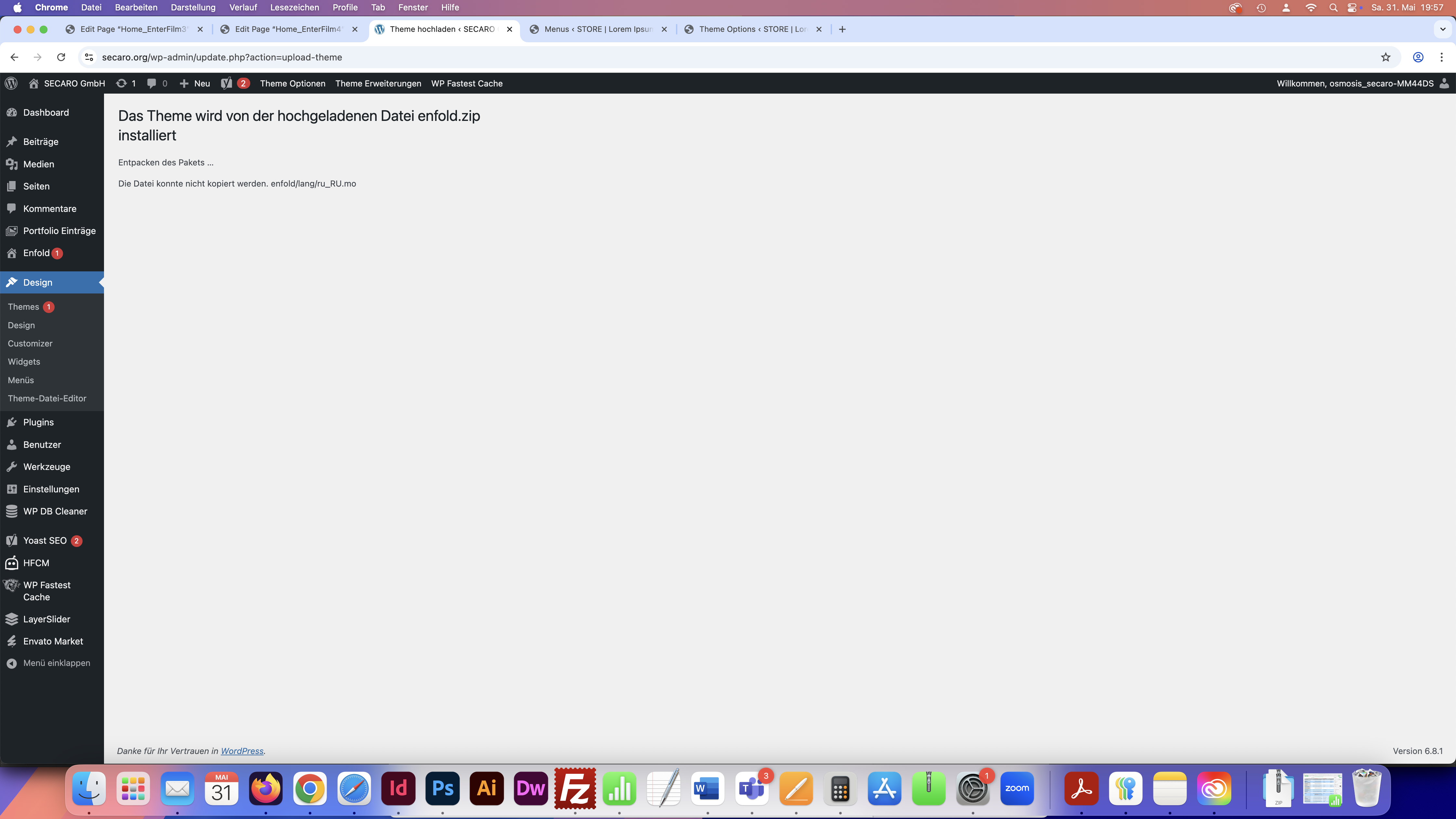
1. created a new token (I deleted the old one) and successfully linked it to ENfold. Unfortunately, however, I got an error message again during the update > see screenshot 1: https://osmosis.de/support/1.png
2. then downloaded the new Enfold theme from Themeforest and reinstalled it via Themes > see screenshot 2: https://osmosis.de/support/2.png > but after a short time an error message appears again: see screenshot 3: https://osmosis.de/support/3.pngWhat should I do now?
Best regards DianaDear Ismael
Thank you very much for your quick reply.
I have integrated the specified script into the function.php of the Enfold theme: however, it still does not work:
Neither when I enter the link directly, nor as a jump marker as requested here:
For the horizontal gallery of the “3D Equipment” >> see http://neu2024.creative-wave.com/rapid-prototyping-3d-print/#3d-equipment. >> when you click on the pictures (or button findmore) you should jump down to the tab section and then to the respective tab of the appropriate printer.
And this link does not work either.What is the reason for this? and should I delete the copied script of the function.php or leave it there?
Best regards, Diana
Thanks a lot for your solution Ismael!
Hello …
@Guenni007: Oh no, I didn’t realize that the logo has this RAnd. MANY THANKS for pointing that out.
and
@ Rikard: yes my question is perfectly solved.
Best regards, DianaHi Mike, so sorry for the super late reply. This worked like a charm!! Thank you!!! Nevertheless I have one more question concerning the centering of the logo in the middle. If you have al look at his page https://www.schlosswirtschaft-schwaige.de/home-2/
Her is the Title of the Slideshoe centered in the middle. And you can see that the logo is always placed a little bit left of the center. As we woul like to use the fixed Header for this site we would like to fix the logo more exaktly in the middle. If I have a look at the css scrpit (see post before), what do I have to change?
Best regards, DianaAlso awesome! I’ m so glad to finish this :)
THANKS A LOT :)Hi Mike,
Awesome! It works PERFECT!
Could you please help me with Problem # 3 also?
Thanks a lot.
Best regrads, DianaDear Mike
thank you very much for the script for the movie section and YES it works perfectly! :)
Now I still have the problem #2 and #3 regarding the tablet landscape optimization.
in addition to problem #2 (see also previous post): In the backend I have a color section here that contains 2 cells (half) next to each other. In one is the text (left) and in the other the masonry gallery. which css do I have to specify so that these cells are displayed BELOW each other and NOT next to each other even on the tablet landscape format.
and then to problem #3:
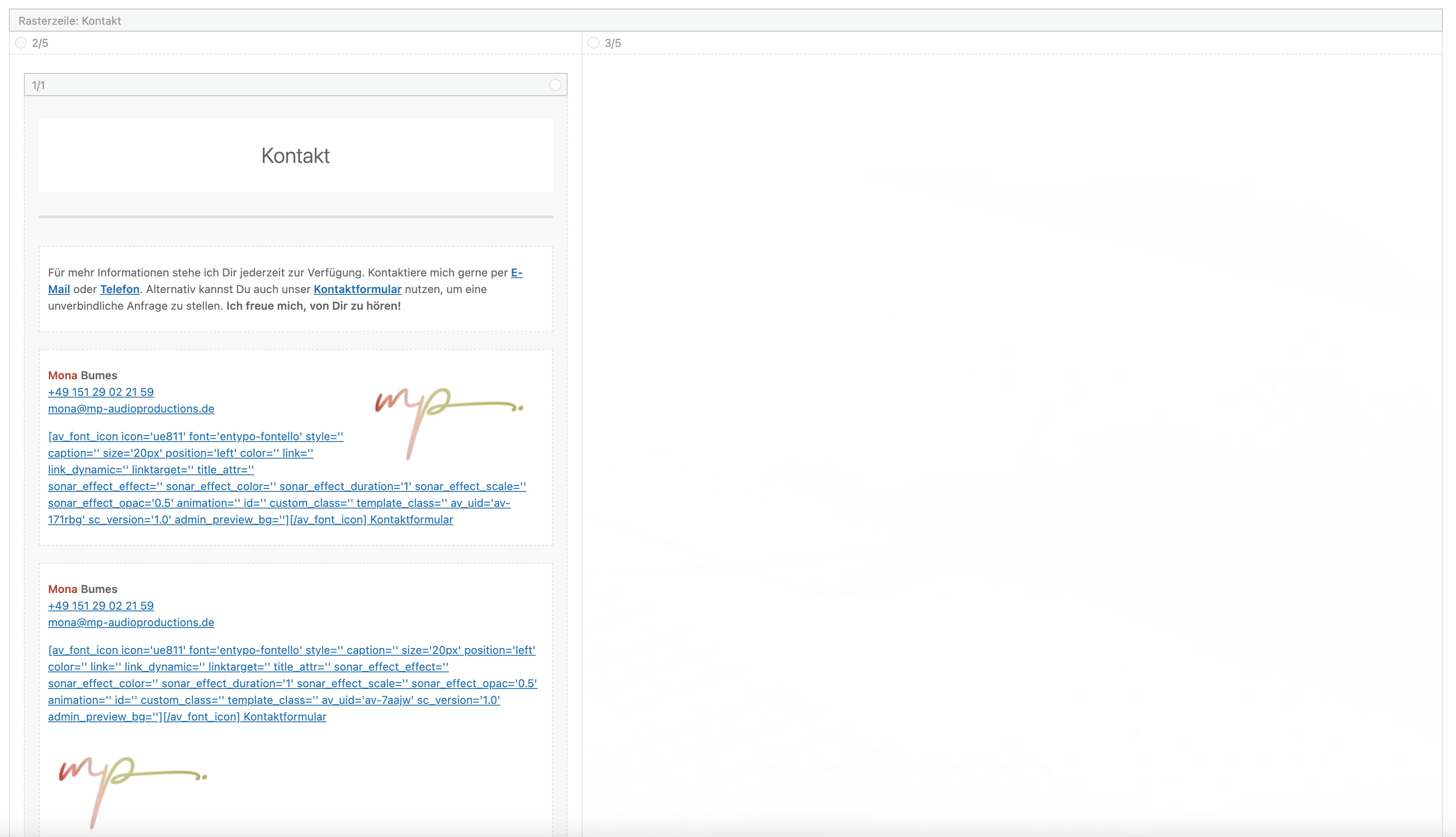
Here I have a gridrow in the backend > see screenshot: https://mp-audioproductions.de/support/4.jpg
The second cell on the right (3/5) is set to be hidden on mobile devices. So it works great on the cell phone and the tablet portrait format and only the left cell is displayed – even without the movement. And this is also how it should appear on the tablet landscape format. How can I achieve this?Best regards, Diana
Hi Ismael,
this code works perfect! Thanks a lot!
Best regards DianaDear Ismael,
Thank you for your reply.
Unfortunately I had a CSS error in the site and had to import a CSS backup. And since it was from Saturday 8.11.2025 I probably overwrote your changes in the CSS! Oh dear, I’m so sorry, I hadn’t seen the mail yet and when I was about to check it, I noticed the misery. Sorry about that. So I don’t know if your changes are gone now??? >> Unfortunately it still doesn’t work correctly on the cell phone > could you please take another look?I have changed the ID “hoerbuecher” to “hoerbuecher-mona”, the tab section has the ID “tab-hoerbuecher”.
Best reagrds, Diana
Hi Ismael,
I had to remove the script from the css again. It had the effect that the text was no longer truncated in the mobile version, but at the same time I just noticed that the tab no longer works in the desktop version either > so I removed it again.Now the view is just as wrong as it was at the beginning.
Is there another solution? Why is the tab element causing such problems in the mobile version?
Best regards, DianaDear Ismael,
Thank you very much for your reply.
Regarding the first part of your recommendation: delete the code:
>> I did not find this code in my css, so I could not delete it>> So I executed the second part and integrated the given code into the css:
.js_active .av-layout-tab {
display: block !important;
}>> The content no longer appears truncated and is displayed correctly, but the tab function no longer works. In the mobile version, all content (from the first and second tab) is listed one below the other in the first tab. The second tab is empty in the mobile version.
What can I do to make the two books from the second tab appear there again?Best regards, Diana
Translated with DeepL.com (free version)
Hello Mike
awesome , that’s perfect!
Thanks a lot :)I have to add that I have now found a manual solution by linking the anchor link for the mobile versions (“#gutschein-mobile” and “#kontakt-mobile”) with new, empty color sections, which I have placed above the color section “Gutscheine” and the grid row “Kontakt”. these color sections are consistently visible for all devices and now the BurgerMenu also works
The grotesque thing is that even in the versions (see screenshots in the last post) in which the BurgerMenu did not work, the content of the contact field was still displayed correctly when scrolling down.
Does this variant also work on all screens?
If there is a better solution – please let me know.Best regards Diana
Dear Ismael,
Thank you for your reply.
As the website should go online before Christmas, I have now integrated the contact form from Contact Form 7 for the main page and this works: https://lebendigfuehlen.de/#kontaktHowever, as I would generally prefer the ENFOLD contact form, I have created a duplicate of the page under the subdomain http://final.lebendigfuehlen.de/ in which the original ENFOLD contact form is displayed.
As further steps I have here times
– deactivated all other plugins – to check if this is the reason > but still does not work, still the same message “Your request has been sent” and then no emails arrive.
– what do you mean it could also be due to a custom script? Which script?I have now installed the “Solid Mail” plugin again in this test version and also added my test mail here, but this did not help either, the sending process dragged on indefinitely and nothing was sent. What else could I try?
Can you help me further? I’m really at a loss as to what the problem could be.
Best regards DianaDear Mike,
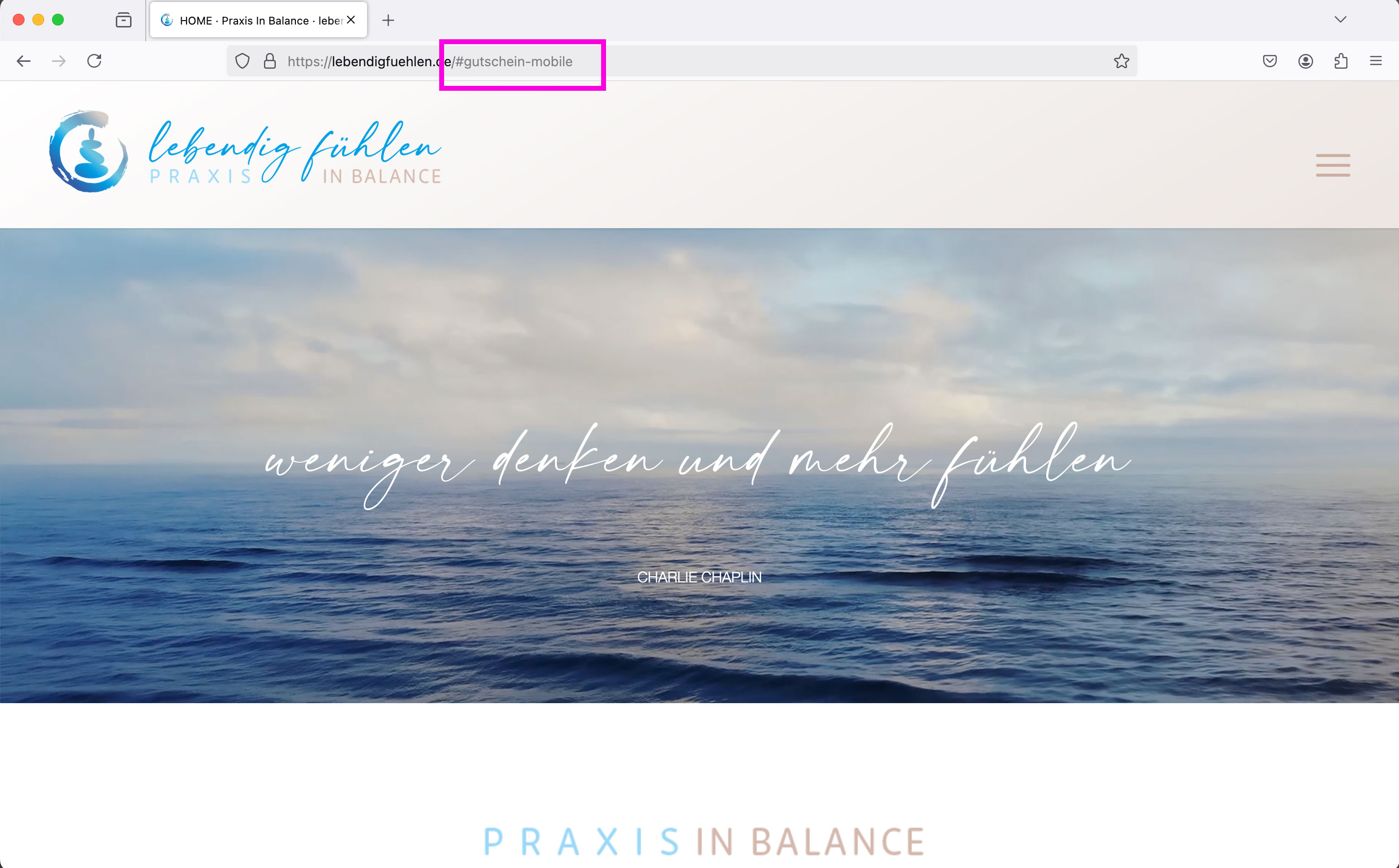
Thank you for your reply. I have now assigned separate IDs for the mobile sections: “#gutschein-mobile” and “#kontakt-mobile”.
The desktop version still links to the IDs “#gift-voucher” and “#contact”
For the mobile version, I have also created a second menu in which the menu items “Vouchers” and “Contact” are linked to the new mobile IDs.1st desktop version: Menu is displayed normally as a bar: > Anchor links work
2. mobile version (cell phone): Menu is displayed as a burger menu: > Anchor links work3. tablet version / laptop screen: Menu is displayed as a burger menu: Anchor links of the two problematic menu items “Vouchers” and “Contact” do not work: for both it jumps onClick to the top of the page.
Example: see screenshots:
Screen view 1-3:
https://lebendigfuehlen.de/support/1.jpg
https://lebendigfuehlen.de/support/2.jpg
https://lebendigfuehlen.de/support/3.jpg
The third screen shows that in this version, which jumps incorrectly to the top of the page, the link to the mobile version #gutschein-mobile” is displayed correctly in the browser bar at the top.Can you help me further? I’m really at a loss as to what the problem could be.
Best regards DianaDear Rikard,
Thank you very much for the link. I have now tried various things, but unfortunately all previous attempts to get this ENFOLD contact form to work have failed. (I’m very surprised and a bit helpless, because I’ve never had this problem before (and I’ve been using ENFOLD for all my websites for almost 9 years now)
to the current status and what I have tried:
1. Typos and SPAM > Checked everything, checked with various email addresses
2. I tried the suggested changes in the function.phph-file, after it didn’t change anything, I removed the suggested code:
function change_cf_from() {
return “ (Email address hidden if logged out) ”
}
add_filter(‘avf_form_from’, ‘change_cf_from’, 10);3. I also tried installing the “Solid Mail” plugin without success and then uninstalled the plugin again.
4.Then: a new contact form from ENFOLD with standard settings integrated into a test page: see link: http://neu2025.lebendigfuehlen.de/home-test/#enfold
– As a test, my own email is entered here as the recipient for the contact form
– I have filled out the contact form and after pressing the “Send” button the message “Your message has been sent” appears >> see screenshot: enfold1.jpg. and enfold2.jpg.
>> !! BUT no message arrives! / There are also no messages blocked or in any SPAM folder, everything checked.5. Then I created a contact form via Contact form 7. See link: http://neu2025.lebendigfuehlen.de/home-test/#contact7
– Again, I filled out the contact form (see screenshot: contact7-1.jpg) and it WORKS.
>> Both emails (which I sent to different email addresses as a test) arrived – both the confirmation email to the author of the message and the notification to the recipient of the contact form: see screenshot: “contact7-2.jpg>> WHAT DOES THIS MEAN, that it works with Contact 7, but not with the ENFOLD theme?
The customer wants as few plugins as possible, so it would be important to make the ENFOLD contact form work as well.
Therefore, I would like to ask you: What can I do to make the above contact form from Enfold work: http://neu2025.lebendigfuehlen.de/home-test/#enfoldPlease help me further. I have never had this problem in all these years and really don’t know what to do.
Best regards Diana
The support request has now been resolved. After consultation with the provider, it was probably the umlaut “ü” that was causing problems. We have changed the entire domain of the site.
Thanks Rikard….Hello dear support team, hello Rikard and Guenni,
first of all many thanks to YOU all for the support: I was able to realise my request so perfectly> the newly revised page is at: https://mp-audioproductions.de/
@GUENNI:
one more question about your hint ‘ to bring a heading to centre position – you do not need to have three 1/3 columns with the heading inside the middle column!’
I have implemented this as an example with the 1/1 column in the test page https://mp-audioproductions.de/home-heading/.
But the background gradient does not work correctly because the dark red colour starts at the very outside. Do you have any ideas on how I can achieve this with the 1/1 column and the correct gradient? (Otherwise I will have the problem again with the mobile optimisation)Greetings to all!
DianaHere is another screenshot for question #1470225:
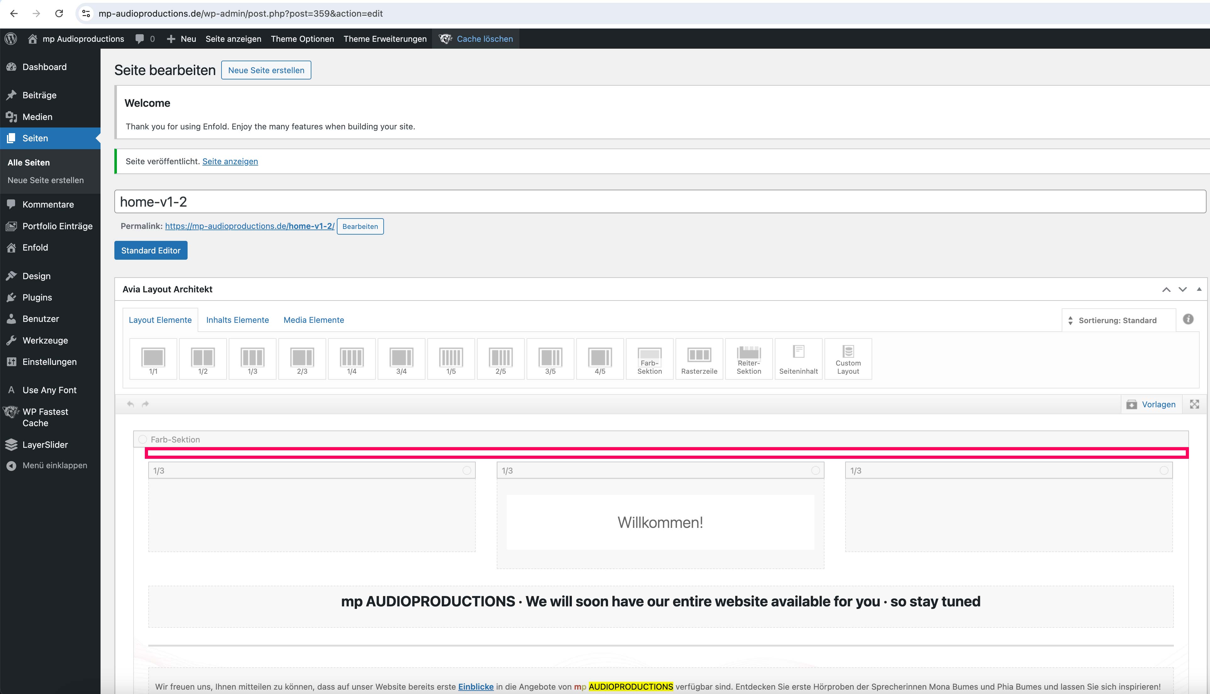
I have created a duplicate of the page and deleted all the empty space elements here: see https://mp-audioproductions.de/support/enter-without.jpg
If you now call up the duplicate in the front end, a part behind the header disappears: https://mp-audioproductions.de/home-v1-2/
I hope it is now clear what I mean.
Best regards DianaHello Guenni
thank you very much for the tips – I have done everything according to your instructions and also removed the min-height from the color section directly.
I have integrated the following in the CSS: https://mp-audioproductions.de/home-v1/#overview
@media only screen and (min-width: 990px) {
#overview { min-height: 280px !important; }
}
Is this correct?—-
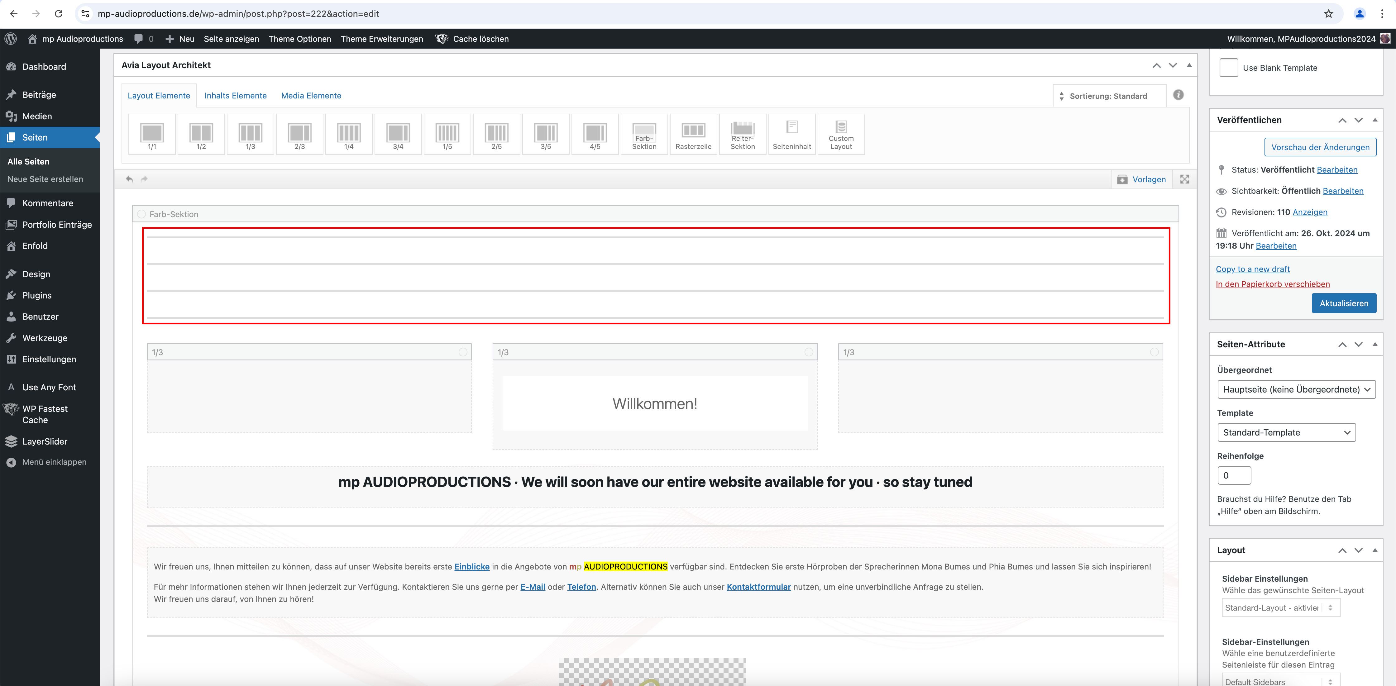
Regarding your question to #1470225, I wanted to show you the following screenshot of the backend:
Somehow everything always disappears behind the header, even though it is shown as non-transparent.
I also had to add several “free space” elements (each 50px > 200px in total) to the Enter section at the top (where it says “Welcome”) so that the heading doesn’t disappear behind the header: see screenshot: https://mp-audioproductions.de/support/leerraum.jpg
Is there perhaps a better solution for this?Best regards, Diana
-
This reply was modified 10 months ago by
-
AuthorPosts