Forum Replies Created
-
AuthorPosts
-
Hi Elliott
I could make it with that. Simply great!
Thank you
Berndah the last comma !
Thank you Yigit!
that works :-)
but what is the difference between my upper code and yours? Am I blind?ups
now I chanded the code in the CSS like this:
#fundraisingtag_programm, #fundraisingtag_referenten,
#fundraisingtag_ort,
#fundraisingtag_service,
#fundraisingtag_zusatzinfos, {
clear: both;
}and problems again. Is this wrong ?
Hooray, its working!
Thank you Yigit!
Hey Yigit,
no answers to my question? I mean it is just a simple anchor link jumping to a codeblock as described in your documentation. But it does not work and I do not know what is wrong here or how I could make it (sections are not on that page).
Thank you for HELP!
BerndHey
but it does not jump to that anchor REFERENTEN!
Please check the pictures above again. It should go here:

Thank you for HELP!
BerndHey Yigit,
unfortunately you got it wrong. The link should be
http://test.norddeutscher-fundraisingtag.de/norddeutscher-fundraisingtag/#fundraisingtag_referenten
so that it goes to the page http://test.norddeutscher-fundraisingtag.de/norddeutscher-fundraisingtag
and there to the anchor #fundraisingtag_referentenThanks for Help!
BerndHi Basilis
the link is going here:

but should go here:

You could see the embedded code if you edit the page “Norddeutscher Fundraisingtag”
Thank you!
Hi Rikard,
As I have some extra options in the product itself it cannot be put in the cart directly. So I want to remove the Icon and text of the cart button on the shop overview page.
See here: http://www.bebm.de/bilder/screenshop.jpg
Thank you
August 19, 2015 at 7:29 pm in reply to: 3.3 update problem – Widget: Latest News – Categories are not there #490340Same on my website
Hi Yiigit!
You are right, it works!
Thank you
BerndHey Yigit!
That was exactly what I meant!
Thank you very much
BerndHi,
sorry, but this did not answer my quaestion I guess. I asked for different colours for the Main Menu Links Font. Violet in usual Menu, White in Shrinking menu. Also I made a change in the extendend styling for the Main Menu Links already.


Thanks for Help!
BerndSuper,
that looks fine nowThank you Ismael!
BerndHi Elliott
I think the code concerning this looks like this at the moment:@media only screen and (max-width: 480px) { #socket .social_bookmarks { right: 40%; } #socket .container { text-align: center; } #socket .container > * { display: block !important; float: none !important; } #socket .social_bookmarks { margin: 0 auto !important; width: 100px !important; } #socket .menu { text-align: center !important; } #socket .menu > li { float: none !important; display: inline !important; }}If I add additional your code again the social bookmarks will be altered also in the desktop version.
For the Separators: could we remove them completely only in iphone-version?
Thanks for Help!
BerndHello Elliott,
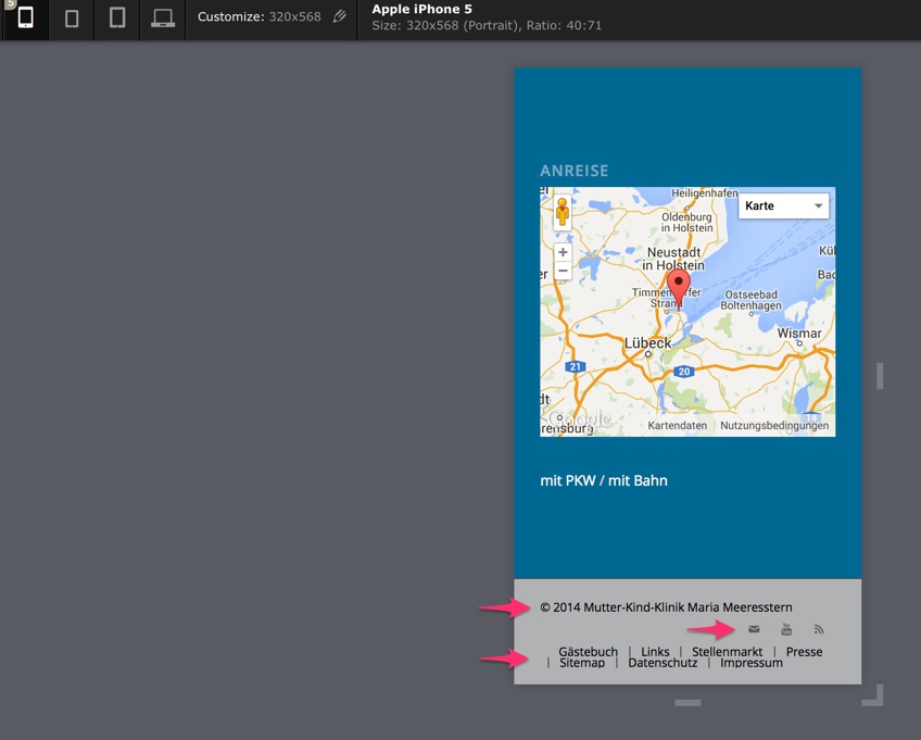
it is almost perfect, but:
– Social bookmarks are on the left side
– the Strokes which define the border to the next Menuitem are on the wrong place sometimes. Any Idea about to change that or to delete them?
Thank you very much
BerndHello Elliott,
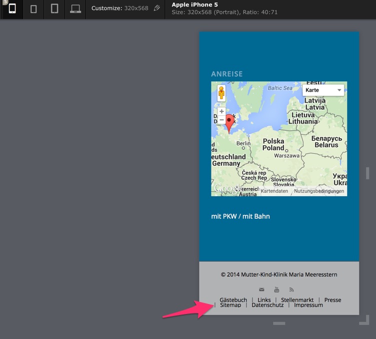
that is much better now, but what about the last two rows with the Footer Menu?

Thanks for Help!
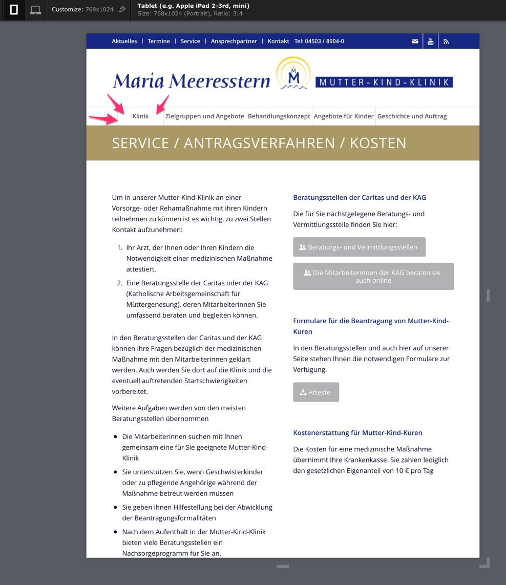
BerndHey Yigit!
That is almost perfect!
What makes me wonder is:
Why is there much more left and right spacing at “Klinik” and
Why has “Klinik” a border on the left side (while there is no one at the other side of the page at “Geschichte und Auftrag”)
Glad about Help!
BerndHey Yigit,
I dont know if you understood what I mean:

I want to center the items in the Socket
Thanks for your Help!
BerndHi Yigit,
thanks, but that is not what I asked for.
I think that in case of a vertical iPad view it is better not to have the mobile menu already.
So what about disable the Search icon and make the Menu fontsize and/or padding a little bit smaller?
Thank you for Help
BerndHi Yigit,
this did not change anything, it looks like before.
Hi Elliott,
I added your code to the custom CSS, but it made no difference, it looks like before
Any ideas?
Thank you
BerndHi Elliott!
That is fast support, thank you!
Is it possible to have everything in the socket centered?
Thank you
BerndHi Ismael,
that works!
Phantastic support!
Thank you very much
BerndHi Yigit
Code looks like this now in the functions.php of the child theme:
<?php
function add_custom_target(){
?>
<script>
jQuery(window).load(function(){
jQuery(‘.avia_partner_widget a’).removeAttr(‘target’);
});
</script>
<?php
}
add_action(‘wp_footer’, ‘add_custom_target’);But it does not work, the link still opens in a new Browser window
Or is there an easier way to have 4 pictures with links in 2 rows in a widget in the footer?
Hi Josue,
really great!
Thank you very much
BerndThank you Yigit!
Hi Ismael,
that worked. I adjusted it to 200px. Looks nearly unstretched.
Thank you
Bernd -
AuthorPosts
