Forum Replies Created
-
AuthorPosts
-
Andy,
Thanks for the CSS! I think I have a workaround using a combination of percent and point values. Strange, but effective in this case. Thanks!
Karl
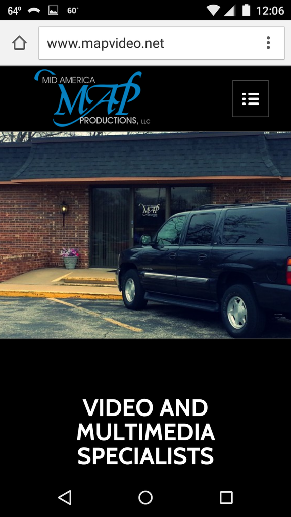
I’ve been testing on a couple different Android phones (Motorola and Samsung). I tried dumping the cache and refreshing, but the same result. Again, oddly enough, when I choose the option “request desktop site”, the image alignment displays correctly.
It’s as if the image alignment CSS style is ignored (or set to “bottom”) when it displays for mobile. The other weird thing is that it used to display correctly, and I’ve encountered this problem without doing any editing on my end. The only things changed are the WordPress and Theme versions and perhaps the Android OS.
Richard,
Thanks for the response. I understand that parts of the images will be cropped depending on the viewing ratio, etc. However, this is not my issue. In the theme settings, I set the positioning of the parallax image to something like “Top Center”. However, when displayed on (at least some) mobile devices, it displays as if it was “Bottom Center”.
I can request the “desktop version” of the site, and then the device recognizes the positioning as set. Note the difference between the first image (default), and the second image (desktop version requested):

-
AuthorPosts