
Tagged: full width, image
-
AuthorPosts
-
June 23, 2018 at 1:20 am #976522
Hello Enfold team,
I’m having issues with this image https://imgur.com/QYsl3tI I want it to cover all the content box in the right side. I’ve tried with sliders but oh God, I have to be honest, they honestly don’t work so good, sadly, the responsive design was also not-so-good. I even tried with the Grid Row but nothing came out good, so I’m just trying with a color section and 1/2 boxes. I’ve been here all afternoon, I can’t believe I can’t work this out when it should be freaking easy.
Please help me with this, I’d be very grateful.
Best wishes.
-
This topic was modified 7 years, 10 months ago by
pazygratitud.
June 23, 2018 at 3:42 am #976833Hey Mireya,
Please try adding the image as a background to the column:
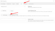
Be sure to choose equal height in the left column so the image shows.

There will still be some padding between the columns, unless you choose no space between columns:
and there will also be some padding on the edge of your page, depending on your layout choice and page max width.Best regards,
MikeJune 23, 2018 at 5:48 am #976843Hello Mike,
Well it’s one step forward but it’s still not finished https://imgur.com/a/RJ3hmoV it still doesn’t show the full image and in the responsive layout is not even showing the photo.
June 23, 2018 at 12:20 pm #976919Hi,
Please include the url to the page in question so we can take a closer look.Best regards,
MikeJune 25, 2018 at 9:24 pm #977656Hello Mike, I have still not posted the page because I am trying to design it, so I’ll give you a temporary access.
I just want the image to look good in any device and with no padding, why is it so hard with this? I tried with a builder and a free theme and I was able to work this out. Please help me with this one, Mike.
Thank you very much, have a nice day.
June 26, 2018 at 5:28 am #977780Hi,
Thanks for the link, though it leads me to a 404 page? Could you create a temporary users for us instead maybe? You can post the details in private. Also please link to the page in question directly in private.
Best regards,
RikardJune 26, 2018 at 7:06 am #977808Hello, Ok I will post the exact same info I put in a previous post.
June 26, 2018 at 12:26 pm #977897Hi,
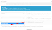
Thank you for the login, I removed the column background-image and added a image element, and then adjusted the text size slightly for tablet so the image & text would be the same height and the buttons would line up side-by-side. I see you had a minimum height of 500px for the color section, I was not sure if you really wanted this for the tablet view, but I thought 350px looked a little better.
Please clear your browser cache and check. Please see screenshot in Private Content area.
Here’s the css I used:@media only screen and (min-width: 768px) and (max-width: 900px) { .white_text h1 { font-size: 40px !important; } .white_text p { font-size: 20px !important; line-height: 20px !important; } .green_section .container { padding: 0 25px !important; height: 350px !important; } }Best regards,
MikeJune 26, 2018 at 4:05 pm #977989Thank you Mike, it looks better! I’m really grateful. However, the image is still inside the container per se, I want it to cover all that side. Is there a way to do that?
June 27, 2018 at 9:40 pm #978570Hello, I’m still waiting for help. Can you please tell me how to make the image in the green section have no padding? Thank you
June 28, 2018 at 1:07 pm #978872Hi,
Sorry for the late reply, I have adjust your css for each screen size:@media only screen and (min-width: 768px) and (max-width: 900px) { .white_text h1 { font-size: 38px !important; } .white_text p { font-size: 18px !important; line-height: 18px !important; } .white_text { padding: 10px !important; } .green_section .container { padding: 0px !important; float:right !important; } .green_section_image { width: 60% !important; ; } } @media only screen and (min-width: 901px) { .green_section .container { float:right !important; padding: 0px !important; max-width: 1410px !important; } .green_section_image { width: 70% !important; padding-left: 20px !important; } } @media only screen and (max-width: 767px) { .green_section .container { margin: 0px !important; width: 100% !important; max-width: 100% !important; } .white_text { padding: 10px !important; } .green_section_image { margin-bottom: 0px !important; } }Please see screenshots in Private Content area.
Please clear your browser cache and check.Best regards,
MikeJuly 4, 2018 at 10:11 am #981042Please Mike and Kriesi team be more careful with what you do because I see you published the page and it was something I didn’t want to do. Also, in another thread you helped, which I’m grateful, but after you did it, somehow an article was completely translated in English, it was a mess. I’m asking you to be more careful, thank you.
Thank you so much for the help! I will take a look and design things with this code you use now to see if it works for me. I’m really grateful Mike, have a nice day!
July 4, 2018 at 7:13 pm #981321Hi,
Sorry for the mixup, we will be more careful.
Was there anything thing else we can assist with on this issue, or shall we close this then?Best regards,
MikeJuly 15, 2018 at 7:15 am #985589Hello Mike, sorry for the late response
Yes we need your help. First of all, thanks for fixing the issue we were having regarding the image not being able to cover the whole container. However, now we see that the first elements (the text and buttons) are waaaay to the right. Also, when you shrink the browser, there’s a size in which the text and buttons have no padding, which is seen very weird. Please help us to make the text and all of those elements normal, we didn’t have any problem with them, just with the imagen not being able to cover all the section.Thanks!! Have an amazing day
July 15, 2018 at 3:02 pm #985653Hi,
Please try this code in the General Styling > Quick CSS field:@media only screen and (min-width: 901px) and (max-width: 1428px) { .flex_column.av_one_half.first.avia-builder-el-5 { padding-left: 20px !important; } }If this doesn’t help, Can you please renew the admin login in the private content area so we can take a closer look.
Best regards,
MikeJuly 16, 2018 at 9:16 pm #986102Here’s the link because it didn’t work Mike
July 17, 2018 at 5:15 am #986247Hi,
Thanks for the login, I added the css to your Quick CSS & cleared your cache plugin and now the text has 20px left side padding.
Please clear your browser cache and check.Best regards,
MikeJuly 17, 2018 at 10:34 pm #986681Ok Mike I’m gonna be honest, I’m a bit mad.
First of all, the website was really ok with the CSS it had and everything, but after I asked you Enfold for help, I saw that you added something called .entry-content which if I delete, the website completely shrinks and looks horrible. Please I would REALLY like an explanation for this because I NEVER asked for this.
Also, I gave up with the thing I asked you. The text touches the border of the section when you shrink the browser size or in mobile, the space between the green section and the white section above is really big and I don’t know why, and the image is the only thing that fit well but there are some issues I still have with regarding this (I will add the link to the screenshots in the private section.
I will still leave the element because I want you Enfold to see what you did to the website that if I delete the .entry-content, it’s like the website had a big margin and ugh I’m really frustrated because of this.
Mike, please, you can see that I added another element down below this one after another white space with a text. PLEASE, I just want the image to cover all the space in the section, do NOT touch the text whatsoever. If it’s so hard to make, please tell me so I can contact a person outside Enfold Team to help me with this thing. Which, again, I don’t know why it has been so hard to make when I can do it with a page builder for FREE. I bought Enfold Theme because I thought I could do all this stuff with no problem. I pay for something, please help me.
Please Enfold team, if you really do NOT know how to program this, please be honest with me and tell me so I can take actions. I’m trusting in you, thank you.
July 17, 2018 at 10:49 pm #986687One more request: please fix the problem with the .entry-content, I just wanted to make myself clear. Thank you
July 18, 2018 at 5:41 am #986766Hi,
Sorry to have caused you this trouble, the code you removed was a part of the solution.
the “.entry-content p {” only centered the text, I have removed it and the other code that doesn’t work. (listed above)
I wish not upset you, we will provide a solution.
Sorry again.Best regards,
MikeJuly 19, 2018 at 6:28 am #987270Hello Mike,
I see that you deleted the green section element you were working on but didn’t touch the second one when I asked you to help me with this new one too…
1- The text of this section is translated… again, when I told you to be more careful. First, you post the page when I didn’t want to, and second, again, you translated one of the text. Fortunately this page is a test to see what I can and (as I can see now…) cannot do.
2- I still have the long code with the .entry-content p property… why if it’s no useful anymore????? I’m afraid of deleting it and crashing my website.
PLEASE FIX THIS, it’s all I’m asking, I really don’t want to ask for help anymore, to be honest it hasn’t been useful at all. Sorry Enfold Team but I’m really disappointed. Don’t worry about this anymore, JUST FIX the entry property issue PLEASE
Thank you!!!
July 19, 2018 at 7:28 am #987288I just realized you deleted a css code I put there……………………………………………………..
Jesus Christ, JUST HELP ME with deleting the .entry-content without affecting the WHOLE WEBSITE and the rest of the code that’s not useful anymore
PLEASE tell me if I’m not explaining myself!!!!!! I just cannot cover my anger anymore, this has been a frustrating nightmare. A week waiting for your help when it’s been more problems than solutions!!!
God… just help me with what I ASK :/…
July 19, 2018 at 1:18 pm #987379Hi,
I removed the css so we could work on a different solution and have the team look at it to advise, without trying to overcome the css I wrote.
I see you added it back though, it would be nice if you removed it.
Today I have a new solution for the image in the green section:#top.page-id-1016 #av_section_3 .container { padding: 0px !important; } #top.page-id-1016 .avia-builder-el-15 img { height: 100%!important; object-fit: cover; } #top.page-id-1016 .avia-builder-el-12 { padding-top: 0px !important; }This fills the container with the image starting around 1300px when the image aspect allows, at higher screen sizes the image is 100% wide (it’s own width) and the height fills the container.
The image will be 100% high all the way down to the mobile brake point, when the image goes below the text.
The problem is that at tablet screen size the font of the white text is too big so it goes to the edge of the screen, and adding padding forces the container larger, which gives the green strip over the image.
This is why the other code needed the “white text” rule that you removed.
So please try this new code above, and see that the image is filling good now. If you want help making the text a little smaller for tablet so it doesn’t go to the edge, let us know.Now for mobile screens, you will see that the image doesn’t go to the edge left & right, this is because of the section margin, and removing it will make the text also go to the edge of the screen, so to correct this we will need to add a rule for the white text, like before. If you would like help with this please let us know.
As for:
.entry-content p {
margin: 20px 0;
}
I removed it before with no issues, and I commented it out (made it useless) again now with no issues.
It only adds about 10px margin to the top of paragraphs. Perhaps you had a issue removing it because you also removed some of the rule before or after? I’m not sure why you would add it back after I removed it?Best regards,
MikeJuly 19, 2018 at 10:34 pm #987642Ok everything was ok, I deleted the old codes, the Entry one, I realized that I just had to go to General Structure and save changes with the 1310px maximum width… but after I added your code, the website shrank again…
And I thought it was a cache problem so I deleted the cache, then I tried to do the same thing in General Structure by setting the maximum width to 1310px by default, but no. Nothing. And I’m in the middle of a campaign…
You know what, just help me have my site ok again and let’s pretend I never asked for help, ok?????
I just want my site to be normal again, I’ll find another way to do the image thing, just forget I asked for help and just help me have my site again with a 1310px maximum width. Thank you.
July 19, 2018 at 10:36 pm #987643The text are all the same… the font I selected for some headings does not appear in the front-end….
PLEASE help me ASAPJuly 20, 2018 at 12:01 am #987651PLEASE I need help!!!!!!!
July 20, 2018 at 12:06 am #987652It seems like after I put the code you just told me, the website shrank. So I deleted it, not it stayed like that and it appears NONE of the CSS codes are working!!!!!!!!!!!!!!!!!!
PLEASE HELP ME.
July 20, 2018 at 12:10 am #987653Ok I was deleting each code until I found that this one is the one causing the problem, but after I put your code. This one has been almost at the beginning of the designing process and now it’s causing troubles, do you know why???
@media only screen and (max-width: 489px) {
#fwsc,#fwsc2,#fwsc3,#fwsc4,#fwsc5,#fwsc6,#fwsc7,#fwsc8, #fwsc9 {
background-size: 209% 100% !important;
background-position: 53% 90% !important;
}
July 20, 2018 at 12:18 am #987655I fixed it!
I used your code again but it didn’t work when I put it on the Quick CSS, what do I do?
July 20, 2018 at 2:28 am #987668Hi,
I added the code to the Quick CSS, temporarily, to take these screenshots of the code working on the green area, as compared to the blue section with no code.
Please see screenshots in Private Content area.
You can add it if you would like to see for yourself.
Please clear any cache plugin and your browser cache and check.Please see the last screenshot of what 768px could look like with minor css text adjustment.
Best regards,
Mike -
This topic was modified 7 years, 10 months ago by
-
AuthorPosts
- The topic ‘Image full width on ONE side of the content’ is closed to new replies.