-
AuthorPosts
-
June 4, 2018 at 6:17 pm #966685
Hi there,
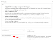
On my ‘over Eefke’ page I’ve a few green check marks.
Unfortunately the text on the 2nd row doesn’t align. How can I do that?See my details below in the private area.
Thanks.
June 5, 2018 at 7:16 am #966998Hey Eefke,
I’m not sure what you mean by that, it looks aligned on my end?
Best regards,
RikardJune 5, 2018 at 1:39 pm #967215This reply has been marked as private.June 5, 2018 at 1:41 pm #967217This reply has been marked as private.June 6, 2018 at 11:34 am #967776Hi,
You can add some padding to the text you want to align:
<span style="color: #000000; padding-left: 20px;">
Het gaat niet alleen om doelen stellen en plannen maken, maar het gaat écht om het maken van een stap naar een nieuwe fase in je leven.
</span>
Best regards,
RikardJune 6, 2018 at 1:24 pm #967834This reply has been marked as private.June 9, 2018 at 5:43 pm #970475Hi,
I added a custom class to your text element: “special-listpoints-green”

then replaced your icons with bullets, and added this css to your Quick CSS:/* special bullets green */ .special-listpoints-green ul { list-style: none; } .special-listpoints-green li::before { content: "\e812"; font-family: entypo-fontello; color: #3ec607; position: relative; padding-right: 11px; margin-left: -20px; }
Thanks to @Guenni007 for the solutionBest regards,
MikeJune 11, 2018 at 1:08 pm #971137Dear Mike and @guenni007,
Thank you very much for this solution. I’ve tried it myself of my homepage and it works.
So happy with it!Kind Regards,
EefkeJune 11, 2018 at 1:47 pm #971177Hi,
Glad we were able to help, we will close this now. Thank you for using Enfold.For your information, you can take a look at Enfold documentation here
And if there are features that you wish Enfold had, you can request them and vote the requested ones here
For any other questions or issues, feel free to start new threads under Enfold sub forum and we will gladly try to help you :)Best regards,
Mike -
AuthorPosts
- The topic ‘Align text under green 'check marks'’ is closed to new replies.
