
-
AuthorPosts
-
April 19, 2018 at 2:20 am #943839
Hello Support
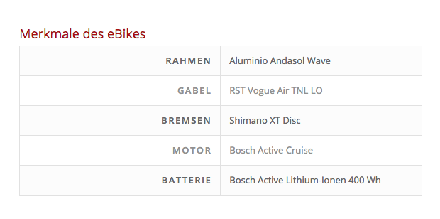
I noticed on a site I am working on the “Table” Content Element does not show correct when going into mobile mode:Normal view = OK:
Mobile view = Wrong:
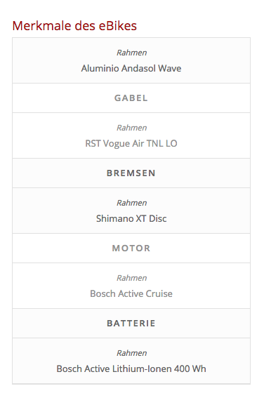
As you can see, the content of the first “Description Column” (= Rahmen ) does not show as heading over the corresponding column (it is hidden) but instead shows on top (repeats) over every other Description.
So instead of
Headline 1
content 1
————
Headline 2
content 2
…………….
Headline 3
content 3it is:
headline 1
content1
————-
headline 1
Headline 2
content 2
————-
headline 1
Headline 3
content 3Very strange, is this a bug??
Thanks,
Gregor-
This topic was modified 7 years, 11 months ago by
gregorh.
April 19, 2018 at 10:41 am #944013Hey gregorh,
I see this code causing the issue:
.avia-table-1 td:nth-of-type(1):before {
    content: 'Rahmen';
}
please try to remove it then, in add this css code:
@media only screen and (max-width:767px) {
  .responsive .avia_responsive_table .avia-data-table tr:first-child th{
    display: block;
  }
}
Hope this helps :)
Best regards,
NikkoApril 19, 2018 at 10:45 am #944015Hello Nikko,
OK, can you please tell me where I find this code (which css file is it in?)
I did not write this css into any of the files and the theme I installed just yesterday so you should check your theme code and correct the bug in the next update.Thanks!
GregorApril 19, 2018 at 10:52 am #944020AND:
I just added the code you gave me to the child-theme css and the table is now showing the first table header correctly BUT it gets still repeated on any other table too. so part of the problem is still not fixed.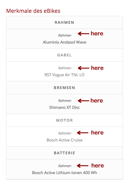 April 19, 2018 at 10:57 am #944023
Actually the file:
http://ebike-lanzarote.com.www482.your-server.de/wp-content/uploads/dynamic_avia/avia-merged-styles-9d9b4a6c09c7fc369ac25b1d35e95edc.css?ver=4.9.5is a dynamic generated file of the ENFOLD theme so I really don’t know how to delete the css from it – it generated on the fly!
for a quick fix I addad this now to my child-theme css:
@media only screen and (max-width:767px) {
.responsive .avia_responsive_table .avia-data-table tr:first-child th{
display: block !important;
}
.avia-table-1 td:nth-of-type(1):before {
display:none !important;
}
}which helps but please look into your code and delete the bug in the next update.
Thanks
Gregor-
This reply was modified 7 years, 11 months ago by
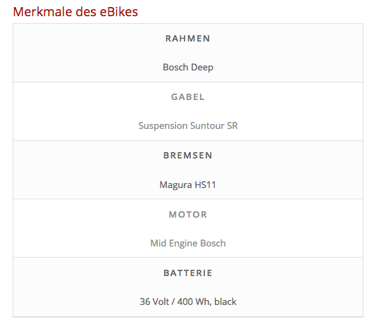
April 19, 2018 at 11:20 am #944040I also want to suggest to add the following to the modified css code to make the responsive table better legible:
@media only screen and (max-width:767px) {
.responsive .avia_responsive_table .avia-data-table tr th {border:none !important}
}because, in responsive mode the extra divider lines between headline and content look odd – personal feeling only ;)
Nice and clean look:
 April 20, 2018 at 10:23 am #944523
Hi,
That’s looking great!
Glad that we could help and that you made a better progress than what I posted :) It’s a difficult though when using tables for both desktop and mobile devices, since different scenarios would need a different type of tweak, but please feel free to request such feature at our feature request system: https://kriesi.at/support/enfold-feature-requests/
This system allows us to keep track of user suggestions and lets you vote on the feature you would like to see the most. I am afraid though there is no guarantee that a feature will get implemented.
Best regards,
Nikko -
This topic was modified 7 years, 11 months ago by
-
AuthorPosts
- You must be logged in to reply to this topic.