Tagged: comment form
-
AuthorPosts
-
February 16, 2018 at 6:22 pm #913321February 17, 2018 at 8:01 am #913556
Hey Ritchie,
Where can I see the standard form? On this page, I only see the comment form and on the contact page the form is different.
Best regards,
VictoriaFebruary 17, 2018 at 3:47 pm #913659Hi Victoria,
thanks for getting back to me! The contact form is fine – I’m referring to the “reply to” function in comments.
The “normale” (level 1) comment form, when someone doesn’t reply to another comment but rather start a new comment thread, looks differently than the form that is displayed after somebody clicks “reply to” on an existing comment.
It’s a bit complicated to explain – and my blog is in German. Reply to is “antworten”.
Hope I could clarify :)
thanks again,
RitchieFebruary 17, 2018 at 6:36 pm #913694Hi,
Try this code in the General Styling > Quick CSS field:#top #respond.comment-respond .comment-form-author input,#top #respond.comment-respond .comment-form-email input,#top #respond.comment-respond .comment-form-url input { width: 220px!important; } #top #respond #commentform label { position: absolute!important; left: 245px!important; }Best regards,
MikeFebruary 17, 2018 at 9:10 pm #913718Hi @Mike,
thanks a lot! Almost there :) Is it also possible to do it the other way round? (Make the normal comment form look like the reply-to comment form with the labels aligned above the input fields.)
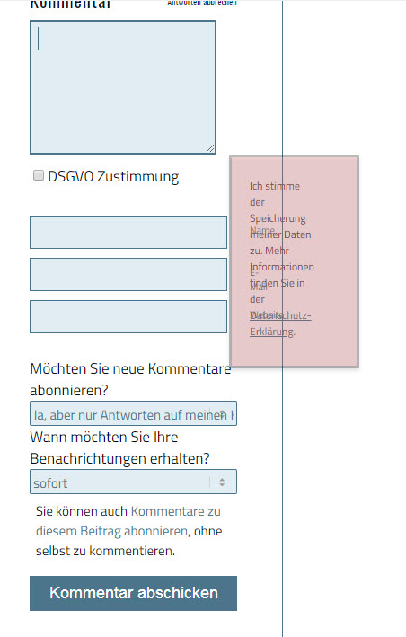
Because the problem with the right-aligned labels is this on smaller screens (I marked the overlapping label texts in red):

greetings,
Ritchie-
This reply was modified 8 years, 1 month ago by
datadirt.
February 18, 2018 at 10:52 am #913867Hi,
Lets try to make the above code only work on tablets and above, so on mobile it will be the other way. So use this code instead.@media only screen and (min-width: 767px) { #top #respond.comment-respond .comment-form-author input,#top #respond.comment-respond .comment-form-email input,#top #respond.comment-respond .comment-form-url input { width: 220px!important; } #top #respond #commentform label { position: absolute!important; left: 245px!important; } }Best regards,
MikeFebruary 22, 2018 at 1:45 pm #916036Hi @Mike,
thank you very much – you guys are geniusses!
One last question: Is it also possible to *always* position the labels above the input fields (in both forms)?
greetings,
RitchieFebruary 22, 2018 at 2:15 pm #916063Hi,
We could work on that but you would need to remove the above custom code as it is hard to over write “!important;”. Did you find that the above code was not working for you?Best regards,
MikeFebruary 22, 2018 at 4:53 pm #916174Hi Mike,
it’s basically an issue with the GDPR explanation – it has too be lengthy, and it never breaks nicely on smartphones. That is why I would prefer this solution over any other.
I can of course remove the above code again. I also did some customization on the look of the comment fields – posting it here in case something interferes:
#comment {background-color:#e1edf3!important; border:1px solid #4b758a !important;padding:9px !important;}
#comment:focus {border:2px solid #4b758a !important;padding:7px !important;}
#author {background-color:#e1edf3!important; border:1px solid #4b758a !important;padding:9px !important;}
#author:focus {border:2px solid #4b758a !important;padding:7px !important;}
#email  {background-color:#e1edf3!important; border:1px solid #4b758a !important;padding:9px !important;}
#email:focus {border:2px solid #4b758a !important;padding:7px !important;}
#url  {background-color:#e1edf3!important; border:1px solid #4b758a !important;padding:9px !important;}
#url:focus {border:2px solid #4b758a !important;padding:7px !important;}
#submit {font-size:18px !important;width:100% !important;}

#commentform label {
	display: block !important;
	}

#commentform label[for=comment-mail-sub-list] {display:boxed !important;position:relative !important;clear:both !important;}
#commentform label[for=comment] {display:none !important;}
#commentform .required {display:none !important;}
#commentform .notice {display:none;}
.comment-form-gdpr {margin-bottom:20px !important;}
#commentform select {
   border:1px solid #4b758a !important;
   background-color:#e1edf3 !important;
   font-size:15px !important;
   padding:3px !important;
}

.comment_text {font-size:16px !important;}
greetings,
RitchieFebruary 23, 2018 at 4:14 am #916485Hi,
There still seems to be some custom code in your css, perhaps a admin login in the Private Content area will be easier.Best regards,
MikeFebruary 23, 2018 at 12:18 pm #916601Hi Mike,
thank you, awesome – there’s a bunch of CSS rules in there, been using Enfold for quite a while. Thanks a lot!!
greetings,
RitchieFebruary 24, 2018 at 4:28 pm #917164Hi,
Ok, I removed the code:@media only screen and (min-width: 767px) { #top #respond.comment-respond .comment-form-author input,#top #respond.comment-respond .comment-form-email input,#top #respond.comment-respond .comment-form-url input { width: 220px!important; } #top #respond #commentform label { position: absolute!important; left: 245px!important; } }and added:
#commentform label {
    position: unset!important;
}
Please clear your browser cache and check.
Best regards,
MikeFebruary 24, 2018 at 5:33 pm #917178Hi Mike
thank you so much!!! This is perfect.
Have a great weekend!
greetings, Ritchie
February 24, 2018 at 6:11 pm #917187 -
This reply was modified 8 years, 1 month ago by
-
AuthorPosts
- The topic ‘Level 1 Comment form vs Reply-to Comment Form’ is closed to new replies.
