
-
AuthorPosts
-
January 30, 2017 at 8:36 am #740084
Hello,
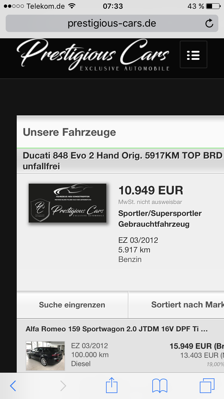
i have a new Website
and i have the Problem in the Category
Fahrzeuge
when i See the Category with my Phone it be no right….
and here is the same Site
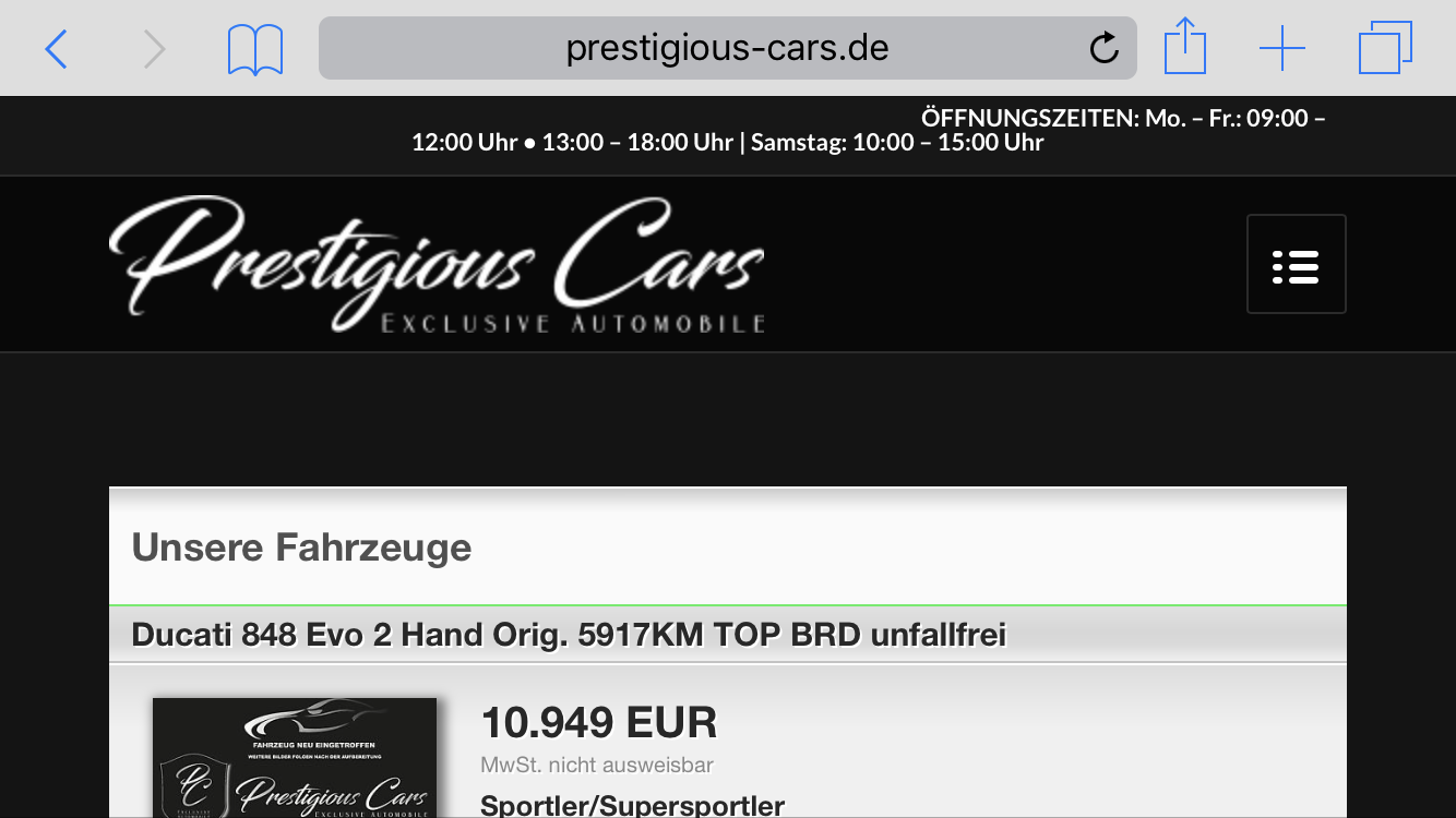
can you help me ?
January 30, 2017 at 9:47 am #740091Hi tsvweinsberg!
Is that a plugin, that shows the cars?
Can you please give us more informations?Thanks a lot
Cheers!
BasilisJanuary 30, 2017 at 10:30 am #740102Thats not a plugin thats with i Frame:
I have Fram in 2 Categorys
The First Categroy is Kundenrezensionen
The I Fram Code on this Category is:
<iframe id=”Fahrzeugangebot” src=”https://www.mobile.de/bewertungen/PRESTIGIOUSCARS#1″ name=”Kundenmeinungen” width=”100%” height=”800px” frameborder=”0″>Ihr Browser kann leider keine eingebetteten Frames anzeigen!</iframe>
and now my Problem Category Fahrzeuge
here is the iframe Code from the Categroy Fahrzeuge:
<iframe id=”Fahrzeugangebot” src=”http://home.mobile.de/home/index.html?partnerHead=false&colorTheme=green&customerId=8033961#ses” name=”Fahrzeugangebot” width=”100%” height=”850px” frameborder=”0″>Ihr Browser kann leider keine eingebetteten Frames anzeigen!</iframe>
January 31, 2017 at 9:09 am #740532@Basilis have you a solution?
February 1, 2017 at 3:13 pm #741278Hi!
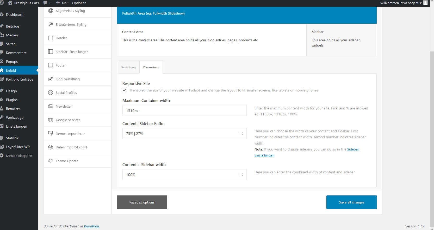
Can you please refer to this post – http://kriesi.at/documentation/enfold/color-section-with-100-container/ and create a color section element with 100% container width and place your iframe inside that Color Section.
Best regards,
YigitFebruary 1, 2017 at 3:42 pm #741293@Yigi i dont have a portfolio … i can give you the login from the wordpress via privat Content and you can check too
-
This reply was modified 9 years, 1 month ago by
tsvweinsberg.
February 1, 2017 at 3:44 pm #741296Hey!
Yes, please create a temporary admin login and post it here privately
Best regards,
YigitFebruary 1, 2017 at 3:56 pm #741304Hey, in the Private is the login, thank you!
February 1, 2017 at 4:13 pm #741320Hi,
I edited your page and added your text block element into a color section element with ID “unique-id ” and then added following code to Quick CSS field
@media only screen and (max-width: 767px) {
#unique-id .container { width: 100% !important; max-width: 100% !important; margin: 0 !important; padding: 0 !important; }}
Please review your website now
Best regards,
YigitFebruary 1, 2017 at 4:15 pm #741322Thank you very much, you can closed! :))
February 1, 2017 at 4:16 pm #741323Hi!
You are welcome!
For your information, you can take a look at Enfold documentation here – http://kriesi.at/documentation/enfold/
And if there are features that you wish Enfold had, you can request them and vote the requested ones here – https://kriesi.at/support/enfold-feature-requests/
For any other questions or issues, feel free to post them here on the forum and we will gladly try to help you :)Best regards,
Yigit -
This reply was modified 9 years, 1 month ago by
-
AuthorPosts
- The topic ‘Mobile Phone Responsiv Problem’ is closed to new replies.