-
AuthorPosts
-
March 2, 2016 at 2:18 am #591840
Hi there,
I know that this topic has been opened before and I have found some answers here and there but since there are posts that go back to 2013, I would like to know if there is a final and official way to move the WPML flags to the social header icons position. Maybe add this feature in a feature release too? That would be great to consider.
The default position (inline with the main menu items) isn’t to my liking as well as the top header bar (I don’t want to use any).
Also please advise if we can show the flags in the mobile menu since the social icons disappear when going to mobile view.
Thanks in advance.March 4, 2016 at 3:07 am #593078Since the support team seems a bit swamped with so many requests, I did some research and I achieved (nearly) what I want.
I activated the header secondary menu and made the “built-in to Enfold” language flags appear. Then I used the following CSS I found in another post with some tweaks to my header:@media only screen and (min-width: 768px) { .sub_menu { position: absolute !important; top: 85px !important; right: 120px !important; } } .header-scrolled .avia_wpml_language_switch.avia_wpml_language_switch_extra { top: -32px; } #top ul.avia_wpml_language_switch li { margin: 0px 10px 0px 5px; }I don’t know if I made any mistakes or if I could make the code better but it seems to work.
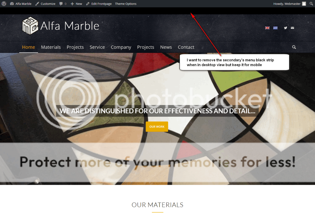
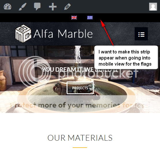
What I would finally want to achieve is to remove the black strip of the secondary menu but keep it for the language flags when it goes into mobile view.


Also I noticed that the social menu icons disappear when the layout jumps into mobile menu view.

I am attaching some screenshots to indicate the above. I hope they help and I hope you will help.
Thanks
March 8, 2016 at 5:13 pm #595066Hi!
Sorry for the late reply!
Please add following code to Quick CSS as well
@media only screen and (min-width: 768px) {
#header_meta {
    margin-top: -30px;
}
html_header_top.html_header_topbar_active.html_header_sticky.html_large.html_bottom_nav_header #top #main {
    padding-top: 168px;
}}
Best regards,
YigitMarch 11, 2016 at 2:41 am #596652Thank you for the reply Yigit.
The code you provided has indeed removed the top socket but only in desktop viewport. When going into 767px or less a black bar appears beneath the header and above the slider. The same and even bigger bar shows up if you resize the site in less pixels. See attached screenshots.
Any ideas?
 March 11, 2016 at 5:34 pm #596959
Hi!
Please add following code to Quick CSS as well
@media only screen and (max-width: 990px) and (min-width: 768px) {
.html_header_top.html_header_topbar_active.html_header_sticky.html_large.html_bottom_nav_header #top #main { padding-top: 147px !important; }}
If you would like to share CSS or any other code, please use pastebin.com and post the links here :)
Regards,
YigitMarch 11, 2016 at 8:21 pm #597021Hey Yigit,
Unfortunately the code didn’t work so I disabled it. I am creating credentials to log in and have a look.Regards,
ManouMarch 15, 2016 at 11:23 pm #598688Hi!
I added the code to top of Quick CSS field and it does work fine on my end. Can you please flush browser cache, refresh your page a few times and review your website?
Regards,
YigitMarch 17, 2016 at 3:43 am #599381Hi Yigit,
I did all that but the black bar of the secondary header menu is still there. Maybe you cannot see it because it is black.
I’ll change it to orange to see what I mean.
Thank youMarch 19, 2016 at 10:55 am #600657Hi!
Add this in the Quick CSS field:
#header_meta, #header_meta .container {
    min-height: 1px;
    height: 1px;
}
Adjust the top padding of the main container:
.html_header_top.html_header_topbar_active.html_header_sticky.html_large.html_bottom_nav_header #top #main {
    padding-top: 168px;
}
Best regards,
IsmaelMarch 24, 2016 at 2:54 am #602856Thank you Ismael,
Your code worked fine and I had to adjust some things using the below CSSTo fix the header padding when in tablet sized viewport:
@media only screen and (max-width: 990px) and (min-width: 768px) {
.html_header_top.html_header_topbar_active.html_header_sticky.html_large.html_bottom_nav_header #top #main { padding-top: 118px !important; }}
To “call” the black bar for the language flags when in mobile view:
@media only screen and (max-width: 768px) {
#header_meta, #header_meta .container {
    min-height: 30px;
    height: 30px; }}
To adjust the padding of the flags in header scrolled:
.header-scrolled .avia_wpml_language_switch.avia_wpml_language_switch_extra {
top: -62px !important; }
Hope this helps someone out there.
Thanks! -
AuthorPosts
- The topic ‘WPML flags at header social icons position’ is closed to new replies.
