
-
AuthorPosts
-
September 21, 2015 at 11:38 am #506347
Hi, love your theme. I have a problem with pictures. They show apparently well on desktop but they are cropped in mobile devices (phone, both Android and Iphone).
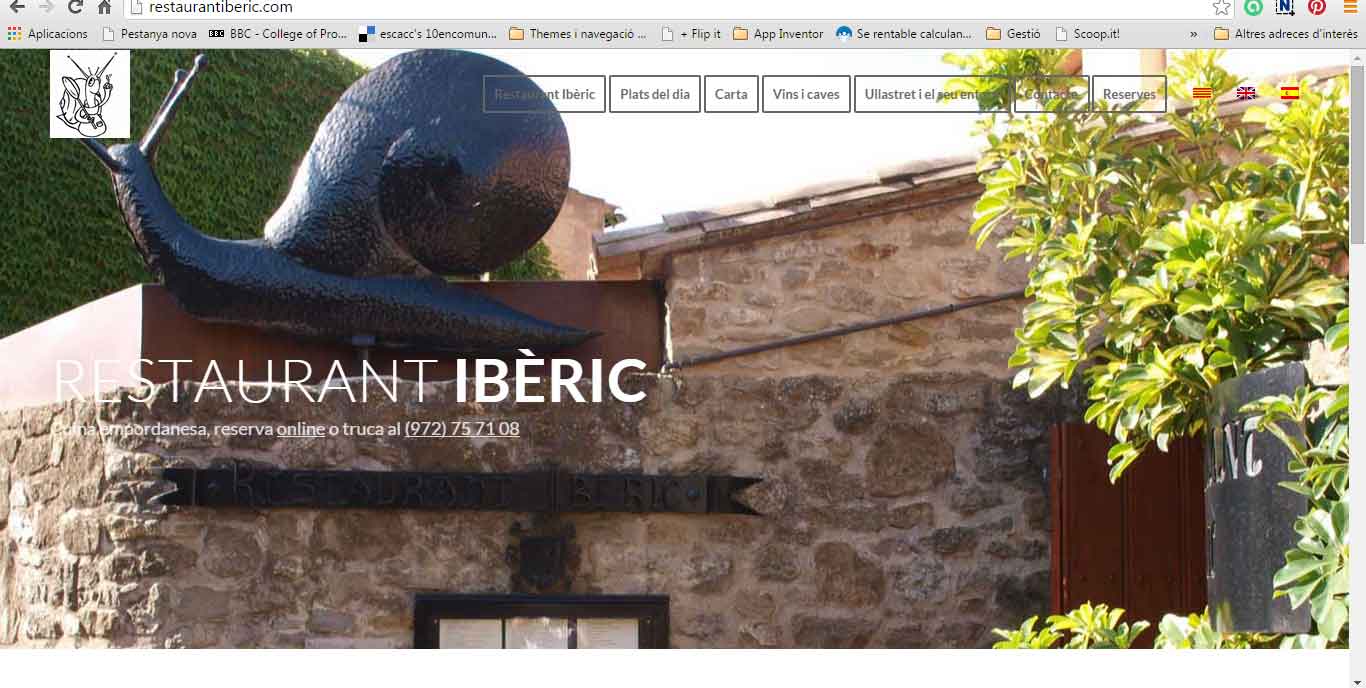
I show you a desktop image and a phone image. How can I fix it (how can the theme work as responsive as is supposed to do?Mobile
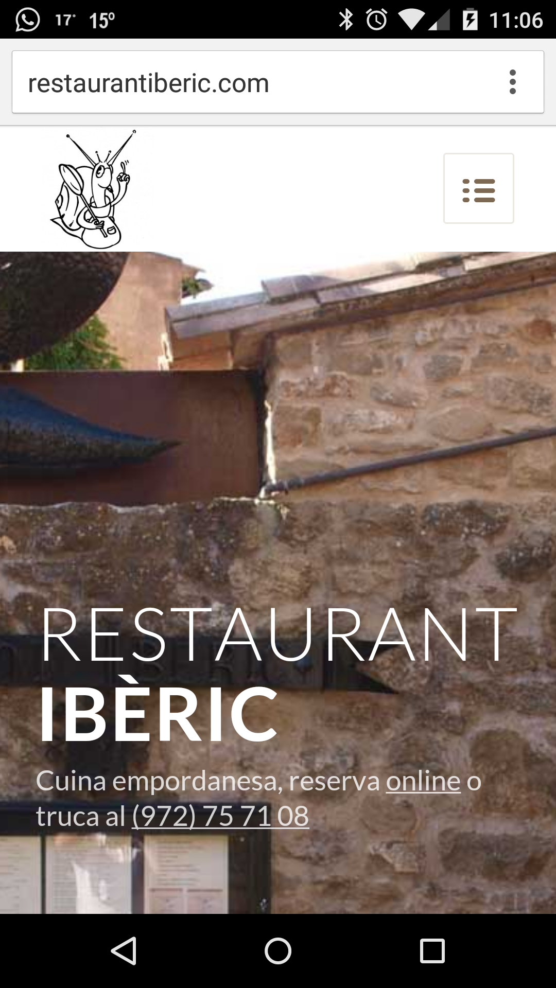
Desktop
 September 21, 2015 at 3:20 pm #506474
Hi lluisbruguera!
try this code in quick CSS field:
@media only screen and (max-width: 767px) {
.av-parallax.avia-full-stretch.active-parallax.enabled-parallax {
background-size: 100% 100% !important;
}}
and adjust as needed.
Cheers!
AndyOctober 7, 2015 at 5:53 pm #515390Thanks Andy for your answer. I tried this code but nothing happens on the mobile version. I do not understand where the problem is, this is suposed to be responsive, While I was doing several trials, I changed the settings ot the background picture from parallax to scroll, and this way I can change the part of the picture that is shown on the mobile version, but still, it takes only part of the picture, it is not showing the full picture in the mobile display.
I wonder if there is another way to ‘tell’ the them to take a less big picture for the mobile version instead of taking a part of the full 1310 px picture. Any ideas, please?October 8, 2015 at 6:23 am #515576Hi,
Maybe you can try to create new sections only for mobile? That would give you greater control over the images. Would that be an option for you? If you should need help with hiding/showing the correct section for the corresponding screen size we’ll be happy to help you out with that.
Best regards,
RikardOctober 8, 2015 at 10:06 am #515671Hi!
you are talking about the image with the snail, right?
It is responsive, but responsiveness does not mean that an image will automatically behave the way you wish. Instead it means you can control different behavior on different screen sizes. Try to control it by adjusting this code:@media only screen and (max-width: 767px) { div#av_section_1 { background-size: 120% 110% !important; background-position: -10px -20px !important; }}Play around with the different values, until it fits as you wish.
Make sure you don’t have any other code conflicting with this one.
Don’t forget to clear browser cache and hard refresh a few times.
Cheers!
Andy-
This reply was modified 10 years, 5 months ago by
Andy.
-
This reply was modified 10 years, 5 months ago by
-
AuthorPosts
- You must be logged in to reply to this topic.