Tagged: alignment, bullet point, bullets
-
AuthorPosts
-
April 24, 2014 at 6:47 pm #255677
Hello all:
In the past you all gave me this code to fix the “second line” after a bullet post icon so that they line up and not fall under the icon.
See code you gave me here:
#after_section_1 .avia-icon-pos-left { margin-left: -18px; }
.home .avia-icon-pos-left {
margin-left: -18px;
}.avia-promocontent .avia-icon-pos-left {
margin-left: -18px;
}But my client just added MORE text making the bullet point take up 3 lines and the last line is now not lining up.
See it here: http://www.warrenbsi.com/employee-benefits/
3rd bullet down –
Provide all employee communications (i.e., custom benefit communicators that includes all required notice requirements and summary of benefits and coverage)
How can I alter the css to fix that?
I’m editing this – client just added MORE content for another bullet point – 5th bullet down:
Provide compliance service for: Affordable Care Act (ACA), Employee Retirement Income Security Act (ERISA), Internal Revenue Service (Premium Only Plan, Flexible Spending Account (FSA), Consolidated Omnibus Budget Reconciliation Act (COBRA), Centers for Medicare Medicaid Services (CMS). * Review of details on these services is required.
As you can see now the first TWO lines line up correctly – after that they go out of line.
Not sure if the new CSS code you would haver send would fix this so I wanted to edit this question.
Thanks!
Paul
-
This topic was modified 11 years, 11 months ago by
noble51. Reason: New bullet content added - making several lines go out of alignment
April 25, 2014 at 10:35 am #256010Hi Paul!
Thank you for using the theme!
Please enclose the descriptions on a container. Something like this:
<div class="group-benefits-description">Provide compliance service for: Affordable Care Act (ACA), Employee Retirement Income Security Act (ERISA), Internal Revenue Service (Premium Only Plan, Flexible Spending Account (FSA), Consolidated Omnibus Budget Reconciliation Act (COBRA), Centers for Medicare Medicaid Services (CMS). * Review of details on these services is required.</div>Add this o Quick CSS or custom.css:
div.group-benefits-description {
margin-left: 20px;
}
Regards,
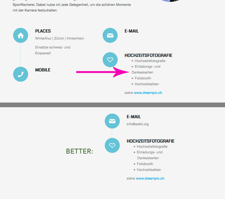
IsmaelMarch 5, 2015 at 10:18 am #406305I don’t understand why the default bullet point list is not working as it might be expected. Have a look at http://www.switch.ch/services/network/ (resize the browser to minimum). All lines in the bullet point lists after line 1 are well aligned; this is the default behavior from Bootstrap as an example…
March 5, 2015 at 12:26 pm #406352Hey aebli!
Not sure I understand exactly what you need help with, could you try and explain a bit further? Also, a link to the site question would help as well.
Cheers!
RikardMarch 5, 2015 at 12:42 pm #406359Hi Rikard
Thank you for your answer. Link: http://www.aebli.org/kontakt/
 March 5, 2015 at 1:35 pm #406378
Hey!
Thank you for coming back.
Try the following:
.avia-icon-list .iconlist_content li {
    list-style-position: outside !important;
}
Regards,
GünterMarch 5, 2015 at 2:17 pm #406402Hi Günter, vielen Dank, hat wunderbar geklappt! Schön, dass es evt. im nächsten Release sogar berücksichtig wird!
-
This reply was modified 11 years ago by
aebli.
March 5, 2015 at 2:41 pm #406419 -
This topic was modified 11 years, 11 months ago by
-
AuthorPosts
- The topic ‘Icon – text alignment’ is closed to new replies.
