
-
AuthorPosts
-
February 8, 2026 at 11:38 am #1494819
HI .. need to make the right image flexible and full screen

So, i added the css
.home #av_section_4 .container {
    max-width: 100%;
    padding: 0;
}
..and updated the section. But this does not take effect.
Strech to fit is also set in the block settings.What is missing?
February 8, 2026 at 4:38 pm #1494831Hey Sebastian,
Your container max-width is 1200px and contains margin & padding:
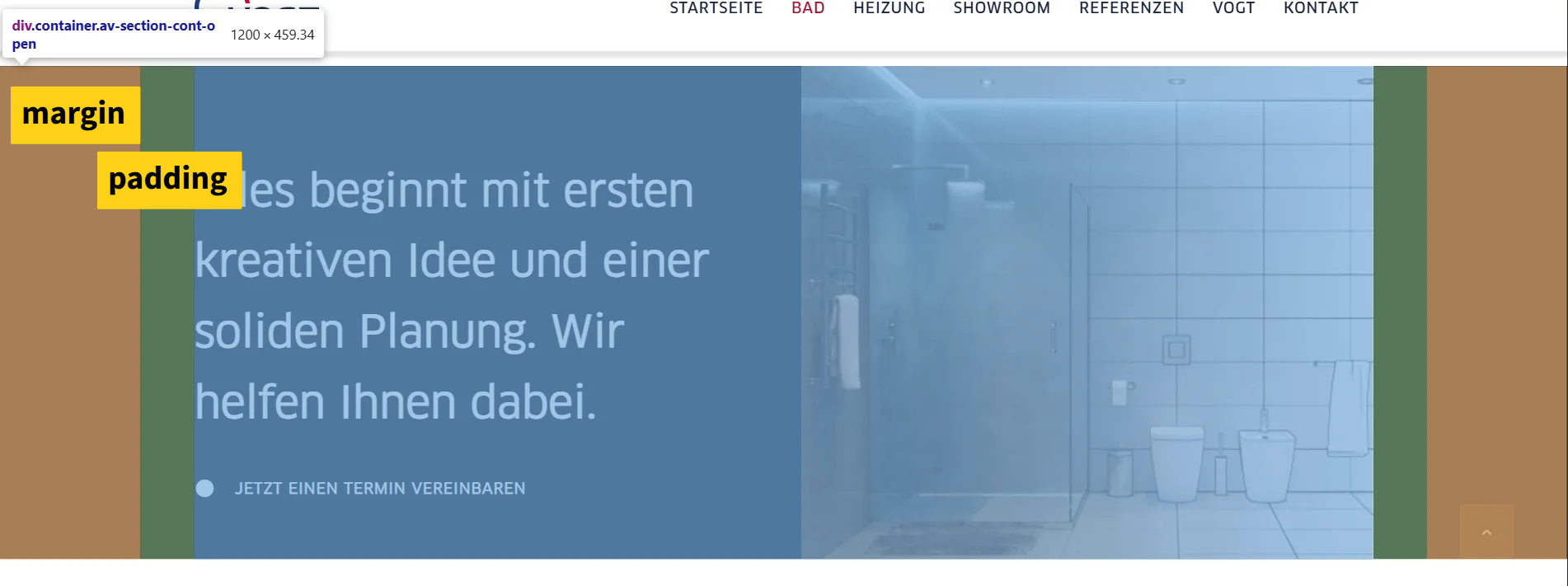
Try this css and adjust to suit:.responsive .page-id-3603 #av_section_4 .container { max-width: 100%; padding: 0; }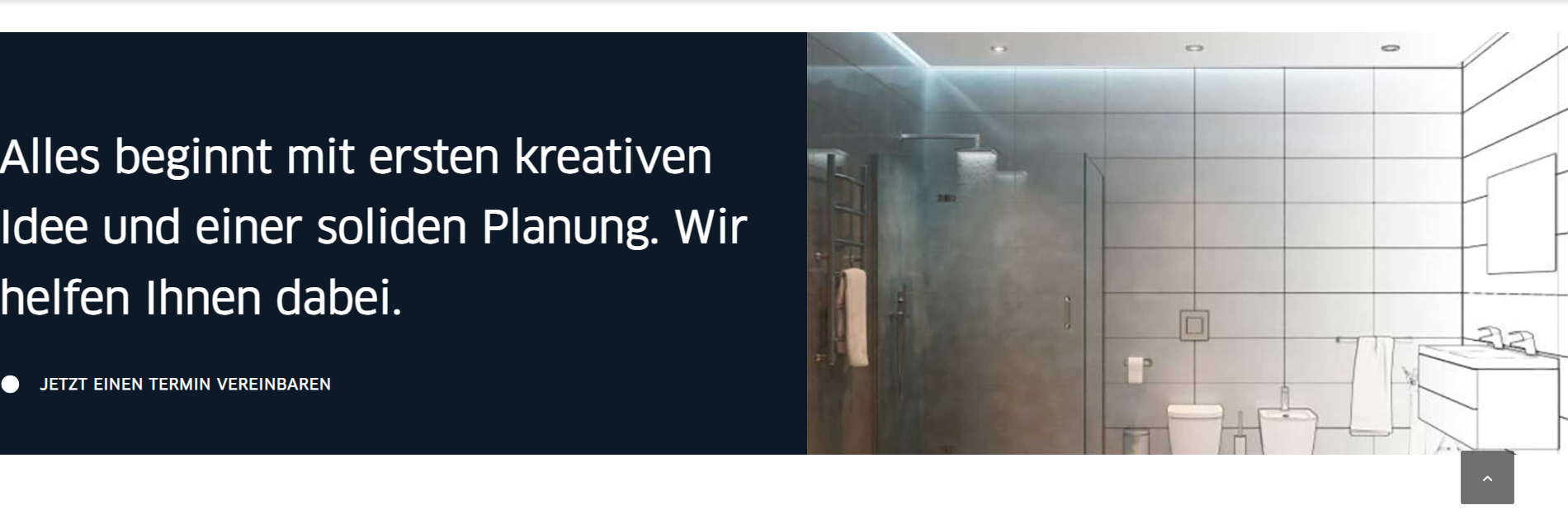
Best regards,
MikeFebruary 8, 2026 at 5:00 pm #1494838have a look to my test-page: https://webers-testseite.de/marcus/
Use the grid-row element instead.what is important for you – is to know your content width set in your enfold options – and the calculation
.content-alignment .flex_cell.avia-builder-el-first {
    padding-left: calc(50% - 755px) !important;
  }
/** or **/
  .content-alignment-right .flex_cell.avia-builder-el-last {
  padding-right: calc(50% - 755px) !important;
  }
my setting on the test page is 1510px width for content width. – so half is 755px – that determines the padding-left or padding-right value.
February 8, 2026 at 5:15 pm #1494840February 8, 2026 at 5:47 pm #1494848i’m using the grid-row elment on that – this is a full-width element so you do not need to think about the image – the solution is to hamper the text to be as wide as the 1/2 grid-cell.
February 8, 2026 at 8:19 pm #1494859Is this not the same like here?
But the left block is also moving flexible February 10, 2026 at 8:01 am #1494911
You can also achieve this with your layout, but it is easier to do it the other way around.
Here you can see your layout with color section (custom class: stretchy). In the column with only the background image, I have placed a whitespace separator for the forced height.February 10, 2026 at 9:36 am #1494915Thank you Guenni,
the first code works prefect.We can close here.
February 10, 2026 at 10:57 am #1494916Remember to adjust this value of 755px—this is because my installation has a maximum width of 1510px for content there.
February 10, 2026 at 11:10 am #1494917Yes, i did :)
February 10, 2026 at 11:13 am #1494918Hi,
Thanks for your help Guenni007, If you have further questions please open a new thread and we will try to help. Thanks for using Enfold.Best regards,
Mike -
AuthorPosts
- The topic ‘2 blocks with flexible bg image’ is closed to new replies.