
Tagged: social icons
-
AuthorPosts
-
September 9, 2025 at 7:16 pm #1489093
Hello everyone.
At https://kriesi.at/documentation/enfold/social-share-buttons/#toggle-id-1, I found this code to display social media icons on mobile devices:/* Do not hide social bookmarks */ @media only screen and (max-width: 479px) { .responsive #top #wrap_all #header .social_bookmarks { display: block; }}It works perfectly, but the icons are to the right of the menu.
Would it be possible to have them between the logo and the menu instead?
Alternatively, is it possible to insert them within the mobile menu?
Regards.September 10, 2025 at 8:04 am #1489119try
@media only screen and (max-width: 989px) {
  .responsive #top #wrap_all .main_menu {
    display: flex !important;
    flex-direction: row-reverse;
    align-items: flex-start;
    height: 100% !important;
  }
  #top #wrap_all .social_bookmarks {
    padding-right: 20px;
    border-right: 1px solid var(--enfold-header-color-meta);
  }
}

@media only screen and (min-width: 768px) and (max-width: 989px) {
  .responsive.html_mobile_menu_tablet #top .avia-menu.av_menu_icon_beside {
    border: none;
    padding-right: 0px;
  }
}

@media only screen and (max-width: 767px) {
  .responsive #top #wrap_all #header .main_menu > .social_bookmarks {
    display: block !important;
    top: 40px
  }
  .responsive #top #wrap_all .av_mobile_menu_tablet .main_menu {
    align-items: flex-start;
  }
  .responsive #top .av_seperator_big_border .avia-menu.av_menu_icon_beside {
    padding-right: 0;
    margin-right: 0;
    border: none;
  }
}
and check please the style on screens less than 767px if that fits for you. on medical demo it works well.
September 10, 2025 at 8:11 am #1489120btw. your code sometimes leads to show the social icons twice. Because the example of medical demo has the navigation below the logo container.
Then we have those social icons twice in the DOM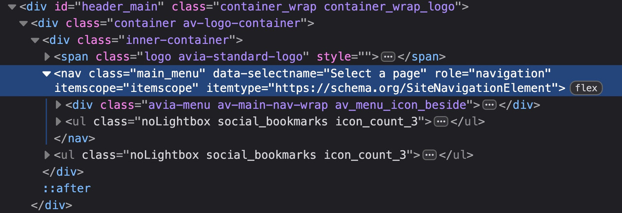
Therefore (menu below the logo) , it is better to define your code as follows:
( for those settings where the social bookmarks are not visible below 767 you had to adjust that code)@media only screen and (max-width: 479px) { .responsive #top #wrap_all #header .main_menu > .social_bookmarks { display: block; } }September 10, 2025 at 9:07 am #1489123At the very least, it would be good to know your header settings (logo left, menu below, etc.). For example, when I work on the new version with (logo left, menu right), the social bookmarks are located within main_menu. When I look at the board at the top here, they are located next to main_menu. – That depends on where I place the flex container.
so it all depends on your setting . so it will be the best to see the concerning site.
f.e. if you got a setting that the burger is visible from the beginning – like in freelancer demo
then you had to remove the media-query setting for screens above 768px.
September 16, 2025 at 4:52 pm #1489285Hi everyone.
The proposed solution seems perfect for my case at the moment.
Thank you @guenni007 for your further contribution!
Regards. -
AuthorPosts
- The topic ‘Social icons position on mobile’ is closed to new replies.