
-
AuthorPosts
-
August 4, 2025 at 1:20 pm #1487552
Hi
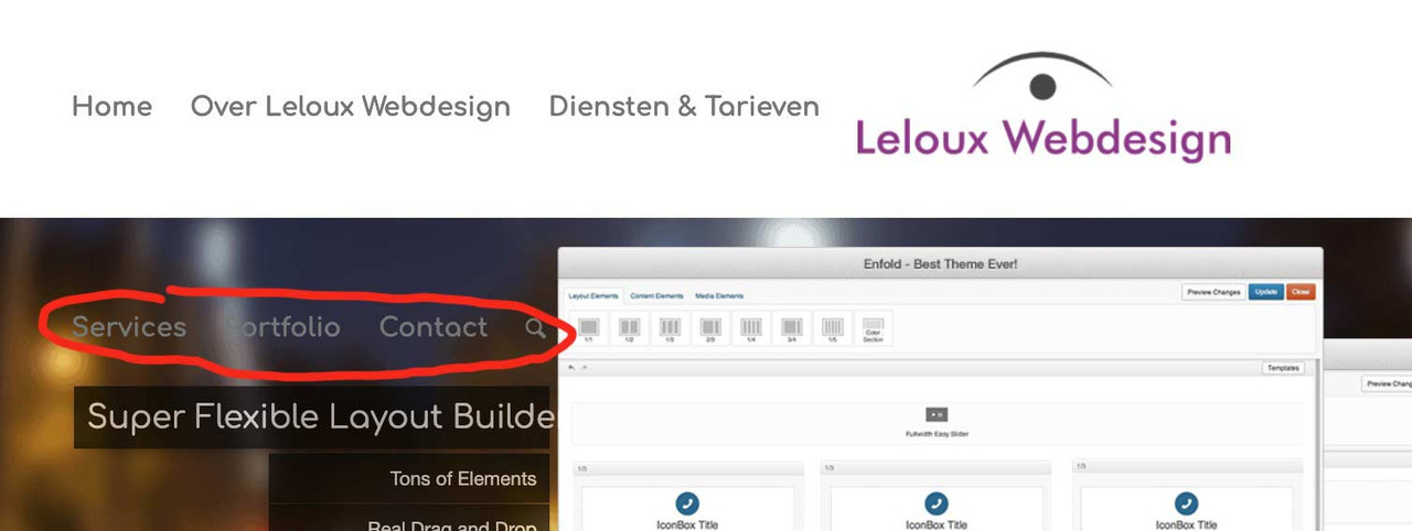
Is it posibble to create a menu- layout like this website?I want to put the logo in the center en the menu-items on both sides of the logo.
Kind regards
Karin LelouxAugust 4, 2025 at 5:33 pm #1487562Hey lelouxwebdesign,
Please try following this: https://kriesi.at/documentation/enfold/example-of-centered-logo-and-menu/
Best regards,
RikardAugust 5, 2025 at 10:32 am #1487597Hi Rikard
Thanks for your reply…
This does not work for me..
I created a header widget and put the css in the functions php but i dont know how to achieve the lay-out i want: the menu layout in : http://www.cinterior.nlCan you help me?
Kind regards
Karin Leloux
In the private content the login credentials for:August 5, 2025 at 10:50 pm #1487614Hi,
In your example site, I don’t see a widget, if you mean the “announcement-banner” across the top, this can be created better with javascript than a widget.
Nonetheless to center the logo in the menu, to start, try this solution.
Please note that it is best to have an even menu count so it can be split in half.Best regards,
MikeAugust 6, 2025 at 9:09 am #1487619Hi Mike
Thanks for your reply.
Unfortunately it does not work for me…I am not able to manage this but is is exactly what i want.Where do i place the codes?
I removed the widget header ( “the announcement-banner”across the top..)What do i have to do to accomplish this?
Kind regards
Karin LelouxAugust 6, 2025 at 10:29 am #1487620read carefully – the first condition:
Logo centered to the menu
best presetting will be logo left – menu right(or logo right menu left – works aswell)
this is best because on responsive case we do not need to take care of logo or burger placement.
left code is for child-theme functions.php – right side codeblock is for quick css.
css adjusted for your settings:
@media only screen and (min-width: 768px) {
  #top .av-logo-container .logo {
    opacity: 0;
  }
  #top .main_menu {
    left: 0;
    width: 100%;
  }
  #top .main_menu .avia-menu.av-main-nav-wrap {
    position: relative;
    left: 50%;
    -webkit-transform: translateX(-50%);
    transform: translateX(-50%);
  }
  #top #menu-item-logo svg,
  #top #menu-item-logo img {
    max-height: 120px;   /**** depends on your choosen header height - on shrinking headers it will be set by that enfold shrink script ******/
    width: auto;
    position: relative;
    top: 50%;
    -webkit-transform: translateY(-50%);
    transform: translateY(-50%);
  }
}

#av-burger-menu-ul .menu-item-logo {
	display: none
}
August 6, 2025 at 10:43 am #1487623by the way i will update that installation now to newest enfold – to check if there are things to change …
August 6, 2025 at 10:55 am #1487624Hi Guenni007
Thanks!
It works fine!
You have been a great help!
I will put the codes in the newest enfold and see if there are things to change…Kind regards
Karin LelouxAugust 6, 2025 at 11:05 am #1487625i switched that installation right now tol WP6.8.2 and Enfold 7.1.1
everything works well.
PS: you had to switch earlier to the burger menu.in this case change it to new media query option:
@media only screen and (max-width: 1070px) {
    #top #header .av-main-nav > li.menu-item  {
        display: none!important;
    }
    #top #header .av-burger-menu-main {
        cursor: pointer;
        display: block!important;
    }
}
you had to synchronise it with the media query above:@media only screen and (min-width: 1070px) { #top .av-logo-container .logo { opacity: 0; } #top .main_menu { left: 0; width: 100%; } #top .main_menu .avia-menu.av-main-nav-wrap { position: relative; left: 50%; -webkit-transform: translateX(-50%); transform: translateX(-50%); } #top #menu-item-logo svg, #top #menu-item-logo img { max-height: 120px; /**** depends on your choosen header height - on shrinking headers it will be set by that enfold shrink script ******/ width: auto; position: relative; top: 50%; -webkit-transform: translateY(-50%); transform: translateY(-50%); } } #av-burger-menu-ul .menu-item-logo { display: none }August 6, 2025 at 11:13 am #1487627Ok; tnx!
But now i have lost my theme editor:-( in my own website….Can you help me to bring it back?
Kind regards
Karin LelouxAugust 6, 2025 at 11:18 am #1487628Hi Guenni007
I got the theme editor back !
Tnx again and have a nice day!Kind regards
Karin LelouxAugust 6, 2025 at 11:19 am #1487629theme editor – where ? you can not edit your child-theme functions.php ?
or theme editor – on editing pages/posts?But that can’t be related to the code snippet from my site. –
I’m Participant as you are so you’ll have to ask a mod here if they can take a look at your installation.August 6, 2025 at 11:23 am #1487630Hi Guenni007
It is already solved!
Sorry for the misunderstanding…Kind regards
Karin LelouxAugust 6, 2025 at 11:23 am #1487631think of css adjustment: https://kriesi.at/support/topic/different-menu-2/#post-1487625
-
AuthorPosts
- The topic ‘Different menu’ is closed to new replies.