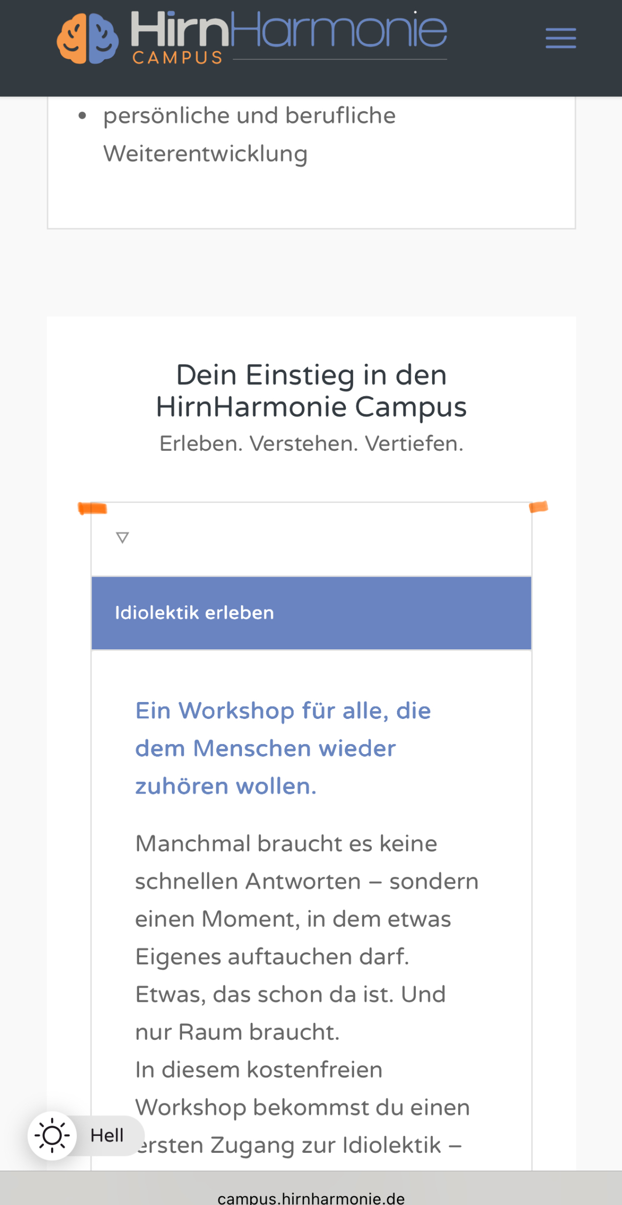
Hello, in the mobile version, I would like the tab section to be a bit wider. As you can see in the screenshot, it’s not fully aligned with the other content.

Also, in the mobile version, the active tab has a purple background color, which I think looks great. In the desktop version, this isn’t the case. How can I change that?
Best regards
Hey northorie,
Try this CSS in your Enfold Theme Options ▸ General Styling ▸ Quick CSS field:
.home .flex_column.av-qr1eee-be79778a5ca7a248c4cd5f4274b9b47d {
    padding: 0;
}
@media only screen and (min-width: 768px) {
	    .responsive #top .main_color .tabcontainer .active_tab {
        background-color: var(--enfold-main-color-secondary);
        color: var(--enfold-main-color-constant-font);
    }
}
After applying the css, please clear your browser cache and check.
Best regards,
Mike
Awesome! Thak you, looks cool now!
Topic can be closed
Hi,
Glad we were able to help, if you have any further questions please create a new thread and we will gladly try to help you. Thank you for using Enfold.
Best regards,
Mike
