Hi, on my desktop site I added Image Position to -100 so it overlaps the top of the columns. ON mobile though it doesn’t look great. Do you know how I would fix this for mobile tablet view?
Hey amandahook62,
Thank you for the inquiry.
Have you tried adjusting the Row Settings > Row Margin > Custom Top and Bottom Margin settings for mobile view or smaller screens? You can toggle the device icons to specify different margins for different screen sizes.
Best regards,
Ismael
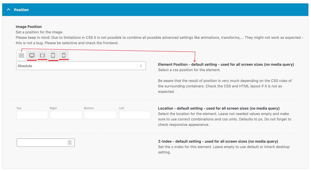
They are part of these settings, as ismael mentioned. These 4 icons (underlined in red) give you settings for different screen widths. There is some explanatory text on the right. The only thing I set as a default is whether absolute or relative positioning is selected. I then set the values for the individual widths.

f.e. on this demo page here (the three columns with that special ampersand) : https://kriesi.at/themes/enfold-parallax/
it will make no sense for mobile view that the columns do overlap and move that parallax way. So these settings are not the same as for the desktop version.
