
-
AuthorPosts
-
August 12, 2024 at 10:04 pm #1464490
Dear Support – Team,
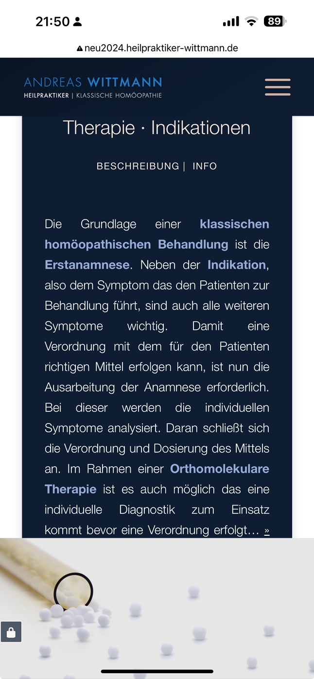
I have a problem with the mobile version of the website in the following section: http://neu2024.heilpraktiker-wittmann.de/#overview
There are 3 adjacent boxes that are correctly displayed one below the other in the mobile version:
Only in the last box (dark blue) the text is suddenly cut off at the bottom in the mobile version and the symbol box below it no longer appears: see screenshot mobile: https://osmosis.de/support/Box-Mobile.jpegWhat can I do to ensure that this last box is still displayed in full in the mobile version with all content and also the spacing padding at the bottom?
Thank you very much for your support!
Best regards DianaAugust 13, 2024 at 6:38 am #1464508Hey Diana,
Thank you for the inquiry.
The content is cut off because the column has a -170px bottom margin.
#top .flex_column_table.av-equal-height-column-flextable.av-wu3tsa-2f8288ffd7b4a522ef607878953863b5 {
    margin-top: 0px;
    margin-bottom: -170px;
}
You can override this by adding this css code:
@media only screen and (max-width: 768px) {

  /* Add your Mobile Styles here */
  #top .flex_column_table.av-equal-height-column-flextable.av-wu3tsa-2f8288ffd7b4a522ef607878953863b5 {
    margin-top: 0px;
    margin-bottom: 0 !important;
  }
}
Best regards,
IsmaelAugust 13, 2024 at 7:37 am #1464511Thank you Ismael for the quick and perfect answer! Works like charme :)
August 13, 2024 at 11:49 am #1464523Hi,
Great, I’m glad that Ismael could help you out. Please let us know if you should need any further help on the topic, or if we can close it.
Best regards,
RikardAugust 15, 2024 at 10:35 am #1464674Dear Support Team,
I have to contact you again regarding the script mentioned above: the specified script no longer works:
@media only screen and (max-width: 768px) {
#top .flex_column_table.av-equal-height-column-flextable.av-wu3tsa-2f8288ffd7b4a522ef607878953863b5 {
margin-top: 0px;
margin-bottom: 0 !important;
}
}I think it’s because of the “av-wu3tsa-2f8288ffd7b4a522ef607878953863b5”.
I have already tried to solve it via an ID by assigning the ID #cell-blue to this column and then tried to reactivate this script in various ways. Unfortunately without success. I have now also integrated the script in the CSS:
@media only screen and (max-width: 768px) {
#cell-blue {
margin-top: 0px;
margin-bottom: 0 !important;
}
}Can you please help me to make this solution work permanently? Even if we then switch the edited version of the website from the subdomain to the main domain?
Many thanks and best regards, DianaAugust 15, 2024 at 12:19 pm #1464681Hi,
I can’t see the element being cut off on my end, so I’m guessing that your new CSS is working?
Best regards,
RikardAugust 16, 2024 at 8:20 am #1464752Dear Rikard,
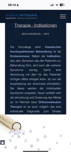
no, unfortunately it does not work: see screenshot: https://osmosis.de/support/Box-Mobile2.jpeg >> I have just created this screenshot from my hand.
I think it only works for you because it is loaded from the cache. It’s true, it worked before, but now it doesn’t work anymore. Please clear your cache.
I have also tried it on another mobile phone (where the page has never been accessed) and unfortunately it does not work here either.
Best regards, DianaAugust 16, 2024 at 9:31 am #1464760Hi,
Please try this CSS as well:
media only screen and (max-width: 768px) {
  #cell-blue {
    height: 650px;
  }
}
Best regards,
RikardAugust 16, 2024 at 1:55 pm #1464773Hello Rikard,
unfortunately the script does not work. I even added an ‘!important;’, but that didn’t help either.
Is there another possibility?
Best regards, Diana
August 17, 2024 at 11:08 am #1464807Hi,
Try increasing the height:
media only screen and (max-width: 768px) {
  #cell-blue {
    height: 850px;
  }
}
Best regards,
RikardAugust 17, 2024 at 11:34 am #1464808Thanks Ricardo! Now it works again! Perfect!
Have a nice day!August 17, 2024 at 2:22 pm #1464813Hi,
Glad Rikard could help, if you have any further questions please create a new thread and we will gladly try to help you. Thank you for using Enfold.Best regards,
Mike -
AuthorPosts
- The topic ‘Content column cut off Mobile version’ is closed to new replies.