-
AuthorPosts
-
June 22, 2024 at 12:55 am #1454337
I have a ‘book now’ button set in the header secondary menu, but I’d prefer it in line with the burger menu and search icon in the main menu.
I’d prefer the button to be larger and have a purple outline too.
How can that be done?
June 22, 2024 at 8:23 am #1454857go to your dashboard – menu and insert as last item your wanted link as individual Link
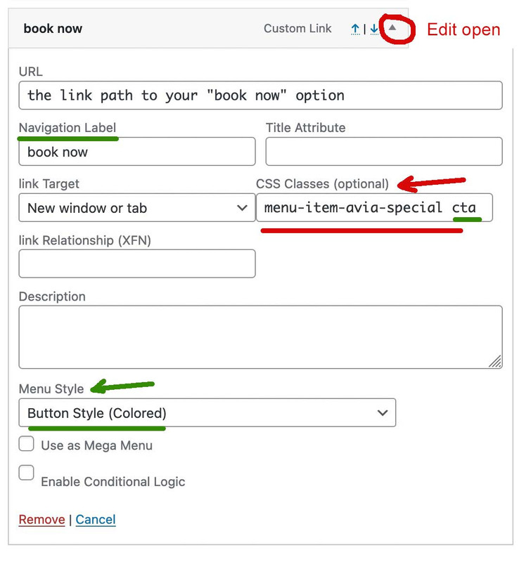
place in your main menu – you can see besides each menu item a little arrow to edit a menu-item.

edit that last item and insert to the css input field: menu-item-avia-special cta
the cta is only to style it without influencing other menu-items with the same class menu-item-avia-special
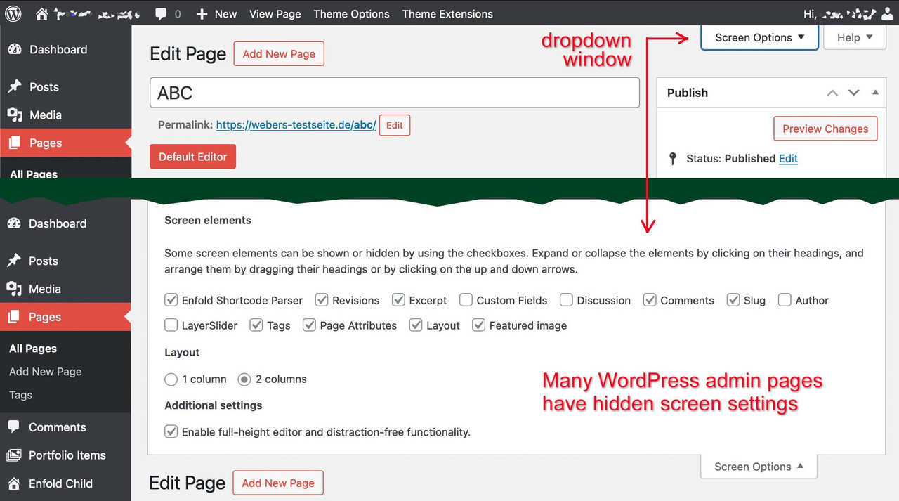
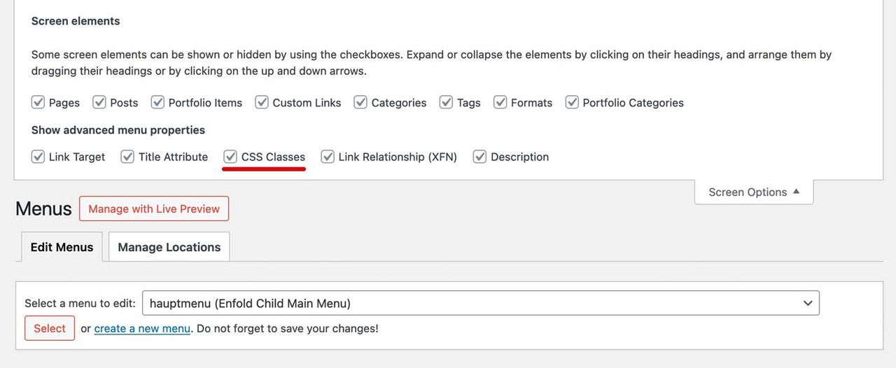
maybe mark allready the menu item style to button.If you do not have a css input field – look on top right corner of the menu Options page: a lot of wordpress option windows got there a slide out :

on menu options slide-out you now can mark to show css attributesbecause of that first class – it will stay visible even if burger menu is active !
see extraButton (book now) in use: https://webers-testseite.de/
with:.menu-item-avia-special.cta a .avia-menu-text { color: #FFF !important; border: 2px solid purple !important; border-radius: 7px !important; background-color: #d935d9 !important; }June 22, 2024 at 11:43 am #1455085Hi,
Thanks for helping out @guenni007 :-) Did you try that out and did you have any luck with it @sandy?
Best regards,
RikardJune 23, 2024 at 4:45 pm #1457251Thank you for the very helpful information. The “book now” button appears in the burger menu. How can it be retained outside of the burger menu?
June 23, 2024 at 5:42 pm #1457340Hi,
When I check it is outside the burger menu:

where did you want it to show? Perhaps a mockup would help.Best regards,
MikeJune 23, 2024 at 6:17 pm #1457352That is the secondary menu button that I had from the start, but it is not the main menu button that is wanted. If you click on the burger menu, you might see the new button that should be beside the burger menu, not in it, as per Richard’s example at https://webers-testseite.de/.
June 23, 2024 at 7:07 pm #1457369Hi,
Thanks for the feedback, the issue is that the example link is using a normal menu and you are using a mobile burger menu for your desktop, these are two different menus.
Whe I checked your site I found no “Book Now” button so I created a new one for you, and added the required custom class menu-item-avia-special cta which was disabled on your site, and then I added this css:.html_burger_menu_active #header .avia-menu .menu-item-avia-special.cta { display: block !important; }and Guenni007’s solution works great, thanks for sharing Guenni007!

you will need to adjust the button url as I didn’t know the like you wanted.Best regards,
MikeJune 23, 2024 at 8:07 pm #1457388Thank you! The problem was that the CSS class specified in my menu item (on the dev not staging site) was missing a space before cta. The button now appears as proposed.
However, it overlaps the logo on mobile, as it also does on https://webers-testseite.de/. Can the logo be positioned above the menu items (book now, search, burger) on mobile only?
June 23, 2024 at 10:15 pm #1457399Hi,
Try this CSS in your Enfold Theme Options ▸ General Styling ▸ Quick CSS field:@media only screen and (max-width: 767px) { .responsive #top #wrap_all .main_menu { position: relative; height: 66px; } .responsive #top .av-logo-container .avia-menu { width: 100%; display: flex; justify-content: center; } .responsive #top .logo { height: 54px !important; width: 100%; display: flex; justify-content: center; } }Please ensure to copy the code from the forum and not an email notification so the symbols are not converted.
After applying the css, please clear your browser cache and check.Best regards,
MikeJune 23, 2024 at 11:27 pm #1457402That works, thank you!
-
AuthorPosts
- The topic ‘Header button beside burner menu and search icon’ is closed to new replies.


