-
AuthorPosts
-
February 17, 2023 at 6:25 am #1398282
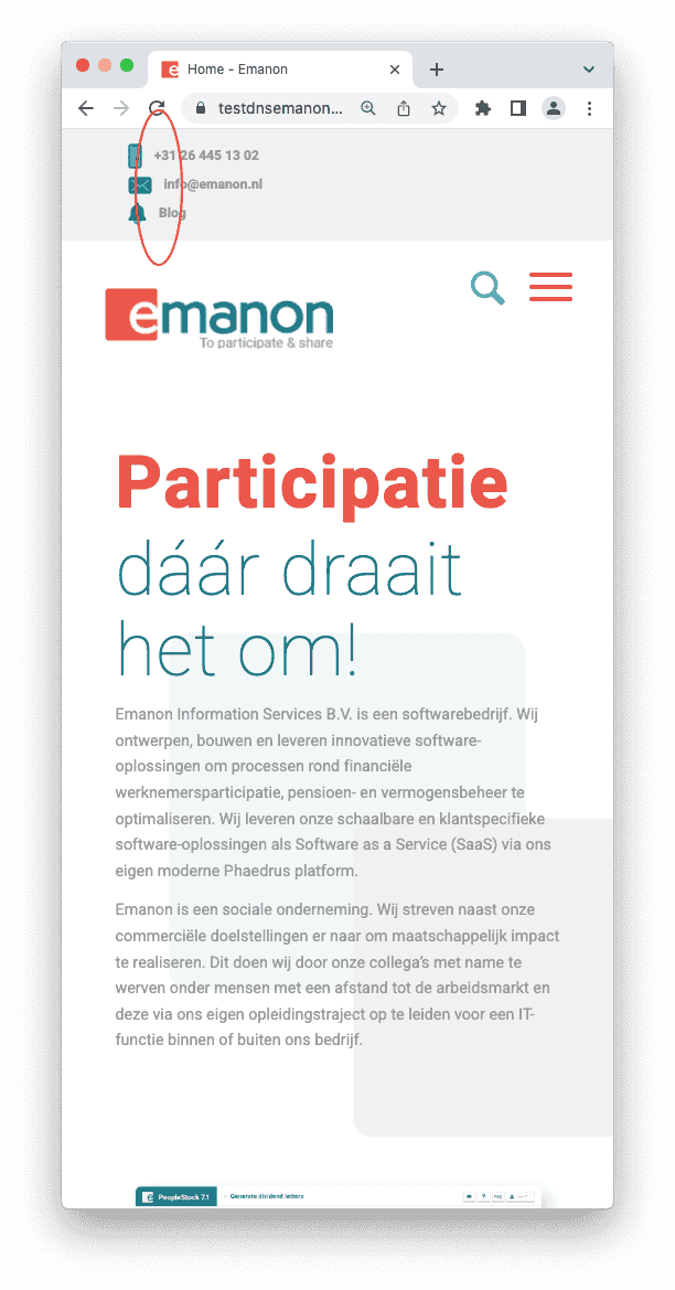
I want to adjust the height of the top bar so that there is more space for the icons. But only in the mobile version. The height of the topbar in desktop version is good as it is.

Thanks in advance.
-
This topic was modified 3 years, 1 month ago by
Emanon.
February 18, 2023 at 11:45 am #1398413Hey Emanon,
Please try the following in Quick CSS under Enfold->General Styling:
@media only screen and (max-width: 767px) {
#header_meta {
    padding: 10px 0;
}
}
Best regards,
RikardFebruary 20, 2023 at 6:53 am #1398579Thank you very much!
Can you also give me some code to left align these three words in the mobile version: +31 26 445 13 02, (Email address hidden if logged out) and Blog?
Greetings
February 20, 2023 at 1:17 pm #1398615Hi,
Please add the following code to the Quick CSS field in Enfold theme options > General Styling tab
@media only screen and (max-width: 767px) {
#header_meta .phone-info {
  text-align: left;
}
}
If that doesn’t work, please post a link to your website.
Best regards,
YigitFebruary 20, 2023 at 2:33 pm #1398626Hi Yigit,
Thanks for your reply. I added the code, but it’s not working.
You can login if you need. Maybe the code is in conflict with other code in Quick CSS?
February 20, 2023 at 4:19 pm #1398640Hi,
The text is already left aligned on my end. Would you like to remove the highlighted space in the screenshot I attached in the private content field?
If so, please use the following code instead@media only screen and (max-width: 767px) { .responsive #top #wrap_all #header_meta .container { padding: 0; width: 100%; max-width: 100%; } }Best regards,
YigitFebruary 24, 2023 at 9:28 am #1399110Hi,
Thanks for your response, but what I actually mean is that I want to align the text to the left. The icons are already aligned as you said.
Is that possible?
Greetings
February 24, 2023 at 2:11 pm #1399153Hi,
I edited the last media query you have in your Quick CSS field and added the following code to it as well
#header_meta .sub_menu #menu-item-2545::before {
  padding-right: 15px;
}
#header_meta .sub_menu #menu-item-2547::before {
  padding-right: 18px;
}
Please review your website.
Best regards,
YigitFebruary 27, 2023 at 2:06 pm #1399418Thank you very much Yigit!
Thread can be closed!
February 27, 2023 at 6:08 pm #1399439Hi,
Great, I’m glad that Yigit could help you out. I’ll close this thread for now then, please open a new thread if you should have any further questions or problems.
Best regards,
Rikard -
This topic was modified 3 years, 1 month ago by
-
AuthorPosts
- The topic ‘Increase hight top bar mobile version’ is closed to new replies.
