-
AuthorPosts
-
December 12, 2022 at 12:31 pm #1375930
Hi all..
On a page I’ve setup two different layout for a section, one for mobile and one for desktop.. I can hide the desktop section in mobile view from
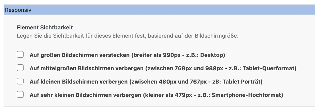
Advanced-> Responsive but I cannot hide the mobile content in desktop view..In past version was possible to choice every content visualizing option but in the last version not..
How I can to hide the mobile content in desktop view..?
Thank You very much
December 12, 2022 at 12:53 pm #1375932You do not have this on your advanced Tab ?
 December 12, 2022 at 1:14 pm #1375936
No Guenni.. This was the screen I had in previous versione.. Now I’ve no more options..
https://www.dropbox.com/s/duqcltuliqaensr/Schermata%202022-12-12%20alle%2012.11.42.png?dl=0
December 12, 2022 at 2:26 pm #1375949but you are talking about a section – i guess you are inside a column alb element now
December 12, 2022 at 3:03 pm #1375951i Guenni007..
This is the page: https://galactus.eu/la-storia-di-galactus-agenzia-di-traduzioni/
I need to invert the first row that now on desktop have the image on the left and the text on the right to have on mobile the text on the left and the image on the right with the image in smaller size so the text will be visualized before the image..
Ive duplicate the two columns but I can’t hide the mobile-specific section in desktop view and in desktop I view both the desktop and mobile section..Probably I must insert the content inside a color section..
December 13, 2022 at 7:05 am #1376022you don’t necessarily have to put all your columns into one color section – do you? So split your content to more than one color-section.
Then you have the possibility to show/hide for different screen sizes thes color sections.December 13, 2022 at 5:02 pm #1376063Thanks @Guenni007
I’ve put the two columns that iI need to show only in mobile view in a separate color section and so I can hide it in desktop view..
Thanks..
We can close..
December 14, 2022 at 4:47 pm #1376187 -
AuthorPosts
- The topic ‘How to hide mobile section in desktop view..’ is closed to new replies.
