-
AuthorPosts
-
August 9, 2022 at 3:26 am #1361177
I love “Featured Images!” I love the way they translate to a thumbnail on things like the “Recent News” section on the Footer.
What drives me nuts, however, is the way the same image will show up at the top of the post in the context of the way it’s listed with every other article that falls under the same category.
At that point, the Featured Image has been enlarged to the point where it’s pixelated and it looks unprofessional.
What I’d like to do is be able to use the “Featured Image” for the thumbnails in the way I referenced earlier, but avoid the way it’s used when it’s enlarged in the context of a list of posts.
I would be happy to provide some screenshots if that would help better describe my quandary. Otherwise, if you could share with me a piece of syntax I can incorporate into my functions.php or if there’s a setting that I’m overlooking, that would be wonderful.
I’m using the Enfold theme (https://themeforest.net/item/enfold-responsive-multipurpose-theme/4519990).
Thanks so much!
August 9, 2022 at 9:40 am #1361210Hey brucegust,
Could you post a link to an example page where you want to remove it please?
Best regards,
RikardAugust 9, 2022 at 3:10 pm #1361260Rikard! You, sir, are in a position to make my day! If we can figure this out within the next few hours before my meeting with my boss, we will be winners among those who merely show up!
Here’s what I’ve got:
First image (http://brucegust.com/downloads/full_page.png): This is the way my page looks like when you click on a “category” and it displays all of the posts that belong to that particular family of articles. In this example, the “featured image” is the trophy. In its proper context, the trophy shows up just fine within the article itself. But when it’s displayed as part of a whole category of similar posts, that same image is now enlarged and pixelated.
That’s what I’m trying to avoid! How can I fix that?
Second image (http://brucegust.com/downloads/sidebar.png): Ultimately, this is why I appreciate the “featured image” dynamic as much as I do. I like being able to include a small thumbnail alongside each article the way they’re displayed either in the footer or, in this instance, the sidebar.
This is part of what prompts my question. I want that part of the “featured image” mechanism. I just don’t want the enlarged and nasty looking image displayed like what I have pictured on http://brucegust.com/downloads/full_page.png.
Bonus (http://brucegust.com/downloads/this_space.png): Rikard, I realize this borders on being a completely different question and I will open up another thread if you prefer I do it that way. But this is all related in that the featured images that I want to see displayed on the side bar would ideally be accompanied by a larger image beneath them. I was envisioning a clickable photo that might connect a user to another article. Is that possible?
Thanks for your time!
August 9, 2022 at 5:25 pm #1361270Hi,
Thanks for the screenshots. So it’s on pages like these you don’t like the featured image? https://kriesi.at/themes/enfold/category/science/, or do you only want to display it smaller?
Bonus; if that is a regular page, then you can add content to the sidebar under Appearance->Widgets. I’m not sure exactly what you had in mind for that, but if you are looking for a dynamic alternative, then there’s nothing like that in the theme by default unfortunately.
Best regards,
RikardAugust 9, 2022 at 5:41 pm #1361271I would like to have the option of NOT displaying the featured image like what’s shown on the link that you sent me.
While the images in your sample don’t look bad at all, mine tend to look pixelated which is most likely due to the fact that they’re not large enough in their original state to be stretched out like that and not start to look jenky.
But is there way to have a featured image, so I’ve got a thumbnail in the footer etc, yet not have it displayed like on the site that you sent me?
August 9, 2022 at 5:52 pm #1361272why don’t you use a different way to show your blog?
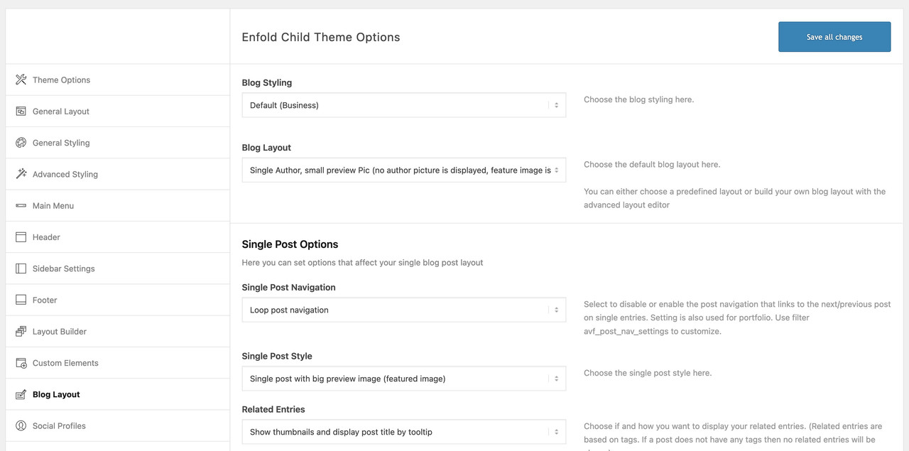
f.e.: like this https://kriesi.at/themes/enfold/blog/blog-single-small/August 9, 2022 at 6:59 pm #1361280Guenni007, that looks pretty good! How do I pull that off?
August 10, 2022 at 1:14 pm #1361349August 10, 2022 at 11:38 pm #1361387Guenni007! That did it! I just chose a different layout and that solved everything! Thanks!
And Rikard, I found a widget that incorporated into my Side Bar and it’s working great!
August 11, 2022 at 8:55 am #1361424Hi brucegust,
I’m glad that both Guenni007 and Rikard could help you out :)
Thanks for using Enfold and have a great day!
@Guenni007 thanks for helping out :)Best regards,
Nikko -
AuthorPosts
- You must be logged in to reply to this topic.

