-
AuthorPosts
-
February 22, 2022 at 12:26 pm #1341780
Urs Ernst Gattiker
GuestDear Sir or Madam
We have 2 sites installed with you template
But we have a problem with the showing of the comments. They show perfectly on a PC
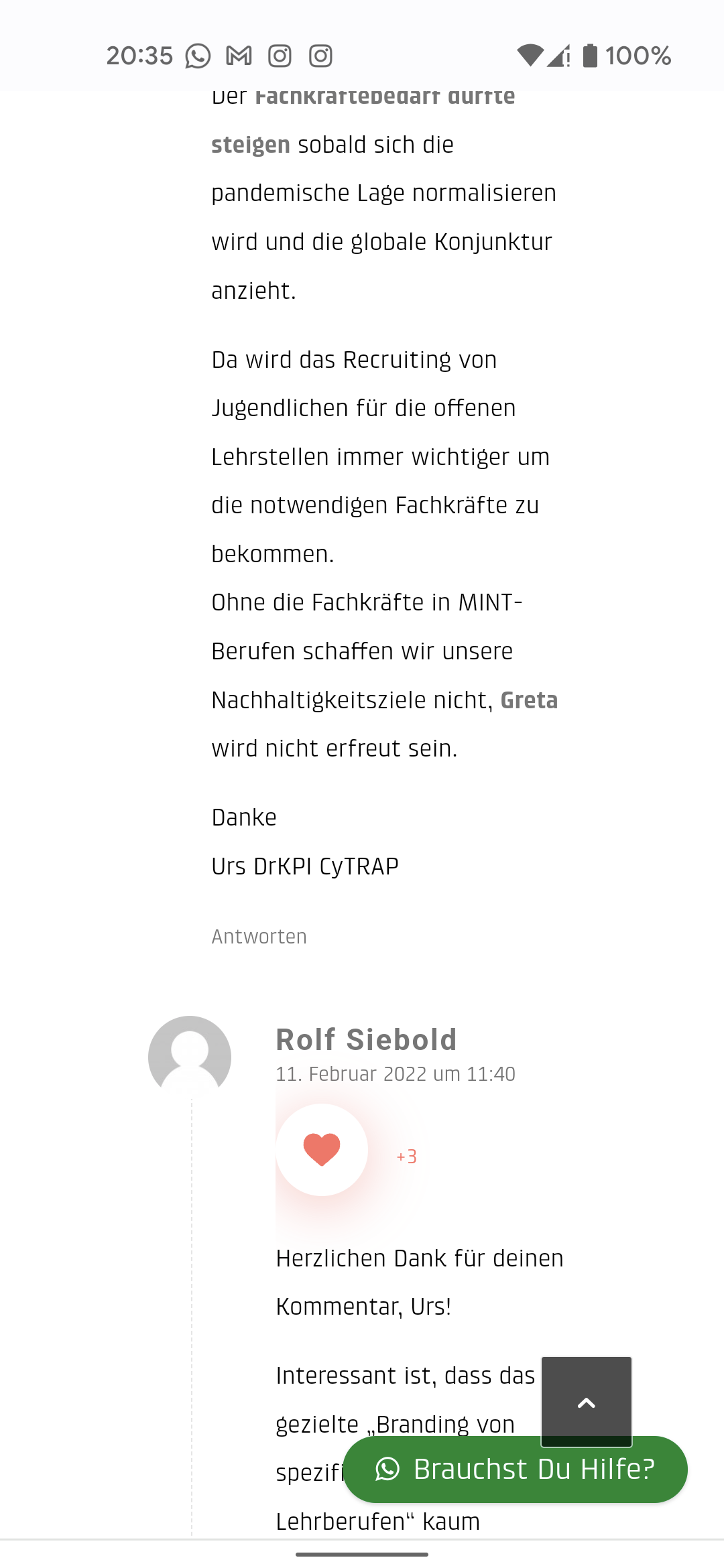
But they show terribly on a mobile when there are several replies to one comment.
What can we do. We were unable to fix it.
We will not be able to buy another Enfold license before we get this fixed. Because our current two clients using it are not happy, and we do not want the next customer to be unhappyThanks for your help.
RespectfullyUrs
CyTRAP Labs GmbH
Zurich SwitzerlandPS. we have been trying to fix this for a long time
February 22, 2022 at 5:03 pm #1341806Hi Urs,
Are you looking to remove the indentation on mobile? Otherwise it’s difficult to display different reply levels like that on limited screen widths.
Best regards,
RikardFebruary 22, 2022 at 6:02 pm #1341817Urs Ernst Gattiker
GuestDEar Rikard
Thanks for the answerWe would have to remove the indentation then… Yes we need to do that
Can we choose, mobile removed but PC/Mac viewer still gets indentation.
Thanks you
UrsFebruary 22, 2022 at 6:55 pm #1341824Hi Urs,
Thanks for contacting us!
Please add following code to Quick CSS field in Enfold theme options > General Styling tab
@media only screen and (max-width: 480px) {
#top .commentlist .children ul {
  margin: 0;
}
}
Best regards,
YigitFebruary 22, 2022 at 9:40 pm #1341867Urs Ernst Gattiker
GuestThanks we put it in but the indentation is still there for the mobile and pc user

STill has indentation i.e. it has very small columns.
Any other idea please.
Cordially
ursFebruary 23, 2022 at 4:51 am #1341913Hi,
Thank you for the update.
You may need to toggle or temporarily disable the Enfold > Performance > File Compression settings after adding the css code, and make sure to purge the cache before checking the page. To create more space for the comments and for further modifications, please add this css code.
@media only screen and (max-width: 480px) {
  /* Add your Mobile Styles here */
  .sidebar_right .comment_container {
    padding-right: 0;
  }

  #top .commentlist ul {
    margin: 0;
    margin-left: 30px;
  }

  .comment_content {
    margin-left: 50px;
    padding: 0 0 15px 0;
  }
}
If you want to move the gravatar above the comment, add this inside the css media query.
  .comment_content {
    margin-left: 50px;
    padding: 0 0 15px 0;
  }

  .gravatar {
    float: none;
    margin-bottom: 20px;
  }
Best regards,
IsmaelFebruary 23, 2022 at 10:27 am #1341962Urs Ernst Gattiker
Guest-thank you ismael
Super
it works
🙌February 23, 2022 at 10:33 am #1341963Urs Ernst Gattiker
GuestPS but it is actually unfortunate that for every little thing the template requires such code.
Sure be nice if we could do without that.
Thanks
UrsFebruary 23, 2022 at 1:24 pm #1341994Hi Urs,
Thanks for the update. Please let us know if you should need any further help on the topic or if we can close it.
Best regards,
RikardFebruary 23, 2022 at 1:49 pm #1341999Urs Ernst Gattiker
GuestPlease close
Rikard
ThanksFebruary 23, 2022 at 6:17 pm #1342029Hi,
Thanks for letting us know, I’ll close this thread for now then. Please open a new thread if you should have any further questions or problems.
Best regards,
Rikard -
AuthorPosts
- The topic ‘Problems with Mobile’ is closed to new replies.
