
-
AuthorPosts
-
August 22, 2021 at 3:15 pm #1317825
i added images to the health demo slider. i made them the same side as the two that were there and i added the css that was in the documnetation
my images still dont look right on a phone my site is 8lettuce.com
the css i used is
/* CSS to scale down fullscreen slider image */.avia-fullscreen-slider .avia-slideshow>ul>li {
background-size: cover !important;
}-
This topic was modified 4 years, 7 months ago by
ymsadv.
August 24, 2021 at 4:23 am #1318056Hey ymsadv,
I had a look at your site, but I’m not sure I understand what exactly you are looking to change? If you want greater control over the images in the slider on mobile devices, then you can copy the slider and use different images in the copy. You can hide/show your sliders for different screen sizes in the Advanced tab in the theme options.
Best regards,
RikardJanuary 10, 2023 at 3:26 pm #1378150Hi Rikard,
I can clarify what Ymsadv tried to request, as I’m having the same issue.
He wanted the Fullscreen Slider on the https://kriesi.at/themes/enfold-health-coach/#top to act as the image on this website – https://www.smallbone.co.uk/ . So no matter what the width of the website is, you would always see full image picture without loosing any bits, sides of it.
The current Enfold themes doesn’t act like that and when same website is opened on let say Table or Smartphone, you only see the middle bit of the image, but not the full view of the image.Hope that helps to understand the issue.
Best regards,
Paul
January 10, 2023 at 4:37 pm #1378159You can twist and turn it however you like, if the aspect ratio of an image is determined, then the image cannot appear in full height for all screens and screen widths without cropping the width! That is the fullpage slider for – cover the whole height of the screen.
The full-width slider adjusts its width to the screen width and then calculates the height according to the aspect ratio.
Incidentally, this is the difference between cover and contain for background images.by the way: where on your page ( 8lettuce.com ) is the slider?
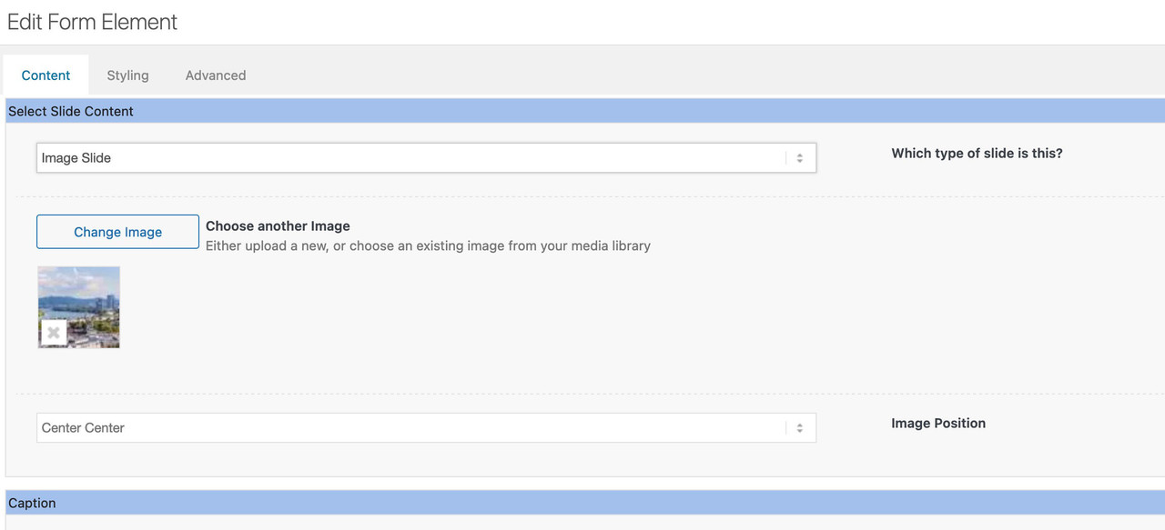
Next – if you are talking about the background-image positioning on shrinking screen width – this can be set by that drop-down select box “image position”
 January 10, 2023 at 8:35 pm #1378171January 13, 2023 at 2:25 pm #1378589
Hi @Guenni007,
Thanks for your clear answer. Now I think I fully understood the principle how the Fullscreen slider works.
I’ve tried the Full-width slider as you suggested and it works the way I wanted!Many thanks!
Paul
January 13, 2023 at 10:18 pm #1378652 -
This topic was modified 4 years, 7 months ago by
-
AuthorPosts
- You must be logged in to reply to this topic.