-
AuthorPosts
-
July 2, 2020 at 8:45 am #1227405
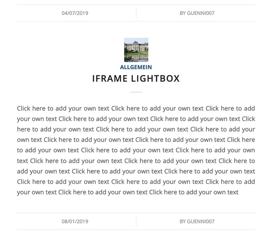
Using the elegant style for blog posts.
1- The “post-meta-infos” are not center as the content. It is going to the left.
#top .fullsize .template-blog .post .entry-content-wrapper > * {
	max-width: 40em;
	margin-left: auto;
	margin-right: auto;
}
That
max-width: 40em;is causing the problem.OR
.html_elegant-blog #top .post-entry .post-meta-infos, .html_elegant-blog .avia-content-slider .slide-meta {
	display: block;
	text-align: center;
	padding: 10px 0;
	border-top-width: 1px;
	border-top-style: solid;
	border-bottom-width: 1px;
	border-bottom-style: solid;
	margin-top: 40px;
	width: 100%;
	clear: both;
	float: left;
}
That
float: left;2- It has 2 lines (border top and bottom) and if you hide author, comments, etc… The 2 lines stay there showing nothing.
How to fix both?
Thanks.
July 2, 2020 at 9:28 am #12274131 ) use position flex instead:
.html_elegant-blog #top .post-entry .post-meta-infos,
.html_elegant-blog .avia-content-slider .slide-meta {
  display: flex !important;
  flex-flow: row nowrap;
  justify-content: center;
  float: none !important;
  margin-top: 80px;  /*** to have the same distance as before ***/
  max-width: 100% !important;
}
By the way: see what happend if you got on justify-content : space-evenly or space-around or space-between
of course it would be better to see the blog page in question.
2) i think you can only have one or the other?
or is it possible to show for one entry the post-meta infos and for the other not?
so if you do not like to have two separators here – remove one of them ( border-top f.e.)-
This reply was modified 5 years, 8 months ago by
Guenni007.
July 2, 2020 at 9:55 am #1227423to have it perfect ( the separator exactly on the center too !
.html_elegant-blog #top .post-entry .post-meta-infos, .html_elegant-blog .avia-content-slider .slide-meta { display: flex !important; flex-flow: row nowrap; justify-content: center; float: none !important; margin-top: 80px; /*** to have the same distance as before ***/ max-width: 100% !important; } .html_elegant-blog #top .post-entry .post-meta-infos > * { width: 150px; /*** just play a bit with this that it does not break at mobile screen-width ***/ } .html_elegant-blog .post-entry .post-meta-infos .text-sep, .html_elegant-blog .post-entry .slide-meta .slide-meta-del { width: 0 !important; }July 2, 2020 at 10:37 am #1227429Thank you Guenni007 .
The problem is that I am not using anything. The code above is a clean new install and how enfold comes. (I assume this can be fixed in the next update)
So how to just fix the 2 issues?
1- CSS for having meta in the center correctly.
2- If I don’t show any meta, then the lines should go away.Thanks.
July 2, 2020 at 11:13 am #1227436So it wasn’t about finding the solution, but to have it installed from Dev-Team directly as a fix for next update, so that it works correctly depending on the setting. So why don’t you write it down this way?
July 2, 2020 at 12:30 pm #1227459Yes, I will display the complete thing to none to fix it in the mean time.
Also:
#top .fullsize .template-blog .post .entry-content-wrapper > * {
	max-width: 40em;
	margin-left: auto;
	margin-right: auto;
}
That max width should be 100%.
Hopefully a dev sees this and comment as well.
Thank you.
July 2, 2020 at 2:28 pm #1227501yes that would do the trick – but to make it perfect – the separator between time and author had to be in the middle too.
This is possible with flex modell and to give a fix width to those containers.
the container with the text separator got the class: text-sep – this is set in the code above to a width: 0 because the content of it is not important it is a normal “/” and set with text-indent to not be seen. The visible Separator is only a border-left – and this could be seen even if width is 0.I like the setting with space-evenly
July 2, 2020 at 5:26 pm #1227550I used:
#top .fullsize .template-blog .post .entry-content-wrapper > * {max-width: 100%;}to overridemax-width: 40em;and now everything looks ok.Now the lines should disappear when nothing is shown.
I believe both are bugs in the theme.
Thanks.
July 9, 2020 at 3:08 pm #1229190 -
This reply was modified 5 years, 8 months ago by
-
AuthorPosts
- You must be logged in to reply to this topic.

