-
AuthorPosts
-
May 15, 2020 at 6:13 pm #1213368
Hi,
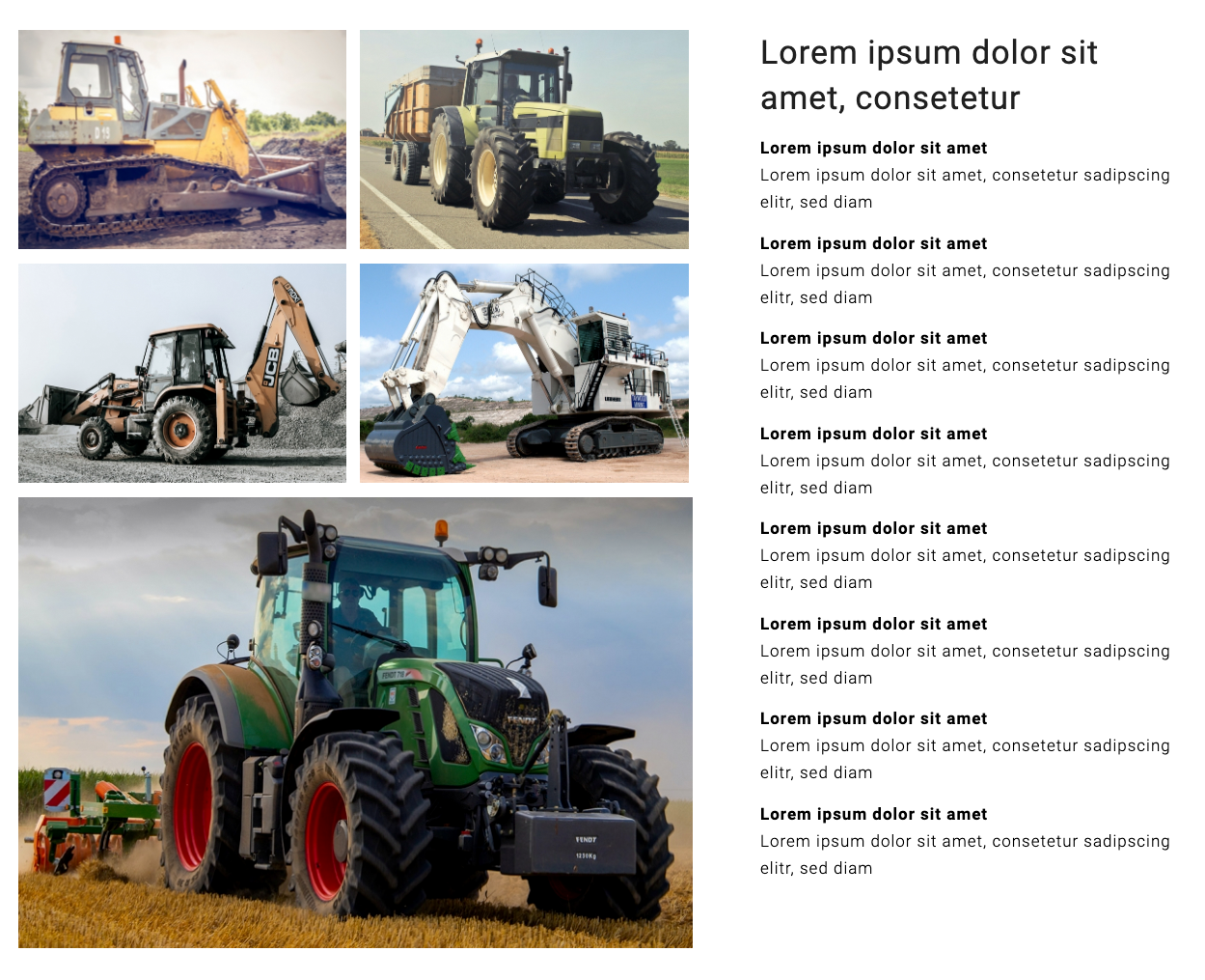
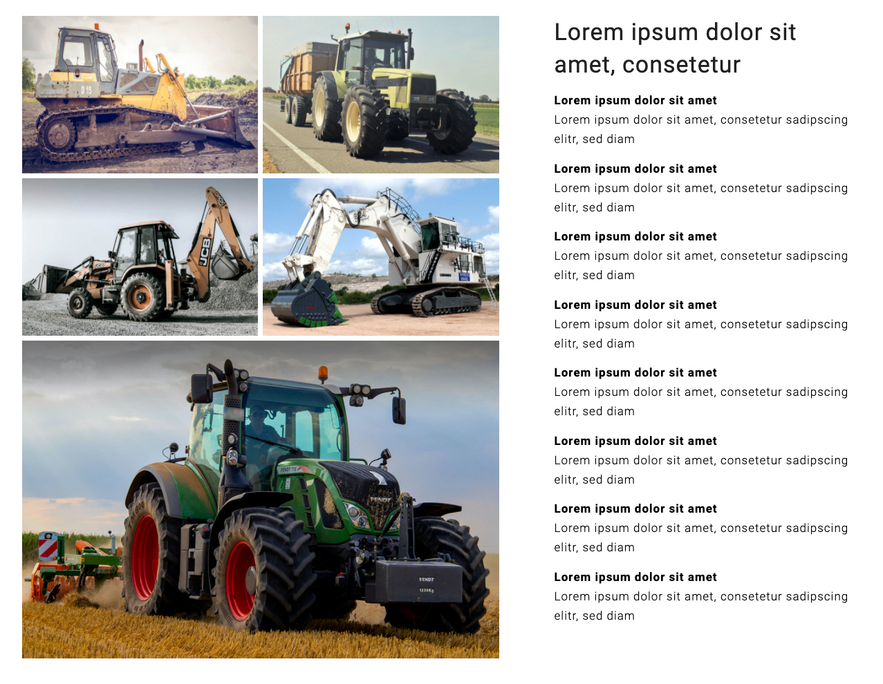
How can I create a gallery with four thumbnails above and one big image below?
I’ve already tried this workaround: Two galleries, one above with four thumbnails and one below with one big image (please see the screenshot in the private content area).
Problem: You can’t scroll directly through all five images in the lightbox by using the arrows. First, you have to open one gallery and then, you have to open the other. To avoid this, is there a way to connect the two galleries?
Or do you see another solution to create a gallery with four thumbnails above one big image below?
Best regards,
zizibe1
May 21, 2020 at 12:32 pm #1214977Hey zizibe1,
Thank you for the inquiry.
You should be able to accomplish this using the Masonry gallery element. Make sure that the Styling > Masonry Settings > Size Settings is set to Perfect Automatic Masonry, and that the last image should have an aspect ratio of 16:9 and larger than the first four images.
Best regards,
IsmaelMay 24, 2020 at 7:00 pm #1215856Hi Ismael,
Thanks for your reply.
I’ve used the Masonry Gallery element, but I didn’t get the desired result.
1.
In the Masonry Gallery element, the white space between the big image and the thumbnails and also between each thumbnail is too big.In the Gallery element, I could correct this by adding the following two codes to Enfold Child > General Styling > Quick CSS:
/* no border around gallery big preview, correct left and bottom padding */
#top div .avia-gallery .avia-gallery-big {
   border-style: none;
   padding-left: 0px;
   padding-bottom: 0px;
}

/* no border around gallery thumbnails, padding 0px to reduce white space, correct left padding of gallery thumbnails */
#top div .avia-gallery img,
#top #wrap_all .avia-gallery .avia-gallery-thumb a img {
   border-style: none;
   padding-top: 0px;
   padding-left: 0px;
}
Could you please tell me the codes to correct the Masonry Gallery element accordingly?
2.
In the preview of the Masonry Gallery element, only sections of the images are visible. But as in the Gallery element, the whole images should be visible (for comparison, please see the new screenshot in the private content area).3.
In the lightbox of the Masonry Gallery element, the images are smaller than in the lightbox of the Gallery element. But they should appear the same size.Best regards,
zizibe 1
May 24, 2020 at 10:51 pm #1215882why not simple:
just create a masonry gallery with set up for 4 columns.

guess this is self-explanatory: https://webers-testseite.de/masonry-4on1big/btw: if you have 5 additional images in there – you can change the code to :
.masonry41 .av-masonry-entry:nth-of-type(5n) {
  width: 100% !important;
}

.masonry41 .av-masonry-entry:nth-of-type(5n) img {
  width: 100% !important;
  height: auto;
}
May 25, 2020 at 10:42 pm #1216309Hi Guenni007,
Thanks for your input.
According to your post, I could realize the following layout:
But the Masonry Gallery should look like this:
a)
The white space between the images should be as small as on the screenshot above.b)
On the right side, the big image should align with the thumbnails above as on the screenshot above.c)
In the lightbox of the Masonry Gallery, the images are smaller than in the lightbox of the Gallery. But they should appear the same size.How can I achieve this?
Best regards,
zizibe1
(Photo credits: DapurMelodi/pexels.com, Andrea Piacquadio/pexels.com, Manzil Joshi/pexels.com, Weir ESCO/pexels.com, Jannis Knorr/pexels.com)
May 26, 2020 at 10:35 am #1216433But take the setting anyway: large gap !
See Example Page again: https://webers-testseite.de/masonry-4on1big/
and :) you also have to chew by yourself a little when eating.
In other words – adjust it to your needs now ( media query break points or spacing ) i set up now a 3px ( on default large gap is 6px )May 27, 2020 at 9:37 pm #1217142Hi Guenni007,
Thanks for your reply.
I’ve added the code from your example page https://webers-testseite.de/masonry-4on1big/ to Enfold Child > General Styling > Quick CSS:
#top .container .av-masonry.masonry41.av-large-gap {
  width: calc(100% + 3px);
}

.masonry41.av-large-gap.av-flex-size .av-masonry-entry .av-inner-masonry {
  margin: 3px !important;
}

.masonry41 .av-masonry-entry:nth-of-type(5n) {
  width: 100% !important;
}

.masonry41 .av-masonry-entry:nth-of-type(5n) img {
  width: 100% !important;
  height: auto;
}

@media only screen and (min-width: 990px) {
  .masonry41 .av-masonry-entry:nth-of-type(5n) {
    width: calc(100% - 6px) !important;
  }
}

@media only screen and (max-width: 989px) {
  .masonry41 .av-masonry-entry:nth-of-type(5n) {
    width: calc(100% - 3px) !important;
  }
}

@media only screen and (max-width: 767px) {
  .masonry41 .av-masonry-entry:nth-of-type(5n) {
    width: 100% !important;
  }
}
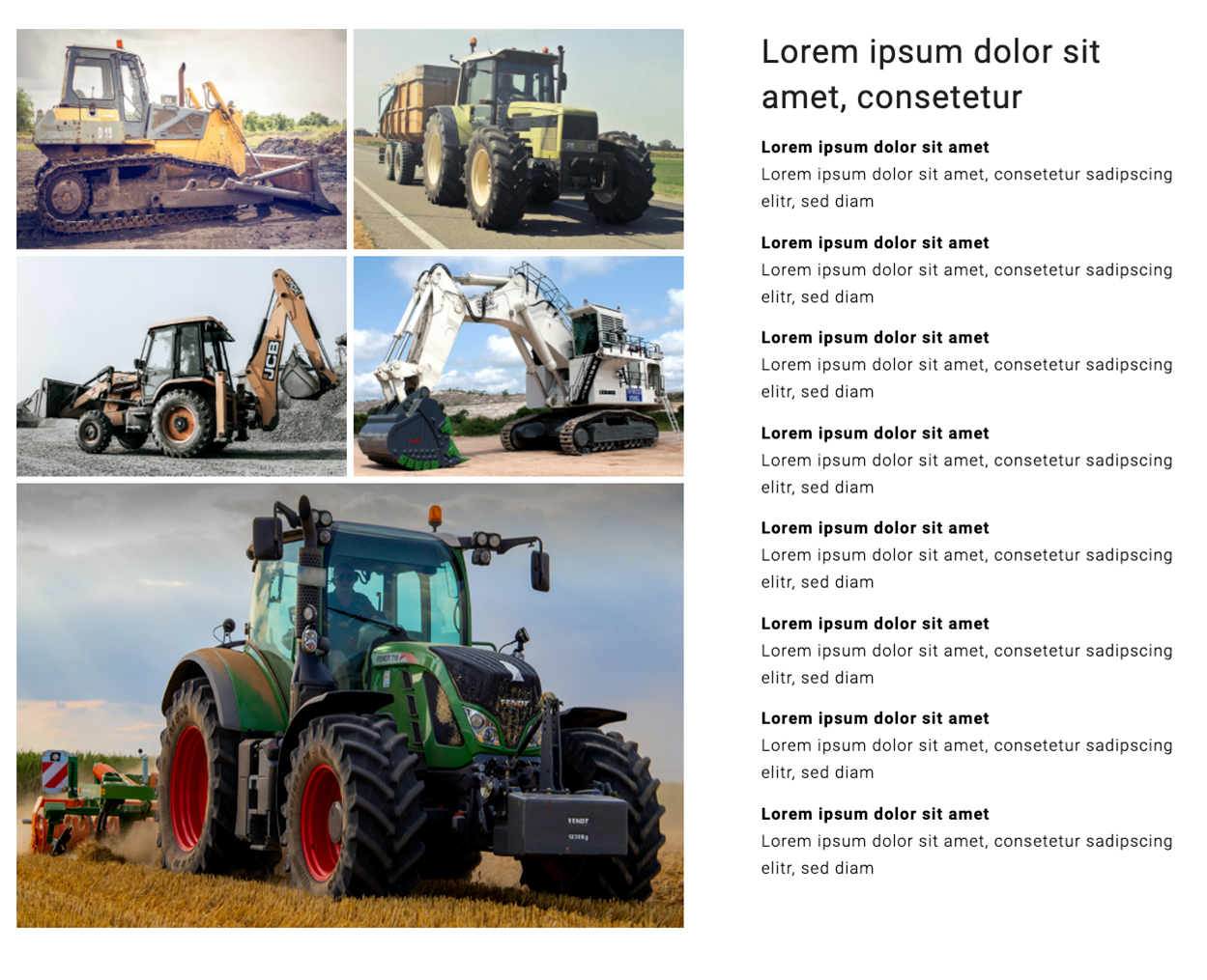
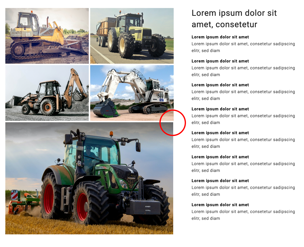
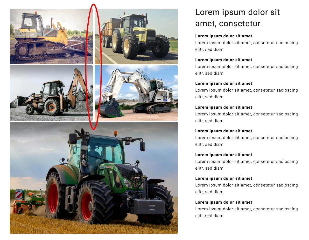
Now, my layout looks like this:
1.
The white space between the images looks alright now. Unfortunately, on the right side, the big image doesn’t align with the thumbnails (see red marking). I’ve tried to adjust this by changing the different parameters in the code (or :) chew by myself a little when eating, as you would call it), but I couldn’t figure it out.2.
The lightbox of the Gallery displays the images in their original size (1196 × 798). But the lightbox of the Masonry Gallery displays a smaller version of the images (only 1030 × 687). What can I do to the make the lightbox of the Masonry Gallery show the images in their original size?Best regards,
zizibe1
(Photo credits: DapurMelodi/pexels.com, Andrea Piacquadio/pexels.com, Manzil Joshi/pexels.com, Weir ESCO/pexels.com, Jannis Knorr/pexels.com)
May 28, 2020 at 2:52 pm #1217366Without seeing your site my support ends here.
Every Enfold Installation is a bit different with different css ( quick css etc. pp)
Even every Browser will render it differently. For some browsers a border f.e. is part of the width for some are not (thats a min 2px difference)You must think of the masonry has a calculation of the width ( somewhere in a js file ) and the left positioning of each Masonry Item with rounded approximations.
Here, too, one will only be able to achieve the closest possible approximation to the ideal.May 28, 2020 at 3:04 pm #1217376Next Question: these are only images ( with maybe a link to lightbox or other pages) ?
It must be a masonry effect? ( Masonry Gallery ALB Element ) ?This is a different approach.
The Masonry Containers are a list of anchor elements.
Anchors are always block-level element.
https://webers-testseite.de/4on1-flexbox-model/May 28, 2020 at 10:18 pm #1217532Hi Guenni007,
Thanks for your efforts.
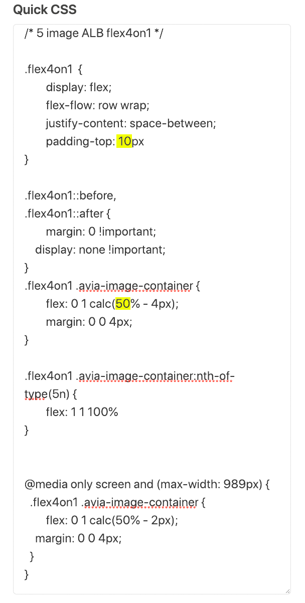
I’ve added the code from your testpage https://webers-testseite.de/4on1-flexbox-model/ to Enfold Child > General Styling > Quick CSS and made some adjustments:
.flex4on1  {
  display: flex;
  flex-flow: row wrap;
  justify-content: space-between;
  padding-top: 10px
}

.flex4on1 .avia-image-container {
  flex: 0 1 calc(50% - 4px);
  margin: 0 0 4px;
}

.flex4on1 .avia-image-container:nth-of-type(5n) {
  flex: 1 1 100%
}

@media only screen and (max-width: 989px) {
  .flex4on1 .avia-image-container {
    flex: 0 1 calc(50% - 2px);
    margin: 0 0 4px;
  }
}
Then I’ve created a new page and added a color-section with two columns in it. The left 3/5 column has only five image elements in it. The right 2/5 column has only text elements in it.
To the left column, I’ve added the custom css class flex4on1 (Edit Cell > Advanced > Developper Settings > Custom CSS Class).
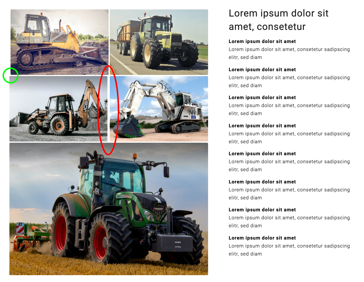
Now, the layout looks like this (unwanted outcomes marked red and green):
But it should look like this:
Again, I couldn’t figure out how to correct this. Do you see a solution?
Best regards
zizibe1
(Photo credits: DapurMelodi/pexels.com, Andrea Piacquadio/pexels.com, Manzil Joshi/pexels.com, Weir ESCO/pexels.com, Jannis Knorr/pexels.com)
-
This reply was modified 5 years, 11 months ago by
zizibe1. Reason: Correction of the code
May 29, 2020 at 7:12 am #1217592add this to the whole code:
.flex4on1::before,
.flex4on1::after {
    display: none !important;
}
i had to see your site ! – no images
are your images the same size! if they got different aspect ratio it will be nearly impossible to get that result.
You can see my testpage that it works on all screen width.
otherwise look for a modMay 29, 2020 at 5:37 pm #1217818Hi Guenni007,
Thanks for your efforts. I really appreciate them.
Unfortunately, for reasons of anonymity, I’ve posted the link to the website only in the private content are which is only visible to moderators. My apologies for not mentioning this earlier to you.
All five images are exactly the same size (1196 × 798). All landscape format images of the website are this size.
On your testpage https://webers-testseite.de/4on1-flexbox-model/, you have four thumbnails in a row. But on my page, I only want to have two thumbnails in a row.
So, I’ve added your code snippet to the code and made two adjustments (see yellow markings):
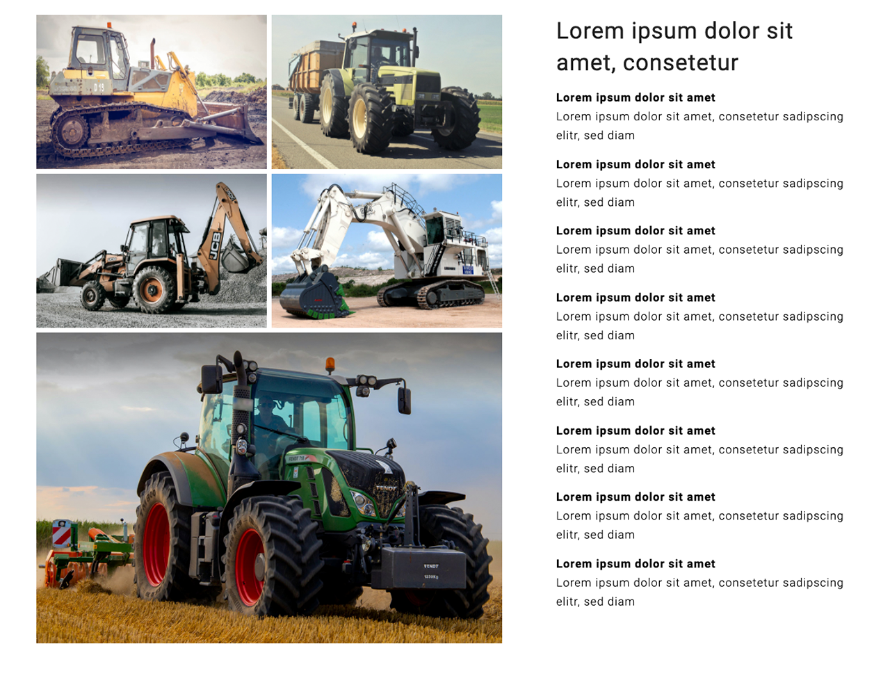
Now, the layout looks like this:
All images are aligned now. But the vertical white space is too big (see red marking).
I hope you can recreate my situation on your testpage and find a way to correct the vertical white space.
Many thanks,
zizibe1
PS: On your testpage, I’ve seen the code to have the container on responsive case under the text. Thank you very much.
In this case, I don’t need this code. Put I’ve posted it here for future reference:
Color Section custom class: section_with4on1
(Note: No other element than the two columns in the Color Section.)@media only screen and (max-width: 767px) { #section_with4on1 .entry-content-wrapper { display: flex; flex-flow: row wrap-reverse; justify-content: flex-start; } }(Photo credits: DapurMelodi/pexels.com, Andrea Piacquadio/pexels.com, Manzil Joshi/pexels.com, Weir ESCO/pexels.com, Jannis Knorr/pexels.com)
May 30, 2020 at 11:14 am #1217946This here is the title of your start posting – and the title of your topic: Gallery with four thumbnails above and one big image below
On your testpage https://webers-testseite.de/4on1-flexbox-model/, you have four thumbnails in a row. But on my page, I only want to have two thumbnails in a row.
So this was described correctly but inadequately.
Also this one: “Two galleries, one above with four thumbnails and one below with one big image” doesn’t exactly lead me to assume it could be 2 rows and 2 lines. Anyway –That my approach is not only theoretically correct but also works practically can be seen on my test page.
If you like to have the behavior of 2 small images in two rows and then one big your can see on the media-query with the 50%.
just get rid of that media query on 989px and set the first rule to :.flex4on1 .avia-image-container { flex: 0 1 calc(50% - 2px); margin: 0 0 4px; }Why : on two containers there should be a distance of 4px. Both containers are set to space-between – So outer edges are left resp. right-justified. You have then for both containers a width of : (100%-4px) so each Container has a width of : (50%-2px)
on 4 images besides ( and I apologize for any inaccuracy ) you have there you have three spaces all should have 4px ( 12px )
same play: (100%-12px) each image then : (25%-3px)I just switched my test page now to that setting – and changed the code-block content too.
I hope you can recreate my situation on your testpage and find a way to correct the vertical white space.
No i can’t – because i do not have this issue
So if something doesn’t work on your installation, i would have now to look for the reason on this page;
since I can’t do that, you will have to wait for mods.But i guess your 50% – 4px is the reason for
-
This reply was modified 5 years, 11 months ago by
Guenni007.
May 31, 2020 at 12:04 am #1218091Hi Guenni007,
Thanks for your reply. I’m sorry for the misunderstanding.
In my previous post, I’d mentioned that the vertical white space between the images was too big. But now I’ve realized that the two horizontal white spaces were too thin actually.
Thanks to your explanation, I could adjust the code like this:
.flex4on1  {
	display: flex;
	flex-flow: row wrap;
	justify-content: space-between;
	padding-top: 0px
}

.flex4on1::before,
.flex4on1::after {
	margin: 0 !important;
    display: none !important;
}
.flex4on1 .avia-image-container {
	flex: 0 1 calc(50% - 3px);
	margin: 0 0 6px;
}

.flex4on1 .avia-image-container:nth-of-type(5n) {
	flex: 1 1 100%
}
The layout looks like this now:
Now, the white spaces between the images are alright.
I have another two questions:
1.
The corners of the images should be sharp. How do I get rid of the rounded corners?*2.
Currently, the lightbox displays a smaller version of the images (1030 × 687). But the lightbox should display the images in their original size (1196 × 798). How do I achieve this?Many thanks,
zizibe1
* I’ve just realized that the white spaces between the images are a little bit bigger when the corners of the images are sharp. That’s how it’s supposed to be. So, how can I achieve the following layout which has images with sharp corners?
(Photo credits: DapurMelodi/pexels.com, Andrea Piacquadio/pexels.com, Manzil Joshi/pexels.com, Weir ESCO/pexels.com, Jannis Knorr/pexels.com)
-
This reply was modified 5 years, 11 months ago by
zizibe1. Reason: * addendum
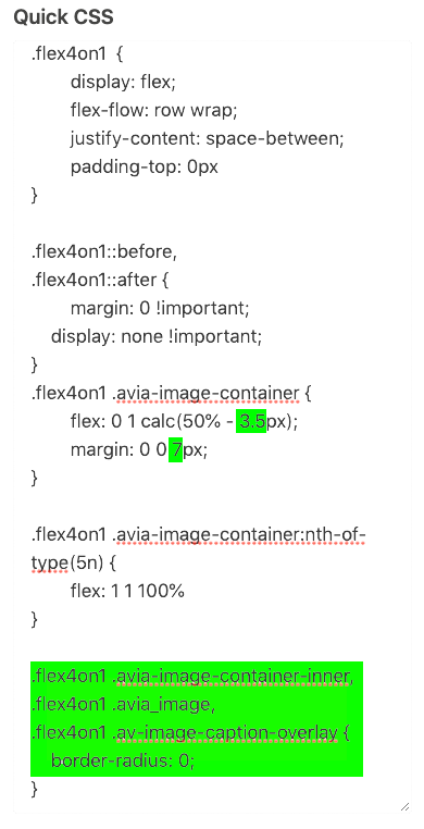
May 31, 2020 at 9:40 am #1218151border-radius of images are part of enfold setting:
.avia-image-container-inner,
.avia_image,
.av-image-caption-overlay {
    border-radius: 3px;
    display: block;
    position: relative;
    max-width: 100%;
}
so you had to change that – if you only like to do it on that images :
.flex4on1 .avia-image-container-inner,
.flex4on1 .avia_image,
.flex4on1 .av-image-caption-overlay {
    border-radius: 0;
}
But border-radius has no influence on image distance. Only the center point will be gone where all images meet.
put this to your child-theme functions.php:
for single images with lightbox:function change_lightbox_size() { return "full"; } add_filter('avf_avia_builder_helper_lightbox_size','change_lightbox_size', 10);for image source for light-box in a gallery
function avia_change_gallery_thumbnail_link($link, $attachment, $atts, $meta){ $link = wp_get_attachment_image_src($attachment->ID, "full"); return $link; } add_filter('avf_avia_builder_gallery_image_link', 'avia_change_gallery_thumbnail_link', 10, 4);-
This reply was modified 5 years, 11 months ago by
Guenni007.
May 31, 2020 at 6:45 pm #1218239Hi Guenni007,
Thanks for your reply.
1.
The code looks like this now (adjustments are highlighted in green):Now on desktop, the white spaces between the images of the flexbox layout look the same as the white spaces between the images of the gallery layout.
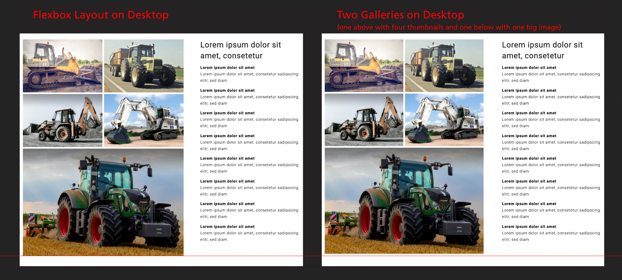
But as you see on the screenshot below, the flexbox layout is a little bit too big.
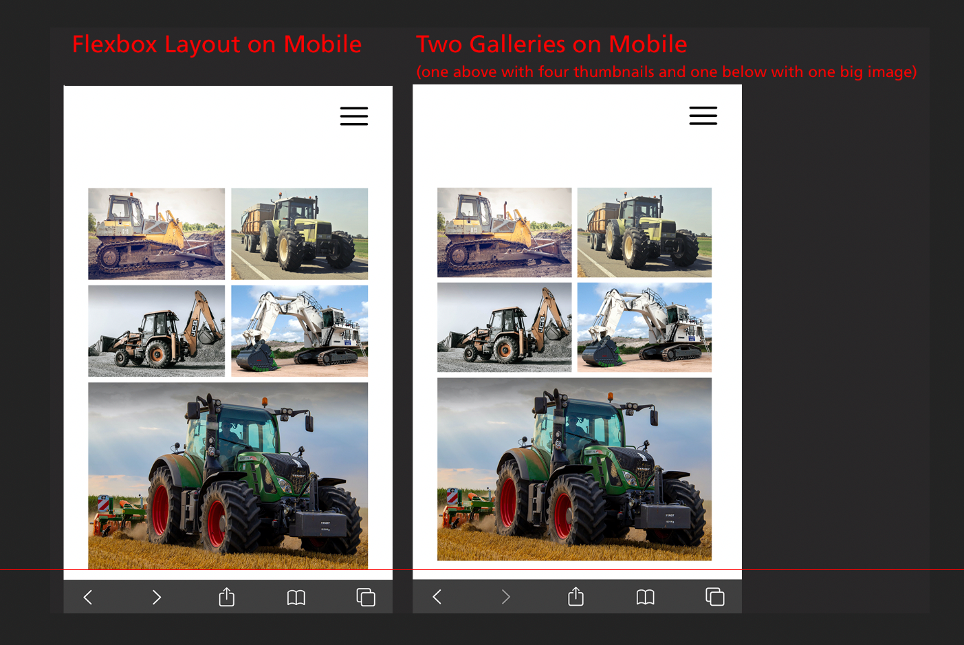
Also on mobile, the flexbox layout is a little bit too big:
How can I correct this?
2.
I’ve added the following code to Appearance > Theme Editor > Enfold Child: Theme functions (functions.php):function change_lightbox_size() { return "full"; } add_filter('avf_avia_builder_helper_lightbox_size','change_lightbox_size', 10);It has worked fine. Now the lightbox of the flexbox layout displays the images in their original size.
3.
I’ve added the following code to Appearance > Theme Editor > Enfold Child: Theme functions (functions.php):function avia_change_gallery_thumbnail_link($link, $attachment, $atts, $meta){ $link = wp_get_attachment_image_src($attachment->ID, "full"); return $link; } add_filter('avf_avia_builder_gallery_image_link', 'avia_change_gallery_thumbnail_link', 10, 4);This code should make the lightbox of the gallery display the images in their original size. Correct? If so, I can see no difference, because the lightbox of the gallery has already displayed the images in in their original size before. But thanks for the code anyway.
Best regards,
zizibe1
June 1, 2020 at 7:28 am #12183353.) the layout above isn’t a gallery – it is 5 single images – I only mentioned it for the sake of completeness.
1.) No – now seriously – I will not comment further on this nitpicking. Do you really believe that someone sits down at his mobile phone and compares it with the display on his desktop PC? Honestly?
And if someone does, would you like to call him your customer?Everything else about further support you should then clarify with a freelancer, who rightly gets money for such fine-tuning.
I once had a customer here who seriously wanted to discuss with me that a border color in Internet Explorer has a little more magenta compared to the Safari browser. Believe me – to leave such customers directly to others – that saves nerves and time and therefore money.
___________
Actually, the flex layout only makes sense anyway, if only one column is shown in the responsive case, i.e. set the code via mediaquery above only for larger screens.
A little hint when it comes to mobile devices, you can use the class: avia_mobile and avia_desktop that are set from enfold on html.responsive to establish different rules.June 1, 2020 at 5:52 pm #1218481Hi Guenni007,
Thanks for your reply.
For me, it’s very important that the flexbox layout and the gallery layout are exactly the same size. I would very much like to know how to fine-tune that. But I understand if you don’t want to invest any more time in this topic.
I’ve posted a link to the page with the flexbox layout and a link to the page with the gallery layout in the private content are. I would appreciate it very much if a moderator could help me.
Best regards,
zizibe1
June 5, 2020 at 11:19 am #1219742Hey,
That is because of the padding around gallery images. I added following code to bottom of Quick CSS field
#top #flex-gallery .avia-gallery img { padding: 0; }
#flex-gallery .avia-gallery-thumb {
    display: flex;
    flex-flow: row wrap;
    justify-content: space-between;
    padding-top: 0px;
}
#top #wrap_all #flex-gallery a {
    width: 50%;
    flex: 0 1 calc(50% - 3.5px);
    margin: 0 0 7px;
}
Please review your website
Regards,
YigitJune 5, 2020 at 9:19 pm #1219952This reply has been marked as private.June 16, 2020 at 9:23 am #1222937Hi,
Sorry for the delay. Try to use this css code to adjust the width of the image in the second gallery.
#top #wrap_all #flex-gallery .avia-gallery-big {
	width: 100%;
	padding: 7px 0;
}
Default width is 50%. The css code will also adjust the padding around the item.
Best regards,
Ismael-
This reply was modified 5 years, 10 months ago by
Yigit.
June 16, 2020 at 4:39 pm #1223111This reply has been marked as private.June 17, 2020 at 1:33 pm #1223374Hi,
1- I added following code to bottom of Quick CSS which removes bottom padding from last two images in the gallery
.custom-gallery .avia-gallery-thumb a:nth-last-of-type(-n+2) img {
    padding-bottom: 0 !important;
}
2- That is because you are using two different gallery elements on your page while you are using 1 gallery element on "Big image above" version. I recreated your layout using single Gallery element below your existing section in page in private content field.
Please review your website.
Best regards,
YigitJune 19, 2020 at 10:27 pm #1224177Hi Yigit,
Thanks for your reply.
I recreated your layout using single Gallery element below your existing section in page in private content field.
Great! That’s the layout I was asking about in the first post of this thread!
I’ve tried to recreate this layout on a new testpage. Unfortunately, I didn’t succeed.
Please have a look at the private content area. What did I wrong?
Best regards,
zizibe1
June 22, 2020 at 10:40 am #1224546Hi,
Sorry, I forgot to mention that I have added “flex-gallery-alt” ID to the column of your gallery. I just edited your new testpage and added the ID :)
You can find custom CSS code related to that customization in the bottom of Quick CSS field.
Best regards,
YigitJune 24, 2020 at 11:38 pm #1225375Hi Yigit,
Awesome! Thank you very much for your support.
For the sake of completeness, it should be mentioned that the custom CSS code related to that customization is:
#flex-gallery-alt .avia-gallery-thumb a:last-of-type {
width: 100% !important;
}
Thanks again. You can close this topic now.
Best regards,
zizibe1
June 25, 2020 at 1:56 pm #1225492Hi,
You are welcome! :)
For your information, you can take a look at Enfold documentation here – https://kriesi.at/documentation/enfold/
If you have any other questions or issues, feel free to start a new thread under Enfold sub forum and we will gladly try to help you :)
Best regards,
Yigit -
This reply was modified 5 years, 11 months ago by
-
AuthorPosts
- The topic ‘Gallery with four thumbnails above and one big image below’ is closed to new replies.

