-
AuthorPosts
-
April 25, 2020 at 12:02 am #1207004
Hi guys!
I need to know how to disable landscape automatic rotation for mobile devices.
My mobile site version needs to be only vertical.Regards
SantiagoApril 26, 2020 at 12:48 am #1207142Hi Santiago,
Unfortunately disabling landscape rotation for mobile devices isn’t something that we can do.
I think what we can do is set a maximum width for your site when the mobile device is in landscape mode, can you give us a link to your site? so maybe we can try to inspect and give you the right CSS codes to use.Best regards,
NikkoApril 28, 2020 at 8:35 pm #1207961Hi Nikko, thanks for your response!
Mi site is https://www.santiagomoyano.comRegards
April 28, 2020 at 11:13 pm #1208026Hi enfold,
Please try adding this CSS code in Quick CSS, located in Enfold > General Styling:
@media only screen and (max-width:767px) and (min-width:570px) {
  .responsive #top #wrap_all {
    margin-left: auto;
    margin-right: auto;
    max-width: 352px;
  }
}
Hope it helps.
Best regards,
NikkoMay 19, 2020 at 6:25 pm #1214393Hi Nikko, thank you for the info, but it does not work
Regards
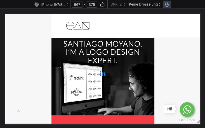
May 19, 2020 at 6:49 pm #1214399hm – i see this on my iphone emulation developer tools:

isn’t that what you want?
The only missing is a rule for the header – because it is in position:fixed – it is not influenced by wrap_all
Try this instead:
@media only screen and (max-width:767px) {
  .responsive #top #wrap_all {
    margin-left: auto;
    margin-right: auto;
    max-width: 352px;
  }
  .responsive #top #header {
    position: fixed !important;
    max-width: 352px;
  }
}
if you only like to have that for mobile devices you can use the class on responsive : avia_mobile to be more selective:
@media only screen and (max-width:767px)  {
  .responsive.avia_mobile #top #wrap_all {
    margin-left: auto;
    margin-right: auto;
    max-width: 352px;
  }
  .responsive.avia_mobile #top #header {
    position: fixed !important;
    max-width: 352px !important;
  }
}
May 19, 2020 at 6:49 pm #1214400Hi,
Did you add the code to the very top of quick css so it runs first? Also, clear the cache a few times over.
Best regards,
Jordan ShannonMay 20, 2020 at 8:01 pm #1214745Yes, I see you like the image you show me, but I just need to disable landscape automatic rotation on mobile devices.
I don’t know if is this possibleRegards
May 20, 2020 at 8:52 pm #1214757Hi,
Unfortnately no, this is not possible. This is due to the rotation being a device function not theme.
Best regards,
Jordan ShannonMay 20, 2020 at 8:54 pm #1214758Ok thanks
May 20, 2020 at 9:14 pm #1214773Hi,
If you need additional help, please let us know here in the forums.
Best regards,
Jordan Shannon -
AuthorPosts
- The topic ‘Disable landscape mode on mobile’ is closed to new replies.
